The 60-30-10 rule splits a room's color into three doses: 60 percent a dominant color, 30 percent a secondary color, and 10 percent a bold accent. Get those proportions roughly right and almost any palette will read balanced instead of busy. My read is that it is the single most useful rule for anyone who picks colors they love individually and then watches the room feel chaotic once they are all in the same space.
The formula works because the human eye wants a clear hierarchy. When two colors compete for the same amount of attention, the room feels unsettled. When one color clearly leads, a second supports, and a small punch of a third adds energy, the whole thing snaps into order. It is a ratio, not a precise measurement, and that flexibility is what makes it stick.
What goes in each bucket
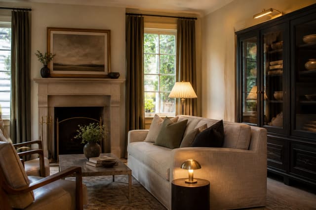
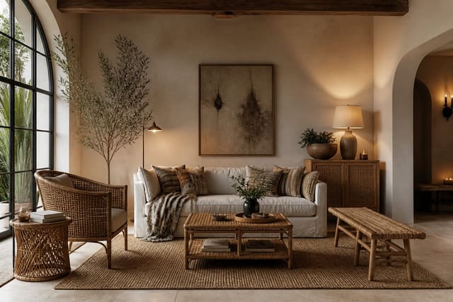
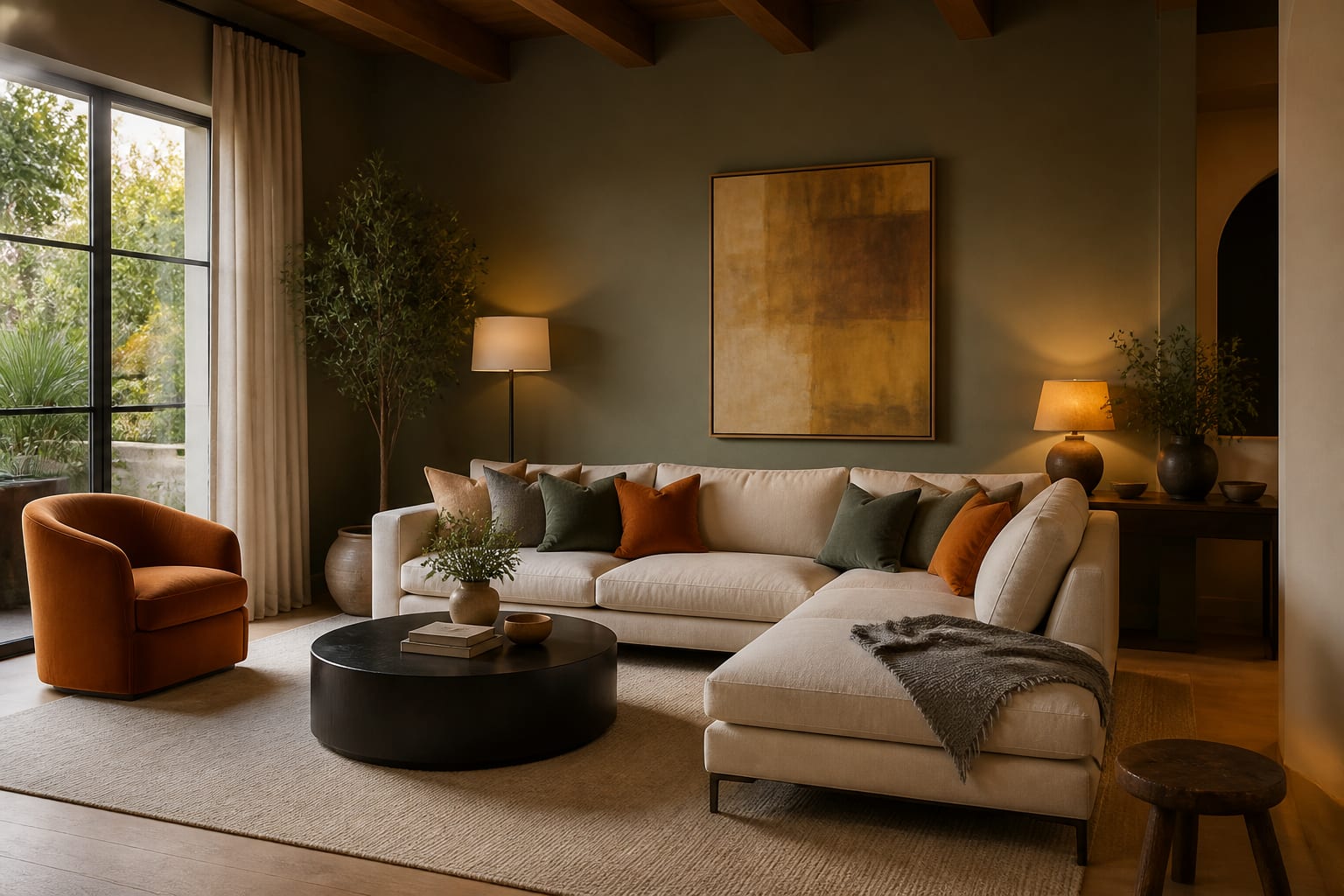
The 60% share is your room's backdrop. It is the largest surfaces: the walls, the flooring or a big area rug, and the dominant piece of furniture like a sofa or a bed. Because it covers the most area, this color sets the mood, so it is usually the calmest and most neutral of the three. If you are nervous about color, this is where to play it safe, and a soft neutral here buys you freedom everywhere else.
The 30% share is the supporting color, covering roughly half the area of the dominant one. Think upholstered chairs, curtains, bedding, a console, or a painted accent wall. It should clearly differ from the 60 percent so the room has contrast, but not fight it. This is the layer that gives a room its character without taking over, and it typically lands near 30% of what your eye sees.
The 10% share is the accent: the smallest dose with the biggest job. Throw pillows, a vase, artwork, a tray, a lamp, fresh flowers. Because it is small, you can be bold here, a saturated color you would never paint on a wall. Here is a clean way to assign real items to each bucket:
- 60% dominant: wall color, flooring or large rug, the sofa or bed.
- 30% secondary: accent chairs, curtains, bedding, a sideboard.
- 10% accent: pillows, throws, art, ceramics, books, plants.
- Metals are part of the accent layer; one repeated finish reads as intentional.
The accent layer is also where finishes earn their keep. A warm metal in small doses can be the whole 10 percent, and I get into how that ages and reads in the unlacquered brass guide.
How to build a palette with it
Start by choosing the 60 percent first, because it is the hardest to change later. Walls and big furniture are commitments. Pick a color you will not tire of, then build outward. Most designers anchor the dominant on a soft neutral or a muted version of a color they love, which buys room to be braver with the smaller layers.
Next choose the 30 percent as a deliberate step away from the dominant: a deeper tone, a complementary hue, or a richer texture. A pale gray 60 percent might take a forest green 30 percent. Then pick the 10 percent as the spark, often the boldest color and the one you can swap seasonally for almost no money since it lives in pillows and small decor.
Temperature is the lever that decides the mood. Keep all three colors warm (or all cool) and the room feels calm and cohesive. Make the 10% accent a contrasting temperature, a hot accent in a cool room, and you get energy and a focal point. Texture counts too: a single color shows up differently in linen versus velvet versus a woven cane, which is one reason natural materials like those in my rattan and cane material guide read as another quiet layer of color even when they are technically neutral.
The rule scales up and down. In a small bedroom the 60% might be the wall color, the 30% the bedding and headboard, and the 10% a single piece of art and a lamp. In an open-plan living and dining space you can run the same split across the whole zone so the rooms feel connected, then nudge the accent in each area, coral pillows on the sofa, a coral vase on the table, so the 10% repeats rather than scatters. You can also nest the rule: a 60-30-10 split for the whole room, then a smaller 60-30-10 inside a single bookshelf or vignette using the same three colors in miniature.
When you are choosing the actual hues, a color wheel keeps you honest. Analogous schemes (colors sitting next to each other, like blue and green) feel calm and are forgiving for the 60% and 30%. Complementary schemes (opposites, like blue and orange) give you a built-in 10% accent with maximum contrast. Either way, pull paint chips and fabric swatches into the room and look at them in daylight and at night before you commit, because the same color shifts noticeably under a warm 2700K bulb after dark. Buy a sample pot and paint a swatch at least 12 inches square on two different walls, since a north-facing wall and a south-facing wall can read as nearly different colors. Stand back about 6 feet to judge it, the distance you actually see the wall from. Repeat your 10% accent in at least 3 spots spaced a few feet apart so it reads as a deliberate thread rather than a single stray pop.
Common mistakes to avoid
The most common mistake is treating 60-30-10 as exact math and measuring square footage. It is a proportion you eyeball; landing within about 10 percent of each ratio is plenty close.
Another frequent mistake is making the dominant color too bold. When the 60 percent is a saturated red or navy across every large surface, there is no calm backdrop for the other colors to register against, and the room feels heavy. A third mistake is forgetting the 10 percent entirely; a room with only two colors often feels safe but lifeless, missing the accent that gives it a pulse. People also confuse the ratio by counting every neutral as a freebie. White and beige are colors and they take up real space, so they belong in your 60 or 30, not floating outside the formula. The last common mistake is spreading the accent too thin, dotting one tiny pop in five different spots so none of them land. Cluster the 10 percent so it reads as a deliberate moment.
Use AI design to test the ratio fast
The 60-30-10 rule is easy to understand and surprisingly hard to picture in your own room until paint is on the wall and pillows are on the sofa. Re-Design removes the guesswork. Upload a photo of your room and the AI design re-renders it with different dominant, secondary, and accent colors so you can watch the ratio play out on your actual walls and furniture.
Because you upload your real space, the preview keeps your room's proportions, light, and layout intact, which is exactly what the rule depends on. Test a navy 60 percent against a soft-gray one, swap the 10 percent accent from mustard to coral, and see which split reads balanced before you commit to a single gallon of paint or a set of cushions.