Sheen is the paint decision people get wrong most often, and it is the one that haunts you every time afternoon light rakes across a wall. The honest answer is that finish matters as much as color: the same warm gray can look chalky and rich in matte yet cheap and plasticky in semi-gloss. My rule is to match the sheen to how much abuse a surface actually takes, then dial it back depending on how flawless the wall really is underneath.
More sheen means more durability and more washability, but it also broadcasts every dent, roller mark, and patched nail hole in unforgiving detail. Less sheen hides flaws and reads sophisticated, but it surrenders much of its scrubbability in the process. Every room you paint is a negotiation between those two competing truths, and the right call changes wall by wall.
What each sheen actually does
Flat or matte sits at the bottom of the scale, with roughly 0 to 5% gloss. It swallows light, hides imperfections generously, and gives walls a velvety depth that photographs beautifully, but it marks easily and resists most washing. Eggshell, around 10 to 25% gloss, is the everyday workhorse of the lineup: enough sheen to wipe gently with a damp cloth, enough softness to forgive a wall that is not perfectly smooth. Satin pushes up to 25 to 35% with a noticeable glow and real, repeatable washability.
Semi-gloss, roughly 40 to 70% gloss, is the trim and cabinet standard because it cures hard and cleans up fast with a damp rag. High-gloss, above 70%, is a statement finish for doors and millwork that demands a genuinely flawless substrate, since it reflects every flaw like a mirror. Each step up the ladder trades a little forgiveness for a little toughness, and knowing where each finish lands lets you place them with intent.
Manufacturers do not all measure sheen the same way, which trips people up. One brand's satin can look closer to another brand's eggshell, because the gloss-meter reading is taken at a different angle. The practical takeaway is to compare finishes within a single brand's line rather than assuming the word on the label means the same thing everywhere. When in doubt, buy a sample pot, paint a two-foot square on the actual wall, and judge the reflectivity in your own light before committing to gallons. That small test saves far more than it costs in time and frustration.
The way a given sheen reads also depends heavily on how light moves through the room over the course of a day. A finish that looks soft and even at noon can turn glaring near a low evening window, which is exactly the kind of light-and-proportion thinking I cover in scale and proportion in interior design. Walk the room at several times of day before you commit a sheen to a big wall.
Color and sheen also interact in ways that surprise people the first time. A deep, dark color in a higher sheen reads almost lacquered and shows hand-oils and dust readily, while the same dark color in matte feels enveloping and quiet. Pale colors are far more forgiving across the sheen scale, which is why a soft white ceiling in flat and a soft white wall in eggshell can coexist without looking mismatched. When you push toward a saturated wall color, drop the sheen a notch from what you would choose for a pale tone to keep the surface from looking plasticky.
Flat paint hides flaws on a ceiling 8 feet overhead, while a high-touch door or trim usually takes two coats of semi-gloss and roughly $40 per gallon of premium enamel.
Room-by-room sheen map
Matching finish to function is what keeps you from repainting in two years out of frustration. Here is how I assign sheen across a typical home, room by room:
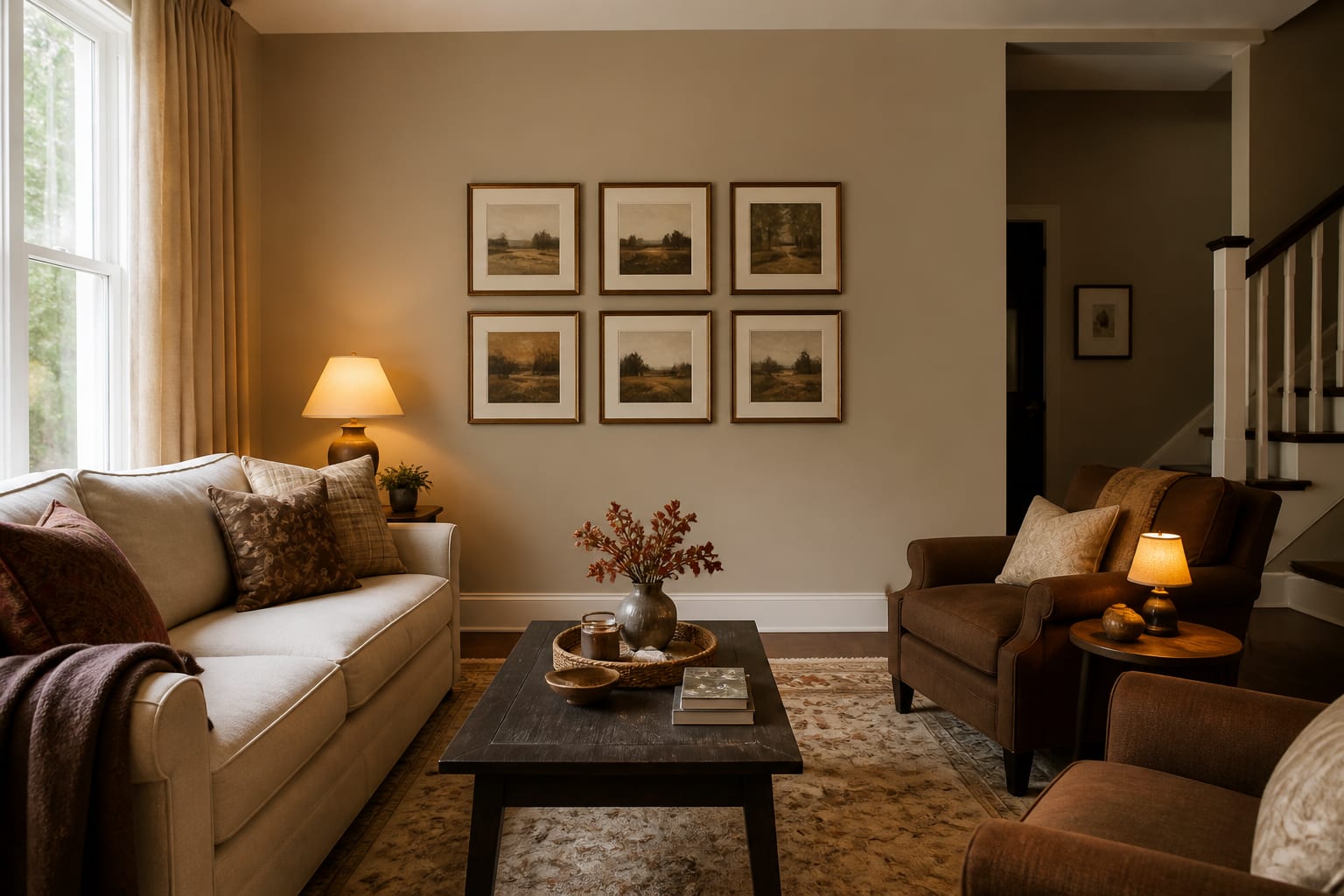
- Living rooms and bedrooms: eggshell for durability with a soft look, or matte if the walls are genuinely smooth
- Kitchens: satin, which shrugs off grease splatter and cooking steam near the range
- Bathrooms: satin or semi-gloss to handle constant humidity and frequent wiping
- Hallways and kids' rooms: eggshell or satin so scuffs and fingerprints come off cleanly
- Trim, doors, and cabinets: semi-gloss for a hard, washable, crisp edge that frames the walls
- Ceilings: dead flat to hide seams and kill any glare from overhead fixtures
Finish also interacts with the materials living around it, and that adjacency is easy to overlook. A matte wall flatters the warm, low glow of unlacquered brass hardware, letting the metal be the shiny thing in the room. A high-sheen trim, on the other hand, can visually compete with a textural natural material like rattan and cane, so I drop the trim to satin nearby. Reading those material pairings keeps a finished room from feeling busy and reflective.
Do not forget the practical realities of touch-ups and longevity, because they differ by sheen. Flat and matte paints are the easiest to spot-repair, since a dab blends in without leaving a shiny halo, which is one quiet reason rental owners favor them. Higher sheens are nearly impossible to touch up invisibly, so a scuffed semi-gloss door usually needs the whole panel recoated. Buy a little extra of each sheen and store it sealed, labeled by room, so a future repair matches instead of standing out under the light.
Common mistakes to avoid
The most common mistake by far is putting flat paint in a high-traffic zone because it looked luxurious in a showroom mockup. A flat hallway will show every handprint and shoulder smudge within months, and flat paint rarely survives a scrub without burnishing into an ugly shiny smear right where you cleaned it. The fix is eggshell, which keeps most of the soft, low-glare look while tolerating an honest wipe-down.
Another frequent error is reaching for semi-gloss on imperfect walls just to get washability. At 40 to 70% gloss, every taping ridge, roller lap, and old patch lights up the moment side light hits it. If a wall has texture or a history of repairs, drop to eggshell and accept slightly less scrubbability rather than spotlighting every flaw. A third anti-pattern is skipping primer over patched spots before painting. The patched drywall absorbs paint differently than the surrounding wall, and the resulting dull flash telegraphs through any sheen above flat. Spot-prime every repair first, then roll the whole wall in one continuous pass for an even finish.
Use AI design to preview paint finishes before you commit
Sheen is genuinely hard to imagine in advance, because a tiny chip never shows you how light will rake across your specific wall at four in the afternoon. Re-Design helps you see it in real context: upload a photo of the room and the AI renders the wall in your chosen color, so you can judge how the finish reads against your actual windows, trim, and furniture.
That preview is most useful for sorting matte from satin in a room with strong, directional daylight, where the gap between soft and reflective is dramatic and easy to get wrong. Upload a couple of angles, compare a quiet matte against a more durable satin on the very same wall, and lock in the finish with confidence before you ever pop the lid on a single can.