When a room feels wrong but you can't say why, the culprit is almost always scale or proportion rather than color or style. I think most people blame the paint or the sofa fabric when the real issue is that a 96-inch sofa is floating in a 10-foot wall, or a 30-inch pendant is hanging over a 96-inch island. The objects are fine on their own; they are just the wrong size for the space and for each other.
Scale is how an object relates to the room and to your body. Proportion is how the parts of an arrangement relate to each other. Get both right and a room reads as calm and intentional even with cheap furniture. Get them wrong and a room full of expensive pieces feels like a showroom that nobody measured. My read is that scale is the single most underrated skill in amateur design, because it is invisible when it works and glaring when it fails.
What scale and proportion actually mean
Scale answers a simple question: is this object the right size for the people and the room around it? A king bed in a 10-by-10 bedroom fails on scale because it leaves under 24 inches of walking room on each side, when 30 inches is the comfortable minimum. The bed is not wrong; it is wrong here. Scale is always relative, which is why a piece that looked huge in the store can look small once it is home against a tall ceiling.
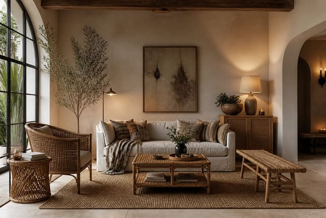
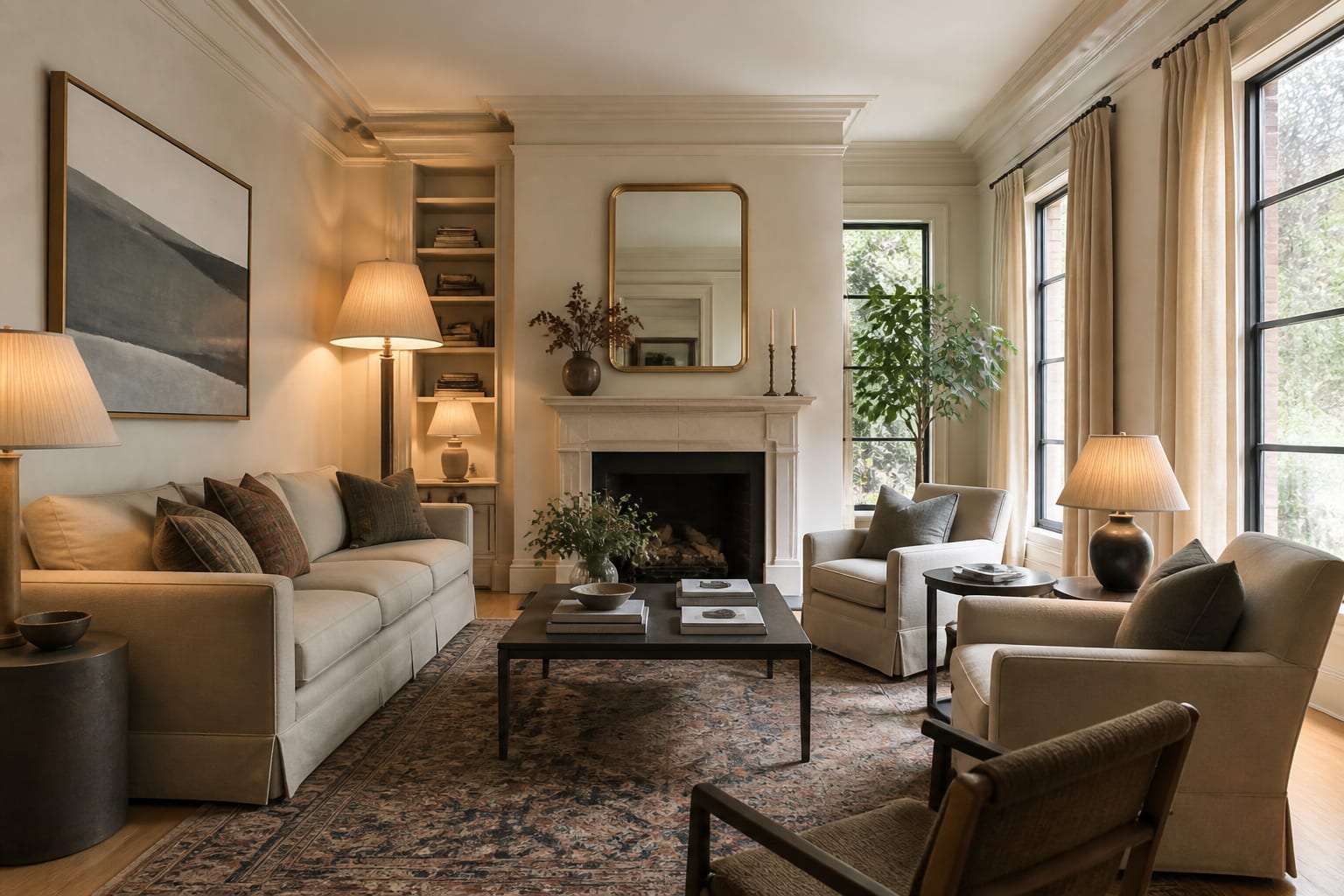
Proportion is about ratios between parts. The reason a 72-inch console under a 24-inch mirror looks awkward is that the ratio is off: the mirror should fill closer to 60 to 75% of the console's width to read as a pair. Designers lean on a few rough ratios because they consistently look balanced. The two-thirds rule shows up everywhere: coffee table to sofa, mirror to vanity, pendant to table. None of it is precise math, but the ranges are tight enough that breaking them by more than a few inches starts to feel off. Material choices interact with scale too, since a chunky, visually heavy material reads larger than its footprint; a rattan and cane piece takes up the same floor space as a solid wood one but feels far lighter and smaller in the room.
The measurements that make a room sit right
Most scale problems come from a handful of clearances people never measure. Keep 30 to 36 inches for major walkways and at least 18 inches for paths people only pass through occasionally. Behind a pulled-out dining chair you want 36 inches before the next obstacle, or 44 inches if someone walks behind the seated guest. These are not suggestions; below them a room physically stops working.
Vertical proportion matters as much as floor space. Here is the short list I check on every room:
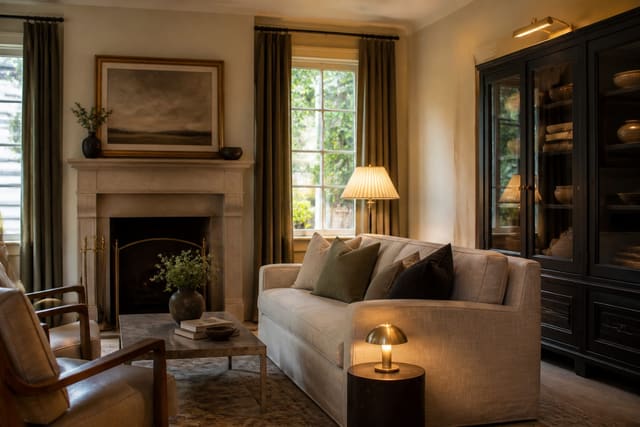
- Coffee table height within 2 inches of the sofa seat, so it reads as a partner not a stumble.
- Side table within 2 inches of the chair arm beside it.
- Curtains mounted 4 to 12 inches above the window frame and dropped to the floor, never to the sill, to add height.
- Pendant or chandelier bottom at least 7 feet off the floor in a walkway, 30 to 36 inches above a table.
- TV center at roughly 42 inches when seated, which usually means the unit sits low.
Metal accents play into proportion through visual weight rather than size, which is why a thin, warm metal can anchor a large surface without crowding it; the patina on an unlacquered brass fixture reads as a small, dense point of interest that balances a big empty wall.
Reading visual weight, not just dimensions
Two objects can share dimensions and have completely different visual weight. A glass coffee table and a solid oak one occupy the same footprint, but the oak one anchors a room while the glass one almost disappears. Dark colors, dense materials, and closed forms feel heavy; light colors, open frames, and reflective surfaces feel light. Balancing a room is mostly about distributing that weight so no corner feels empty and none feels crammed.
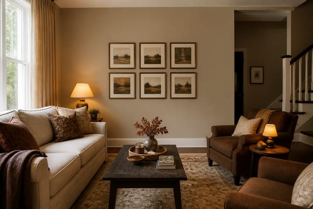
This is where symmetry and asymmetry come in. Symmetry is the easy win: a matched pair of lamps on a console reads as stable and formal. Asymmetry is harder but more interesting, and it works when the visual weight balances even though the objects differ, like a tall plant balancing a low, wide credenza on the opposite wall. Finish contributes here too; a flat, light wall recedes and makes furniture feel larger by comparison, while a deep, slightly sheenier wall pulls in and shrinks the apparent room. If you are choosing wall color partly to manage how big the furniture looks, the paint finish guide covers how sheen changes a surface's perceived weight and depth. The goal is a room where your eye moves across several different heights and weights instead of skating over a flat line of same-size objects.
Common mistakes to avoid
The most common mistake is the floating-island problem: a sofa and chairs pushed to the walls of a large room, leaving a dead zone of carpet in the middle. Pulling seating in by even 12 to 18 inches and adding a rug that anchors the group fixes the scale instantly. The second mistake is the undersized rug, where a 5-by-7 rug sits like a postage stamp under an 8-foot sofa; the rug should be wide enough to reach under at least the front legs of every seat in the grouping.
Another frequent mistake is matching heights, where the sofa back, the console, the art, and the curtain rod all land at the same level and the room reads as one flat band. Vary the heights deliberately. People also misjudge art, hanging a tiny frame in the center of a big wall; size art to cover 60 to 75% of the furniture beneath it or group small pieces into one larger shape. The last mistake to avoid is buying the biggest sectional that fits, which leaves no room for circulation and makes everything else look like an afterthought. Measure the walkways first, then buy to the space that remains.
Use AI design to preview scale and proportion before you commit
The hardest part of scale is that you cannot trust your eye in an empty or half-furnished room, and returning an oversized sofa is expensive and miserable. With Re-Design you upload a photo of the actual room and test furniture sizes against your real walls, windows, and ceiling height, so a piece that would crowd the space shows up as crowded in the render instead of in your living room. You can compare a 72-inch versus an 84-inch sofa in the same shot and see which one leaves the clearances feeling generous.
The AI design preview also lets you check proportion relationships you would otherwise guess at, like whether a rug reaches the seating or a pendant hangs at the right span over a table. Because you are working from your own photo, the scale reference is honest: the doorway, the window mullions, and the existing furniture all stay the right size, so the new piece is judged against something real rather than a blank template. Run a few options before you spend a dollar, and let the room tell you which proportions work.