AI cottagecore room design is charming when the algorithm understands age, and unbearable when it confuses romance with a flower explosion. My opinion: cottagecore should feel like a room that has been loved for years, not a tea party staged by a prop department. AI can reproduce cottagecore interior design fairly well because the style has recognizable signals—florals, painted wood, linen, vintage shapes, soft color—but the good results need restraint. This guide shows what the tool gets right, where it goes sticky, and how to prompt a room that feels romantic without becoming costume.
How well does AI reproduce cottagecore interior design?
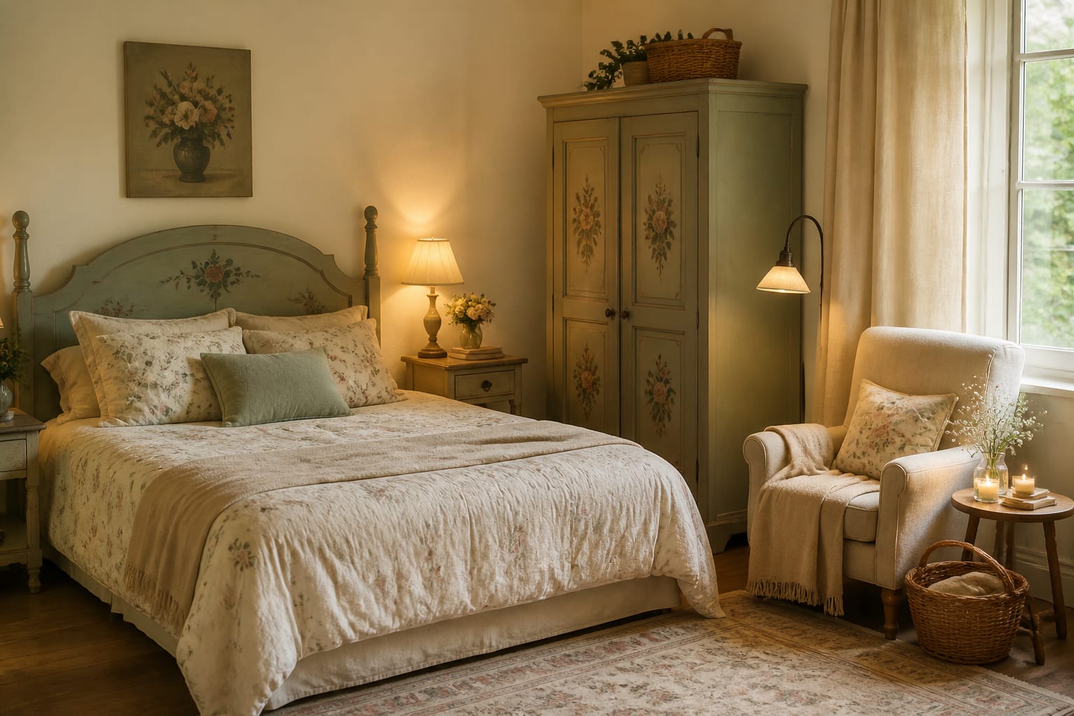
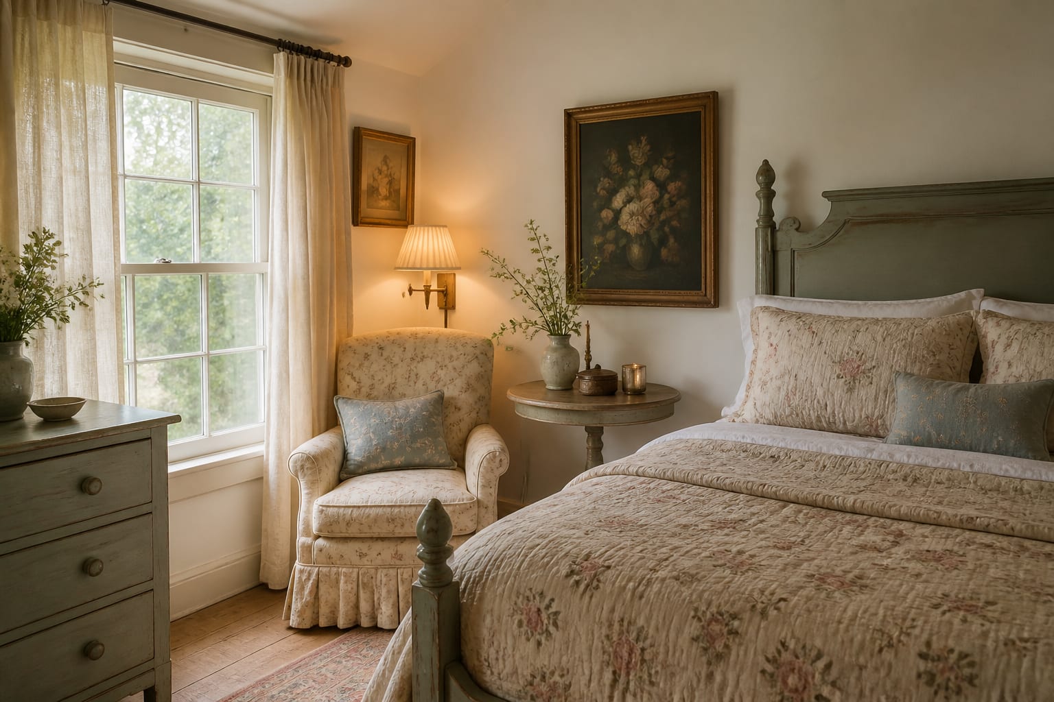
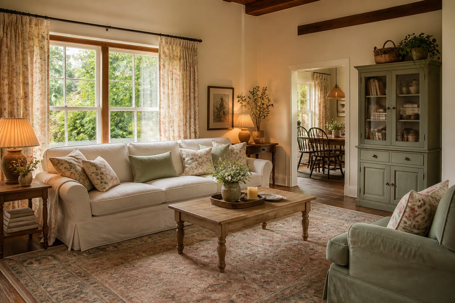
AI reproduces cottagecore interior design well when the prompt gives it material age, pattern hierarchy, and practical room limits instead of asking for a vague cozy cottage mood. The algorithm recognizes the obvious vocabulary: floral wallpaper, vintage beds, skirted tables, painted dressers, gingham, open shelves, lace, quilts, and garden color. That is enough to create an appealing first image, especially in bedrooms, reading corners, breakfast rooms, and small living rooms.
The problem is that AI often over-decorates the style because cottagecore has so many visible cues. A human room might have one faded rose fabric and one chipped pine table; a weak render adds floral walls, floral bedding, floral curtains, floral lampshades, and ten bouquets. That is not cottagecore. That is a pattern argument.
A better prompt gives the room a clear age story. Ask for “soft cottagecore bedroom with existing oak floor, 8-foot ceiling, cream painted dresser, iron bed, faded block-print quilt, linen curtains, warm 2700K lamps, and one botanical wallpaper wall.” If you like countryside warmth but want less sweetness, compare the output with AI French country design ideas, which handles rustic wood, antiques, and muted elegance with a firmer hand.
Which cottagecore ideas are worth previewing first?
Start with the choices that make this cottagecore room feel softer from the doorway. Tiny accessories photograph well, but they rarely fix a room that has the wrong bed, rug, light, or storage. Cottagecore works best when the largest surfaces feel gentle and the smaller objects look collected rather than sprinkled.
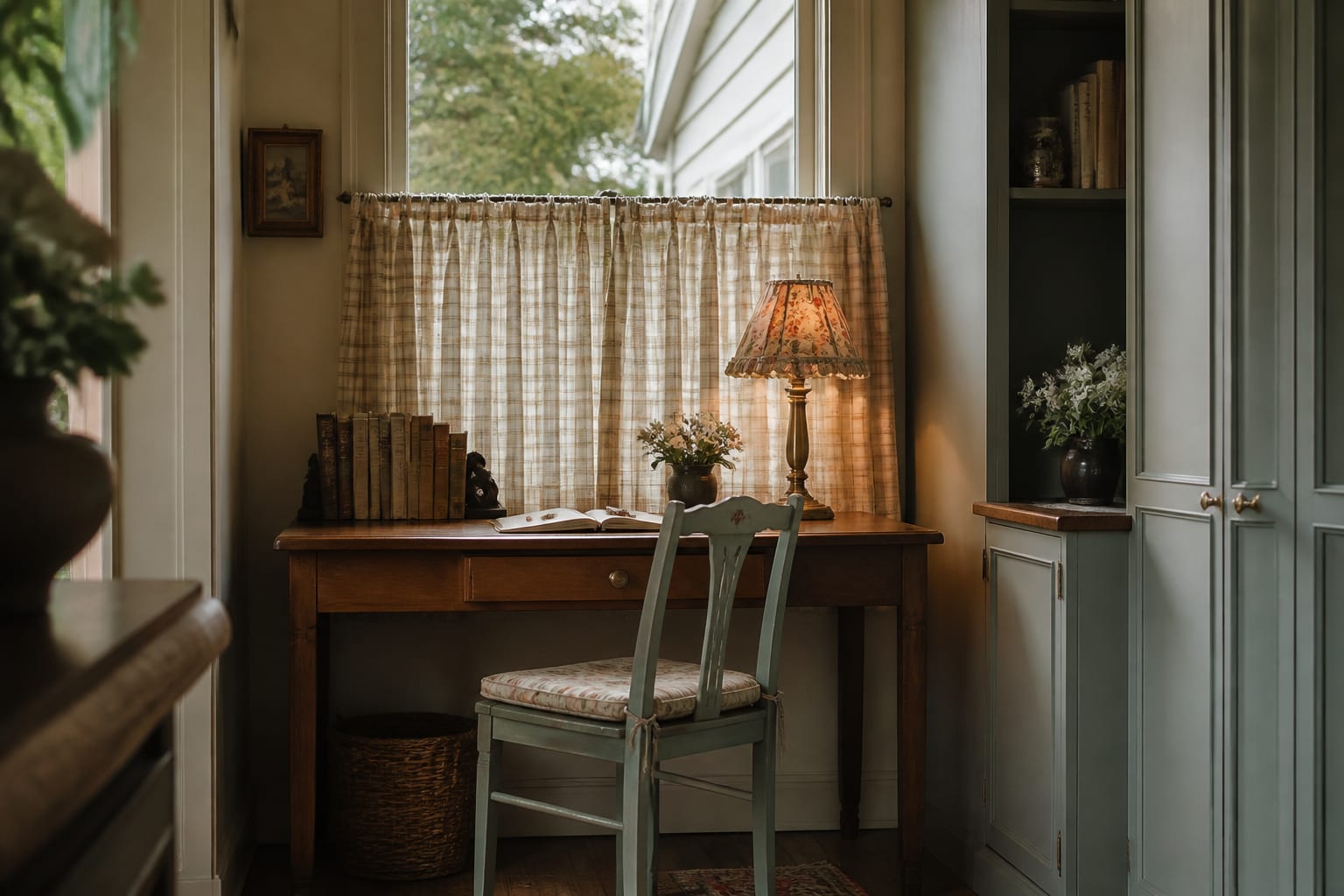
- Use a painted wood anchor because cottagecore needs a piece that feels inherited; a 36-inch dresser, 48-inch writing desk, or 60-inch sideboard in cream, sage, dusty blue, or butter yellow gives the room history without filling every wall with pattern.
- Choose one serious textile pattern because the room needs a lead voice; try faded roses on bedding, a botanical curtain panel, a small-scale check on chair cushions, or a block-print duvet, then keep nearby solids in linen, muslin, wool, or cotton.
- Bring the rug up to room scale because a tiny mat makes the look feel staged; in a living room, test an 8-by-10 rug with at least the front legs of seating on it, and in a bedroom, let the rug extend 18 to 24 inches beyond the bed sides.
- Warm the lighting before adding more decor because blue-white bulbs kill the softness; use 2700K bulbs in shaded table lamps, small sconces, or a pleated floor lamp so the painted wood and florals look mellow after sunset.
- Add one garden reference with restraint because cottagecore should nod outside, not become a greenhouse; a botanical print, dried herb bundle, terracotta pot, or checked café curtain is usually stronger than plants on every surface.
- Leave a useful work surface because romantic rooms still need function; protect at least 24 inches of clear tabletop on a desk, dresser, or kitchen table so books, tea, laptops, and keys have somewhere to land.
Use the first preview round to separate charm from clutter: - Keep one dominant floral or botanical print, then let checks, stripes, or solids support it at smaller scale. - Add one practical storage move, such as a skirted table, painted cabinet, or lidded basket, so the room can stay romantic on an ordinary weekday. - Test warmer lamps before adding more pattern, because 2700K light often does more for cottagecore softness than another decorative object.
Where AI cottagecore rooms get too sweet
The first mistake is letting every object speak in the same sugary accent. When the wallpaper, lampshades, pillows, curtains, artwork, and bedding all use flowers, the room loses charm because nothing gets to be background. Replace half the motifs with texture: plain linen, raw wood, woven rush, matte ceramic, or a wool throw.
The second mistake is erasing the practical parts of the house. Cottagecore can handle a radiator, an old floor, a low ceiling, or a rental window frame better than many polished styles. If the preview replaces those facts with arched casements and perfect plaster, regenerate with stricter wording: keep the existing windows, keep the ceiling height, keep the floor color, and do not add built-ins.
The third mistake is confusing cottagecore with clutter. A room can have books, baskets, quilts, and china, but the circulation still needs discipline. Keep about 30 inches for the main walkway, 16 to 18 inches between seating and a coffee table, and enough drawer clearance that the pretty dresser can actually open.
The fourth mistake is using only pale colors. Cream, blush, and sage are lovely, but they need an old-world shadow to keep them from floating away. Add walnut, oxblood, tobacco, olive, black iron, or aged brass in small but visible doses. If the render drifts toward sun-baked plaster, terracotta, and heavier Mediterranean texture, study AI Mediterranean design examples before you commit to the wrong rustic language.
Use AI design to preview the romance before you commit
Use AI design as a rehearsal for mood, scale, and pattern load from the room you actually have. Photograph the space with the boring details visible: ceiling fan, mini blinds, outlet wall, laundry basket, pet bed, orange floor, narrow closet door, or the radiator under the window. Cottagecore is forgiving, but it is not magic; the preview should solve the room in front of you.
Write the prompt like a design brief, not a wish. For a bedroom, try: “Create a cottagecore bedroom using the existing 8-foot ceiling and warm wood floor, with an iron bed, 52-inch upholstered or painted headboard option, faded floral quilt, 28-inch painted nightstands, linen curtains mounted 6 inches above the window, 2700K lamps, and no change to the window size.” For a living room, ask for an 84-inch slipcovered sofa, 8-by-10 muted rug, painted cabinet, botanical curtains, closed storage, and one dark antique accent.
Run at least three versions with different pattern levels. One should be restrained, with mostly texture and one floral. One should be fuller, with wallpaper or curtains as the lead. One should test a darker, storybook mood with olive, plum, or tobacco. The useful result is not the prettiest frame; it is the version that still looks believable with your ceiling, your windows, and your furniture that has to stay.
If the tool keeps adding lacquered symmetry, glossy black furniture, brass fans, and theatrical contrast, it may be drifting toward AI Art Deco room design. Cottagecore wants softness, patina, and domestic ease; Art Deco wants polish, geometry, and drama. Both can be beautiful, but mixing them accidentally makes the room feel confused.
How to make the winning preview feel real
Once an AI preview feels right, translate it into a shopping and editing plan. Start with the largest soft surface: sofa, bed, curtains, or rug. If that piece carries the pattern, keep the next two big items quieter. If the walls carry the pattern, choose plain bedding or a simple slipcover so the room has somewhere to breathe.
Then check the furniture silhouettes. Cottagecore likes turned legs, skirted bases, spool beds, iron frames, wicker, rush seats, and painted case goods, but it does not need all of them in one room. In a bedroom, an iron bed with painted nightstands is enough. In a living room, a slipcovered sofa with one antique wood table can carry the style before you add a single floral pillow.
Color should feel faded rather than freshly iced. Good cottagecore palettes include cream with sage and walnut, dusty blue with warm white and brass, butter yellow with pine and terracotta, or muted rose with olive and black iron. Avoid asking AI for “pastel cottagecore” unless you truly want a candy-colored result. “Weathered,” “faded,” “chalky,” “aged,” and “sun-washed” are better prompt words.
Finally, keep the useful mess in the plan. A cottagecore room should have a place for books, hand cream, dog leashes, seed packets, charging cords, sewing supplies, or whatever your real life produces. Closed baskets, skirted tables, small wall hooks, and shallow cabinets around 12 to 16 inches deep let the room stay romantic without pretending nobody lives there.
A strong cottagecore AI preview does not make your home look like a rental cottage nobody has touched. It helps you see which old-fashioned details belong, which patterns can coexist, and which practical pieces keep the sweetness from collapsing into clutter.