How do you use contrast in interior design? You vary three things on purpose: value (light versus dark), color temperature (warm against cool or complementary pairs), and texture (rough next to smooth). My read is that contrast is the single biggest reason a styled room looks intentional while an under-styled one looks unfinished, even when both rooms use perfectly nice furniture.
Most spaces I walk into fail in the same direction. Everything lands in a narrow middle band of beige, greige, and soft natural wood, so nothing has a job and nothing draws the eye. Contrast fixes that without a renovation, and you can dial it from quiet to bold depending on how much energy you want a room to carry. The rest of this guide breaks down the three contrast levers and the numbers that make each one land.
Value contrast: get the light-to-dark range right
Value is how light or dark a color is regardless of its hue, and it quietly does more work than the hue itself. Here is a quick test: squint at a room photo until the colors blur into grays. If the whole image collapses into one flat gray, you have a value problem. A room with genuine depth shows a clear lightest spot, a clear darkest spot, and a few steps in between that your eye can climb.
The practical move is the 60-30-10 split applied to value, not just to color. Let about 60% of the visible surfaces sit in a light range, with walls at a light reflectance value, or LRV, of 70 or higher. Hold about 30% in a mid range, and reserve roughly 10% as a dark anchor under an LRV of 20. A charcoal armchair, a near-black picture frame, or a deep walnut console can each carry that 10%. I like keeping the lightest and darkest points 40 to 60 points apart on a 0 to 100 scale, because anything tighter than 30 points stops registering as contrast at a normal viewing distance of 8 to 12 feet.
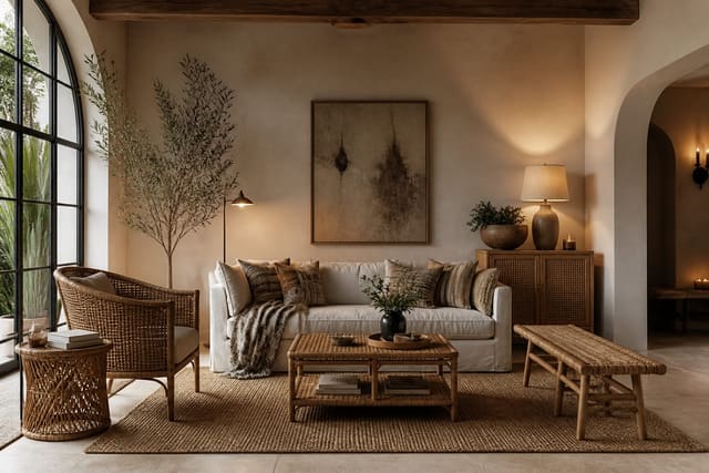
Dark anchors also fight the flatness that low light creates, and they pull double duty as material moments. A glossy near-black console reflects light while grounding the room, which is one reason a warm, light-friendly material like the look and feel of natural rattan and cane plays so well beside it: the pale weave reads as your light field while the dark piece sets the anchor, and the contrast between the two does most of the styling for you.
Color contrast: complementary, tonal, and temperature
Color contrast comes in three useful flavors. Complementary contrast pairs opposites on the color wheel: blue and orange, yellow and violet, red and green. These are the loudest, so I rarely run both sides at full saturation. Mute one side by 20 to 30% (think terracotta in place of pure orange against a dusty blue) and the pair feels considered instead of cartoonish.
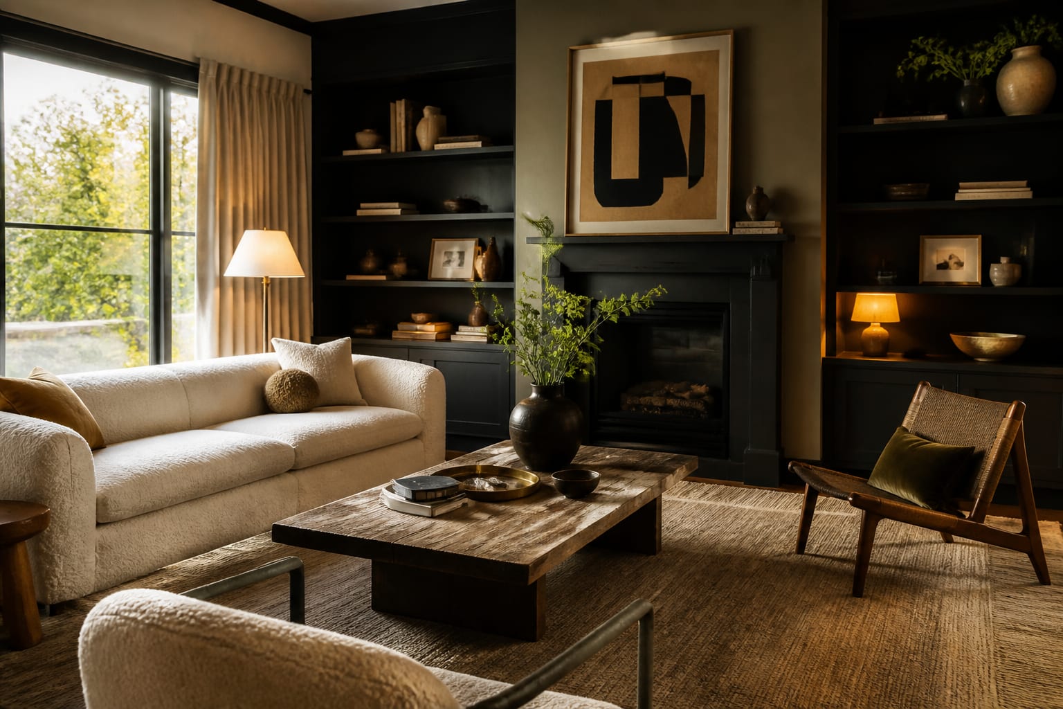
Tonal contrast stays inside one hue family and shifts only value: pale oat, mid camel, deep espresso. It is the safest path and the easiest to live with over years. Temperature contrast plays warm against cool, like a cool gray-blue wall behind warm metals and oak. Aim for roughly a 70-30 warm-to-cool balance so one temperature clearly leads rather than fighting for the room. Warm metal is the classic accent here, and a living finish such as the patina that develops on unlacquered brass deepens that warm-against-cool contrast over time, so the same fixture reads slightly differently in year one than in year three.
When you are choosing accents, look for these signals that a contrast is actually pulling its weight:
- It stays visible when you squint and the colors drop out to gray.
- It repeats at least once more across the room, even in a small dose.
- It sits near a light source or along a path your eye already travels.
- It shifts value, hue, or temperature by a clear margin, not a subtle one.
Texture and finish contrast
Contrast is not only about color. Two objects in the exact same shade of off-white can still contrast hard if one is matte plaster and the other is high-gloss lacquer. Pair a flat 0% sheen wall with a semi-gloss trim and the trim crisps the edges of the room. Layer a 1-inch chunky knit, a smooth glazed ceramic, and a slubby linen on a single sofa and the grouping gains real depth with zero added color. The eye registers each shift in surface as its own small event, which is why a tonal room full of texture never feels boring despite living inside one narrow color band.
Scale matters with texture, too. A few large texture moments read as intentional, while a dozen tiny ones turn into visual noise that cancels itself out. I usually pick two or three hero textures per room, give each a surface of at least 2 square feet, and let smoother finishes fill the space between them so the rough materials have room to register.
Finish sheen is a contrast lever most people forget, because the way a surface catches light is itself a value shift. A gloss panel under a window can read 20 to 30 points lighter than the same paint in matte right beside it. That is exactly why understanding how different paint sheens behave helps you place gloss where you want a highlight and flat where you want a surface to recede quietly into the background.
Common mistakes to avoid
The most common mistakes to avoid start with too little contrast. A room where every surface lands within 15 value points reads as a fog, no matter how expensive the pieces are; the fix is one true dark anchor under LRV 20. The opposite error is scattering high-contrast moments with no repeat, so a lone black lamp looks like it wandered in by accident. Repeat any bold note at least once more, even at 10% of its original size.
People also abandon the 60-30-10 discipline and split a room 50-50 between two strong colors, which creates tension instead of hierarchy. Keep one value clearly dominant at around 60% of the visible area. Watch undertones, too: a warm cream against a cool gray can fight even when the values look balanced, so test swatches in your actual light for at least a full day. And do not forget sheen as a variable; flooding a small room with high-gloss on every surface bounces so much light that the contrast you built disappears into a single bright haze.
Use AI design to preview contrast before you commit
Contrast is one of those things that looks obvious on a mood board and surprising on your actual walls, because your room's daylight, ceiling height, and existing wood tones all push the result around. Re-Design lets you skip the guesswork: upload a photo of the exact room you are working on and ask the AI design tool to add a dark anchor wall, swap a flat finish for gloss, or test a complementary accent before you spend a dollar.
I lean on it to compare options side by side on the same space. Upload one photo, generate a quiet tonal version and a bold complementary version, and within seconds you can see whether a 60-point value jump feels dramatic or just heavy in your particular room. That is far cheaper than repainting a wall twice, and it keeps every contrast choice grounded in the space you actually live in rather than a showroom that looks nothing like home.