The basic principles of interior design are balance, scale and proportion, rhythm, contrast, emphasis, harmony, and unity. My read is that you do not have to memorize the textbook names to use them; you have to recognize what each one fixes when a room feels off. The honest answer to why a space looks wrong is almost always that one of these seven is missing, and naming the culprit is faster and cheaper than buying more furniture to paper over the problem.
Think of these principles as diagnostic tools rather than rules to obey. A room that feels chaotic usually lacks unity; one that feels boring lacks contrast or emphasis; one that feels awkward usually has a scale problem hiding in plain sight. Once you can spot which lever is off, the fix tends to get cheap and obvious.
Balance, scale, and proportion
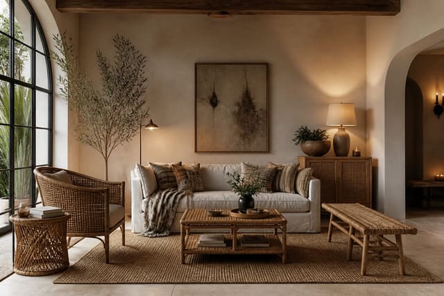
Balance is how visual weight spreads across a room. Symmetrical balance, like matching lamps flanking a bed, reads calm and formal and is the easiest to pull off, which is why builders default to it. Asymmetrical balance is trickier but livelier: a tall bookcase on one side can offset a low sofa plus a piece of art on the other, as long as the visual heft feels even when you squint. Radial balance arranges pieces around a center, like chairs encircling a round table, and shows up less often but works beautifully in dining rooms. A quick way to test balance is to photograph the room and flip the image; if one side suddenly looks far heavier than the other, your weight is lopsided and you need to add height, color, or mass to the light side. Visual weight is not just physical size, either, since a dark navy chair pulls more attention than a pale linen one of the same dimensions.
Scale and proportion are about size relationships, both between objects and between objects and the room itself. A coffee table should run about two-thirds the length of the sofa, so an 84-inch sofa wants a table near 48 to 54 inches rather than a tiny 30-inch square that looks marooned. Designers lean on roughly a 60-40 split instead of dead-even halves because the eye finds it more natural and less static. Material choices feed proportion too; a chunky woven texture like the one in this rattan and cane material guide carries visual weight that can balance a heavier solid piece across the room without adding bulk.
Rhythm, contrast, and emphasis
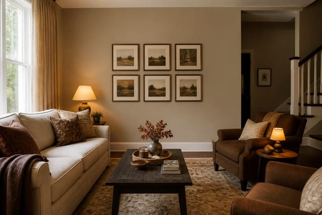
Rhythm keeps the eye moving instead of stalling on a single spot. You create it by repeating an element at least three times across a space, the way a song repeats a beat. Use these moves to build it:
- Repeat one accent color in at least three places, such as a pillow, a vase, and a framed print.
- Echo a single shape, like three round mirrors or a run of arched openings, to set a clear visual beat.
- Repeat a material or metal finish across hardware, lighting, and accents so the room feels composed.
Contrast supplies energy through opposites: light against dark, smooth against rough, matte against shine. A warm metal carried through the room is one of my favorite contrast-and-rhythm tricks at once, and the patina described in an unlacquered brass guide shows how a single finish can both repeat and add depth as it ages. A room with no contrast at all, every surface in the same beige and the same matte sheen, reads as quietly exhausting even when nothing is technically wrong with it; the eye wants somewhere bright and somewhere dark to rest.
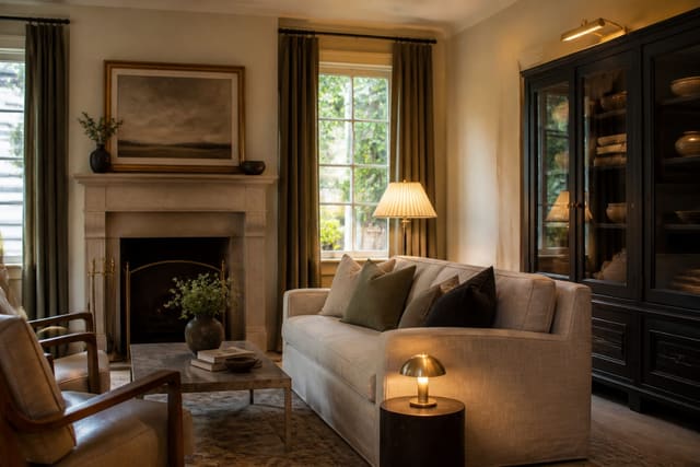
Emphasis is the principle beginners skip most: every room needs one undisputed focal point, whether a fireplace, a bed, or a bold piece of art, and everything else in the room should defer to it rather than compete. You can manufacture emphasis when the architecture gives you nothing, using an oversized 40-by-60-inch canvas, a single saturated accent wall, or a 90-inch bookcase that pulls the eye on entry. The test is simple: stand in the doorway and notice where your gaze lands first. If it wanders or splits between three loud objects, you have an emphasis problem, and the fix is usually subtraction rather than addition.
Harmony, unity, and how to apply all seven
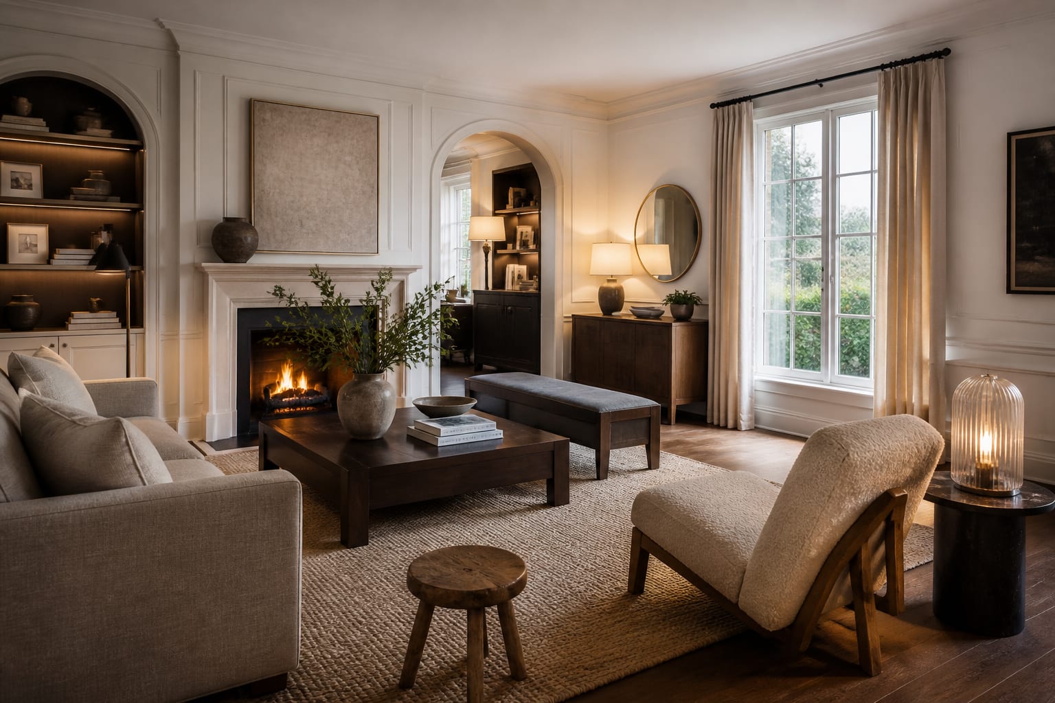
Harmony and unity are the closers. Harmony comes from elements that share a quality, a palette, an era, or a material, so the room feels intentional rather than collected at random off a clearance shelf. Unity is the bigger umbrella: the sense that every single choice belongs to the same conversation. The fastest route to both is a tight palette held to three colors in a 60-30-10 split, plus one or two repeated finishes that show up in more than one place. A consistent wood tone across the floor, a side table, and a frame does the same quiet unifying work, so try not to mix four competing wood species in one small room.
Color is the most underrated unifier, and the sheen you choose changes how a wall behaves under light all day. A flat finish hides drywall flaws but scuffs easily, while an eggshell or satin wipes clean and reflects a touch more light, and a careful read of this paint finish guide helps you keep the same undertone flowing across rooms so the whole home reads unified rather than chopped into zones. Apply the seven in order: settle balance and scale first, layer in rhythm and contrast next, name your single focal point, then check that harmony and unity actually hold the finished result together.
Common mistakes to avoid
The common mistakes to avoid usually come from applying one principle and forgetting the other six. People nail symmetry but starve a room of contrast, so it reads flat and showroom-stiff, pretty in a photo but lifeless in person. Or they chase contrast with ten competing bold pieces and lose all unity, which is the chaotic, headache-inducing result of zero restraint and no clear palette.
Scale errors are the most expensive of all. A sofa over 90 inches crammed onto an 8-foot wall kills proportion, and a 5-by-7 rug floating in a large room breaks the eye-line that every other principle depends on; size up to an 8-by-10 that catches at least the front legs of the furniture. Hanging art with its center pulled above 66 inches throws off the balance with the furniture below it, leaving an awkward gap. And the deadliest mistake is having no focal point at all, which leaves emphasis undefined and the eye with nowhere comfortable to land. Decide the one thing the room is about before you decorate a single inch around it.
Use AI design to preview these principles before you commit
Reading about balance and proportion is one thing; seeing them prove out in your own room is what makes them finally click, and that is where Re-Design earns its keep. Upload a photo of the space you are working on, and the AI re-renders it so you can test a focal point, swap in better-scaled furniture, or repeat a brass finish across the room without owning a single new piece yet or measuring twice.
The real value is watching a principle demonstrate itself in your actual space. Upload your living room and see how an oversized art piece finally gives the bare wall a focal point, how a larger rug restores the proportion the small one was breaking, or how a repeated warm finish creates the rhythm the room was quietly missing. Using AI design to A-B these options means you confirm that balance, scale, and emphasis genuinely work in your room before you spend a single cent committing to any of them.