The rule of odd numbers in interior design says that objects arranged in odd counts, most often three or five, look more natural and engaging than even groupings. My take is that it works because an odd group refuses to split neatly in half, so your eye keeps moving across the cluster instead of pairing things off and stopping. The honest answer to why three feels right is psychological, not mystical: a small asymmetry holds attention, and an odd count almost guarantees that asymmetry without any effort on your part.
This is the single easiest principle for a beginner to apply, because it costs nothing at all. You are not buying more stuff; you are arranging what you already own into groups of one, three, or five instead of tidy, forgettable pairs. Once you see it, you cannot unsee how often great rooms lean on odd grouping in every vignette. Florists, stylists, and window dressers have leaned on the same instinct for generations, which is why a hand-tied bunch of flowers almost always holds an odd stem count and a shop display rarely lines goods up two by two.
Why odd numbers read better than even
The mechanism is simple once you picture it. Two identical vases create a closed, balanced pair that the brain resolves instantly and then politely ignores. Add a third object at a different height, and suddenly there is no easy split; the eye triangulates between the three pieces, lingering a beat longer. That lingering is exactly what we call visual interest. Three is the smallest number that reliably produces it, which is why it gets all the attention, though five and seven work on the same principle with more pieces in play.
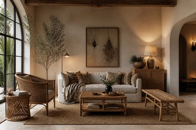
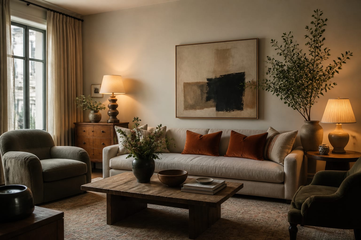
The trick is variation within the group, not just the count. A trio of identical objects is really just a pair with a tagalong, and it falls just as flat. There is a practical limit on the low end too, since a single object can absolutely stand alone as a deliberate statement, but two nearly always reads as an unfinished pair waiting for a third. That is why a confident single object and a varied trio both work, while two matched pieces so often look accidental rather than chosen. I aim for three different heights, with at least a 2-to-3-inch step between each, and ideally three different shapes as well, like a tall vase, a stack of books, and a low rounded bowl. Mixing materials reinforces the effect; pairing a glossy ceramic with a woven texture from this rattan and cane material guide gives the cluster the tactile contrast that keeps it lively rather than matched.
Where to use the rule, and where to break it
The rule shines anywhere you style a surface. Build your groupings using these guidelines:
- On a coffee table, set a trio of a low tray, a medium candle, and a tall stem within an 18-inch span.
- On open shelves, style in odd clusters per shelf and let one item break the front plane by an inch or two.
- On a mantel, anchor with one larger piece off-center, then balance it with a group of three on the other side.
Metal accents are a favorite of mine for these vignettes, because a warm finish unifies otherwise mismatched objects, and the living patina from an unlacquered brass guide makes a single brass candlestick the natural anchor of a trio as it deepens with age. That said, the rule is not a law you must obey. Symmetry, with its even pairs, is the better choice anywhere you want calm and rest, such as two matching nightstands or a pair of sconces flanking a bed. Dining settings and formal entryways also often call for deliberate, balanced pairs rather than a staged trio.
Scaling up to fives and sevens
When one surface or wall is large, three pieces can suddenly look lonely, so you step up to five or seven. The same logic holds the whole way: vary heights, shapes, and finishes, and arrange the group as a loose triangle or a gentle zigzag rather than a soldier-straight row. A gallery wall reads best with an odd count of frames, say seven or nine, hung with a consistent 2-to-3-inch gap between them so the cluster reads as one composition instead of scattered art.
Color becomes the quiet helper as the counts rise. Repeating a single hue across the odd group ties it together even when the objects differ wildly in shape and size, and the wall behind matters more than people expect; a softer sheen from this paint finish guide keeps a busy shelf from bouncing glare and lets the grouping read the way you intended under lamplight. Past about seven items, honestly, nobody is counting anymore, and you should switch to organizing by color blocks or material instead of chasing the odd number.
Depth is the other thing larger groups need. A flat line of five objects all pushed to the back of a shelf still looks dull no matter how the heights vary, so I stagger the front-to-back placement by 2 to 4 inches, pulling one or two pieces forward toward the edge. That small overlap, where a nearer object partly hides one behind it, is what gives a vignette the layered look you see in magazines. On a bookcase, the trick is to break up the rows: lay a few books horizontally as a 6-inch riser, stand a brass object on top, and let a trailing plant soften one corner. The odd-number rule sets the count, but staggered depth and varied height are what actually sell the arrangement to the eye.
Common mistakes to avoid
The common mistakes to avoid start with treating odd numbers as a magic spell rather than a sensible starting point. Three identical objects at the same height defeat the entire purpose; without varied heights and shapes, you have a flat row that the eye reads as plain boring. The fix is that simple 2-to-3-inch height step plus at least one shape change inside every group.
The second error is applying odd grouping everywhere, including the spots that genuinely beg for symmetry, like the two sides of a bed or a fireplace flanked by built-ins. Forcing a lopsided trio there reads as a mistake rather than a deliberate choice. People also crowd their trios, spreading them across 30 inches so they stop reading as a group at all; keep the footprint tight, somewhere near 12 to 18 inches on a console. And on gallery walls, an even count of frames locked into a rigid grid loses the lively triangulation that odd, slightly staggered arrangements create so easily.
Use AI design to preview odd-number groupings before you commit
Styling vignettes is the kind of thing you usually learn by rearranging the same objects forty times until your back hurts, but Re-Design lets you skip most of that fiddling. Upload a photo of your shelf, mantel, or coffee table, and the AI re-renders the surface with different groupings, so you can see a varied trio against your actual wall color before you physically move a single thing.
What I like most is testing the count itself. Upload your console table and compare a tidy pair against a stepped trio side by side, check whether five pieces comfortably fill an empty mantel or crowd it, and see how a staggered seven-frame gallery reads above your sofa. Letting AI design preview those arrangements means you find the grouping that triangulates beautifully without spending a whole Saturday shuffling vases, and you only buy the extra piece if your room genuinely needs it to complete the odd count.