Most Valentine's decor fails because it shouts. The drugstore version is glossy red hearts, foil banners, and cartoon cupids that look like a third-grade classroom by February 1st. My take: romance in a home should be felt, not announced, and the most romantic rooms use restraint, warm light, and texture rather than a single loud color repeated everywhere. The goal is a space that feels intimate on an ordinary Tuesday, not a set dressed for one date you tear down the next morning.
Why Subtle Beats Saturated for February
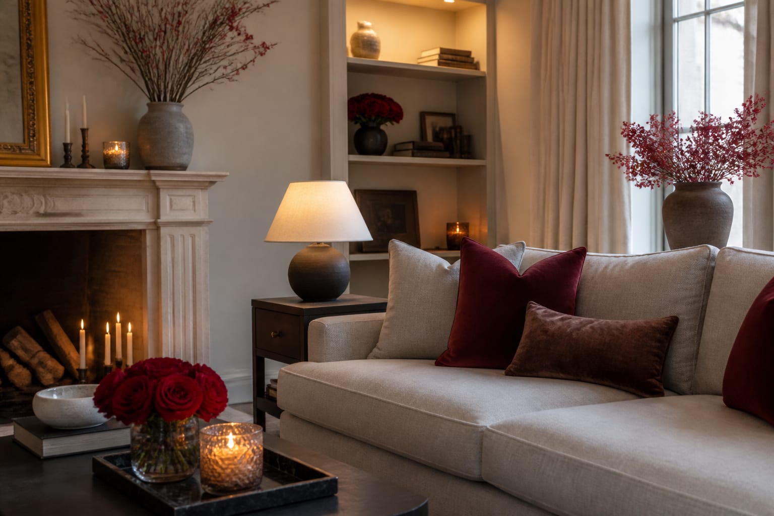
The instinct to go all-in on red backfires because saturated red is an aggressive, high-energy color that fights the calm a romantic room needs. A single deep red rose reads as intimate; a room drowned in red bunting reads as a clearance aisle. The trick is to borrow the feeling of the color family without the cartoon intensity, which is why dusty rose, blush, and burgundy do the emotional work better than fire-engine red.
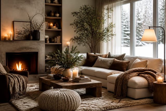
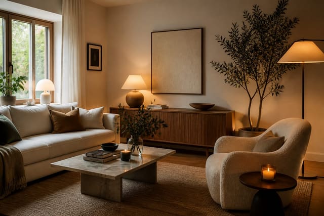
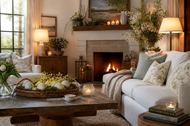
Texture carries romance more reliably than any motif. A velvet pillow, a brushed-mohair throw, and a bouclé chair all invite touch, and touch is the most romantic sense in a home. Swapping one slick surface for a soft one does more for the mood than a dozen heart-printed accessories, because it changes how the room feels under your hand, not just how it looks in a photo. The same principle applies to what is underfoot and overhead: a plush rug that begs to be walked on barefoot and a soft, layered light overhead both register as comfort long before anyone reads them as romantic. Comfort, it turns out, is the foundation that romance is built on, so the rooms that feel most loving are often just the ones that feel best to be in.
Restraint also keeps the decor adult. The line between romantic and juvenile is mostly about quantity and finish. Matte ceramics, real or dried flowers, and unscented beeswax candles signal intention, while glossy plastic and foil signal a holiday aisle. Choosing fewer, better objects is what separates a date-night living room from a kid's party.
Light temperature does more romantic heavy lifting than any object on the table. Cool, bright overhead light flattens a room and kills intimacy no matter how lovely your flowers are, while warm light around 2200K to 2700K makes skin glow and shadows soften. Dim the overheads to roughly 30 percent, or switch them off entirely in favor of lamps and candles, and the same room reads as romantic instantly. This single adjustment costs nothing and outperforms a cart full of seasonal accessories, which is why I treat lighting as the first move rather than the finishing touch.
Romantic Touches That Stay Tasteful
- Swap throw pillows to a dusty rose, plum, or terracotta palette for two weeks, then return to your usual covers; it is the cheapest mood shift available.
- Cluster unscented pillar candles of mixed heights on the table and let real flame, not overhead light, set the evening tone.
- Bring in a single generous bunch of ranunculus, anemones, or garden roses in a muted vase instead of a dozen red roses in cellophane.
- Layer one tactile upgrade, like a mohair or velvet throw folded over the sofa arm, so the room invites you to settle in.
- Add scent intentionally with one rose, fig, or amber candle in the main room; smell triggers memory more than any visual, and a single warm fragrance does more for atmosphere than a shelf of decorations.
- Hang a single piece of soft, abstract art or a framed love note in one spot rather than a banner across the mantel.
- Set an intimate tablescape with linen napkins, a low floral runner, and two place settings, keeping centerpieces below eye level so you can see across the table without leaning around a tall arrangement.
Keeping It Cohesive With the Rest of Winter
Valentine's decor lands in the middle of winter, so it should feel like a warm note within the season rather than a jarring interruption. The dusty rose and candlelight you add in February sit naturally alongside the deep tones and soft lighting of winter home decor ideas, which means you are layering onto an existing mood rather than starting from scratch. That continuity is what keeps the styling from looking like a costume the room puts on for one day. Because winter rooms already lean warm and dim, a February refresh asks for almost nothing new; you are nudging an existing palette toward romance, not building one from zero.
Because these touches are temporary, plan how they come and go. The pillow covers, flowers, and candles should be easy to swap in and out, the same low-commitment logic that makes a new year room reset sustainable: a small, deliberate change you can fully reverse without regret. Romance should not require redecorating. Keep a single small bin of February pieces, two pillow covers, a candle, a vase, so the whole shift takes ten minutes to set and ten to put away, and you will actually bother to do it year after year.
Think about the whole arc of the early year. A room that shifts gently from January reset to February warmth to March freshness feels considered, never abrupt. The muted, botanical-leaning palette you choose now transitions easily into the fresh greens and blush tones of easter home decor ideas, so February's dusty rose is a stepping stone, not a dead end you have to dismantle. Choosing colors that bridge two holidays means less to buy and less to undo.
Preview Your Valentine's Mood in Re-Design
A preview is handy for the tablescape too. Drop a low floral runner and two settings into a photo of your table to judge proportion and color against your dishes, and you avoid a centerpiece that blocks the very eye contact a romantic dinner is built on. It also lets you test a palette quietly: if plum overwhelms your existing dishware or blush disappears against a pale tablecloth, you find out on screen rather than after the flowers are already in the vase.
Frequently Asked Questions
How do I make Valentine's decor feel grown-up? Lean on muted tones like dusty rose and burgundy, use real flame and texture instead of motifs, and limit overt hearts to one small moment. Restraint and finish are what separate romantic from childish.
What colors work besides red for Valentine's Day? Dusty rose, blush, plum, terracotta, and warm cream all carry the romantic feeling without red's intensity. They also blend more easily into a year-round palette.
How can I decorate for Valentine's without buying much? Swap pillow covers, light candles you already own, and add one bunch of flowers. Those three moves shift the mood for under $40 and reverse instantly after the holiday.