The safest bathroom color is also the most forgettable one. Builder-grade white walls over white tile read clean for about a week, then start to feel like a hospital corridor. The better move is to commit to a single mood and let the color do real work: a deep envelope, a soft tonal wash, or one bold contrast against neutral tile. A bathroom is small enough that paint and a few accents change everything, and the stakes are low because a gallon covers the whole room. That smallness is permission to be braver here than anywhere else in the house.
How do you pick a bathroom color that flatters the light?
Bathrooms throw two curveballs at color: small windows and a lot of reflective surface. Tile, mirror, chrome, and glossy fixtures all bounce light and pick up whatever tint is in the room, so a paint chip that looked warm in the store can turn green next to a cool-white vanity light. Start by checking your bulb temperature. A 2700K warm bulb pushes everything toward amber and flatters earthy tones; a 4000K cool bulb sharpens blues and grays but can make beiges look dingy. Pick your color under the light you actually have.
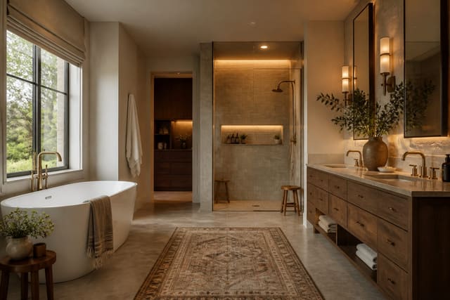
Then test against the tile, not a blank wall. Buy two sample pots, paint a 12-inch square of foam board, and prop it against the existing tile and countertop across a full day. North-facing baths get weak, cool light and reward warmer colors like clay or putty; a sunny east-facing room can carry a cool sage or pale blue without going cold. If you are reworking the tile too, our guide to a spa bathroom palette shows how stone, wood, and muted color combine for a calm result. The point is to choose color in context, never in the abstract.
Which bold bathroom colors actually work?
Small bathrooms are the one place a saturated color almost never backfires. There is no sofa or bed to clash with, the surfaces are hard and easy to repaint, and the enclosed feeling that would overwhelm a living room reads as cozy and considered in a powder room. A deep navy below a white-tile wainscot gives you contrast and a crisp line at the same time. Forest green pairs with brass fixtures and warm wood for a room that feels older and richer than its square footage suggests.
Dark colors also forgive the things bathrooms do to walls. Water spots, splashes, and the inevitable scuff disappear into a charcoal or ink-blue far better than they hide on white. If you want drama without committing every surface, paint the vanity a deep color and keep the walls neutral, or color-drench a single wall behind the tub. Here are bold directions worth testing:
- Navy walls below a white subway-tile wainscot with brushed-brass fixtures for a tailored, classic contrast.
- Forest green on the vanity cabinet against pale limestone tile and a wood-framed mirror.
- Oxblood or terracotta in a windowless powder room, where the lack of daylight makes the warm depth feel like a jewel box.
- Charcoal walls with a single bright element, a white pedestal sink or a lemon-yellow towel, as the focal point.
- Inky teal on both walls and ceiling to blur the room's edges and make a tiny space feel boundless at night.
How do soft, serene palettes read spa-like?
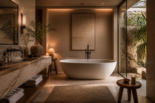
If bold is not your instinct, the opposite approach is just as deliberate: a tonal palette where everything sits within a narrow band of one color. Sage walls, a slightly deeper green-gray vanity, and natural linen reads layered and restful precisely because nothing jumps out. The trick is to vary the tone and texture, not the hue. Three shades of the same warm greige across walls, tile, and stone feels intentional and quiet, while three unrelated neutrals just look like indecision.
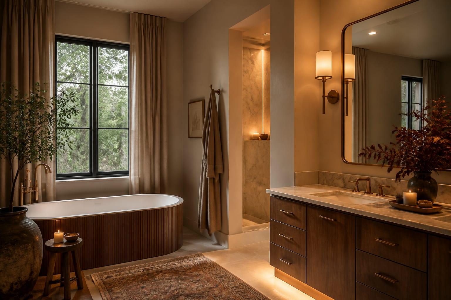
Warm whites and putty tones do the spa thing better than stark white because they carry a hint of pigment that flatters skin and softens the hard surfaces. Pair a soft mushroom wall with honed stone, unlacquered brass, and a wood stool and the room feels like a retreat rather than a utility closet. A primary bathroom especially benefits from this calm, since it is the room you start and end the day in. Keep the contrast low, let texture carry the interest, and the palette will feel expensive without a single loud color.
Unexpected color moves worth trying
The most memorable bathrooms break a small rule on purpose. Painting the ceiling a color instead of default white is the easiest unexpected move: a pale blush or soft blue overhead makes the room feel finished and draws the eye up in a low space. Color-drenching, where walls, trim, and ceiling all wear the same shade, erases the room's boundaries and works shockingly well in awkward spaces with sloped ceilings or odd angles.
Two-tone schemes also punch above their weight. A darker color on the lower third of the wall, capped with a simple rail and a lighter shade above, grounds the room and echoes traditional wainscot without millwork. You can pull a single accent color straight from a patterned floor tile and repeat it on the vanity so the room feels coordinated rather than matched. Even hardware counts as color here: swapping chrome for matte black or aged brass shifts the entire temperature of a neutral room. None of these moves cost much, and all of them give a bathroom a point of view.
See your palette before you commit in Re-Design
Paint chips lie in bathrooms more than anywhere, because the tile, the mirror, and the bulb all conspire to change what you see. Snap a photo of your bathroom and upload it to Re-Design to test a navy vanity, a sage color-drench, or a blush ceiling against your real tile and fixtures in seconds. Swapping between three undertones on the same wall, with your existing chrome and mirror in frame, tells you far more than a foam-board swatch ever could. You can settle the question of how dark to go, or whether a bold color overwhelms the room, before a single sample pot leaves the shelf, then walk into the store knowing exactly what to buy.
Frequently Asked Questions
What is the best paint sheen for a bathroom?
Use a satin or semi-gloss at roughly 25 to 40 percent sheen on bathroom walls. The higher sheen resists moisture, wipes clean, and stands up to the humidity that would make flat paint streak or grow mildew. Reserve true flat finishes for ceilings or for low-traffic powder rooms with strong ventilation, since they hold up poorly to steam and splashing over time.
Can dark colors work in a small bathroom?
Yes, small bathrooms are often the best place for dark color. With no large furniture to clash and plenty of reflective tile and mirror to bounce light, a deep navy or forest green reads cozy and intentional rather than cramped. Dark walls also hide water spots and scuffs better than white. Just add warm 2700K light so the color glows instead of going flat.
How do I choose a bathroom color that matches my tile?
Never choose paint in the abstract. Paint a 12-inch sample on foam board and prop it against your actual tile, countertop, and fixtures across a full day. Watch how the tile's undertone, cool gray or warm cream, pulls the paint one way or another under your real bulbs. The goal is a color that flatters the surfaces you are keeping, not one that fights them.
Should the ceiling be a different color than the walls?
It depends on the effect you want. A white ceiling keeps a small room feeling crisp and tall. Painting the ceiling the same shade as the walls, called color-drenching, blurs the boundaries and makes an awkward or tiny space feel enveloping and finished. A soft contrasting ceiling color, like a pale blush over neutral walls, adds warmth and draws the eye upward in a low room.