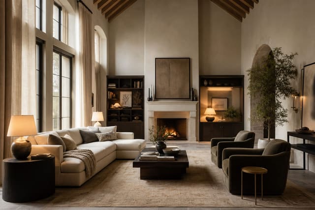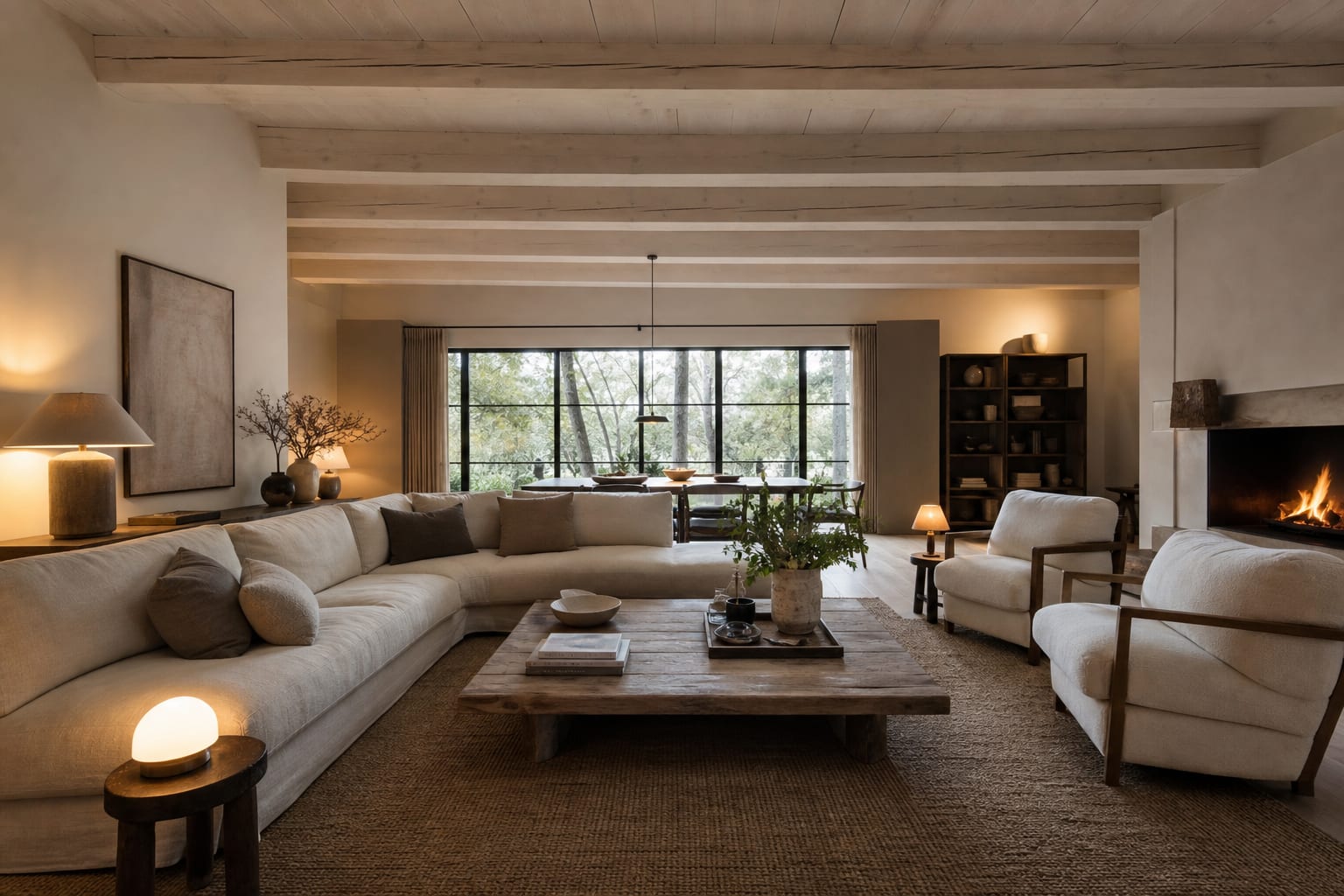
Beamed ceilings read modern when the beams are painted white, stained dark contrast, or wrapped in clean rift-cut oak, paired with low-profile modern furniture and warm 2700K lighting that downplays the woodwork rather than spotlighting it. Exposed beams can be the best thing in a room, or the detail that makes every new chair look like it wandered into a lodge. My position is simple: beams should read as architecture, not as a theme. If the ceiling is heavy, orange, glossy, or visually disconnected from the room below, no amount of modern furniture will fix it. The goal is to edit the beam color, light, and lower furniture layer until the ceiling feels chosen instead of inherited.
What makes exposed beams feel modern instead of rustic?
You modernize a room with exposed ceiling beams by reducing contrast, simplifying the beam finish, adding clean layered lighting, and choosing furniture that balances the ceiling without copying its rustic mood. The fastest shift is usually color, not demolition. Dark brown beams against a white ceiling can look handsome in a tall, sunlit room, but in an 8 foot room they often feel like stripes pressing down on your head.
For a modern exposed beam ceiling, decide whether the beams should blend, contrast softly, or become one controlled feature. Paint beams the same color as the ceiling when the room is low, narrow, or already busy. Use one or two shades deeper than the ceiling when you want definition without a cabin effect. Keep strong black, espresso, or raw orange wood only when the room has enough height, daylight, and visual quiet below.
Finish matters as much as color. Glossy varnish makes old beams look sticky and dated, especially near recessed lights. A matte clear coat, diluted stain, limewashed wood, or painted satin finish usually feels more current. If the wood has beautiful grain, do not bury it automatically; calm the undertone instead. Orange pine can often be softened with a cooler brown wash, while gray driftwood stain can make a normal suburban room look unnecessarily themed.
If your beams are making the ceiling feel lower, study the proportion advice in rooms with low ceilings and dark beams before choosing a dramatic finish. The darker the beam, the more disciplined the rest of the room must be.
Which beam color and ceiling color should you choose?
The cleanest modern beam rooms usually use a limited ceiling palette: beam, ceiling field, and wall color all belong to the same family. That does not mean everything must be white. It means the undertones should stop arguing. Warm oak beams look better with warm white, clay, mushroom, putty, or soft greige than with icy white paint. Charcoal beams need walls with enough depth to hold them, not thin builder beige.
A useful test is to sample paint directly beside the beam, not across the room. Put at least two 12 x 12 inch paint swatches near the beam line and view them morning, afternoon, and after dark. If the ceiling paint turns blue, pink, or dirty beside the wood, the beam will look older than it is. Flat ceiling paint hides uneven plaster better than eggshell, while satin on beams is usually safer than high gloss.
In a room with standard 8 foot ceilings, low contrast is usually the modern move. Paint the ceiling and beams the same warm white, then let texture do the work. In a 9 to 10 foot room, a soft contrast can be beautiful: pale plaster ceiling with natural oak beams, warm white ceiling with taupe beams, or clay walls with slightly deeper painted beams. Above 10 feet, stronger contrast becomes easier to carry, but the furniture still needs enough scale below.
Do not forget fake beams. If the beams are hollow polyurethane, boxed MDF, or decorative wraps, treat them with even more restraint. Faux beams that are too dark, too evenly grained, or too chunky can make a room feel staged. Keep boxed beams proportional: a 4 to 6 inch face works in many average rooms, while oversized 10 inch beams need real height and a reason. If you are comparing boxed beams with a grid ceiling, the costs and proportions in a coffered ceiling DIY cost guide can help you decide whether the ceiling wants beams, coffers, or less carpentry altogether.
Test this on your own room photo with ReDesign before you choose the final direction; keep the doorway, walls, windows, main furniture, lighting, and awkward fixed features visible so the preview solves the room you actually have.
How should furniture, rugs, and lighting balance the beams?
A beamed ceiling feels modern when the room below has enough visual weight to answer it. Thin furniture under heavy beams looks nervous. Very bulky furniture under heavy beams looks trapped. The middle path is low, broad, and clean: sofas around 30 to 34 inches high, lounge chairs with simple arms, long consoles, and rugs large enough to organize the floor.
In a living room, start with an 8' x 10' rug for a compact seating group and a 9' x 12' rug for a full sofa with two chairs. Let the front legs sit on the rug by 6 to 10 inches, and keep 14 to 18 inches between the sofa and coffee table. That grounded lower rectangle lets the beams feel architectural rather than top-heavy.
Lighting should live both on and below the ceiling. Recessed lights between beams can work, but avoid peppering every bay with identical bright dots. Use fewer fixtures, align them carefully, and choose warm bulbs around 2700K for living rooms and bedrooms or 3000K for kitchens and work areas. Add side light with table lamps, plug-in sconces, picture lights, or a floor lamp so the beams do not become the only thing visible after sunset.
Curtains are another quiet correction. Mount rods 4 to 8 inches above the casing, or 2 to 4 inches below the beam line if the architecture allows it. Extend rods 6 to 10 inches beyond each side so fabric stacks off the glass. Floor-skimming linen or matte cotton panels can soften hard beams without pretending the room is traditional.
If the room is dim, avoid solving the problem with a glossy white ceiling alone. Pair beam updates with the same practical moves used to fake natural light in any room: matte pale surfaces, warm layered lamps, and mirrors aimed at actual daylight rather than random ceiling glare.
Common exposed beam ceiling mistakes
The most common mistake is staining every beam darker because contrast looks dramatic in photos. In a real family room, dark beams can make a normal ceiling feel chopped into strips. If the room is under 9 feet, test a painted or softened beam finish before committing to espresso, black, or high contrast walnut.
Another mistake is matching every wood tone to the beams. A room with beam-colored floors, beam-colored tables, beam-colored shelves, and beam-colored picture frames starts to feel themed. Repeat the wood once or twice, then bring in plaster, linen, wool, metal, stone, or painted furniture so the beams can breathe.
Do not hang a tiny pendant from a large beam and call the lighting finished. A small fixture under a strong ceiling detail looks accidental. Over a dining table, keep the bottom of the fixture about 30 to 36 inches above the tabletop. In a walking path, maintain roughly 7 feet of clearance under the lowest point whenever possible.
Avoid rustic accessories as a reflex. Iron wagon-wheel fixtures, barn doors, faux antlers, and distressed signs can drag beautiful beams into theme-restaurant territory. Modernizing beams usually means subtraction: cleaner light, quieter walls, larger rugs, better art, and fewer objects perched near the ceiling line.
The last mistake is ignoring beam spacing when placing furniture. If the sofa, bed, island, or dining table sits awkwardly between structural lines, the whole room can feel slightly off. Center the main furniture zone under the most logical bay when you can, or make the off-center choice look deliberate with a larger rug and balanced lighting.
Use AI design to preview your beamed ceiling before you commit
Beams are difficult to judge from a paint chip because the ceiling changes the whole room at once. Upload a straight photo of the room and test the beam finish, ceiling color, rug size, lighting, and furniture scale together before you sand, paint, or order a new fixture.
Prompt the preview with the actual condition: “living room with exposed ceiling beams painted warm white, matte plaster ceiling, low linen sofa, 9' x 12' wool rug, oak coffee table, black picture lights, 2700K lamps, and no rustic decor.” Then run a second version with natural oak beams, a third with taupe painted beams, and a fourth with darker beams only if the ceiling height can handle it.
Use the images to judge proportion and mood, not construction details. Does the ceiling still feel heavy? Do the beams look intentional from the doorway? Does the rug give the furniture enough weight below the architecture? If every version with dark beams makes the room feel shorter, believe the pattern. If the painted-beam version looks cleaner but a little flat, add texture through a wool rug, linen curtains, or limewashed walls rather than making the beams loud again.
Renters can preview reversible changes first: warmer bulbs, larger rugs, removable sconces, curtain height, art scale, and furniture placement. Owners can test permanent work such as stripping varnish, painting beams, adding junction boxes, wrapping beams, or changing ceiling paint. A good exposed beam ceiling modern design plan should make the architecture quieter, sharper, and easier to live with every day.
Frequently Asked Questions
Can a beamed ceiling work in a modern room?
Yes — modern beam treatments include paint-white-to-match-ceiling, high-contrast dark stain against white plaster, or rift-cut oak wraps; all three read intentional next to modern furniture instead of rustic. Use the room photo to compare the visible layout and fixed constraints before committing, because door swings, windows, outlets, storage reach, circulation, and existing furniture decide whether the idea survives daily use.
Should beams match or contrast the ceiling color?
For a calm modern room paint beams the same color as the ceiling so they read structural not decorative; for a bold modern room, dark beams against a white ceiling create a graphic line. Keep the preview honest by leaving the problem area visible in the frame, then compare one conservative version against one bolder version before you buy lighting, paint, furniture, or storage.
What furniture style pairs with modern beamed ceilings?
Low-profile sofas under 32 inches tall, leather or boucle upholstery, blackened-steel or rift-oak case goods; avoid carved or distressed pieces that lean into the rustic reading. Check the result against ordinary movement first: drawer clearance, chair pullout, walkway width, glare, switch access, and sightlines matter more than a perfect catalog angle.
What lighting works with modern beamed ceilings?
Warm 2700-3000K recessed or surface-mount fixtures between the beams, plus one statement pendant on the central beam; avoid yellow incandescent and avoid pot lights that highlight every beam edge. Use the image to narrow priorities and measurements before ordering anything custom; final purchases still need real dimensions, outlet locations, installation limits, and product clearances.
Should the floor pick up the beam tone?
Yes — repeating the beam tone in the floor (warm white oak or walnut) ties the beams to the structure of the room; clashing floor tones makes the beams read as an afterthought. If the preview invents architecture or hides the awkward feature you need solved, rerun it with stricter instructions so the result remains tied to your actual room.
Three transformations to try
- Beams painted white to match ceiling
- Dark stained beams against white plaster
- Rift-cut oak beam wraps with low sofa