Clashing undertones get fixed by picking one undertone family — warm (yellow/red), cool (blue/green), or neutral — locking it on the largest surface (floor or walls), and matching every other finish to that family rather than the surface color. You can choose “safe” colors and still end up with a room that feels vaguely wrong. My opinion is firm: undertones are the quiet bully in most mismatched rooms, and ignoring them makes expensive choices look cheap. The wall, sofa, floor, rug, and trim may all be beige, gray, white, or wood, but their hidden temperatures can argue from every angle. Once you learn to see that argument, the fix gets much less mysterious.
Why do similar colors clash when they look related?
Room colors clash even when they seem similar because their undertones can be warm, cool, clean, muted, pink, green, yellow, blue, or gray in ways that become obvious only when the colors sit beside each other. A cream wall with a yellow base can make a pink beige sofa look fleshy. A blue gray rug can make honey wood flooring look orange. A bright white lampshade can make ivory trim look dingy, even though both are technically “white.”
Undertone is the color underneath the color you name first. You may call a wall beige, but the room experiences it as yellow beige, pink beige, green beige, or gray beige. You may call a sofa gray, but it might lean violet, blue, green, or taupe. Those hidden biases matter more than the label on the swatch.
The fastest test is comparison. Hold a plain sheet of printer paper, a warm cream sample, a cool gray sample, and a muddy taupe sample beside the surface you are judging. The undertone will usually show itself within 10 seconds because one comparison will make the color look cleaner, dirtier, warmer, or colder. Do this in daylight and again at night under your actual lamps.
A room starts to feel off when the undertones do not share a plan. Warm oak floors, pink beige upholstery, cool gray walls, blue white trim, and yellow bulbs can all be reasonable choices alone. Together, they make the eye work too hard.
How do you read undertones before buying anything?
Start with the surfaces that cost the most to change: flooring, tile, countertops, built-ins, large upholstery, and existing trim. These are the undertone anchors, whether you like them or not. A pillow can leave the room; a concrete floor, cherry cabinet, or stone fireplace usually stays.
Look at each anchor under the light conditions that matter. North-facing rooms exaggerate coolness, while west-facing rooms can turn beige and wood more golden in late afternoon. Bulbs around 2700K to 3000K usually flatter homes better than icy bulbs, and 90 CRI or higher helps paint, fabric, and wood read more accurately.
Use a white comparison card, not your memory. Place it directly against the wall, floor, sofa, and rug. If the wall looks peach against the paper, do not buy a gray linen curtain and expect peace. If the floor looks orange, do not pretend a blue-white wall will make it disappear. The fix may be a warmer white, muted green, mushroom, tobacco, black, olive, or dusty blue instead.
If the room also has too many visible colors, solve the palette hierarchy at the same time. Undertone discipline and color discipline are related; a useful next step is learning how to harmonize a room with too many colors so the accent colors stop amplifying the undertone problem.
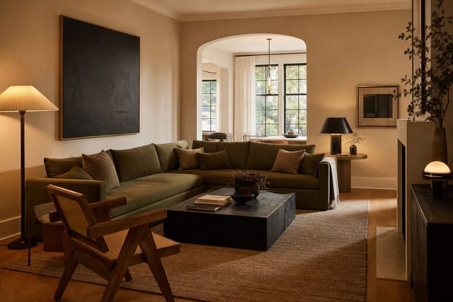
A practical rule: keep the largest three surfaces in the same undertone family or in a deliberate contrast. Cream walls, warm wood, and camel leather can work because they agree. Warm wood, muted green walls, and black accents can also work because the green cools the wood on purpose. What fails is the accidental middle: yellow beige walls, blue gray rug, pink beige sofa, and cool white trim with no referee.
Test this on your own room photo with ReDesign before you choose the final direction; keep the doorway, walls, windows, main furniture, lighting, and awkward fixed features visible so the preview solves the room you actually have.
What is the fix once the undertones are fighting?
Choose the undertone you are going to honor first. In most homes, that is the undertone of the fixed surface: floor, tile, countertop, fireplace, or the sofa you cannot afford to replace. The room gets calmer when the other choices either support that undertone or oppose it clearly.
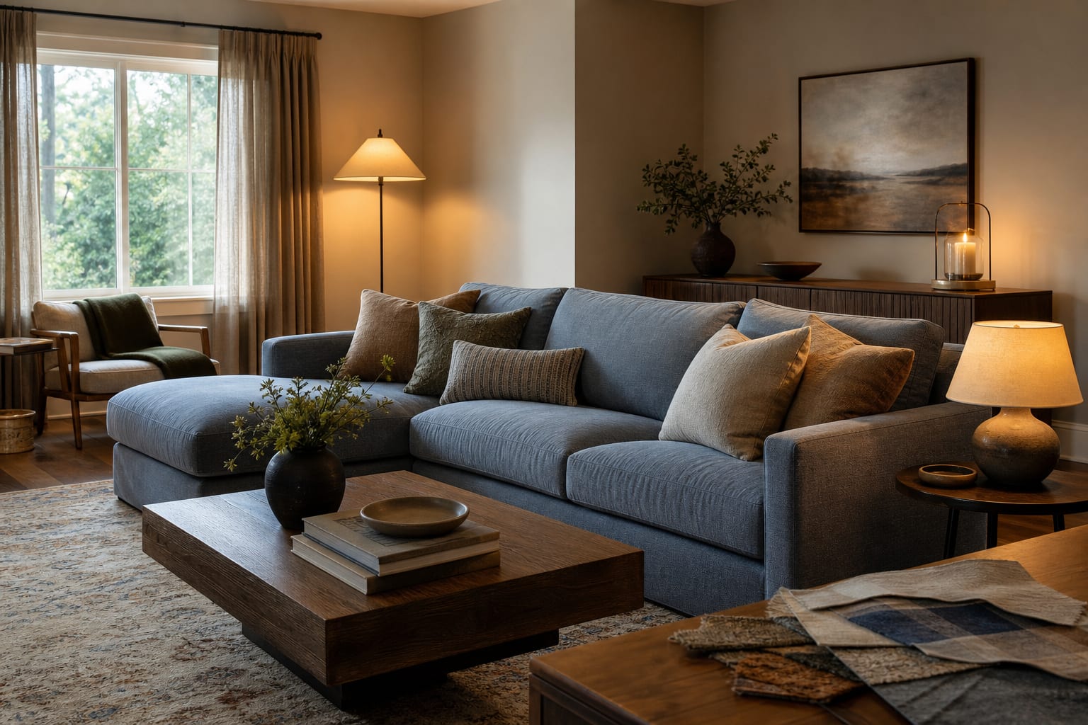
If the fixed undertone is yellow or orange, use warm white, cream, olive, muted blue, mushroom, warm black, tobacco, or clay. Avoid icy gray unless the room has unusually balanced light and enough warm texture to keep the floor from shouting. If the fixed undertone is pink beige, avoid yellow cream and orange wood overload. Try taupe, plum brown, soft charcoal, stone, muted green, or a dirty white with a little gray in it.
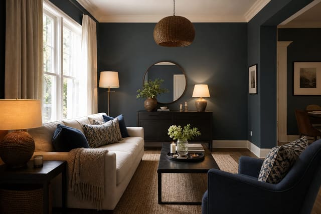
If the fixed undertone is blue gray, do not add yellow beige and hope they “neutralize.” They usually make each other look worse. Bring in cooler whites, slate, charcoal, walnut, black, muted navy, or a beige that is clearly taupe rather than butter. If the room has a green undertone in tile, carpet, or concrete, avoid pink beige unless you want both surfaces to look uneasy. For floors with strong mineral variation, the same logic used for stained concrete floors inside a home applies: the floor is not a blank neutral just because it is gray.
Then repeat the chosen undertone through at least three visible decisions. A mushroom wall wants a mushroom, taupe, or stone note in the rug, art mat, or lampshade. Warm oak wants cream, black, olive, or cognac to appear more than once. Repetition tells the eye the undertone is intentional.
Use contrast with restraint. One black line in curtain rods, frames, or lamp stems can sharpen a beige room. One cream rug can relieve dark wood. One muted blue textile can cool orange flooring. But five unrelated contrast moves create a new problem.
Common undertone mistakes that keep a room looking wrong
- Buying paint from a tiny chip under store lighting is the classic mistake because undertones reveal themselves at scale. Paint at least two coats on a 12 by 18 inch sample board, move it beside the floor, sofa, trim, and window, and check it in morning, afternoon, and evening light.
- Treating white as one color creates quiet chaos because blue white, warm white, cream, ivory, and chalk all change nearby surfaces. If trim is bright cool white, a yellow beige wall may look dirtier; if trim is warm white, a cool gray wall may look colder. Compare whites directly before ordering curtains, bedding, or shades.
- Matching neutrals by name instead of undertone makes rooms feel flat and mismatched at the same time. A beige rug, beige sofa, and beige wall can still clash if one leans pink, one leans yellow, and one leans green. Aim for family resemblance, not identical labels.
- Ignoring wood and metal finishes undercounts the palette. Brass, chrome, black iron, walnut, oak, cherry, pine, and espresso all add temperature. Limit metals to one dominant finish and one supporting finish in a single view, then repeat each finish at least twice so it looks chosen.
- Adding a bright accent to “fix” undertones usually makes the clash louder. A cobalt pillow will not reconcile pink beige walls and orange floors. Correct the background temperature first, then bring in accent color at 10% to 15% of the room’s visual weight.
- Forgetting bulb temperature can make a good palette look wrong after sunset. A room that works in daylight may turn green, peach, or gray at night under cheap cool bulbs. Start with warm, high-quality light before repainting a room that only bothers you after dinner.
How AI previews expose undertone clashes before money moves
AI design is useful for undertones because the problem is relational. A paint color is not right or wrong in isolation; it is right or wrong beside your actual floor, sofa, trim, rug, lamps, windows, and shadows. Uploading a real photo lets you test those relationships before you buy gallons of paint or return a rug for the third time.
Use a straight photo taken from the room’s main entrance or a back corner. Include the floor, ceiling line, windows, largest furniture, trim, and at least two walls. Do not crop out the “ugly” fixed finishes, because those are often the surfaces causing the undertone clash. If the room is used mostly at night, photograph it with the lamps you normally turn on.
Run focused versions. Ask for one palette that cooperates with warm floors, one that cools the room with muted green or blue, one that uses mushroom or taupe, and one that keeps the walls but changes textiles and lighting. Keep the large furniture consistent unless you are truly replacing it. The value is not a fantasy makeover; it is seeing which undertone strategy survives contact with the room you own.
If you are unsure how much control to give the tool, read can AI design a room for you before treating any preview like a purchase order. The best use is diagnostic: compare the versions, identify the repeated moves, then test the smallest real-world change first.
What should you change first for the biggest undertone correction?
Begin with light, then textiles, then paint. Light changes every undertone in the room, so swap bad bulbs before judging every surface. Use lamps with fabric or paper shades around 14 to 18 inches wide when the scale fits the table, because tiny shades create harsh pools and make color look stingy.
Next, change the largest movable textile. Curtains, rugs, bedding, and slipcovered seats can correct a room faster than small accessories. Hang curtain rods 6 to 10 inches above the casing and 8 to 12 inches beyond the trim when wall space allows, then let panels finish about 1/2 inch above the floor. A full-height cream, flax, taupe, or muted blue curtain can make a clashing wall and floor relationship feel controlled.
For rugs, use size and undertone together. In many living rooms, an 8 by 10 foot rug is the starting point for connecting the sofa and chairs. Choose a rug that contains the floor tone in a small amount and adds the undertone you want the room to follow. A rug that ignores the floor completely will look dropped in.
Paint comes after those tests because paint covers the most area and punishes guessing. Once you know the fixed undertone and have seen one textile direction work, choose a wall color that repeats or deliberately balances that decision. The room does not need every surface to match. It needs every surface to admit what color family it belongs to.
Frequently Asked Questions
How do I tell if my undertones are clashing?
Stand at the room entry — if the walls read pink-beige while the floor reads orange-yellow and the trim reads cool white, the undertones are clashing even though each individual color looks neutral. Use the room photo to compare the visible layout and fixed constraints before committing, because door swings, windows, outlets, storage reach, circulation, and existing furniture decide whether the idea survives daily use.
Which surface dictates the undertone family?
The largest fixed surface — usually the floor in most rooms, the cabinets in a kitchen, the tile in a bathroom; match wall, trim, and furniture undertones to that surface family. Keep the preview honest by leaving the problem area visible in the frame, then compare one conservative version against one bolder version before you buy lighting, paint, furniture, or storage.
Can I mix warm and cool undertones in the same room?
Yes, but limit the off-family pieces to small accents (one rug, one piece of art) — most of the room should sit in one undertone family for a calm read. Check the result against ordinary movement first: drawer clearance, chair pullout, walkway width, glare, switch access, and sightlines matter more than a perfect catalog angle.
What is the most common undertone clash in rented homes?
Builder-beige walls (pink-yellow) against cool-grey LVP floors (blue-grey) — the clash is the room reading dated despite both finishes being recent. Use the image to narrow priorities and measurements before ordering anything custom; final purchases still need real dimensions, outlet locations, installation limits, and product clearances.
Does AI help diagnose undertone clashes?
Yes — upload the room photo and AI shows which surfaces fall into warm vs cool families and previews neutralizing color shifts before any paint or refinish. If the preview invents architecture or hides the awkward feature you need solved, rerun it with stricter instructions so the result remains tied to your actual room.
Three transformations to try
- Cool-toned room with matched cool whites
- Warm-toned room with matched warm whites
- Neutralized accent against cool floor