Cool gray is over, and 2026 makes that official. The clearest color story this year is warmth and groundedness: earthy greens, clay and terracotta browns, soft butter yellows, and deep moody blues, often used to drench a whole room rather than dabbed on as one accent wall. Crisp stark white and builder-beige are both losing ground to colors that feel like materials found in nature. If you are repainting now, commit to a warm undertone and let the color do more work.
What the major forecasts agree on for 2026
The paint companies rarely line up this neatly, but for 2026 they do. The collective forecast points warm and earthy: muddy greens drawn from foliage and herbs, browns that read like clay and leather, and soft yellows that feel like morning light rather than highlighter. Cool blue-grays, the defining neutral of the 2010s, are being actively phased out of lead positions. The undertone shift matters as much as the hue, because a warm gray-beige and a cool gray sit very differently against wood floors and brass.
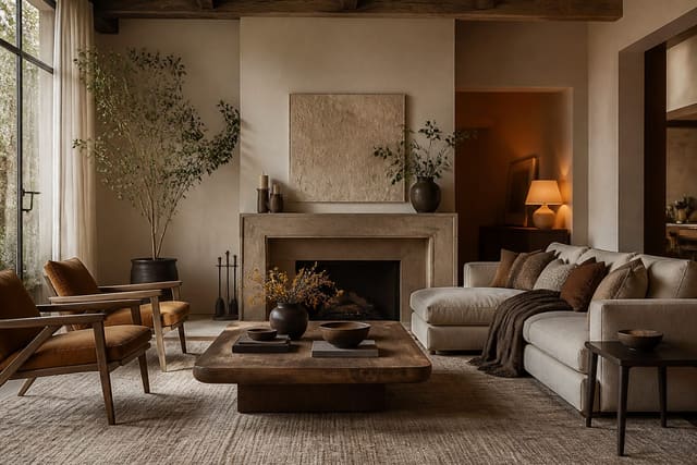
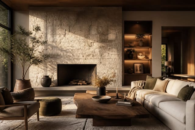
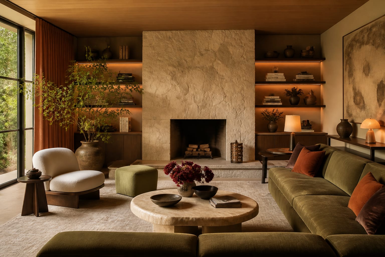
Green remains the connective thread across nearly every palette, but it has moved. Where recent years favored clean sage and emerald, 2026 leans into murkier, more complex greens, the color of olives, rosemary, and weathered bronze. These read as neutrals in practice, pairing easily with wood and stone, which is why designers are using them on full rooms instead of as a cautious accent. Pair a muddy olive with unlacquered brass and warm white oak and the room instantly looks current.
The other agreement is intensity and immersion. Forecasts and designers alike are pushing whole-room color: walls, trim, and often the ceiling in one shade so the room feels enveloping. This is partly a reaction against the choppy, accent-wall look that made rooms feel busy. A single deep color, applied everywhere and lit warmly, reads as confident and expensive in a way a lone painted wall never did.
Knowing what is leaving is as useful as knowing what is arriving. Cool gray-and-white schemes, gray vinyl plank paired with bright white walls, and the single contrasting accent wall are all on the way out, and a roundup of what's out of style in interior design 2026 makes the contrast plain. Choosing a 2026 palette is partly a matter of editing out the cool, high-contrast moves that now date a room faster than any specific hue.
The 2026 palettes worth copying
- Drench a study or bedroom in a deep moody blue or near-black green, walls and trim alike, for an enveloping, intimate feel.
- Use a murky olive or rosemary green as a full-room neutral, paired with warm wood and brass.
- Bring back soft butter yellow or warm ochre in a kitchen, entry, or breakfast nook for cheerful warmth that still reads grown-up.
- Replace cool gray with a warm taupe or greige base coat throughout shared spaces for a calm, flexible backdrop.
- Layer clay and terracotta browns through textiles, a painted vanity, or a feature piece to add earthy depth.
- Carry one color across walls, trim, and ceiling in a single room to retire the accent-wall look.
- Anchor a warm neutral scheme with a single saturated piece, like a clay-colored sofa or an olive cabinet run.
Color is the cheapest, fastest way to update a room, which is why it leads every trend conversation. A few gallons of paint and a weekend can move a whole home toward 2026 for a couple hundred dollars. Test large swatches on multiple walls and view them at different times of day, since warm earthy tones shift dramatically between morning and lamp light.
Think in terms of a whole-home flow rather than treating each room as a separate decision. Picking one warm neutral as a base that runs through hallways and open spaces, then layering bolder drenched colors in the rooms you close off, keeps the house feeling cohesive instead of like a tour of paint chips. A muddy olive study, a clay-toned powder room, and a butter-yellow nook all read as part of the same family when they share an undertone and a common neutral connecting them. That continuity is what makes a home feel designed rather than decorated room by room.
How to use the 2026 colors without overdoing it
The risk with a bold color year is overcorrection. The fix is to anchor saturation against generous neutral and natural materials. A drenched olive study works because the wood floor, linen curtains, and brass lamp give the eye somewhere to rest. Strip those away and the same color can feel oppressive. Think of the bold hue as the lead and the warm neutrals, wood, and stone as the supporting cast that keeps it livable day after day.
Undertone discipline is the other half of getting it right. Warm earthy colors clash badly with leftover cool-gray elements, so check your flooring, tile, and fixed finishes before choosing a palette. If your floor is a cool gray laminate, a warm clay wall will fight it; either lean into deep moody tones that override the floor or choose your palette around what you cannot change. These are the practical mechanics behind the broader interior design trends 2026 that make a color scheme feel intentional rather than trendy for its own sake.
Sheen and finish quietly shape how a color reads, too. A flat or matte finish deepens an earthy tone and hides wall imperfections, which is why drenched rooms almost always use it; an eggshell or satin can make the same olive look plasticky under direct light. Reserve higher sheens for trim and high-touch areas, and test the actual finish you plan to use, not just the color, since a chip card is usually printed in a sheen you will never paint. Getting the finish wrong can undo an otherwise perfect palette.
Preview your 2026 palette in Re-Design
Seeing the palette in context also helps you judge what stays and what goes. A warm new color often reveals which existing pieces suddenly look dated, which is its own useful signal. For a fuller picture of where the year is heading across materials and styling, the interior design trends 2026 full guide puts the color story in context with everything else changing in the home.
Frequently Asked Questions
What is the color of the year for 2026? The forecasts cluster around warm, earthy tones rather than one shade, with murky greens, clay browns, and soft yellows leading. The shared message is a decisive move away from cool gray toward grounded, nature-derived warmth.
Is gray finally out of style in 2026? Cool blue-gray as a lead neutral is clearly fading, replaced by warm taupes and greiges. Gray is not banned, but warm undertones now dominate, and a cool-gray room reads as the most dated of the recent neutrals.
Is color drenching hard to pull off at home? It is more forgiving than people expect, because committing one shade to walls, trim, and ceiling reads as intentional. The key is choosing a color you genuinely like and balancing it with wood, stone, and natural textiles so it stays livable.