Most trend roundups are useless because they list everything and commit to nothing. This guide takes a position: the 2026 shifts worth your money are warmer palettes, curved and softened forms, and honest natural materials, while the cold gray minimalism of the last decade is finally done. Trends matter only when they make a room feel better to live in, and the strongest ones this year all push toward comfort and texture over showroom polish. Adopt two or three deliberately and skip the rest.
The palette shift away from gray
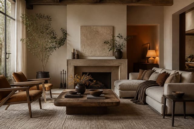
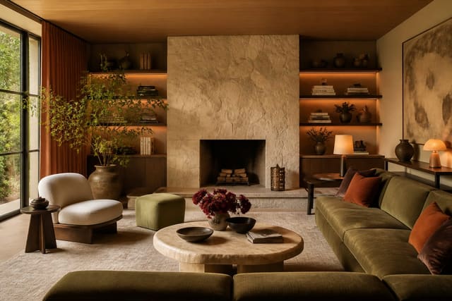
The biggest change is at the wall and the big-upholstery level. Cool gray, which dominated for years, now reads as dated and a little cold, and it is being replaced by warm neutrals and earthy saturated tones. Clay, terracotta, ochre, mushroom, and muted forest green are doing the work that greige used to do, grounding a room while adding warmth. The practical move is to choose a warm white or soft beige base and let one earthy color carry the room through an accent wall, a sofa, or cabinetry.
This is not a call to paint everything brown. The skill is balance: a warm neutral envelope with a single grounded color keeps a room from tipping into either blandness or chaos. Repeat your chosen tone in two or three places so it feels intentional. If you want a deeper map of where color is heading this year, our breakdown of color trends 2026 goes specific on combinations that hold up beyond a single season. The safest way to test a warmer direction is to start with a removable element, a rug or a set of cushions, and live with it for a few weeks before you touch the walls.
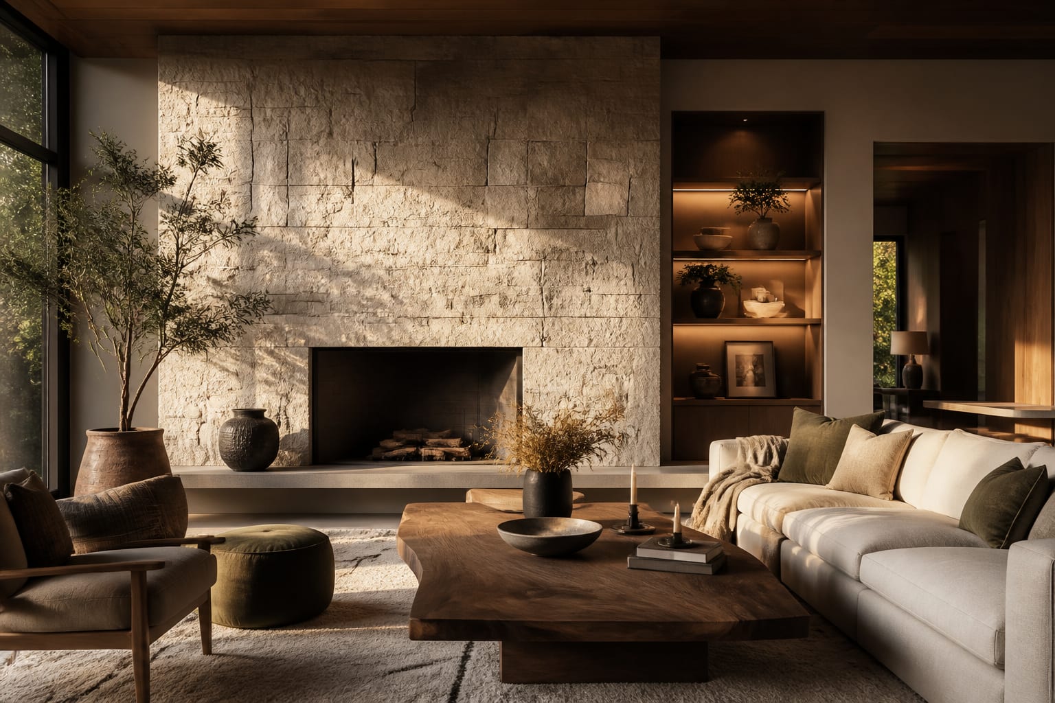
Materials reinforce the palette. Warm woods like white oak and walnut, unlacquered brass that ages gracefully, and natural stone with visible veining all read as current because they carry warmth and depth. The throughline is honesty in materials: surfaces that look like what they are tend to age better than high-gloss synthetics chasing a perfect finish.
Texture is doing quiet, heavy lifting in 2026 rooms. A space can hold a fairly restrained palette and still feel rich if the surfaces vary, a nubby bouclé against smooth oak against a slubby linen drape. This is why the new look photographs as warm even when the colors are muted: the eye reads the interplay of matte and tactile finishes as comfort. If your room feels flat, the fix is usually more texture rather than more color, and texture rarely dates the way a loud hue can.
Trends worth adopting in 2026
Here are the shifts I would actually act on this year, in rough order of impact. Choose the ones that fit your space and ignore the others without guilt.
- Swap cool gray walls or upholstery for a warm neutral or one earthy saturated tone.
- Introduce a curve: an arched mirror, a rounded sofa, or a softened-edge coffee table.
- Add a tactile material moment, such as a bouclé chair, a stone tabletop, or a wood-slat wall.
- Layer lighting at three levels instead of relying on a single overhead fixture.
- Bring in unlacquered or aged brass for hardware and fixtures so metal warms over time.
- Make room for plants and natural light as core design elements, not afterthoughts.
- Choose fewer, better pieces with visible craftsmanship over a high volume of cheap items.
That list is a menu, not a checklist. Two or three of these moves in a main room read as a genuine update, while attempting all seven at once produces a space that feels like a trend report rather than a home. For the broader context behind these picks, our companion piece on interior design trends 2026 covers the cultural shifts driving them.
What is fading out
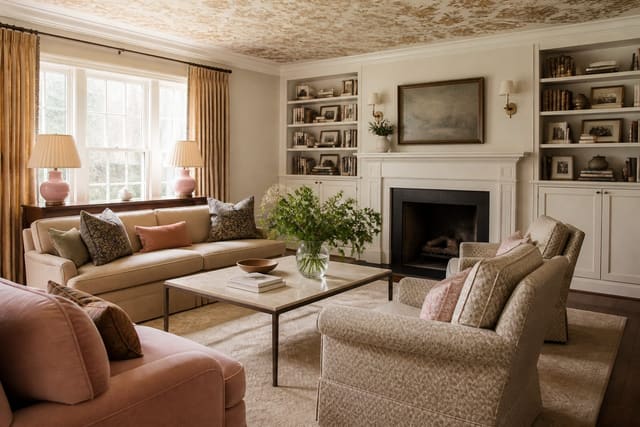
Knowing what to drop is half of staying current. All-gray rooms, the most obvious casualty, now feel flat and dated, and so does the cold open-plan minimalism that left spaces feeling like empty galleries. Fast, disposable furniture is also losing favor as people tire of replacing wobbly pieces every few years and shift toward fewer, sturdier buys. The fastest way to date a 2026 room is to lean on glossy all-white kitchens and identical big-box pieces with no texture or warmth.
The deeper pattern is a move away from rooms designed to be photographed and toward rooms designed to be lived in. Wellness-minded design, with attention to natural light, air, soft acoustics, and calming color, is replacing the hard, reflective surfaces that defined the previous era. Anything that prioritizes a flawless first impression over daily comfort is on its way out.
This does not mean ripping out a recent renovation. If your kitchen is white and gray, warm it with wood accents, brass hardware, and textiles rather than gutting it. Trends are most useful as a direction to nudge toward, not a mandate to start over, and the cheapest updates often deliver the biggest perceived change.
The other thing fading is the matched set. Furniture suites in identical finishes, gallery walls of mass-produced prints, and accessories bought as a coordinated bundle all read as a moment frozen in time. The 2026 instinct is collected over coordinated: a room that looks gathered over years, mixing a vintage piece with a new sofa and an inherited lamp. You can fake that look honestly by introducing one older or handmade object into an otherwise new room, which breaks the showroom flatness instantly and costs little.
Preview 2026 trends in your room with Re-Design
Frequently Asked Questions
Is gray really out for 2026? Cool, flat gray as a dominant scheme is fading fast, replaced by warmer neutrals and earthy tones. That does not mean gray is forbidden; a warm-leaning greige or a gray with brown undertones still works. The shift is away from the cold, blue-gray palette that defined the last decade.
Which 2026 trend gives the biggest change for the least money? Repainting in a warm neutral or earthy tone, paired with swapping a few textiles, delivers the largest perceived update for the lowest cost. Adding one curved element and warm lighting compounds the effect. You rarely need to replace furniture to feel current.
How many trends should I actually adopt? Two or three per room is the sweet spot. Adopting everything at once makes a space feel like a catalog rather than a home, and it quickly looks dated when the next cycle arrives. Pick the trends that genuinely suit how you live.