The difference between a festive living room and a tacky one is restraint, not budget. The single best decision you can make this season is to pick a tight palette of two or three colors and repeat it, instead of layering every ornament and color you own onto every surface. Designed holiday decor reads calm and intentional; kitschy decor reads like a clearance aisle exploded. If you do nothing else, edit hard and let real greenery and warm light carry the room.
Why most holiday rooms tip into tacky
The usual failure is volume, not taste. People decorate by addition, piling on every inherited ornament, color, and novelty until the room has no focal point and no breathing room. Tacky is rarely about a single ugly object; it is about quantity and clash. A room with twelve competing colors and tinsel on every surface looks frantic, while the same room with a disciplined red-and-evergreen scheme looks like a holiday magazine spread.
The second culprit is light. Bright, cool overhead fixtures flatten everything and kill the cozy mood the holidays are supposed to evoke. A room lit by a single harsh ceiling light will look tacky no matter how nice the decorations are. Swapping to warm 2700K bulbs, adding candles, and putting string lights on a dimmer does more to make a room feel festive than another box of ornaments ever could.
The fix is to decorate like a designer: subtract before you add, choose a palette and hold the line, and concentrate effort on a few high-impact zones rather than spreading thin. The mantel, the tree, and the coffee table earn the attention; the rest of the room should stay calm so those moments stand out. Restraint is what separates a styled room from a decorated one.
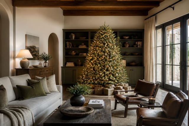
The tree is usually the biggest offender and the biggest opportunity. A tree with a coherent palette, ribbon woven in vertical ribbons, and ornaments clustered for depth looks far more polished than one with every ornament you have ever owned spaced evenly across the branches. The same edit-and-repeat logic applies, and a focused set of christmas tree styling ideas covers layering picks, lights, and a topper that finishes rather than crowds the look. Get the tree right and the rest of the room can stay quiet.
Holiday living room ideas that stay chic
- Choose a disciplined palette, such as evergreen and warm white with one metallic, and carry it through ornaments, ribbon, and throws.
- Layer real or premium faux greenery on the mantel, across shelves, and along the coffee table for natural fullness.
- Drape a chunky knit or velvet throw over the sofa arm and swap in two or three seasonal pillow covers rather than buying new pillows.
- Cluster candles of varying heights on a tray and set string lights on a dimmer for a warm 2700K glow.
- Bring in natural elements, like pinecones, eucalyptus, dried orange slices, and bare branches, for texture without color clash.
- Style the coffee table with a small tray, a stack of books, and a single seasonal object instead of scattering trinkets.
- Add one statement piece, such as an oversized wreath or a garland-wrapped banister, and keep everything else quiet around it.
None of this requires replacing your everyday decor. The goal is to layer a thin festive top coat over the room you already have, then strip it cleanly in January. Buying fewer, better pieces, especially quality greenery and good ribbon, pays off every year because you reuse them instead of starting over.
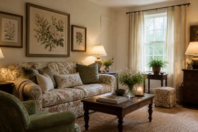
Let the room you already own set the holiday palette instead of fighting it. If your sofa is deep green and your walls are warm white, a brass-and-cream scheme will look intentional, while a clash of bright red and silver dropped on top will look bolted on. The most designed-looking holiday rooms simply turn up the volume on colors already present, adding seasonal texture and a little sparkle rather than importing a whole new color story for six weeks. Working with the room, not against it, is what makes the styling feel effortless.
Building festive vignettes that look designed
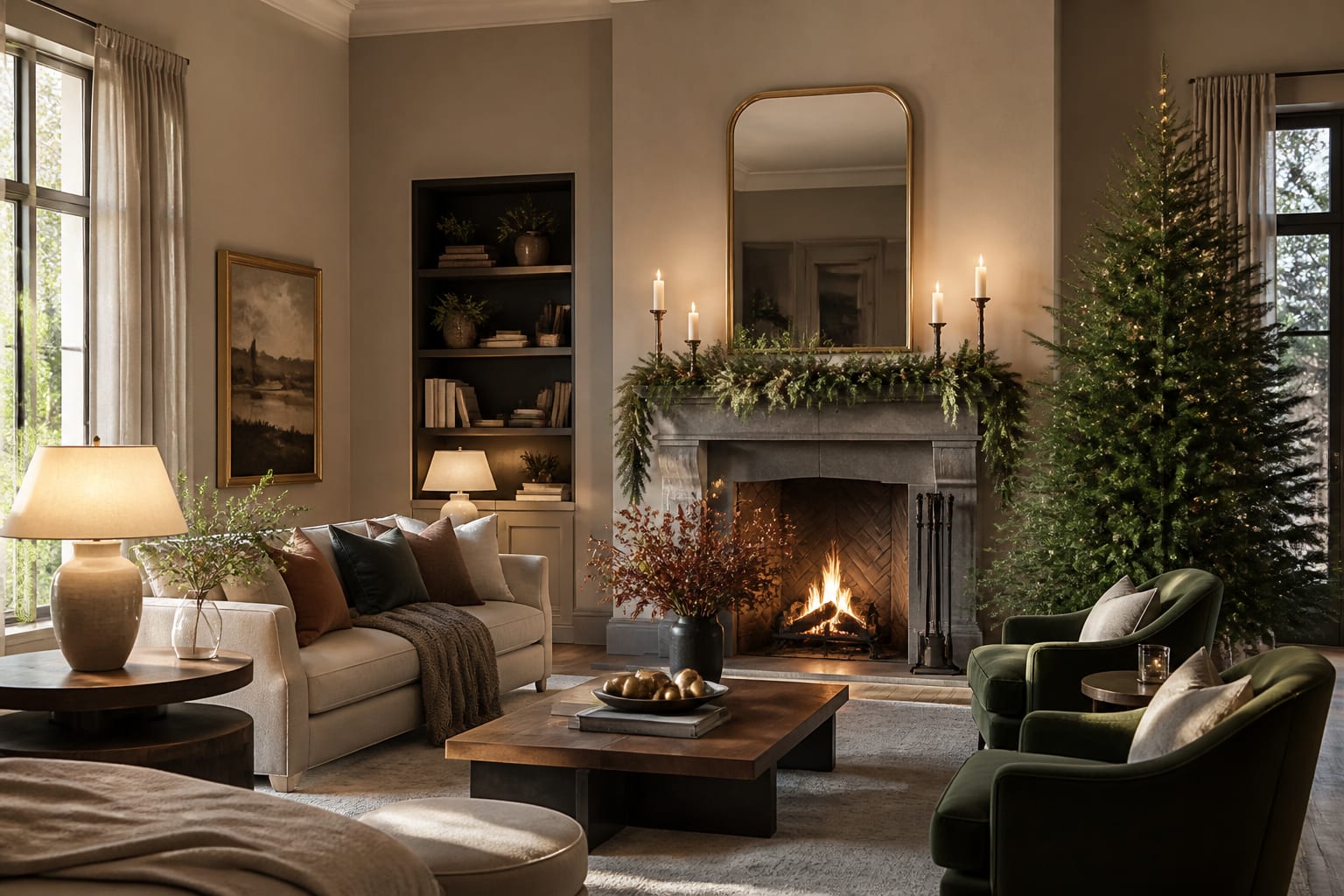
The secret to professional-looking holiday styling is the vignette: a small, deliberate grouping that draws the eye and feels composed. The rules are simple and worth following. Work in odd numbers, usually threes, because the eye reads them as more natural than pairs. Vary the height so the grouping has a clear tall, medium, and short, which creates rhythm instead of a flat row. And give each vignette a visual anchor, like a tray, a stack of books, or a lantern, so the objects feel intentionally placed rather than dropped.
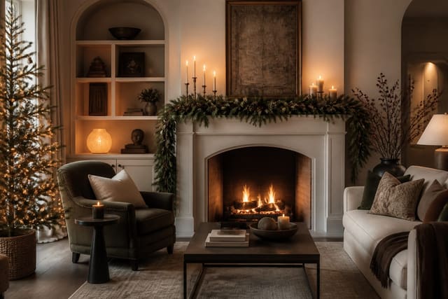
The mantel is the highest-impact vignette in most living rooms, which is why it rewards extra effort. Layering greenery, candles, and a few seasonal objects against the wall or a leaning piece of art creates the focal moment the whole room organizes around. If you want a deeper walkthrough of arranging that ledge, a focused set of holiday mantel decorating ideas covers proportion, layering, and how to keep it from looking crowded. Apply the same odd-number, varied-height logic to the coffee table and console and the whole room starts to feel styled.
Scale is the detail amateurs miss most often. A garland needs enough volume to drape with weight, not a thin string of plastic needles, and a few oversized ornaments in a bowl read more deliberate than a scatter of tiny ones. The same is true of candles: three pillars of different heights on a tray beat a row of identical tealights. When in doubt, go larger and fewer. A handful of generous, well-placed pieces always looks more expensive than a surface crowded with small ones, and it is far faster to put up and take down.
Preview your holiday living room in Re-Design
Seeing it first also keeps the season affordable, because the previewed plan tells you exactly what to buy and what you already own. Once the festive layer comes down, the same room can carry a cozier year-round mood, and pulling in a few cottagecore living room ideas keeps the natural-texture warmth going long after the holidays end.
Frequently Asked Questions
How do I decorate my living room for the holidays without it looking tacky? Pick a tight two or three color palette and repeat it, lean on real greenery and warm 2700K light, and concentrate effort on a few zones like the mantel and tree. Restraint and a consistent palette are what separate designed from kitschy.
What colors look most sophisticated for holiday decor? Disciplined, natural schemes age best: evergreen and warm white with a single metallic, or a muted palette of cream, sage, and brass. The sophistication comes from limiting the colors and repeating them, not from the specific shades.
How can I make my living room festive on a budget? Focus on greenery, warm light, and texture rather than buying new decor. A few branches of eucalyptus, candles, a chunky throw, and string lights on a dimmer deliver more mood per dollar than another bin of ornaments.