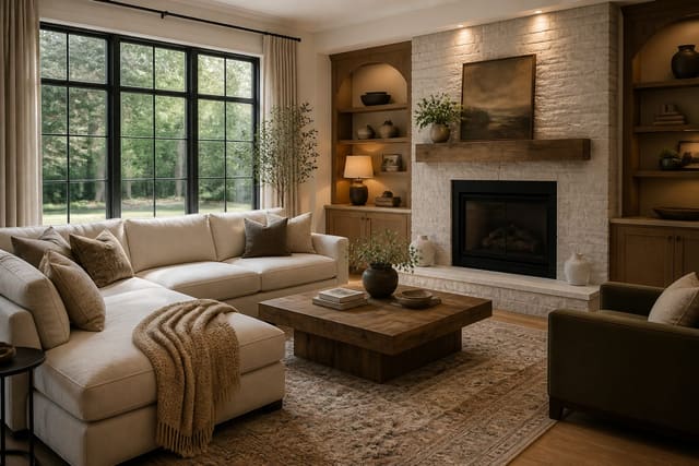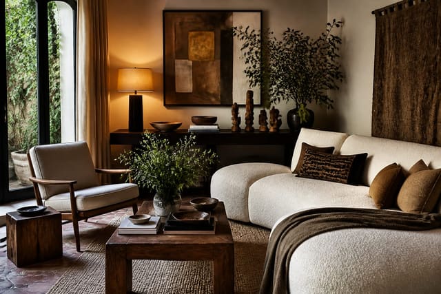
A mood board works when it forces decisions instead of collecting pretty pictures. Anchor it with one focal image, pull a tight 3-4 color palette plus an accent, test everything as physical samples under your real lighting, and write a budget next to each category. Do that and the board becomes a contract that keeps every future purchase matching, instead of a Pinterest dump that drifts into compromise.
Start with one focal image, not fifty
Every board needs a single anchor image that sets the emotional tone; everything else supports it or gets cut. It can be a finished room photo, a textile, or a piece you already own. Pick the one you'd defend in an argument, pin it dead center, and audit every other element against it.
From that anchor, pull three to four core colors plus one accent, keeping the dominant color at roughly 60% of visual weight, the secondary at 30%, and the accent at 10%. Going past five colors turns boards muddy. If you're still deciding on overall direction, find your design style first so the anchor image isn't a random impulse pin.
Layout should mirror real-world scale: wall color gets the most space, flooring runs as a wide band underneath, and the accent shows up as a small dot in the corner. Giving a throw pillow the same area as a sofa will mislead you about balance. Keep the board to one page so you can take in the whole scheme at a glance, the way you'd experience the actual room.
Use physical samples, because screens lie
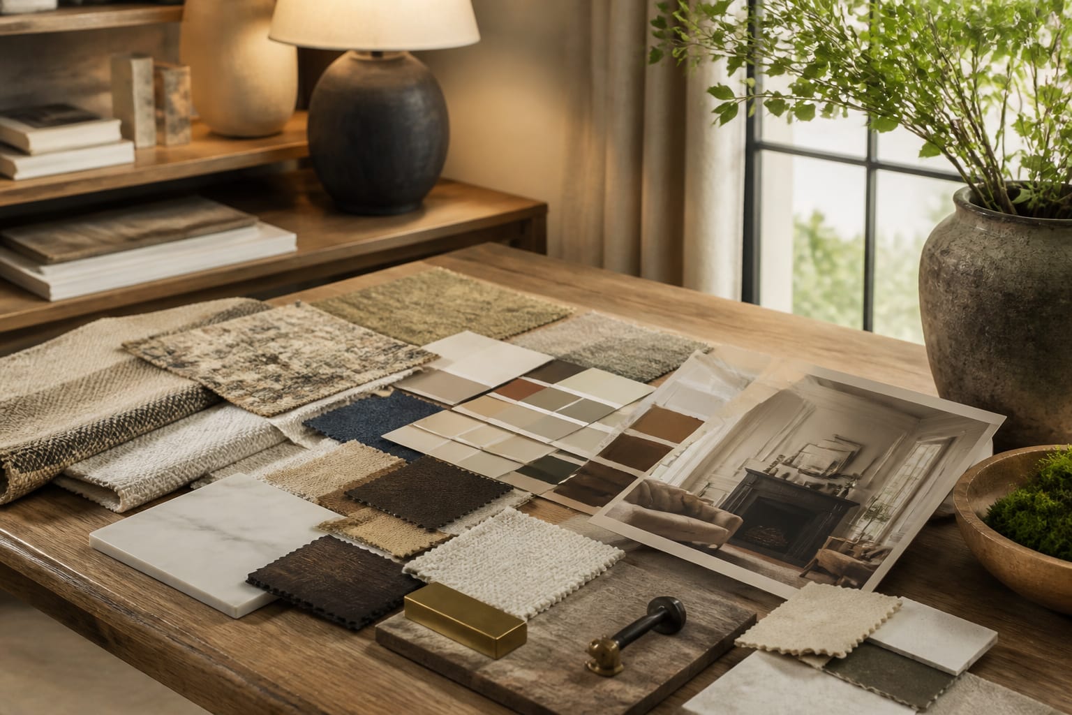
Screen color is a trap. A white that looks warm on a laptop can read cold on a north-facing wall, and an online charcoal fabric can arrive nearly navy. Order 5-7 real samples per room: paint chips, a fabric cutting, a wood veneer or flooring chip, and a metal finish for hardware, since photos can't show sheen.
Tape samples to the actual wall and observe them across a full day. Morning light, midday sun, and a 2700K-3000K lamp at night each shift the colors, and a palette that only works at noon fails for the 16 hours you're actually home. Photograph the board under the lighting you live with, not a phone flash that flattens everything.
A complete materials board needs:
- A paint chip for walls plus a second for trim, taped side by side
- One fabric sample for the largest upholstered piece
- A flooring or rug swatch at real scale
- A metal finish chip for hardware and fixtures
- A wood tone for furniture so undertones match
Turn the board into a budget and buying plan
A board that ignores money is just a fantasy. Write a target price next to each major category directly on the board: sofa, rug, lighting, window treatments, accessories. A realistic mid-range living room split might run $1,200-1,800 on the sofa, $300-600 on a rug, and $400 on lighting. Seeing these numbers together stops the spiral where one splurge starves everything else.
The board also becomes your prompt sheet. Once palette and materials are fixed, you can describe them precisely to a designer or an AI render tool instead of guessing. Writing a tight AI room design prompt is far easier when colors and finishes are already named; for board mechanics and tooling, see how to create a design mood board.
Phasing the budget keeps a project moving when funds are tight. Mark each category essential or later, so the sofa and rug might be phase one while window treatments wait. Since the board fixes the palette up front, pieces bought months apart still match. Leave a 10-15% contingency for delivery surcharges or fabric upgrades you didn't anticipate.
Common mistakes to avoid
The most common mistake is collecting without curating, so the board balloons to 40 images with no decision. Cap it. Another is ignoring scale: a board full of close-up textures tells you nothing about how a 7-foot sofa sits against an 11-foot wall, so include one full-room reference for proportion.
People also overweight trendy accent colors; the 10% accent should be the easiest thing to swap in two years, so don't build the room around it. And avoid judging samples under store lighting, which is engineered to flatter — a tile glowing under a 4000K showroom spot can look dull and grey in your actual hallway.
Use AI design to preview mood board interior design before you commit
A swatch on the wall shows the color, not how it reads against your existing window, floor, and furniture together. Re-Design closes that gap: upload a photo of the actual room, describe the board's palette, dominant material, and accent, and the AI renders your space in that scheme so you judge the whole composition instead of squinting at chips.
Use it as a final sanity check before big purchases. If the board calls for warm oak floors, sage walls, and brass hardware, upload the room, request that exact scheme, and compare a few variations side by side. Seeing your own room in the palette often reveals that the secondary color needs to drop to 20%, or that the accent fights the existing flooring — catching that on screen costs nothing, while catching it after a $1,500 order costs plenty.
Frequently Asked Questions
How many images should be on a mood board?
Keep it to one focal image plus supporting swatches and references, roughly 6-10 elements total. More than that dilutes the decision the board is supposed to make. Cap colors at 3-4 plus one accent so the palette stays sharp instead of muddy.
Should a mood board use physical or digital samples?
Use physical samples wherever possible. Screen colors shift under different displays and lighting, so a paint chip, fabric cutting, and wood or metal sample taped to your actual wall will always be more reliable than an online swatch.
What lighting should I use to test mood board colors?
Test under the lighting you actually live with: natural morning and midday light plus a 2700K-3000K bulb at night. Showroom lighting is designed to flatter finishes and will misrepresent how a color or material looks in your home.
How does a mood board help with budgeting?
Writing a target price next to each category (sofa, rug, lighting, accessories) directly on the board prevents one expensive item from consuming the whole budget. It also lets you phase purchases as essential now or later while keeping the palette locked.
Can I use a mood board to generate an AI room render?
Yes. Once your palette, materials, and accent are fixed on the board, describe them precisely in an AI prompt or upload your room photo to a tool like Re-Design to preview the full scheme before buying anything.