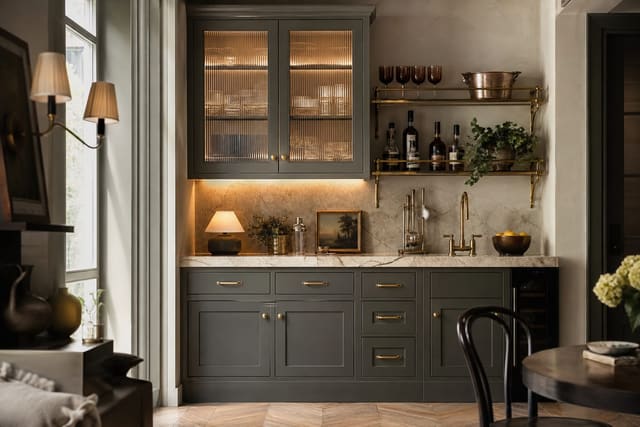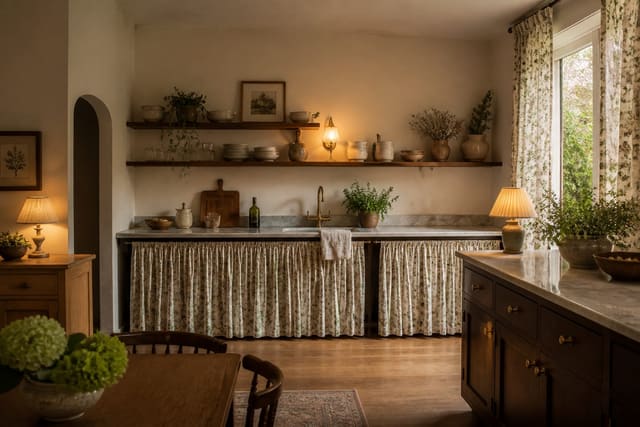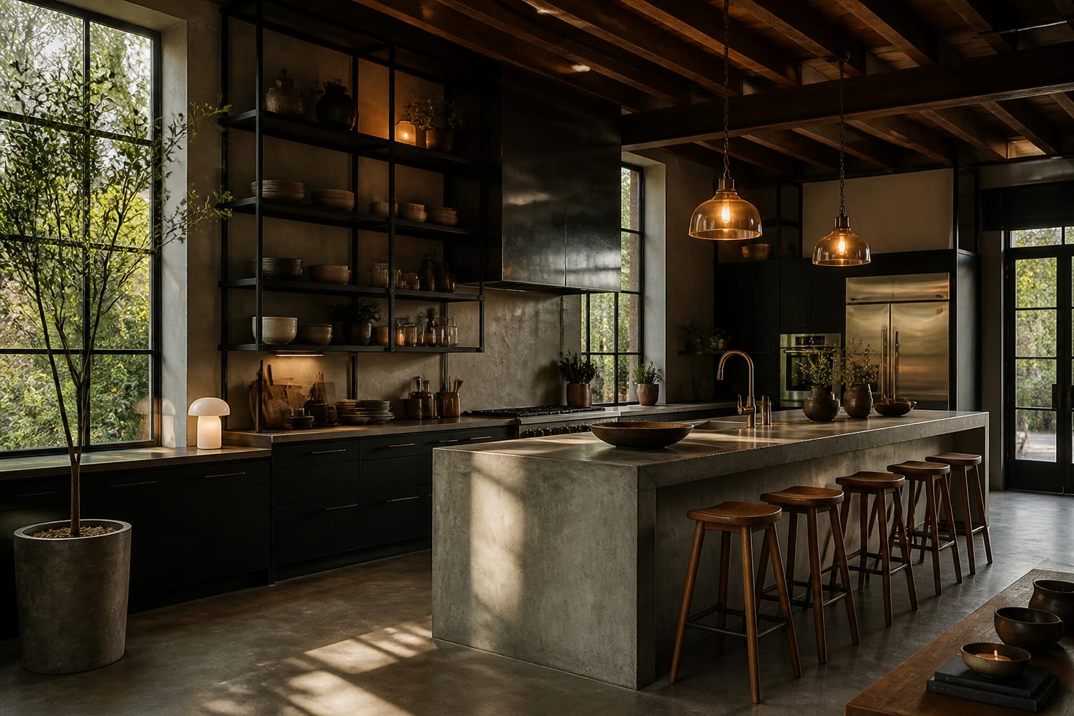
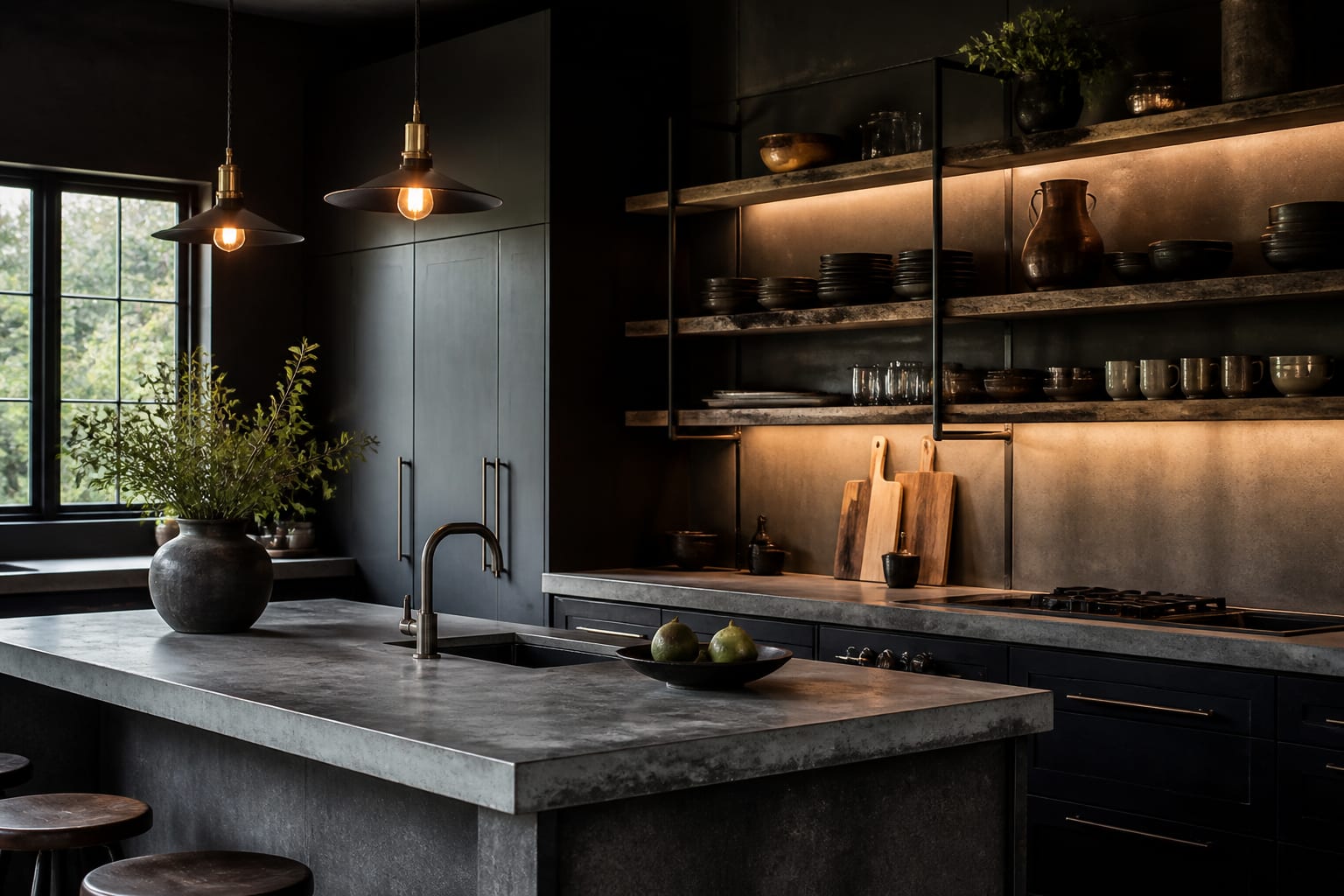
An industrial kitchen looks like an urban working space built from concrete, dark steel, open shelving, exposed texture, warm wood, and practical lighting arranged with enough discipline for daily cooking. The best industrial kitchen ideas add grit without sacrificing function: a counter stool that's comfortable, a pendant that actually lights the island, a shelf that keeps plates within reach.
What does an industrial kitchen look like?
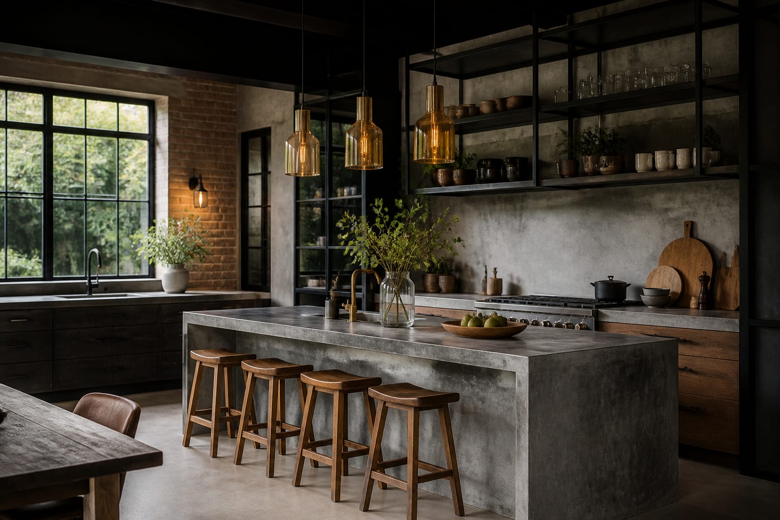
An industrial kitchen is a refined workspace built from honest materials: open shelves, dark metal, concrete or stone, visible grain, substantial lighting, and storage that admits real cooking happens here. It borrows from warehouses, restaurant prep spaces, and lofts, but a home kitchen needs more softness than those references suggest.
The palette runs charcoal, blackened steel, concrete gray, brick red, tobacco, walnut, cream, olive, and stainless. The shapes are straightforward: slab doors, metal frames, thick counters, simple stools, utilitarian pendants, and shelves built to hold real weight. No exposed brick or beams? Contrast works just as well: matte black against oak cabinets, concrete-look counters with warm wood shelving, or a steel-framed glass partition beside plain white tile.
Which industrial kitchen ideas make the room feel urban?
Choose ideas that change the main surfaces first. Industrial style is a material plan that shows up in the island, shelves, lighting, counters, and floor, not just a drawer-pull theme.
- Use open shelving with a real storage job, keeping shelves about 10 in–14 in deep for plates, bowls, mugs, and glassware; deeper shelves become dark ledges where serving pieces disappear.
- Install black steel brackets or a slim metal shelf frame, then repeat that dark line in cabinet pulls or pendant details so the metal reads as architecture, not scattered hardware.
- Choose concrete, concrete-look quartz, or honed stone for a major horizontal surface, especially an island or perimeter counter; see these concrete countertop ideas for kitchens for durability and edge-profile comparisons.
- Pair a dark island with warmer perimeter cabinets, such as walnut, white oak, mushroom, or cream, so the contrast adds depth without black absorbing all the daylight.
- Hang pendants 30 in–36 in above the island with shades at least 10 in–16 in wide; industrial lighting needs scale to compete with heavy materials.
- Add a tool rail only where it helps the cooking zone, mounted 18 in–24 in above the counter; overload it with props and the backsplash turns chaotic.
- Bring in one textile layer, such as a low-pile runner, leather stool seats, or heavy cotton curtains, to soften sound so steel, concrete, and tile don't feel like a service corridor.
- Build a compact drinks or coffee zone with a metal shelf, tray, lamp, and 18 in–24 in of counter width; borrow proportion from this kitchen home bar design without turning the whole kitchen into a lounge.
How should open shelving, concrete, and dark steel work together?
Shelving creates rhythm and access, concrete gives mass, and steel draws the outline. When all three become equally aggressive, the kitchen looks like a commercial set rather than a home.
Let concrete be the broad plane: counter, island top, floor tile, or plaster-look wall. Use steel as the thinner detail: shelf supports, pulls, pendant stems, stool legs, or a glass door frame. A walnut shelf against concrete tile reads intentional; an all-black shelf, tile, and cabinet run can vanish into a cave.
Open shelving needs editing more than styling. Put daily dishes on the lowest shelf, serving bowls higher, and decorative pieces where they won't block access. Leave 10 in–12 in of vertical space for mugs and short bowls, and 12 in–15 in for plates or tall glassware.
Concrete needs warm neighbors too. Stainless appliances look sharp beside it, but too much cool gray drains the room, so add a warm stool, cutting board wall, vintage rug, or aged brass faucet if it feels flat. If your taste drifts softer and more botanical, compare the mood against cottagecore kitchen ideas; industrial style wants harder edges and less romance.
Common industrial kitchen mistakes
Industrial kitchens usually fail when people buy the symbols before planning the work zones. A kitchen can be raw and still respect dishes, groceries, ventilation, and the person cleaning up after dinner.
- Too much black shrinks the room visually; repeat dark metal in three or four controlled places and bring in wood, cream, brick, or warm stone for relief.
- Open shelves used as display-only collect dust and guilt; store items used several times a week and limit decorative pieces to one shelf section.
- Undersized pendants weaken the island; two larger fixtures usually beat three tiny cages, especially over an island longer than 72 in.
- Skipping counter clearance ruins daily use; keep at least 24 in of clear prep space near the sink or range.
- Copying restaurant lighting makes the kitchen unflattering; use warm bulbs around 2700K for pendants and sconces, plus under-cabinet light where knives and boards land.
The quieter mistake is acoustics. Concrete floors, metal stools, slab cabinets, and hard tile can make a kitchen ring, so add a runner, upholstered stool pad, wood shelves, or cork-backed mat to cut the harshness without losing the industrial mood.
Use AI to preview your industrial kitchen before you commit
An industrial kitchen is risky to assemble one purchase at a time because every material changes the next. Dark steel can make oak look richer or yellower; concrete can make white cabinets feel crisp or clinical.
Upload a straight-on photo of your kitchen to Re-Design and test full directions before ordering expensive pieces. Try one version with concrete counters and wood shelves, one with dark lower cabinets and lighter walls, and one where the mood comes mostly from lighting, stools, and hardware. Keep appliance locations, window size, cabinet runs, and ceiling height visible so the preview matches your actual room.
This works especially well in rentals and builder-grade kitchens without true loft architecture. Test peel-and-stick brick, black rods, metal shelves, or a darker island without pretending you live in a converted factory.
What final details keep the kitchen usable and raw?
Add objects with weight and purpose: a thick wood board, stoneware bowl, black rail, metal tray, linen towel, vintage runner, glass canisters, or a ceramic crock for tools. Skip faux factory signs and decorative gears that announce the style louder than the materials do.
Hang art where steam and grease won't punish it, such as a breakfast nook or short wall away from the range. A 16 in x 20 in print in a black, walnut, or steel frame adds personality without cluttering the backsplash.
Before calling the kitchen finished, stand at the entrance and name the strongest material in three seconds. If the answer is concrete, steel, brick, wood, or leather, the room has direction; if it's just "dark stuff," edit the hardest pieces and add warmth where hands and food actually meet the room.
Frequently Asked Questions
What makes a kitchen look industrial?
An industrial kitchen combines one dominant raw material, such as concrete or brick, with dark steel accents, open shelving, exposed texture, and warm wood. The finish should feel like a working space, not a factory replica, with lighting and storage that support real cooking rather than just visual grit.
Is open shelving practical in an industrial kitchen?
Yes, if it stores items you use regularly. Keep shelves 10 in–14 in deep for dishes, put daily items on lower shelves, and limit purely decorative objects to one section so the shelves don't turn into dusty display ledges.
Will concrete countertops make my kitchen feel cold?
Not if you balance them with warmth. Pair concrete with wood shelving, leather or upholstered stools, aged brass fixtures, and 2700K warm bulbs so the gray surface doesn't flatten the room's overall feel.
How much black should an industrial kitchen have?
Less than you think. Repeat dark steel in three or four controlled places, such as hardware, pendants, or a shelf frame, then use wood, cream, or brick elsewhere so the room doesn't feel small or heavy.
Can I get an industrial kitchen look in a rental or builder-grade space?
Yes. Peel-and-stick brick, black rods, metal shelving, and concrete-look accessories can create the mood without structural changes, especially when tested with an AI preview tool before committing to purchases.