A modern coastal color palette fails far more often from too much color than too little. People hear coastal and reach for bold turquoise walls, then wonder why the room feels like a kid's pool toy instead of a serene beach house. Refined coastal is mostly neutral, ruled by light and restraint, with color earning its place in small, deliberate moments. Get the proportions right and the undertones honest, and even a tiny apartment can feel like an airy shoreline cottage.
Start With the Right Proportions
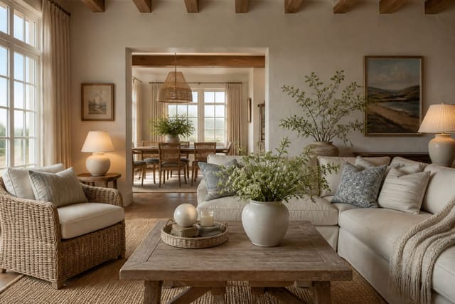
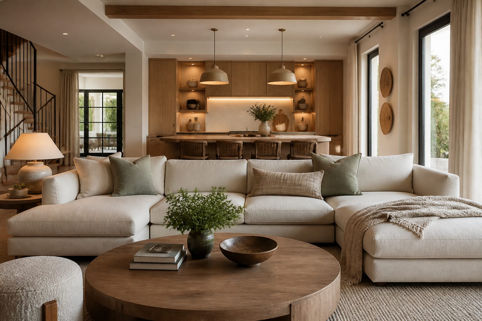
The fastest way to keep a coastal palette from tipping into theme-park territory is to follow a 60/30/10 ratio. The largest share of the room is your dominant neutral, the walls, large cabinetry, and major surfaces, in a warm white or soft sandy tone. The middle share is a secondary natural color, usually wood like oak or a greige textile. The smallest tenth is your accent, where blue or seafoam finally appears and earns its impact through scarcity.
That last sliver is where most people overreach. When blue stays near the bottom of the 60/30/10 split, it feels like a considered choice; let it swell and the space starts to read as a beach gift shop. Hold the discipline and the eye relaxes, because the dominant neutrals give it somewhere calm to rest between accents.
Proportion also applies vertically and across materials. If you cover a large 8 foot accent wall in color, pull blue out of the smaller decor so the totals stay balanced. Conversely, an all-neutral room can carry several small blue touches, throw pillows, a vase, a stack of towels, without exceeding its accent budget. A simple test is to step back 6 feet and ask whether any single color dominates. Thinking in this measurable framework turns palette decisions from guesswork into something you can actually plan room by room. It also scales across an open-plan home, letting connected spaces share one dominant neutral while each gets its own small accent.
See also our guide to Coastal Grandmother Aesthetic for more on modern coastal color palette.
Choose Honest Whites and Neutrals
The neutrals do the heavy lifting in coastal design, so their undertones matter enormously. A white that looks crisp on a tiny paint chip can turn cold and bluish across a large wall, killing the warm, sun-washed quality you want. Lean toward warm whites with a faint cream or greige base, which read as soft light rather than hospital sterile. The difference between two whites can be invisible on a chip yet obvious once it wraps an entire room.
Sandy neutrals fill the middle of the palette and bridge white to wood. Look for tones that pull slightly warm, like a pale oatmeal or greige, and avoid anything with a heavy yellow or pink cast that fights the cool blue accents. The goal is a quiet gradient from white walls to sand-toned textiles to natural oak, with no jarring jumps between them. Each step should feel like a slightly deeper pour of the same light.
Always test undertones at scale and in your own light. Paint a 2 foot by 2 foot swatch on at least two walls and watch it across a full day, because north light, south light, and evening bulbs each reveal a different face of the same color. A neutral that flatters at noon can go gray and flat by dusk. Spending a few dollars on sample pots and a couple of days observing saves you from repainting an entire room you got wrong on a chip.
For a related angle on modern coastal color palette, read What Is Industrial Design.
Add Color With Discipline
Once the neutrals are settled, color becomes the seasoning rather than the substance. The coastal blues that work best are muted and grayed, the color of sea glass or a hazy horizon, not the saturated cobalt of a beach umbrella. These softer tones sit comfortably beside natural wood and warm whites instead of shouting over them. A grayed blue also ages well, looking current far longer than a trend-driven brighter hue.
Placement is where discipline pays off. Reserve color for elements you can change without a renovation: textiles, a painted island, art, ceramics, a single piece of furniture. This keeps the accent flexible so you can refresh the mood seasonally without touching the costly neutral base. It also prevents the common mistake of committing an entire wall of tile to a trendy shade you tire of in two years. Cheap, swappable surfaces are where experimentation belongs.
Introduce a second accent only with restraint. A touch of warm terracotta or pale blush can echo a sunset and stop an all-blue scheme from feeling chilly, but two competing accents quickly muddy the calm. When in doubt, repeat one accent in three spots around the room rather than scattering five different colors. Coordinated repetition reads as intentional design, while variety for its own sake reads as clutter and undoes the serene effect coastal palettes promise. Pulling that repeated accent from a single inspiration photo of a beach or sky keeps the whole scheme feeling cohesive.
Tune Lighting to the Palette
A palette only looks as good as the light it sits in, so bulb temperature is a genuine design decision, not an afterthought. Color temperature is measured in kelvin, and for coastal interiors the sweet spot is warm, soft light around 2700K. That gentle, sun-washed glow keeps whites looking creamy and oak looking rich, exactly the late-afternoon-beach feeling the palette is chasing. Swapping cool bulbs for warm ones is also the cheapest upgrade in this entire guide.
Go too cool and the whole scheme suffers. Bulbs at 4000K or higher cast a bluish, office-like light that turns warm whites gray and makes sandy neutrals look dingy. If you love a slightly crisper feel in a bathroom or kitchen, 3000K is the practical ceiling before the coastal warmth starts to drain away. Keep every bulb in a single room at the same temperature, because mismatched kelvin values make one space feel patched together and uneven.
Natural light deserves the same attention. North-facing rooms skew cool and blue, so push their neutrals a touch warmer to compensate, while bright south-facing rooms can carry slightly crisper tones. Hang sheers rather than heavy drapes to keep daylight soft and abundant, and add dimmers so you can drop a 2700K fixture even lower in the evening. Mounting sconces around 60 inches high puts warm light at eye level where it flatters most. Matching artificial and natural light to the palette is what makes the colors finally click.
Here are the common mistakes to avoid: - Letting blue creep past the accent share until the room reads like a beach gift shop - Choosing a cool, bluish white that turns cold and clinical across a large sunlit wall - Judging paint from a tiny chip instead of a large swatch viewed across a full day - Mixing several saturated accent colors that compete and muddy the calm, airy coastal feeling - Installing cool 4000K bulbs that drain warmth and make sandy neutrals look gray and dingy
Bring the look home with Re-Design
Testing a palette on swatches still leaves a lot to imagination. With Re-Design you upload a photo of your room and preview a full modern coastal color palette in place, seeing your chosen warm white, sandy neutral, and grayed-blue accent on the actual walls and furniture. It reveals how the proportions and undertones behave in your own light before you buy a single can of paint.
Frequently Asked Questions
What is the ideal ratio for a coastal color palette?
Use a 60/30/10 split. Sixty is your dominant warm white or sandy neutral, thirty is a secondary natural tone like oak, and ten is the blue or seafoam accent. Holding blue to that final tenth keeps the scheme calm and refined.
Which white is best for a modern coastal palette?
Pick a warm white with a faint cream or greige undertone rather than a cool bluish one. Cool whites turn clinical at scale and fight the sun-washed mood. Always test a large swatch in your own light before committing to the whole room.
What bulb temperature suits coastal interiors?
Aim for warm light around 2700K, which keeps whites creamy and oak rich. Avoid bulbs at 4000K or higher, since cool light makes neutrals look gray. Keep every bulb in one room at the same kelvin for a cohesive, restful glow.