Open kitchen shelves go wrong in two opposite directions: packed so tight they look like a pantry, or so bare they look like you just moved in. The honest answer is that good styling lives in a ratio, not a vibe. Leave roughly a third of each shelf empty and group what's left, and almost any collection of mismatched mugs starts to look intentional.
I think the reason people struggle is that they style shelves object-by-object instead of as a composition. A shelf is a small stage. Once you think in groupings, negative space, and a tight color story, the daily-use stuff and the pretty stuff can coexist without the whole thing reading as noise. This is the method I use.
The object-to-space ratio explained
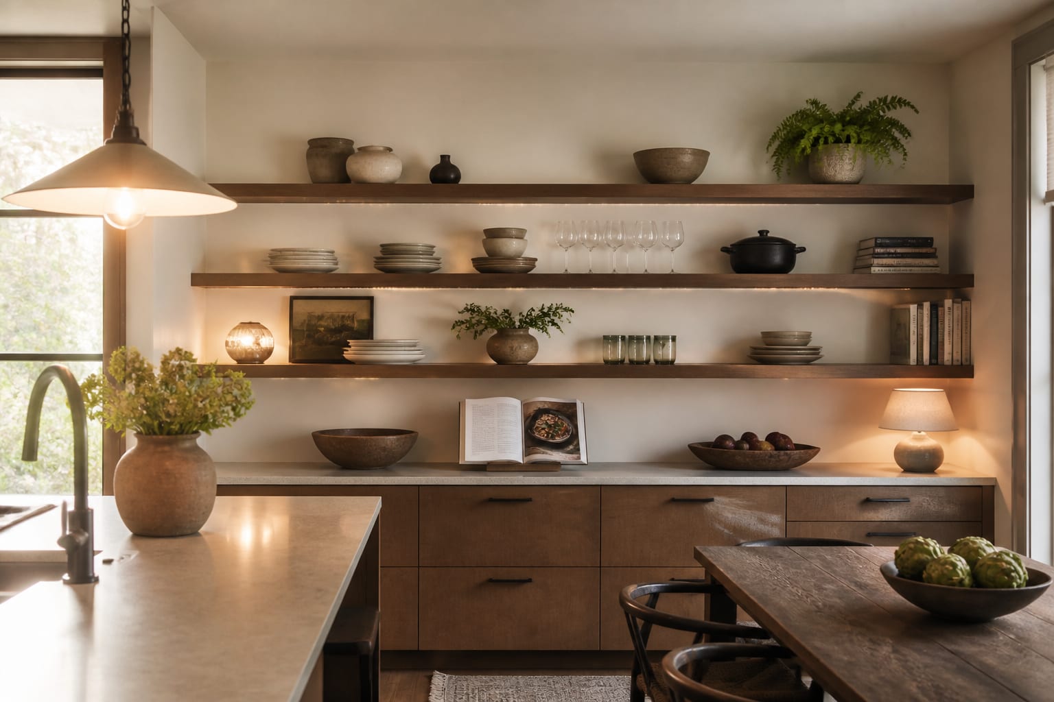
The core rule is the ratio of objects to empty space. When a shelf is more than about two-thirds full, the eye can't separate the items and it all blurs into clutter. Leave a third empty and suddenly each piece has room to register. That empty third is doing real work; it's not wasted space, it's the contrast that makes the rest look chosen.
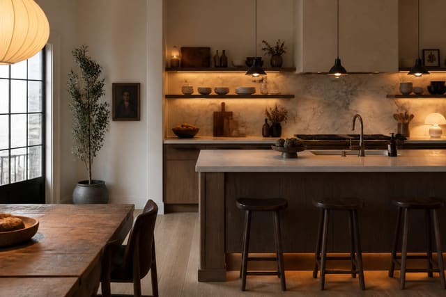
Within the filled portion, work in groups rather than rows. Cluster three to five objects that share a color or material, vary their heights by 2 to 3 inches, and let the group read as one shape. A 12-inch gap between groups separates them cleanly. If your kitchen runs along a single wall, this composition thinking matters even more, because the shelves are the main event, something I get into with one-wall kitchen ideas where every surface is on show.
The ratio also depends on shelf depth and spacing, which most people inherit rather than choose. A shelf 10 to 12 inches deep holds dinner plates and books face-out comfortably; go shallower than 8 inches and you're limited to mugs and small bowls. Vertically, leave at least 12 inches between shelves for everyday dishware and 15 to 16 inches if you want to stand a pitcher or a tall canister upright. When the spacing is too tight, even a well-edited shelf reads as crammed, because the objects touch the shelf above and lose their breathing room. Get the gaps right and the one-third rule does the rest.
Grouping, color, and height
The difference between a styled shelf and a storage shelf is structure. Here's the order I build a shelf in:
- Anchor each shelf with one taller object on one side (a vase, a board, a framed print) at 10 to 14 inches tall.
- Add a mid-height grouping of 3 items in odd numbers next to it.
- Drop in one low, horizontal element like a stack of 4 to 6 plates or a shallow bowl.
- Layer one organic touch (a small plant, a sprig, a lemon bowl) for life.
- Leave the remaining third open, ideally toward the outer edge.
Color is the quiet controller. Pick 3 colors and one metal finish and stick to them; a wall of mixed brights is the fastest route to clutter. Tying the shelf palette to the cabinets and counters keeps it integrated, which is part of planning a working layout like the L-shaped kitchen where shelves often turn a corner and need to read continuously.
Material repetition is the quiet trick behind shelves that photograph well. Pick one warm note and let it recur: a wood cutting board, a wood-handled utensil crock, a wood-framed print, so the eye travels across the shelf finding the same tone three times. Do the same with one ceramic glaze or one metal. This is the difference between a curated open shelf and a yard-sale shelf, and it's exactly the principle that runs through the broader open shelving kitchen ideas worth borrowing. Three deliberate repetitions of a color or material will pull a mismatched collection together faster than buying anything new.
Function still comes first
Styled shelves still have to work. Keep the things you reach for daily, glasses, the everyday plates, the salt, in the 30-to-48-inch zone above the counter where you don't have to stretch or crouch. Push the decorative and seasonal pieces higher, and store the genuinely ugly utility items behind closed doors entirely.
The most usable open shelving mixes about 70% function with 30% display. Heavy items like a stack of bowls belong on the lower, stronger shelf; light, pretty objects go up top. If the shelf has to hold real daily volume, that's fine, just be ruthless about editing duplicates so you're displaying one nice set rather than three chipped ones.
There's also a grease-and-dust reality nobody mentions in styling guides. Open shelves within about 3 feet of a cooktop collect an airborne film that turns sticky, so the further a shelf sits from the hob, the more decorative it can afford to be. Closest to the stove, keep only what you use and wash constantly, the daily plates and glasses that get cycled through the dishwasher anyway. Reserve the fragile, dust-catching display pieces for shelves on the far wall. Plan the shelf contents around cleaning frequency and the styling stays looking intentional instead of greasy by month two.
Common mistakes to avoid
The most common mistake is filling every inch. A full shelf reads as a cupboard with the doors removed, which defeats the entire point of going open. Pull a third of the objects off and the rest instantly look better.
Another frequent error is ignoring height, lining everything up at the same level so the shelf looks like a supermarket aisle. Vary heights by at least 2 to 3 inches per group. A third mistake is too many colors and finishes competing at once; hold the line at 3 colors and one metal. And don't style shelves you can't maintain, if a grouping makes grabbing your morning mug annoying, it'll be wrecked within a week, so keep daily items reachable and decorative ones out of the way.
Use AI design to preview open kitchen shelf styling before you commit
Styling is iterative, and rearranging real dishes a dozen times is tedious. Upload a photo of your empty or half-styled shelves to Re-Design and you can preview different groupings, palettes, and densities without touching a single plate. Seeing a rendered version tells you fast whether two shelves or three suits the wall, and how much negative space actually looks right at your ceiling height.
AI design is also the easy way to test the color story before you buy anything new. Render your shelves with a 3-color palette against your existing cabinets, and you'll know whether that set of green glassware integrates or fights the room. It's a low-stakes way to settle the look before you commit counter space, money, and a weekend to it.