Cottagecore can go wrong the second it becomes costume. My firm opinion: the style only works when the house still looks useful, not staged for a picnic fantasy. If you love the cottagecore aesthetic but worry about clutter, sweetness, or a room that feels too themed, the fix is to build the look from material, light, and daily rituals first. This guide defines the style, then shows where to spend your attention in a real whole home.
What is cottagecore interior design, really?
Cottagecore interior design is a home style that blends nature-inspired color, vintage or handmade-feeling furniture, floral pattern, warm light, and visible everyday comfort. It borrows from rural cottages, English country rooms, farmhouse kitchens, garden sheds, old quilts, pressed flowers, and useful objects that look better with handling.
The important word is useful. A cottagecore room should make space for reading, cooking, bathing, sewing, potting herbs, storing linens, or drinking tea at a real table. It is not just a pile of florals. It is also not shabby for the sake of shabby; chipped paint, worn wood, and aged metal need to feel cared for, not neglected.
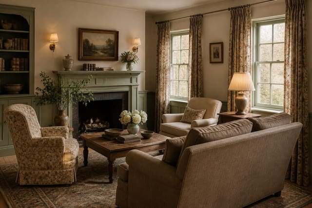
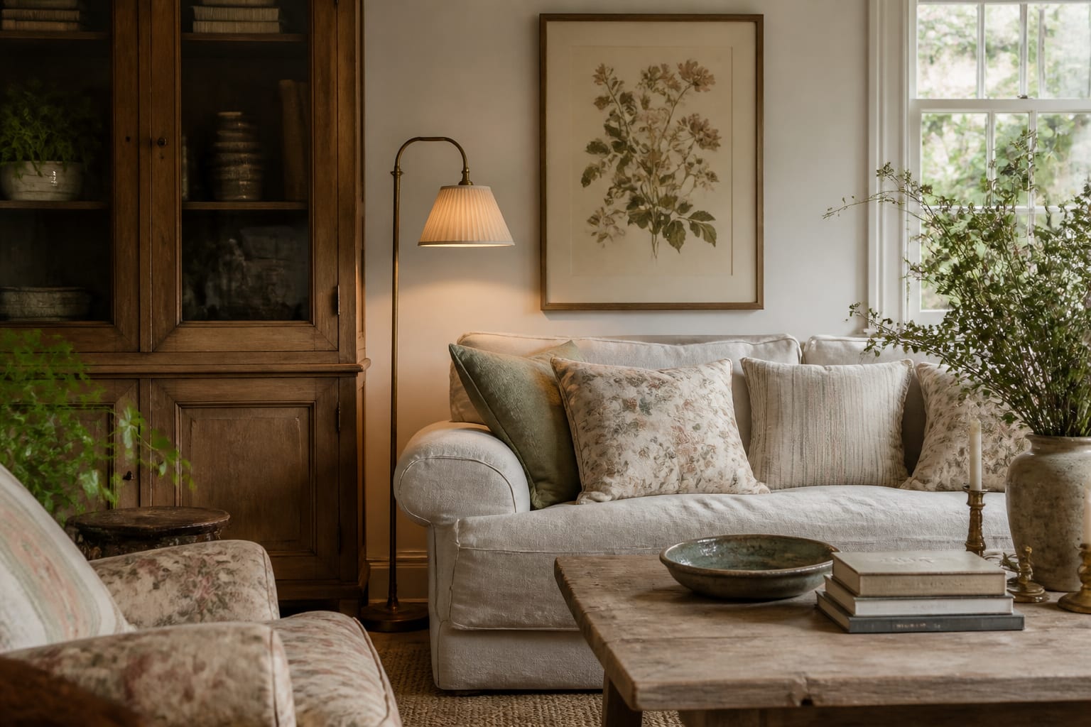
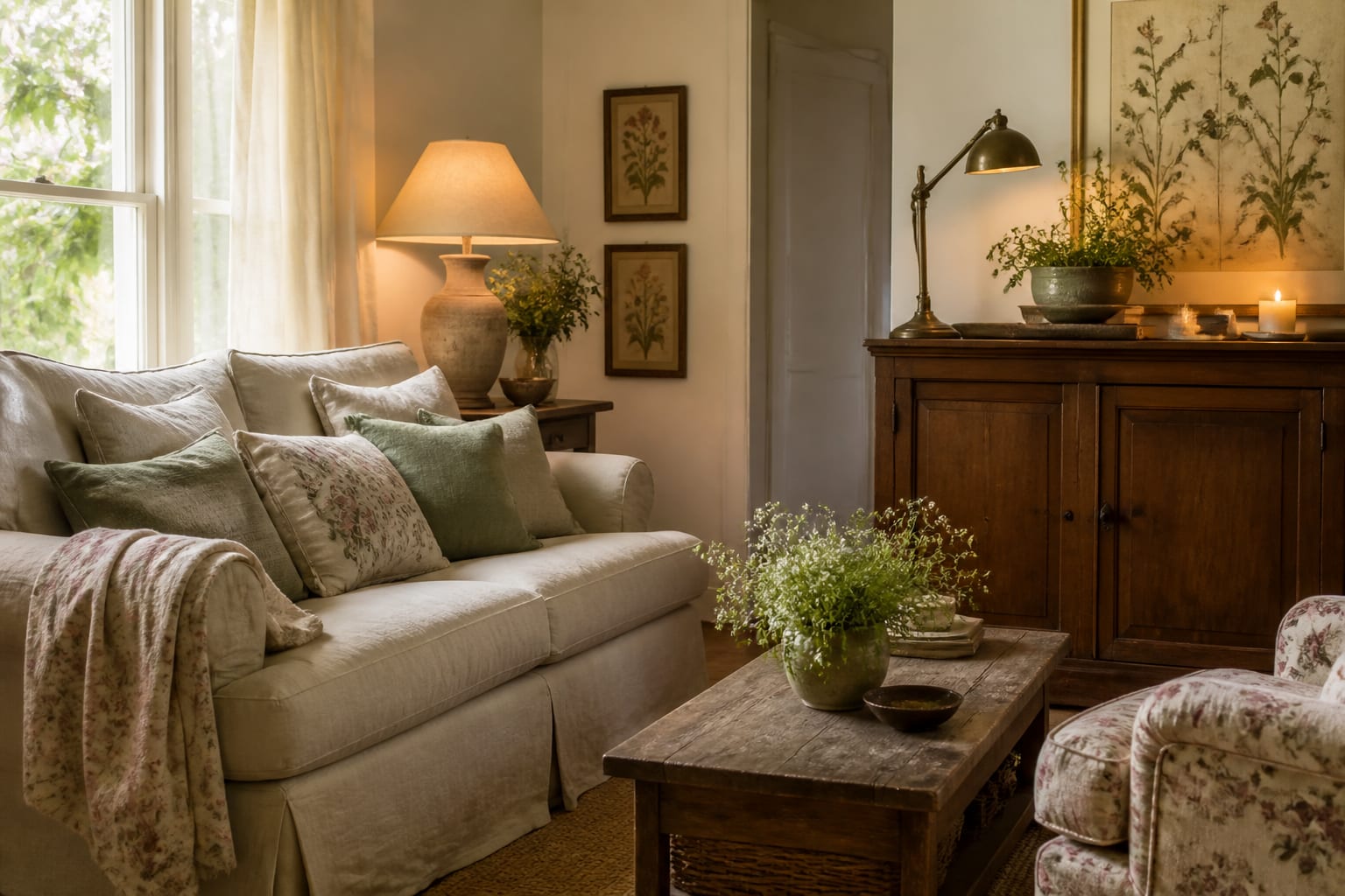
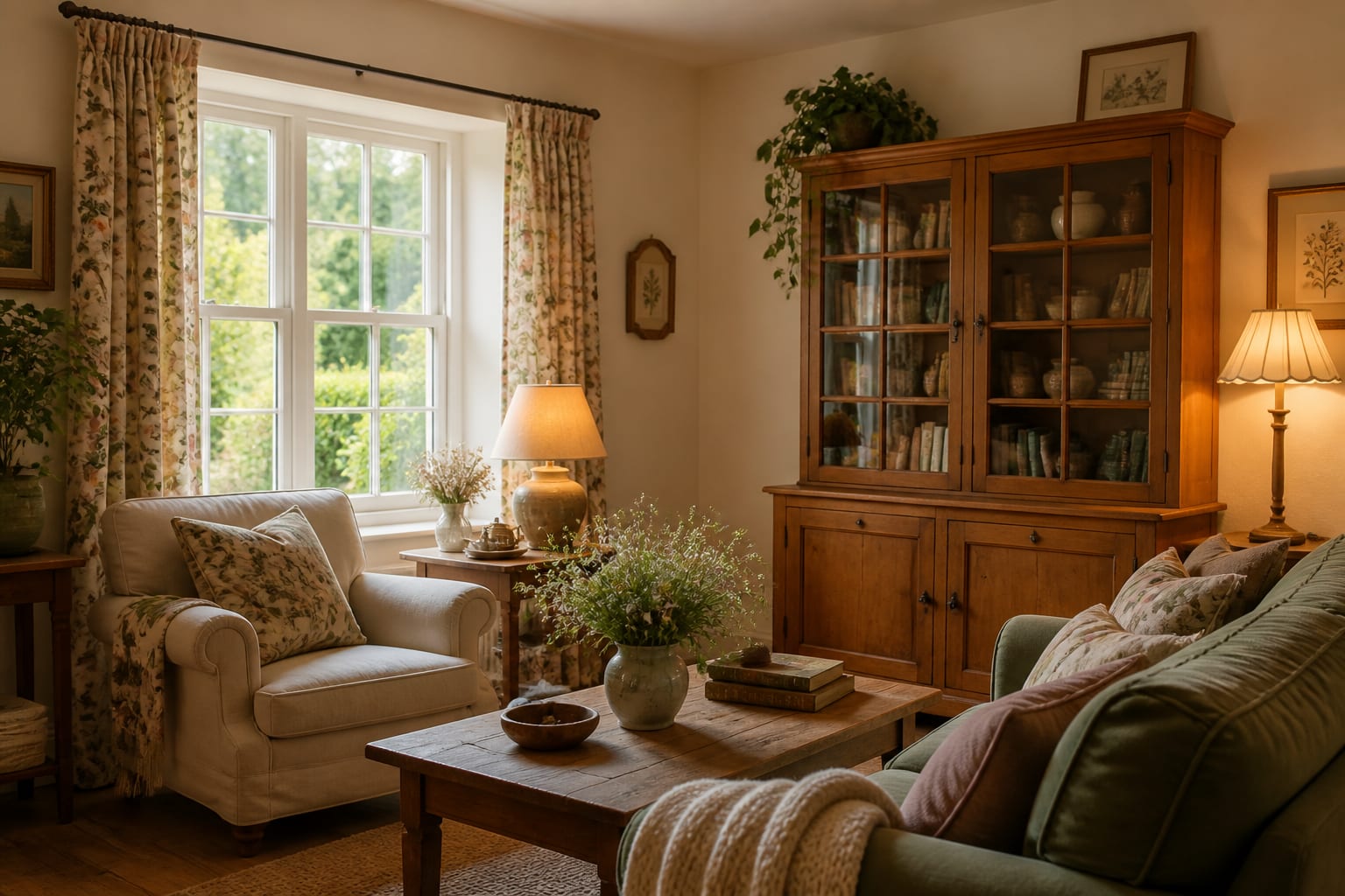
A strong cottagecore home usually has three layers. The first is a quiet base: cream walls, warm white trim, wood floors, stone, plaster, beadboard, or simple tile. The second is the garden layer: botanical prints, leafy greens, faded rose, dusty blue, ochre, terracotta, or a restrained floral fabric. The third is the human layer: books, ceramics, baskets, quilts, collected art, and lamps that make the room comfortable after dark.
If you want to go deeper on palette before choosing paint, this cottagecore color palette guide is the natural next step. Color is not decoration here; it is what keeps the whole house from tipping into either sugary or gloomy.
What materials and colors make cottagecore feel grown up?
Cottagecore needs tactility more than novelty. Linen, cotton, wool, unfinished or gently stained wood, stoneware, terracotta, iron, brass, ceramic, rattan, beadboard, plaster, and botanical paper all make sense because they have texture under the eye. Glossy plastic, high-shine chrome, blue-white LED light, and matching furniture sets usually fight the mood.
Start with colors that look slightly weathered. Cream, bone, oatmeal, putty, mushroom, sage, olive, dusty blue, faded rose, butter yellow, muted ochre, clay, and warm brown all sit comfortably in the style. The more saturated the color, the more it needs grounding: dusty rose looks better with walnut or bronze than with more pink, and sage looks stronger when it touches cream, blackened iron, or old pine.
Use this simple structure when a room feels confusing:
- Choose one quiet base over the largest surfaces, such as walls, sofa, bedding, tile, or curtains; keeping about 60% of the room calm gives florals and vintage pieces room to breathe.
- Add one nature-based midtone on roughly 30% of the room, such as a painted cabinet, patterned drapery, a rug, a quilt, or a large chair; this is where the cottage feeling becomes visible without taking over.
- Finish with a darker 10% through wood, metal, frames, lampshades, or a deeper stripe; cottagecore without shadow can look washed out, especially in rooms with pale flooring.
- Keep bulbs warm, usually 2200K–2700K for bedrooms and living rooms; warmer light makes cream paint, brass, wood, and faded textiles feel intentional at night.
Pattern should be handled with restraint. One floral curtain, one block-print quilt, or one wallpapered wall can carry a room. Once florals appear on the rug, pillows, lampshade, bedding, and art all at once, the room loses hierarchy. Let checks, ticking stripes, plain linen, woven baskets, and solid wood do the supporting work.
How do you build cottagecore room by room?
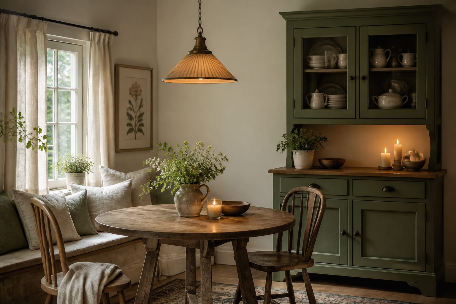
A whole home cottagecore look should repeat materials without making every room identical. The hallway might carry the cream wall color, the kitchen might carry sage and brass, the bedroom might carry faded blue and linen, and the bathroom might carry a floral curtain instead of green paint. Repetition makes the house feel collected; duplication makes it feel themed.
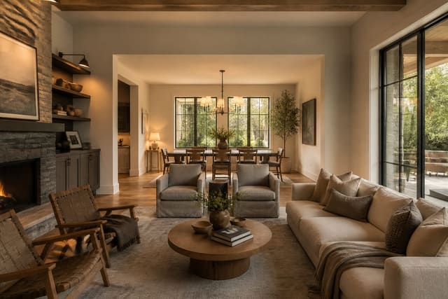
In the living room, choose comfort first. A linen or cotton-covered sofa, a wood coffee table, a shaded lamp, and a rug that extends at least 6 in–12 in past the front legs of the main seating will do more than a shelf full of trinkets. If the room is small, one large botanical print can be better than a crowded gallery wall.
In the kitchen, cottagecore should help the room work. Cafe curtains, open shelves for daily dishes, aged brass pulls, a peg rail, a runner, or a freestanding hutch can soften hard cabinets. Keep at least 24 in of clear counter near the sink or range if you cook often; charm becomes irritating when it steals prep space.
In the bedroom, the bed is the main story. Use breathable sheets, a quilt or coverlet, and a duvet rather than stacking decorative pillows nobody wants to move. Nightstands should land within about 2 in of the mattress height, and bedside lamps around 20 in–28 in tall usually give the room better proportion than tiny accent lamps.
In the bathroom, pick moisture-safe romance. A cotton shower curtain, sealed wood stool outside splash zones, ceramic tray, glass jars, framed botanical art behind glass, and warm vanity bulbs can shift the mood without making cleaning harder. For a standard 5 ft x 8 ft bath, the shower curtain is often the largest pattern surface, so choose it carefully.
In entries and utility spaces, use hooks, benches, baskets, washable runners, and painted storage. Cottagecore should make muddy shoes, dog leashes, market bags, towels, and mail look managed. That is where the style becomes livable instead of merely pretty.
Common cottagecore design mistakes
The most common cottagecore design mistakes come from buying symbols of the style instead of building the atmosphere. The fix is not to remove personality; it is to give the room discipline.
- Buying too many tiny themed objects makes the home feel like a gift shop; choose fewer pieces with scale, such as a 24 in x 36 in botanical print, a real wood hutch, a large quilt, or full-length linen curtains.
- Using pure white everywhere can make vintage wood and floral fabric look dingy by contrast; switch to cream, plaster, warm white, or putty when the room needs softness.
- Forgetting storage turns charm into clutter; use closed drawers, lidded boxes, skirted bases, or a freestanding cabinet before styling open shelves.
- Choosing only pale colors removes the depth cottagecore needs; add walnut, olive, oxblood, blackened iron, bronze, terracotta, or a darker frame to anchor the room.
- Hanging curtains too low weakens the architecture; mount rods 6 in–10 in above the casing and extend them 8 in–12 in beyond each side when wall space allows.
Another mistake is treating vintage pieces as automatically better. A wobbly table, musty rug, or cracked chair is not romantic if it makes daily life harder. Look for sturdy joinery, washable covers, smooth drawers, solid lamp wiring, and rugs with enough pattern to forgive pets, kids, and shoes.
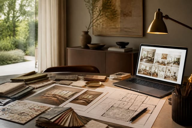
Use AI design to test cottagecore before paint or purchases
Cottagecore is difficult to judge one item at a time because the style depends on relationships: wood against wall color, floral scale against room size, brass against appliance finish, and warm light against existing tile. Uploading a photo of your room to Re-Design lets you preview those relationships before you buy paint, curtains, wallpaper, hardware, or a secondhand cabinet.
Use the preview as a decision tool, not a fantasy machine. Keep your real windows, ceiling height, flooring, cabinet runs, sofa size, and doorways visible enough that the result respects the house you actually have. Then test specific versions: one with florals on textiles, one with color on furniture, and one with pattern on the wall.
This is especially helpful if your home has rental flooring, orange wood, gray tile, north-facing rooms, or furniture you need to keep. If you want to understand why clear prompts and specific design language matter, read how AI search cites interior design advice. If you are comparing a preview with reality, the guide to AI room visualization accuracy will help you judge what to trust and what to verify with samples.
The best preview is the one that helps you remove an idea. If floral wallpaper makes the room feel smaller, try curtains. If sage paint turns muddy, test putty or dusty blue. If the vintage cabinet crowds the walkway, choose a wall shelf no deeper than 8 in instead.
What final details make cottagecore feel personal, not precious?
The final layer should connect to habits, not hashtags. A cottagecore home feels convincing when there is evidence of real life: a reading lamp beside the chair you use, a bowl for keys, a stack of linen napkins, a herb pot near the kitchen window, a quilt folded where someone naps, or a small framed landscape from a place you remember.
Hang art at 57 in–60 in on center when it stands alone, or keep 2 in–3 in between frames in a small grouping. Let curtains touch or nearly touch the floor. Keep tabletop arrangements low enough that people can talk across them. Use one tray near a sink or dresser, not three competing clusters.
The doorway test is ruthless and useful. Stand where you first see the room and remove the object that shouts the theme the loudest. If the space still has warmth, nature, texture, storage, and comfort after that edit, you have cottagecore design rather than cottagecore costume.