A 1990s color scheme updates with AI when you photograph the room, mark the dated finishes the AI should swap (oak cabinets, hunter green accent wall, brass-and-glass fixtures, salmon-pink carpet), and preview three palette directions on the same room — warm modern neutrals, sage and walnut, or warm whites and brass — before paying for any actual paint or replacement work. Mauve carpet, shiny brass knobs, hunter green walls, burgundy valances, and yellow beige paint can make an otherwise solid home feel stuck in a catalog from 1996. My opinion is blunt: the mistake is usually not one dated color, but the way all of those colors are still being treated as equally important. You do not need to bleach the house into white and gray to fix it. You need a stricter palette, better light, and a sequence that keeps the expensive pieces from driving every decision.
What is the cleanest way to update a 1990s color scheme?
You update a 1990s color scheme in your home by choosing one fixed finish to respect, muting the dated accent colors, replacing shiny brass selectively, and repeating a calmer neutral palette through paint, textiles, lighting, and hardware. The fastest path is not a total purge; it is a ranking exercise.
Start with the surfaces that would cost real money or real mess to change: flooring, tile, countertops, large sofas, built-ins, fireplace stone, and cabinets. If the whole house has pink beige tile, cherry-stained cabinets, or honey oak floors, those finishes get a vote before any paint swatch does. Fighting them with cold gray is how many 90s updates end up looking newer but not better.
Most 1990s palettes need one of three routes. If the fixed finishes are warm beige, honey wood, or cream tile, use softened white, oatmeal, camel, olive, tobacco, warm black, and aged brass. If the house leans pink beige or mauve, move toward taupe, mushroom, plum-brown, stone, muted blue, and dark bronze. If hunter green or burgundy is still everywhere, keep one deep color as an accent and reduce the rest to smaller moments.
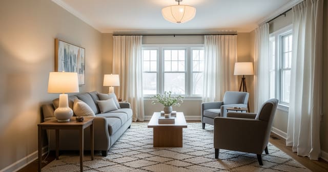
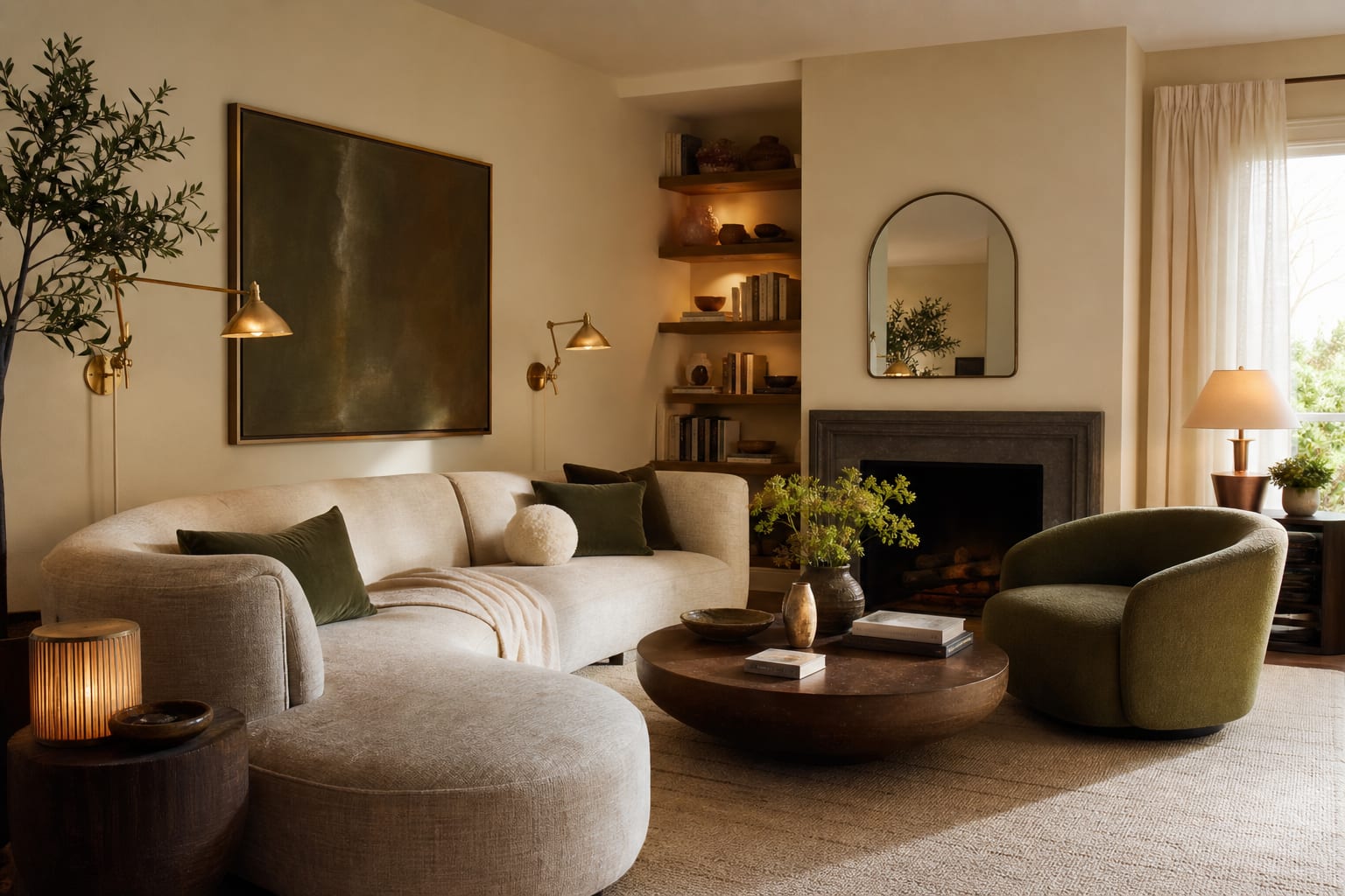
A practical balance is 70% calm background, 20% warm or earthy support, and 10% sharper contrast. That might mean cream walls, walnut furniture, olive textiles, and black frames. It might mean mushroom walls, ivory curtains, dark bronze hardware, and one burgundy note in art. The point is to stop letting mauve, brass, green, burgundy, oak, and beige all speak at full volume.
If the walls are still the original tan, read the strategy in updating builder beige walls without a big renovation before repainting. Beige from the 90s often looks worse because the lighting, trim, and textiles around it are vague, not because beige itself is impossible.
Which 1990s colors and finishes deserve to stay?
Keep the pieces that have good material, useful scale, or architectural value. Replace or reduce the pieces that are flimsy, glossy, undersized, or repeated so many times that they make the house feel packaged.
Honey oak can stay when it is real wood, in good condition, and balanced with cream, olive, black, clay, or muted blue. It struggles beside icy gray walls, blue-white trim, and chrome everything. Cherry and mahogany can stay when the room has enough relief: pale rugs, larger lampshades, matte finishes, and art that adds cooler depth. Burgundy can become elegant when it appears once in a rug, print, or pillow; it becomes dated when it covers a sofa, valance, border paper, and dining chair seats.
Mauve needs the most discipline. A small amount of dusty rose can work with mushroom, taupe, cream, walnut, and black. A full mauve-and-green scheme usually needs editing, especially if the carpet, wallpaper border, and floral fabric are all still present. If mauve carpet is staying for budget reasons, do not add more pink beige. Use cream, warm charcoal, olive-gray, walnut, and textured neutrals to make the carpet look quieter.
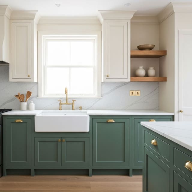
Brass is not the enemy. High-gloss yellow brass on every hinge, faucet, doorknob, chandelier, and cabinet knob is the problem. Keep brass where the shape is clean and the tone is softer. Aged brass picture lights, simple cabinet pulls, or a good lamp can look current. Tiny shiny knobs, scroll chandeliers, and builder-grade faucet trim usually age the room from across the doorway.
Dark stained paneling and built-ins deserve a separate judgment. Some 1990s rooms have genuine woodwork hiding under bad styling, while others have thin sheet paneling that only contributes brown noise. If a paneled family room is part of the issue, compare paint, removal, and preservation with the dark wood paneling update options before you cover everything in white primer.
Test this on your own room photo with ReDesign before you choose the final direction; keep the doorway, walls, windows, main furniture, lighting, and awkward fixed features visible so the preview solves the room you actually have.
Common mistakes that make a 90s update look worse
The first mistake is replacing every dated color with cool gray. Gray felt like the antidote to beige for years, but blue-gray walls beside honey oak, mauve tile, or warm brass can make the old finishes look louder. If the fixed surfaces are warm, choose warm white, mushroom, olive-gray, flax, putty, or muted blue instead of a cold gray that refuses to speak to the room.
The second mistake is keeping the wallpaper border spirit alive in new form. Removing a floral border and then adding a row of tiny themed signs, small gallery frames, or patterned valances keeps the same chopped-up feeling. Use fewer, larger moves: one 30 by 40 inch artwork, full-height curtains, a substantial mirror, or a single patterned rug with enough scale to hold the room.
The third mistake is changing hardware without changing lighting. New pulls will not rescue a kitchen or bath if the room is still lit by yellowed shades, weak bulbs, or a single overhead fixture. Choose bulbs in the 2700K–3000K range for most living spaces, and use 90 CRI or higher when you care about paint, wood, and fabric reading accurately. A 14–18 inch fabric lampshade often does more for a dated beige room than another decorative tray.
The fourth mistake is buying tiny accents in a trendy color. A teal vase, two black knobs, or one sage pillow cannot pull an entire 90s palette forward. Repeat the new direction at low, middle, and high levels: a rug line, a pillow or chair fabric, and art above eye level. Repetition makes the update look intentional rather than nervous.
The fifth mistake is ignoring window treatments. Short balloon valances, heavy swags, and shiny rods are some of the fastest tells of a 1990s room. Mount drapery rods about 7–10 inches above the casing when wall height allows, extend them 8–14 inches wider than the window, and let panels finish just above the floor. Linen, cotton, or a quiet stripe in cream, flax, mushroom, or warm white usually calms the architecture without turning the room bland.
How AI design helps you preview the update before you buy
AI design is especially useful for a 1990s color scheme because the problem is relational: mauve changes beside oak, brass changes under warm bulbs, and hunter green changes when the rug gets lighter. Uploading a real room photo lets you test a palette strategy before buying paint, ordering hardware, or donating furniture that may only need better surroundings.
Photograph the room from the main doorway or a back corner so the image includes the floor, ceiling line, windows, largest furniture, trim, and at least two walls. Do not crop out the awkward tile, dated brass, dark cabinet, or beige carpet. Those fixed pieces are the very surfaces the preview needs to solve.
Run focused versions, not fantasy renovations. Try one preview that keeps the beige walls but changes textiles, lighting, and hardware. Try one with warm white walls, olive accents, and black details. Try one with mushroom, cream, and dark bronze. Try one that keeps the wood but removes the burgundy and mauve. If the tool replaces the floors, cabinets, sofa, and windows in every version, narrow the prompt until the room still looks like yours.
This is also where bad lighting reveals itself. A generated room may look better simply because the light appears cleaner and more even. If your actual room has one dim ceiling fixture or a north-facing window, use the practical moves in creating fake natural light in any room alongside the color plan. The 90s palette may be less offensive once the shadows stop turning beige into mud.
Use the best preview to make a shopping list in order. Paint samples on 12 by 18 inch boards come before gallons. One hardware sample comes before forty pulls. One curtain panel comes before a whole house order. The preview should reduce returns and second-guessing, not encourage you to replace every visible surface at once.
What should you change first for the biggest 90s-to-current shift?
Begin with lighting and the largest soft surfaces. Replace weak bulbs, add lamps at seated height, and remove shades that are too small, too yellowed, or too dark. Then address curtains, rugs, bedding, and upholstery covers before you attack every cabinet and fixture. These surfaces occupy more visual space than accessories and can make the remaining 90s pieces look selected instead of stranded.
In a living room, start with a rug large enough to connect the seating. An 8 by 10 foot rug is often the minimum for a standard sofa and two chairs; a 9 by 12 foot rug is better in larger rooms. Choose a pattern that includes one existing fixed color in a small amount and introduces the new direction more clearly.
In a bedroom, change bedding before case goods. Ivory, oatmeal, warm white, muted blue, olive, or mushroom bedding can soften cherry or honey furniture without pretending the set is new. Add two lamps with shades wide enough to matter, then update art or mirror frames in black, dark bronze, warm wood, or aged brass.
In a kitchen or bath, decide whether the brass, tile, or wall color is doing the most damage from the doorway. If the tile is sound and the cabinets are usable, start with bulbs, a simpler fixture, cleaner hardware, and a wall color that respects the fixed undertone. If every surface is glossy beige, mauve, and brass, choose one finish to calm first rather than scattering small upgrades everywhere.
A 1990s home does not become current by denying its warm bones. It becomes current when the palette is edited, the metals are chosen instead of inherited, and the lighting finally lets the good materials look intentional.
Frequently Asked Questions
What 1990s colors look most dated today?
Hunter green walls, salmon and dusty rose carpets, peach-toned tile, brass-and-glass fixtures, mauve and grey-blue accents, and high-contrast oak-against-white-laminate kitchens read as the most dated 1990s tells. Use the room photo to compare the visible layout and fixed constraints before committing, because door swings, windows, outlets, storage reach, circulation, and existing furniture decide whether the idea survives daily use.
What palette replaces 1990s colors best?
Warm whites or warm greiges on the walls, walnut or oak wood tones (returned as a feature, not a default), one muted accent (sage, navy, terracotta), and matte black or unlacquered brass hardware replace the 1990s palette without erasing the era's warmth. Keep the preview honest by leaving the problem area visible in the frame, then compare one conservative version against one bolder version before you buy lighting, paint, furniture, or storage.
Can AI design preview new colors in my actual room?
Yes — upload one photo of the room, ask the AI to keep the architecture and furniture fixed and swap the wall color, cabinet color, or carpet to your tested palette; this previews the update before any paint or replacement work. Check the result against ordinary movement first: drawer clearance, chair pullout, walkway width, glare, switch access, and sightlines matter more than a perfect catalog angle.
What single 1990s color update has the biggest impact?
Replacing the wall color with a warm off-white or warm greige delivers the biggest visual update for the lowest cost; saturated 90s wall colors (hunter, dusty rose, peach) read as the loudest era tell in every room. Use the image to narrow priorities and measurements before ordering anything custom; final purchases still need real dimensions, outlet locations, installation limits, and product clearances.
Should I keep any 1990s finishes when updating?
Yes — solid oak floors, brass fixtures (when unlacquered or aged), and any solid wood furniture often read modern in a current palette; ripping out everything is rarely the cheapest or best-looking path. If the preview invents architecture or hides the awkward feature you need solved, rerun it with stricter instructions so the result remains tied to your actual room.
Three transformations to try
- Warm-greige walls replacing 1990s hunter green
- Walnut cabinet refinish with warm-white walls
- Brass and navy accent replacing peach-and-mauve