Builder beige updates best by shifting to a warm white with a touch of beige (Sherwin Williams Alabaster, Benjamin Moore White Dove), a warm greige (Agreeable Gray, Edgecomb Gray), or a deep contrast on one accent wall — each tested against the existing trim and floor before any paint purchase. Builder beige walls are not automatically ugly; they are usually undirected. My firm opinion: the worst thing you can do is throw random “colorful” accessories at them and hope the beige wakes up. That tan wall color already has an undertone, and the room will look better the moment you choose whether to cooperate with it, cool it down, or make it the quiet background. This guide gives you three clear routes so the walls stop feeling like a default setting.
How do you update builder beige walls without a big renovation?
You update builder beige walls without a big renovation by choosing one clear palette route, correcting the light, and repeating the new colors through textiles, art, trim, and hardware before you repaint. Beige only looks bland when every nearby finish is also vague: tan carpet, yellow bulbs, brown furniture, cream pillows, and no contrast.
Start by identifying the beige undertone. Hold a plain white sheet of paper against the wall in daylight. If the wall turns peach, yellow, green, or gray beside that paper, you have your clue. Do not pick a new rug, curtain, or sofa fabric until you know which family the wall belongs to.
A builder grade paint color update usually follows one of three routes:
- Choose the warm route when the beige leans yellow, sand, or camel. Add ivory, oatmeal, cognac, olive, unlacquered brass, and warm black. Keep bulb color around 2700K to 3000K so the room feels intentional instead of dingy.
- Choose the cool route when the beige has a gray or pink cast. Bring in mushroom, taupe, slate blue, soft charcoal, linen white, and brushed nickel. The key is muted color, not icy white, because blue-white trim can make beige look dirtier.
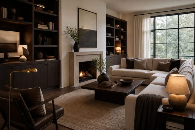
- Choose the contrast route when you cannot change the walls but want the room to feel sharper. Use black frames, deep green, navy, terracotta, or a strong patterned rug, then repeat that darker note at least three times so it reads as design, not clutter.
If the room feels flat even after you pick a route, fix the light before judging the color. The tactics in creating fake natural light in any room are especially useful with beige because weak light turns every undertone muddy.
Which palette route should your beige walls take?
The right route depends on what the beige is already fighting. Look at the fixed finishes first: flooring, tile, countertops, fireplace stone, cabinet color, and any large sofa you cannot replace. Those surfaces outrank pillows because they occupy more visual space and cost more to change.
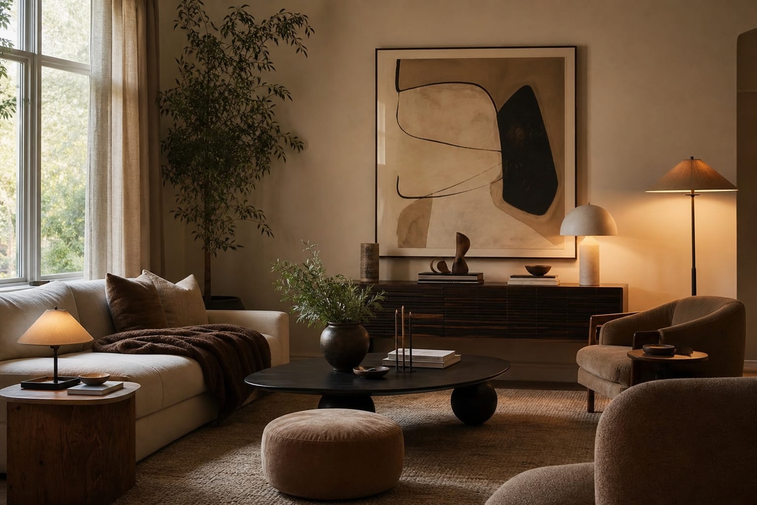
For a warm beige room, lean into richness instead of pretending the walls are white. A camel leather chair, cream linen curtains, olive pillows, and black picture frames can make beige look like a deliberate neutral. Use one pale surface at scale, such as an 8 by 10 foot rug in a living room or a full bed of ivory bedding in a bedroom, so the wall color has something lighter to play against.
For a cooler beige room, avoid orange wood, bright brass, and yellow cream fabrics. Try taupe upholstery, stone-colored lamps, blue-gray art, and off-white shades. If you use white, choose a softened white rather than a blue-white; the trim should look cleaner than the wall without making the wall seem stained.
For a contrast route, beige becomes the backdrop rather than the star. Hang one piece of art at 24 by 36 inches or larger, use a black or dark bronze curtain rod, and add a rug with a real dark line in the pattern. Contrast works best when it is thin and repeated: a black lamp stem, a black frame, and a dark side table are usually stronger than one heavy black cabinet.
Test this on your own room photo with ReDesign before you choose the final direction; keep the doorway, walls, windows, main furniture, lighting, and awkward fixed features visible so the preview solves the room you actually have.
What changes make builder-grade paint look intentional?
The fastest improvements are the surfaces that touch the wall visually: curtains, art, trim contrast, lighting, and the first large textile on the floor or bed. Beige walls look unfinished when every edge is weak, so give the room a few crisp boundaries.
Hang curtains higher and wider than the window frame. A rod 6 to 8 inches above the casing and 8 to 12 inches beyond each side makes the wall look planned, not leftover. Let panels finish about 1/2 inch above the floor; short beige curtains against beige walls almost always read as builder-basic.
Choose art with the wall color in mind, not against it. If the beige is warm, art with ivory, rust, olive, black, or tobacco tones will connect. If the beige is cooler, look for charcoal, muted blue, plum-brown, stone, or chalky white. Over a sofa, art should be roughly two-thirds the sofa width, or the wall will still feel empty no matter how good the palette is.
Replace undersized lampshades and cold bulbs. A 14 to 18 inch linen shade on a table lamp gives beige a softer edge, while high-CRI bulbs help colors stay accurate. In a room with one small window, a mirror can help, but only when it reflects a lamp, window, pale curtain, or open sightline. The same principle behind using mirrors to amplify light applies here: a mirror that doubles beige carpet and a blank wall is not doing the room any favors.
Trim is the bigger decision. If you own the home and can paint, a warm white trim can clean up yellow beige, while deep charcoal trim can make the contrast route feel architectural. In a rental, get a similar edge with black curtain rods, framed art, plug-in sconces, peel-and-stick picture molding, or a darker lampshade.
Common beige wall mistakes that keep the room bland
The most common mistake is buying only mid-tone pieces. Beige wall, tan sofa, medium wood table, oatmeal rug, and cream pillows may sound calm, but the eye has nowhere to land. Add either a light large surface or a dark repeated accent so the palette has range.
Another mistake is choosing white that is too clean. Bright white shelves, blue-white bedding, and cool white bulbs can make warm beige look yellow by comparison. If the wall leans warm, choose ivory, flax, chalk, or warm white, then save bright white for paper, ceramics, or tiny details.
Do not ignore the floor. Builder beige walls beside beige carpet need contrast more than they need another beige throw. If you cannot replace carpet, use a rug with a different texture and visible pattern; even a flatweave with charcoal, olive, or rust lines can separate the furniture from the floor.
Do not spread accent colors evenly across the room like sprinkles. Pick one main accent and repeat it at three heights: low in the rug or ottoman, middle in pillows or upholstery, high in art or a lampshade. That vertical repetition makes a beige room feel designed rather than decorated in isolated purchases.
Finally, do not treat every opening as separate. Beige walls often run through halls, living rooms, entries, and kitchens, so color decisions leak from one zone into the next. If the space has several doorways, borrow the discipline used for a room with too many doorways: keep the visible neighboring colors quieter, and let one zone carry the stronger accent.
Use AI design to test beige walls before paint
AI design is particularly helpful with beige because the wrong move can look fine as a swatch and wrong across four walls. Upload a straight photo of the actual room, then test the warm, cool, and contrast routes while keeping the existing walls in place. The useful preview is not the fantasy version where the flooring, sofa, windows, and budget all disappear.
Take the photo from a doorway or corner so the preview includes at least two walls, the floor, the ceiling line, and the largest furniture. Open curtains, turn off harsh overhead lights if they distort the color, and leave the room tidy enough that the palette is visible. If you normally use lamps at night, run a second photo with lamps on; beige can look completely different after sunset.
Ask for focused versions. One version should make the beige warmer with camel, olive, cream, and black. One should cool it with taupe, slate, chalky white, and charcoal. One should add contrast through dark frames, a stronger rug, and bolder art. Keep the same sofa and main furniture in every version so you can judge the wall strategy, not a pretend shopping spree.
When a preview works, translate it into the lowest-risk changes first. Order 18 or 20 inch pillow covers, test curtain panels, tape up art dimensions with painter’s tape, or buy one lamp shade before replacing a whole room. Beige walls can look expensive, but only when the palette has a point of view.
Frequently Asked Questions
What is the problem with builder beige walls?
Mid-1990s through 2010s builder beige (Navajo White, Practical Beige) has a pink-yellow undertone that fights with cool-white trim and cool-toned floors; the clash reads dated regardless of furniture choice. Use the room photo to compare the visible layout and fixed constraints before committing, because door swings, windows, outlets, storage reach, circulation, and existing furniture decide whether the idea survives daily use.
What is the best replacement color for builder beige?
For neutrals that read current, choose a warm white with the slightest beige cast (Alabaster, White Dove) or a true warm greige (Agreeable Gray, Edgecomb Gray); both read fresh without losing wall warmth. Keep the preview honest by leaving the problem area visible in the frame, then compare one conservative version against one bolder version before you buy lighting, paint, furniture, or storage.
Can I just paint over builder beige with cool white?
You can, but pure cool white (Chantilly Lace, Decorators White) against warm trim and warm-toned floors often reads sterile; balance the white against floor tone first, AI preview confirms the read. Check the result against ordinary movement first: drawer clearance, chair pullout, walkway width, glare, switch access, and sightlines matter more than a perfect catalog angle.
Should I do an accent wall instead of repainting everything?
An accent wall in deep green, navy, or warm brown updates the room without a full repaint; this works best when the existing beige is at least one shade cleaner than 1990s Navajo White. Use the image to narrow priorities and measurements before ordering anything custom; final purchases still need real dimensions, outlet locations, installation limits, and product clearances.
Does AI preview the wall color shift?
Yes — upload the room photo and AI previews three replacement colors against the existing furniture and floor so you commit to the right shift before opening any paint cans. If the preview invents architecture or hides the awkward feature you need solved, rerun it with stricter instructions so the result remains tied to your actual room.
Three transformations to try
- Warm white walls replacing builder beige
- Greige walls with existing brown furniture
- Deep green accent wall against builder beige