The 60/30/10 rule is the most reliable shortcut to a balanced room, so learn it once and you will stop guessing at color proportions forever. Most amateur palettes fail not because the colors are wrong but because they appear in the wrong amounts. The rule assigns roughly 60% of a space to a dominant color, 30% to a secondary color, and the final 10% to an accent, creating a clear hierarchy the eye finds restful. The 60 grounds the room, the 30 supports and adds interest, and the 10 delivers the pop that brings the scheme alive. Apply these percentages deliberately and almost any color combination snaps into a composed, intentional whole.
What the 60/30/10 Rule Actually Means
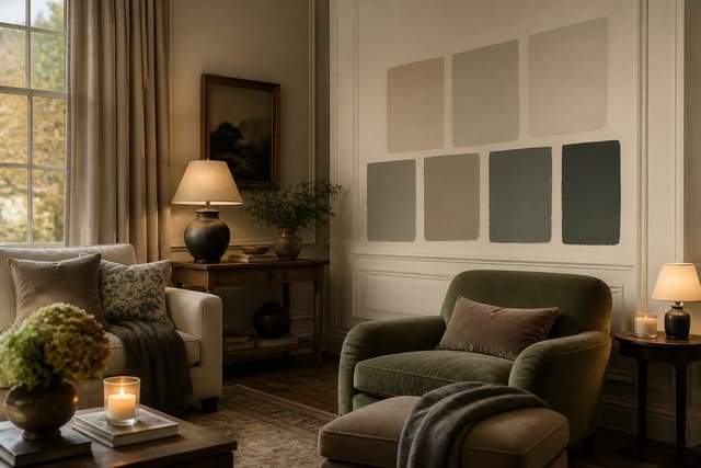
The 60/30/10 rule splits a room's color into three proportions that build a visual hierarchy. The dominant color fills about 60% of the visible space and usually lives on the walls, the largest rug, or major flooring, acting as the calm backdrop that everything else sits against. The secondary color covers roughly 30% and typically shows up on upholstery, an accent wall, draperies, or cabinetry; it contrasts enough with the dominant to add interest but supports rather than competes. The accent color is the final 10%, the smallest and boldest share, delivered through pillows, artwork, a vase, lamps, or a single statement chair. These percentages are guidelines, not laboratory measurements, so think 60-ish, 30-ish, and 10-ish rather than counting square inches. The point is the ratio of dominance: one color clearly leads, one clearly supports, and one clearly punctuates. This hierarchy is why designed rooms feel resolved while DIY rooms often feel busy; a space with three colors in equal thirds gives the eye nowhere to rest and reads as chaotic. The rule traces back to classic design proportion and works because the human eye prefers a clear focal structure over competing equals. You can extend it for more complex schemes by treating the 10% as two smaller 5% accents, or by using tints and shades of the dominant color within its 60% to add subtle depth without breaking the ratio. The rule also scales: it applies to a single room, but you can run a consistent dominant across an open plan and vary the 30 and 10 by zone. Understanding the rule as a hierarchy of dominance, not a rigid math problem, is what lets you apply it flexibly to any room you tackle next.
See also our guide to Two Tone Paint Ideas for more on 60 30 10 color rule interior design.
Applying 60/30/10 in the Living Room
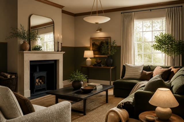
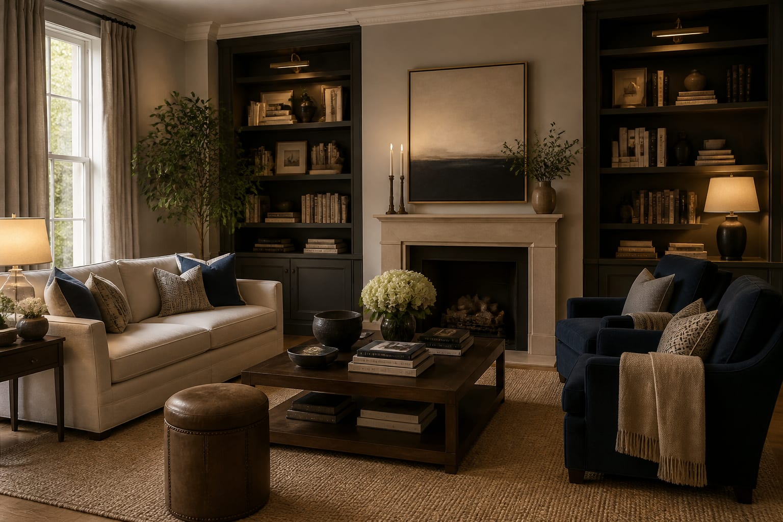
The living room is the easiest place to see the rule in action because it has so many surfaces to assign. Start with your dominant 60%, which in most living rooms means the wall color plus the largest area rug working together as the backdrop. A warm greige on the walls echoed by a rug in a related tone reads as one quiet field that frames everything else. Move to the secondary 30%, most often the sofa and any large drapery; a deep teal or olive sofa against neutral walls supplies the supporting color and the first real contrast. If your sofa is neutral too, push the 30% onto curtains, an accent wall, or a pair of armchairs in a distinct color. Finally, place the 10% accent, the boldest and most fun, across throw pillows, a piece of art, a ceramic lamp, or a single mustard ottoman. The accent should appear in at least two or three spots so it reads as a deliberate thread rather than one random object; a rule of thumb is to repeat the accent color a minimum of three times around the room. Resist the urge to spread the accent too thin, because past roughly 10% it stops being a punctuation and starts competing with your secondary color. Watch the rug, since an oversized patterned rug can accidentally become the dominant color and throw your whole ratio off. If you crave more energy, vary texture within each share rather than adding a fourth color, layering a chunky knit and a smooth velvet in the same secondary hue. Stand in the doorway and squint; a balanced room shows clear masses of 60, 30, and 10 rather than a confetti of equal patches. Get the living room right and the same logic transfers to every other space.
For a related angle on 60 30 10 color rule interior design, read How To Choose Paint Colors.
Adapting the Rule for Bedrooms, Kitchens, and Baths
Each room offers different surfaces to carry the three shares, so the rule bends to fit. In a bedroom, the dominant 60% is usually the wall color and the bedding's base, the secondary 30% comes from an upholstered headboard, a bench, or curtains, and the 10% accent lands on a throw, lumbar pillows, or a piece of art above the bed. Because bedrooms aim for rest, many people choose a soft, low-contrast version of the rule, keeping the 60 and 30 close in value and letting the 10 supply the only real pop. Kitchens shift the surfaces dramatically: cabinetry often becomes the dominant 60%, the walls and backsplash share the secondary 30%, and the accent 10% shows up in bar stools, small appliances, or a runner. A two-tone kitchen, with lower cabinets darker than uppers, can split that 60% itself while still reading as the dominant field. In bathrooms, tile usually claims the dominant share, wall paint or a vanity provides the secondary, and towels, a stool, or framed art give the 10% accent that is cheap to change seasonally. Wherever you apply it, count the fixed elements first, since flooring and counters you cannot change are already eating into your percentages and may dictate the dominant or secondary color for you. In smaller rooms, lean the dominant 60% toward a lighter color to keep the space open, and let the accent carry the personality. Repeat each color at least twice in every room so none feels accidental. The beauty of the rule is its portability; once you can identify which surfaces should hold the 60, the 30, and the 10 in any given room, you can compose a balanced palette anywhere in the home with confidence.
Common Pitfalls and How to Keep the Ratio Honest
The rule is forgiving, but a few habits quietly break it. The most frequent is creeping toward equal thirds, where the accent grows until you effectively have three co-dominant colors and the room loses its focal point. Keep the accent disciplined at roughly 10% and let it stay the smallest share. Another pitfall is forgetting that fixed elements count toward your totals; a strong wood floor or a bold countertop may already be your dominant or secondary color, so adding more competing color overloads the scheme. Audit what is already there before you shop. People also mistake pattern for a single color; a busy multicolor sofa can read as two or three colors at once, blowing past its 30% allotment, so treat a strong pattern as more than one share. A third trap is choosing an accent that does not relate to the other two; the 10% should harmonize or deliberately contrast, not float in from an unrelated palette. Texture confusion trips up others, who add a fourth and fifth color seeking interest when varying material within the existing three shares would have added depth without clutter. Lighting can also distort the ratio, since a warm 2700K bulb deepens warm accents and a cool 4000K bulb mutes them, shifting how dominant each color feels at night. Finally, many forget to repeat each color, dropping a single accent object that looks orphaned; echo every color in at least two or three places so the eye connects them. To keep yourself honest, photograph the room and convert the image to grayscale; the value masses reveal instantly whether one color truly dominates or whether your supposed 60, 30, and 10 are actually fighting as near-equals. Correct the proportions, not the colors, and most off-feeling rooms come right.
Here are the common mistakes to avoid: - Letting the 10% accent grow until you have three co-dominant colors competing. - Forgetting fixed floors and counters already count toward your color percentages. - Treating a busy multicolor pattern as one color, blowing past its 30% share. - Choosing an accent color that does not relate to the dominant or secondary. - Dropping a single accent object so it looks orphaned instead of repeated. - Adding a fourth or fifth color for interest instead of varying texture within three.
Bring the look home with Re-Design
Seeing the 60/30/10 split before you commit is far easier than imagining it. Upload a photo of your room to Re-Design and preview how a dominant wall color, a secondary upholstery tone, and a bold 10% accent actually balance on your real surfaces before you buy any paint. Swap the dominant shade and test accent options so you can tell whether one color truly leads. Once the 60/30/10 balance looks right on screen, shop for the exact colors with no guesswork.
Frequently Asked Questions
What does the 60/30/10 rule mean in interior design?
It splits a room's color into three proportions: about 60% dominant, 30% secondary, and 10% accent. The dominant color usually covers walls and large rugs, the secondary appears on upholstery or drapes, and the accent shows up in pillows, art, or small objects. This hierarchy gives the eye a clear focal structure, which is why balanced rooms feel resolved rather than busy.
Do fixed elements like flooring count in the 60/30/10 split?
Yes. Floors, counters, and large tile you cannot change already occupy part of your percentages, often claiming the dominant or secondary share. Audit them before choosing paint or upholstery, because adding more color on top of a bold floor can overload the scheme. Working with fixed elements as part of the ratio keeps the room balanced instead of fighting itself.
Can I use more than three colors with this rule?
Yes, with care. Split the 10% accent into two smaller 5% accents, or use tints and shades of the dominant color within its 60% for depth. The key is preserving the hierarchy so one color clearly leads. Adding a true fourth competing color usually flattens the structure, so vary texture instead when you want more interest without breaking the ratio.