Warm versus cool is the single decision that sets a room's mood, so resolve it before you obsess over the exact shade. People agonize over hundreds of chips when the real fork is simply which side of the spectrum suits the space and its light. Warm colors carry red, orange, and yellow undertones that feel cozy and energizing; cool colors carry blue, green, and violet undertones that feel calm and crisp. The right pick hinges on light direction, with north-facing rooms craving warmth and south-facing rooms tolerating cool, and on bulb temperature, where a 2700K lamp warms everything and a 4000K bulb cools it. Read the light, then choose your side.
What Makes a Color Warm or Cool
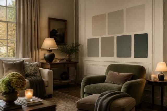
Every paint color sits somewhere on a temperature spectrum set by its undertone, the subtle bias hiding beneath the obvious hue. Warm colors are built on red, orange, and yellow, so think terracotta, mustard, caramel, and warm whites with a cream or beige base. Cool colors lean on blue, green, and violet, giving you slate, sage, navy, and crisp whites with a hint of gray or blue. The tricky part is neutrals, because grays, whites, and beiges all carry a quiet undertone that decides their temperature. A 'greige' can pull warm toward taupe or cool toward gray depending on which pigment dominates, and that subtle lean is exactly what makes two seemingly similar samples look completely different on the wall. To spot an undertone, place a candidate beside a true neutral like a pure white card; the bias jumps out by comparison. Warmth and coolness also affect perceived space and mood. Warm tones advance toward you, making large rooms feel cozier and more intimate, which is why they suit bedrooms, dens, and dining rooms meant for gathering. Cool tones recede, so they make small or low-light rooms feel a touch larger and more serene, fitting for bathrooms, offices, and bedrooms aimed at rest. Saturation matters alongside temperature: a pale warm blush reads gentle, while a deep warm brick reads intense, and the same range applies on the cool side from misty blue to inky navy. Light reflectance value, or LRV, tells you how much light a color bounces back, on a scale from 0 to 100; pairing temperature with the right LRV keeps a warm room from feeling heavy or a cool room from feeling stark. Knowing where a color sits on this spectrum is the foundation for every other choice.
See also our guide to Two Tone Paint Ideas for more on warm vs cool paint colors.
How Light Direction Changes Everything
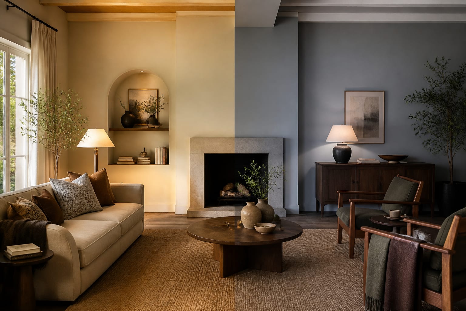
The same can of paint behaves like two different colors depending on the light a room receives, and orientation is the biggest factor. North-facing rooms, those whose main windows point roughly north, get cool, indirect, shadowless light all day. That light strips warmth out of colors, so cool paints can turn dreary and gray, while warm tones like soft terracotta, warm white, or buttery yellow restore balance and stop the space feeling cold. South-facing rooms enjoy strong, warm light for most of the day, which intensifies warm colors, sometimes too much, and lets cool blues and greens look their best without going dull. If you love a cool color, a south-facing room is where it will shine. East-facing rooms get warm golden light in the morning that shifts cooler and bluer by afternoon, so a flexible mid-tone that flatters both ends of the day works better than a color tuned to a single moment. West-facing rooms reverse that, staying neutral in the morning and glowing warm and intense near sunset, which can push an already warm paint into something overwhelming, so a cooler or more muted choice often balances them. Beyond direction, the amount of glazing matters; a room with floor-to-ceiling glass amplifies whatever the orientation delivers, while a single small window mutes it. Trees, neighboring buildings, and overhangs filter and color the incoming light too, so a green canopy outside can cast a faint green tint onto pale walls. The practical rule is simple: fight cool light with warm paint and let warm light carry cooler colors. Always confirm by taping a sample to the relevant wall and watching it from sunrise to dark, because describing light is no substitute for seeing your color in the exact exposure it must live in every day.
For a related angle on warm vs cool paint colors, read How To Choose Paint Colors.
Matching Bulbs and Temperature to Your Paint
Natural light only rules during daylight; after dark, your bulbs take over and can completely rewrite a color's temperature. Bulb color is measured in kelvin, and the number on the box tells you what to expect. A 2700K bulb gives a warm, yellowish glow close to old incandescent light, and it pushes every paint color warmer, deepening reds and yellows while muddying cool blues toward gray-green. A 3000K bulb is a slightly cleaner warm white, still cozy but less yellow. A 4000K bulb is a neutral-to-cool white that flattens warm tones and lets cool colors read true and crisp, which is why kitchens and bathrooms often use it. Anything at 5000K or above is daylight-mimicking and quite blue, useful for task areas but harsh in a living room. The mistake is choosing paint under one light and lighting the room with another; a warm beige picked in a 4000K showroom can turn orange under 2700K lamps at home. Decide the mood first, then align paint and bulbs. For a cozy warm room, pair warm paint with 2700K bulbs and the effect compounds pleasantly. For a fresh, clean look, pair cool paint with 3500K to 4000K bulbs so neither fights the other. If you mix warm walls with very cool bulbs, the room can feel clinical, and cool walls under very warm bulbs can look dingy. Check the bulb's color rendering index too; a CRI of 90 or above shows colors more accurately than a cheap CRI 80 lamp that can dull your carefully chosen paint. Swap a bulb into the actual fixture before painting and judge your sample at night under it. Aligning kelvin temperature with your paint's warmth is the difference between a room that glows and one that feels off in a way you cannot name.
When to Pick Warm and When to Pick Cool
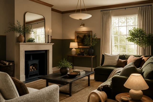
With temperature and light understood, the choice between warm and cool comes down to the room's job, its exposure, and the feeling you want when you walk in. Pick warm paint when a space needs to feel inviting, intimate, or energizing: dining rooms where people gather, bedrooms meant for comfort rather than stark calm, dens, and any north-facing room battling cool light. Warm neutrals like a creamy off-white or a soft greige with a beige lean flatter most skin tones and make gatherings feel cozier. Pick cool paint when you want calm, focus, or a sense of more space: bathrooms that should feel clean and spa-like, home offices where concentration matters, and small or south-facing rooms that can carry blue and green without going gloomy. Cool tones also pair naturally with modern, minimalist interiors and with cool-toned fixed finishes like gray quartz or stainless steel. Many rooms are happiest with a hybrid; a warm white wall keeps a cool-toned kitchen from feeling sterile, and a cool accent in a warm room adds crispness. The fastest gut check is to ask what the room lacks. If it already feels chilly, dark, or unwelcoming, warm it up. If it feels cramped, busy, or overheated by afternoon sun, cool it down. Honor your fixed finishes when you decide, since fighting warm wood floors with icy gray walls creates daily friction no accessory can fix. Consider the adjacent rooms too, so a warm living room does not slam into a cold hallway in a way that jars at the threshold. There is no universally correct side, only the side that suits this room's light, purpose, and the mood you actually want to come home to.
Here are the common mistakes to avoid: - Putting cool paint in a north-facing room, which turns it dreary and gray. - Choosing paint in a cool 4000K showroom but lighting home with warm 2700K bulbs. - Ignoring a neutral's hidden undertone, so warm and cool finishes clash on the wall. - Forcing icy gray walls against warm wood floors that fight them daily. - Using daylight 5000K bulbs in a living room, making warm paint feel harsh and clinical. - Judging temperature against a strong existing wall color instead of a true white card.
Bring the look home with Re-Design
Temperature is hard to judge from a chip, so preview it first. Upload a photo of your room to Re-Design and see warm versus cool paint colors rendered on your actual walls, in your own light, before buying a single can. Compare a warm terracotta against a cool slate and watch how each plays with your floors and fixtures. Seeing the warm-or-cool decision in your real space, rather than imagining it from a fan deck, makes the choice obvious. Lock in the side that suits your light, then shop for the exact shade with confidence.
Frequently Asked Questions
Should a north-facing room use warm or cool paint?
Generally warm. North-facing rooms receive cool, indirect light all day that drains warmth from colors, so cool paints can look dreary and gray. Warm tones like soft terracotta, buttery yellow, or a warm white restore balance and stop the space feeling cold. If you must use a cool color, choose one with a warm undertone and test it on the actual wall.
What bulb temperature works best with warm paint?
Warm paint pairs naturally with 2700K to 3000K bulbs, which give a cozy yellowish glow that deepens reds and yellows. Avoid lighting warm walls with cool 4000K or higher bulbs, since that flattens the warmth and can make the room feel clinical. Also check the bulb's CRI; 90 or above renders your paint color far more accurately than a cheap CRI 80 lamp.
How can I tell if a neutral is warm or cool?