Choosing paint for an open plan is a flow problem first and a color problem second, so start by deciding how zones relate rather than picking shades in isolation. The biggest mistake is treating one continuous space as separate rooms with unrelated colors that collide at the sightlines. Build a connected palette around a single undertone, anchor it to fixed elements like flooring and counters, and let one main color carry the largest surfaces. Test every candidate as a 12x12 inch swatch viewed at three times of day, and split the scheme roughly 60/30/10 between main, secondary, and accent. Done this way, an open layout feels intentional and calm instead of busy and chopped.
How to Start: Read the Light and the Fixed Elements
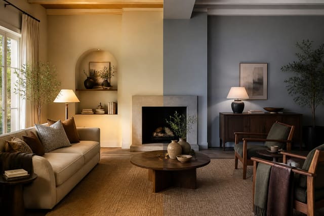
Begin where you cannot change anything. Flooring, countertops, large tile, and cabinetry are fixed costs you will live with for years, so let them dictate your direction rather than fighting them. Identify the undertone in each: a warm oak floor leans yellow-orange, a gray-veined quartz reads cool, and a beige travertine pulls pink or gold. Your wall colors should agree with these undertones, not clash with them. Next, map your light. Note which direction the main windows face, because orientation changes how a color looks all day. North-facing windows deliver cool, steady, indirect light that makes colors look grayer and flatter, so warmer paints compensate. South-facing rooms get strong, warm light that can wash pale colors out by midday. East light is warm in the morning and cool by afternoon, while west light turns golden and intense near sunset. In an open plan, a single space may have windows facing two directions, so the same wall color will shift from one end to the other. Check the LRV, or light reflectance value, printed on most paint chips; it runs from 0 for black to 100 for pure white. A color around 60 to 70 LRV bounces light and keeps an open space bright, while anything under 40 absorbs light and needs good natural exposure to avoid feeling gloomy. Walk the whole layout at morning, midday, and evening before deciding, holding a chip near the floor and the counters at each stop. The goal is a main color whose undertone bridges your fixed finishes and whose LRV suits the light you actually get. Nail these constraints first, and the rest of the palette almost chooses itself.
See also our guide to Two Tone Paint Ideas for more on how to choose paint colors open plan.
Building a Palette That Flows Across Zones
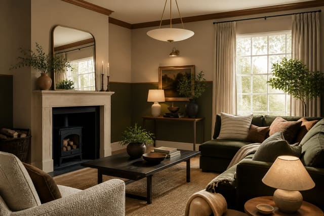
Once you know your undertone and light, assemble a connected set of colors rather than picking each room separately. The cleanest approach for an open layout is one dominant wall color carried through the shared space, with secondary shades drawn from the same paint strip or an adjacent undertone. Using lighter and deeper steps of a single hue gives instant cohesion: a soft greige on the main walls, a step darker on a feature zone, and a near-white on trim and ceilings throughout. Distribute these by the 60/30/10 split, where the main color covers about 60% of visible surface, a supporting color about 30%, and a bolder accent the final 10%. In a kitchen-living-dining flow, the main wall color is the 60, cabinetry or a large rug might be the 30, and pendant lights, art, or a single painted nook the 10. Keep trim and ceiling consistent across the entire plan so the eye reads one envelope rather than stitched-together rooms. You can still signal a zone change without a hard color break; a deeper version of the main shade behind the dining table, or a warm wood island, defines the kitchen without shouting. Avoid more than three or four total colors in one sightline, since each extra hue competes for attention and shrinks the sense of space. Pull your accents from things already in the room, like a sofa fabric or a rug, so the palette feels gathered rather than imposed. If you crave contrast, get it through a single saturated accent rather than several mid-tones that muddy together. A palette that steps gently across the open plan reads generous, while a patchwork of unrelated colors makes even a large space feel cramped and restless.
For a related angle on how to choose paint colors open plan, read Warm VS Cool Paint Colors.
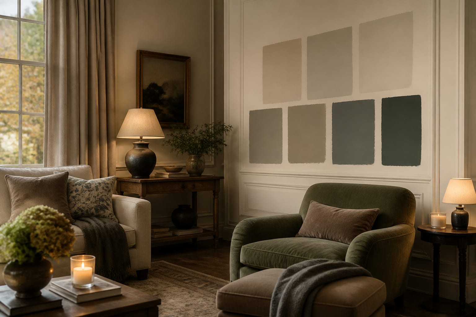
Testing Swatches the Right Way
Paint chips lie, and tiny ones lie most, so never commit from a fan deck alone. Buy sample pots of your top two or three candidates and paint generous swatches at least 12 by 12 inches, though larger is better. Apply two coats so the true depth shows, and let each swatch dry fully before judging, because wet paint always reads darker. Paint your samples on more than one wall in the open plan, since a color near a north window will look nothing like the same color at a south-facing end. Better still, paint a swatch on a sheet of foam board or poster board you can move around the space and prop against the floor, counters, and trim to test it against your fixed finishes. View each candidate at three times of day: morning, midday, and after dark under your actual bulbs. A color that looks perfect at noon can turn green or gray under a warm 2700K lamp at night, and that nighttime read matters because that is when many people use the room most. Watch how the swatch behaves near other colors too, holding it against the sofa, rug, and cabinets rather than against a white chart. Give the choice at least two full days; first impressions often fade as your eye adjusts. Avoid testing against existing bright wall color, which throws off your perception, so prime a patch white first if the current shade is strong. Take photos at each time of day on your phone, since the camera sometimes reveals an undertone your eye glossed over. Only after a swatch survives morning, noon, night, and proximity to your fixed elements should you order full gallons. This patience prevents the expensive cycle of painting, disliking, and repainting an entire open floor.
Avoiding the Common Open-Plan Color Traps
Open layouts punish a few specific errors that closed rooms forgive. The first is choosing colors room by room as though walls separated them; in a single sightline, three unrelated mid-tones read as chaos. Decide the whole palette at once and treat the connected space as one canvas. The second trap is ignoring undertone clashes between paint and fixed finishes; a cool gray wall beside warm honey floors fights every day, while a warm greige settles the same floors instantly. Third, people over-rely on the 'safe' bright white everywhere, which can feel sterile and flat in a space without warm accents, and which shows every scuff in high-traffic zones. A soft off-white with a touch of warmth usually flatters more. Fourth, watch sheen across the plan: high-traffic kitchen and hallway walls want a wipeable satin or eggshell, while living-area walls can take a softer matte, but jumping between very different sheens on connected walls catches the light unevenly and looks patchy. Fifth, do not forget the ceiling as a fifth wall in open volumes; a stark bright white ceiling over a warm wall can create a harsh line, so a ceiling tinted slightly toward the wall color softens the transition. Sixth, resist picking colors under store lighting, which is usually a cool 4000K fluorescent that misrepresents how warm tones will look at home. Finally, account for how much wall is actually visible; in a glass-heavy open plan with few full walls, your accent 10% may be the only place strong color lands, so make it count. Sidestep these traps and the palette holds together from the front door to the back wall, which is the entire point of choosing colors for an open home.
Here are the common mistakes to avoid: - Picking colors room by room instead of as one connected open-plan palette. - Ignoring undertone clashes between wall paint and fixed floors or counters. - Judging color from tiny paint chips rather than large 12x12 inch swatches. - Viewing samples only once, not across morning, midday, and evening light. - Jumping between very different sheens on connected walls, which looks patchy. - Choosing colors under cool store lighting that misrepresents warm tones at home.
Bring the look home with Re-Design
Swatches help, but seeing a color across your whole open plan is faster with Re-Design. Upload a photo of your space and preview candidate paint colors on the actual walls, checking how one main shade flows from the kitchen sightline to the living end before you buy a single gallon. Compare warm versus cool options against your real flooring and counters, then judge the scheme in your own light. Previewing the look digitally lets you reject undertone clashes in minutes, so you only purchase paint you already know works.
Frequently Asked Questions
What size should paint test swatches be?
Paint swatches at least 12 by 12 inches, larger if you can, using two coats so the true depth shows. Tiny chips distort color badly. Paint on more than one wall or use a movable foam board, and let each swatch dry fully before judging, since wet paint always looks darker than the cured result you will live with.
Should every room in an open plan be the same color?
Not necessarily, but they should share an undertone and flow. Carry one main color across the largest connected surfaces, then use lighter or deeper steps of the same hue for zones. Keep trim and ceilings consistent throughout. This reads as one cohesive envelope while still letting you define a kitchen or dining area with a subtle shift in tone.
How does window direction affect paint color choice?
Orientation changes how a color looks all day. North-facing rooms get cool, indirect light that grays colors out, so warmer paints compensate. South-facing rooms get strong warm light that can wash pale shades. East light is warm at morning and cool later, west turns golden at dusk. Always test swatches against the specific light each wall actually receives.