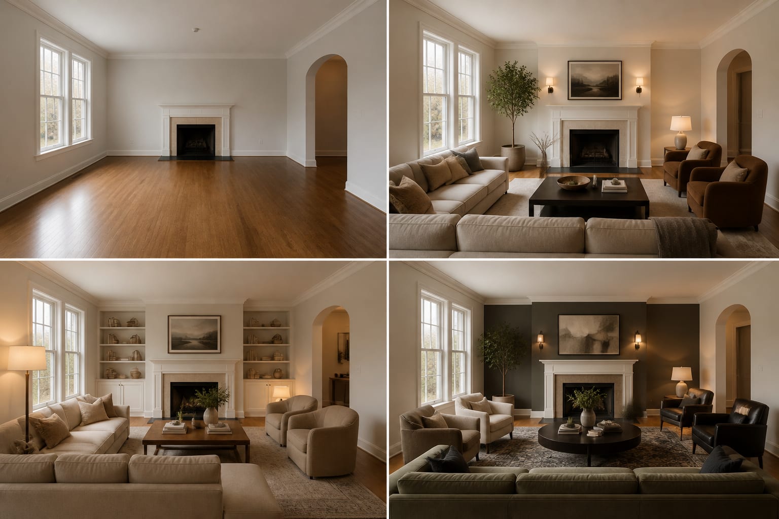
A before-and-after test can be brutally clarifying, or it can be a vanity collage that tells you nothing. My opinion: the “before” photo is more important than the after image, because a sloppy baseline lets every redesign look falsely impressive. If you want a real AI room before after design test, you need a repeatable setup, a narrow brief, and a way to judge the result beyond “that looks nicer.” This guide shows how to document the room, generate useful alternatives, and compare them without fooling yourself.
How do you create an AI before-and-after for your room?
You create an AI before-and-after for your room by photographing the current space from a fixed angle, saving that image as the baseline, generating 2–3 focused redesign options, and comparing each option against the original using the same criteria: layout, light, scale, storage, and cost. The test works only when the “after” images answer the same design question.
Start by choosing one problem, not a whole-room fantasy. A useful test might ask whether the living room needs a larger rug, whether the bedroom should go warmer or darker, or whether the office can feel brighter without new windows. If the actual issue is a flat, gloomy room, use the principles in making fake natural light feel believable before asking AI for another pale sofa or white wall.
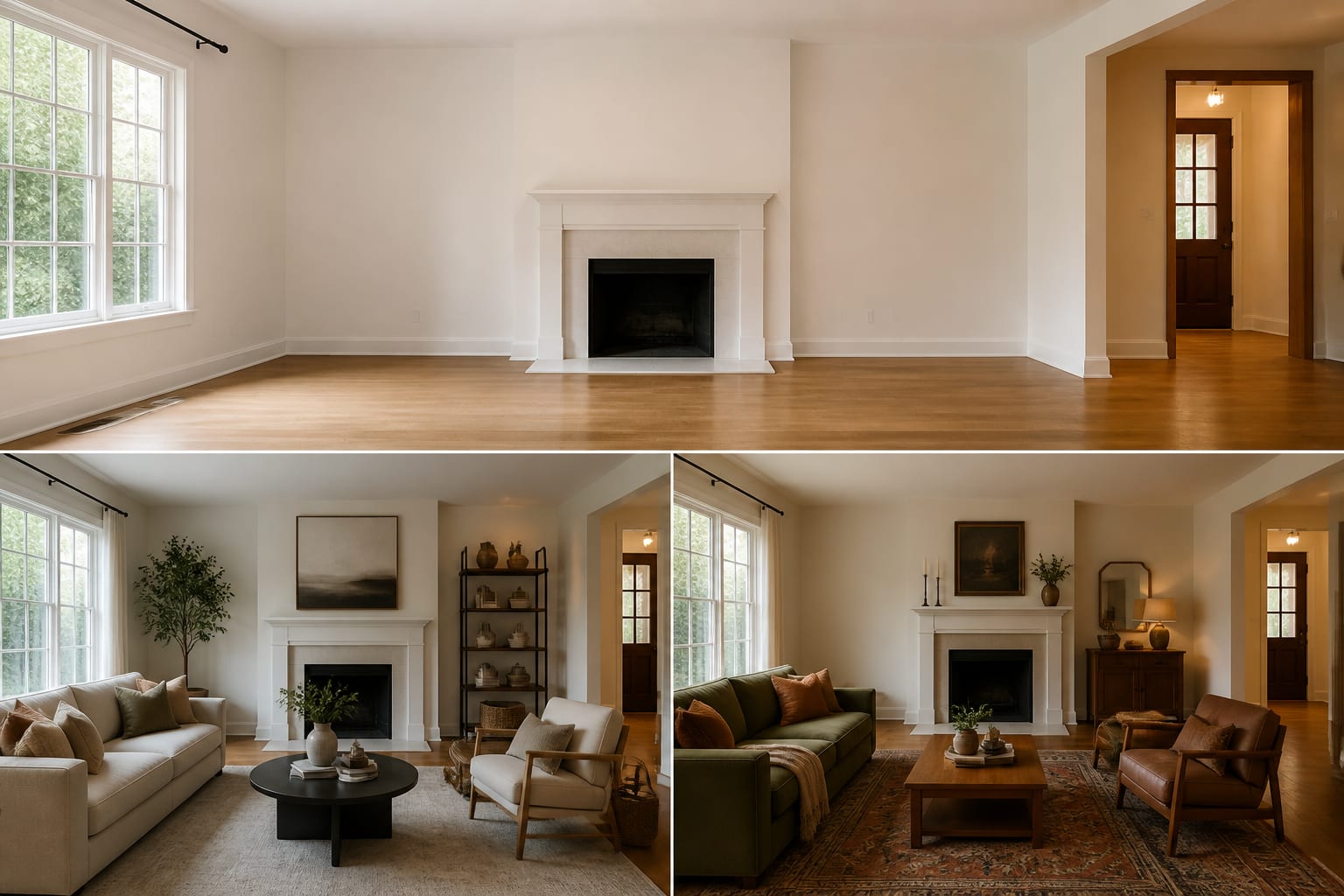
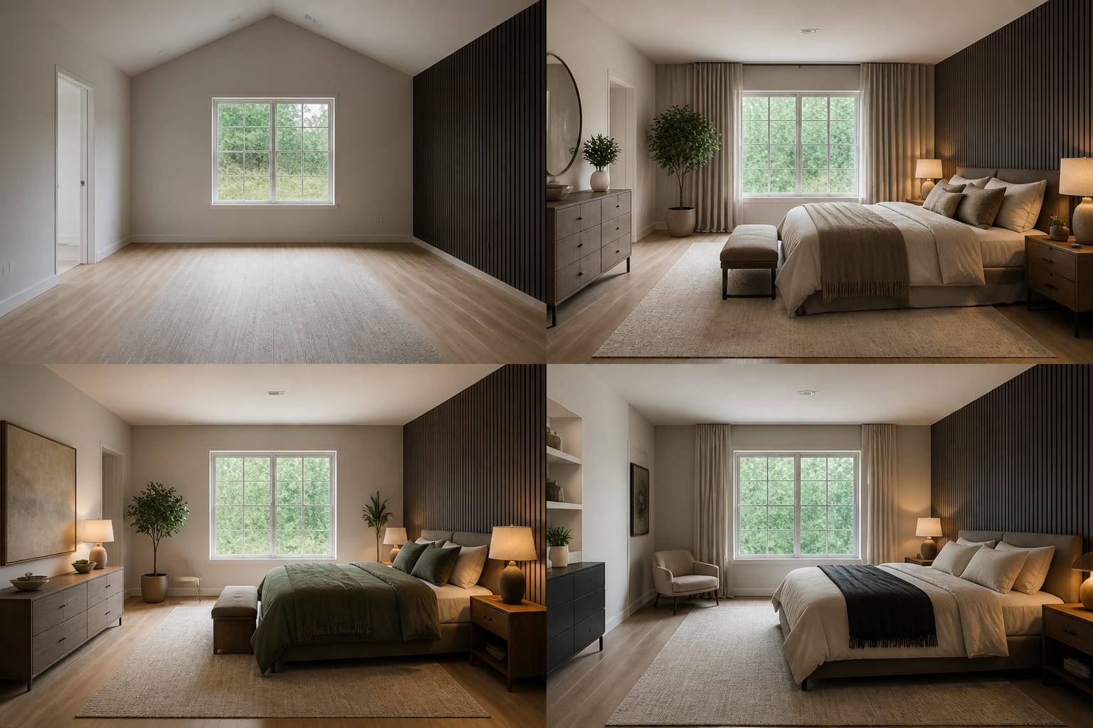
Shoot the room from standing height, roughly 48–60 inches from the floor, and keep the camera position repeatable. A corner or doorway view usually gives the best geometry because it shows two walls, the floor plane, the ceiling line, and the main furniture. Save the untouched photo in its own folder before cropping, editing, or uploading it.
What should stay identical between the before and after?
The honest comparison protects the room’s fixed facts. If the AI changes the floor, widens the window, deletes a doorway, or raises an 8 foot ceiling into a loft, the image may look better, but the test has failed. Your job is to make the room’s limits visible enough that the preview has to solve the real space.
Keep the camera angle consistent. You do not need a tripod, but you do need a repeatable position: stand on the same floorboard, align the phone with the same door casing, and keep vertical lines straight. If the after option looks good only from a lower or wider angle, it may be hiding scale problems.
Keep the permanent materials visible. Flooring, trim, tile, brick, cabinet stain, and large windows decide whether colors and furniture actually belong. A mushroom wall that flatters white oak can look muddy beside pink beige tile, and a black metal bookcase can feel sharp or heavy depending on the floor underneath it.
Keep everyday constraints in the prompt. Say “rental, no wall paint, no hardwired lighting, keep the gray sofa, keep the 84 inch media console” before you ask for style. Rooms with broken circulation need even more discipline; if every wall has an opening, read the logic in fixing a room with too many doorways before asking AI to add storage to the only usable path.
How do you build a comparison board that tells the truth?
A good comparison board is not the prettiest grid; it is the grid that lets you make a decision. Put the original image first, then place each AI option at the same size. Label each option by the decision it tests, such as warmer palette, better layout, stronger storage, or brighter lighting.
Use a short scoring pass after the images are side by side:
- Check circulation before style, because a pretty layout that steals the path will irritate you every day. Main walkways usually need about 30–36 inches, and the test should show whether doors, drawers, and chair legs still have room to move.
- Check furniture scale against known dimensions, because AI can make oversized pieces look harmless. If the preview depends on a 96 inch sofa, 9 by 12 rug, 36 inch coffee table, or 24 inch nightstand, write those numbers beside the image and tape them on the floor later.
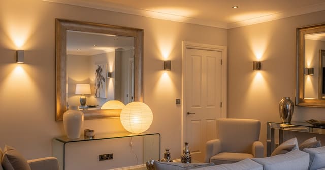
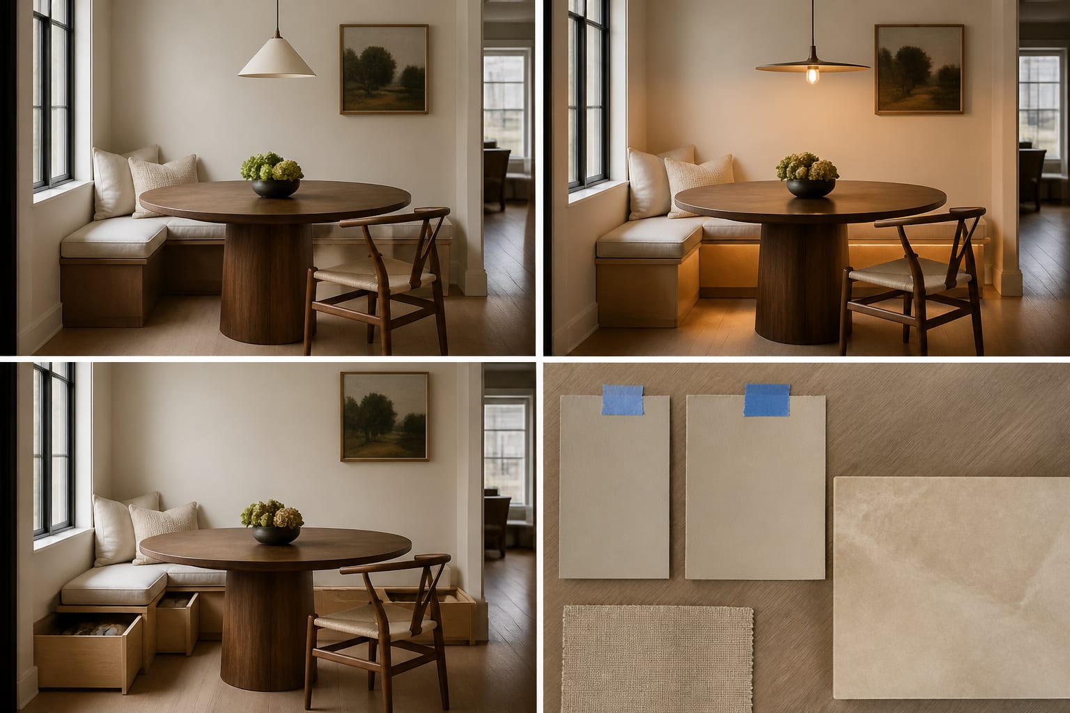
- Check light honestly, because generated rooms often brighten surfaces without adding real lamps. Living rooms and bedrooms usually feel warmer with bulbs around 2700K–3000K, and a preview should show where those lamps actually sit.
- Check what the image removes, because absence is often the cheat. If the after image quietly deletes the ceiling fan, toy storage, radiator, pet bed, laundry basket, or office printer, add that object back to the next prompt.
- Check the next action, because the winning image should produce a physical test. You should know whether to order 24 by 36 inch paint samples, tape an 8 by 10 rug, try a mirror location, or move the existing chair before spending money.
Mirrors deserve special suspicion in these comparisons. A mirror that reflects a blank wall is decoration, not a light strategy. If your after image relies on reflection, apply the placement rules from using mirrors to amplify light: aim the mirror toward a window, lamp, pale wall, or long sightline.
Common mistakes that distort an AI room comparison
The most common mistake is letting the after image compete against a bad before photo. If the original is dark, crooked, and cluttered while the generated image is bright, straight, and styled, you are comparing photography improvement to design improvement.
- Changing too many variables at once fails because you cannot tell what helped. If the after image swaps the layout, wall color, rug, lighting, art, and sofa shape, you may like the mood without learning which choice matters.
- Using different crops fails because a wider after image can make the room look larger than it is. Keep the floor edges, ceiling line, and key doorways visible in both versions so scale does not drift.
- Ignoring the budget fails because AI has no shame about custom built-ins, stone slabs, oversized rugs, and new wiring. Put limits in the prompt, such as “under $750 changes,” “paint and textiles only,” or “freestanding furniture only.”
- Trusting the first attractive option fails because the first version often reveals the missing rule. If it changes the floor, blocks the window, or adds hardwired sconces in a rental, revise the prompt around that failure before judging style.
A second mistake is saving every version. Keep the original, the best 2–3 afters, and the prompt that created each one. A folder of 30 images makes the room feel less clear, not more designed.
Use AI design to preview the better version before you commit
AI design is useful here because it turns a vague room complaint into a visible A/B test. Upload the baseline photo, write a narrow prompt, and ask for versions that keep the same architecture while changing only the decision you want to study.
For a bedroom, the test might compare warm white walls, muted clay textiles, and darker nightstands while keeping the queen bed, 8 foot ceiling, and existing floor. For a living room, it might compare the current rug against an 8 by 10 and a 9 by 12, or test whether two shaded table lamps and one floor lamp solve the flat overhead-light problem. For an office, it might test closed storage versus open shelves without moving the window or desk.
The best prompt sounds measured rather than poetic: “Use this same 11 by 14 foot living room, keep the oak floor, white trim, balcony door, gray sofa, and black TV. Test a warmer modern design with a 9 by 12 rug, walnut storage, linen curtains mounted 6 inches above the casing, two shaded lamps, and a 32 inch clear path to the hallway.” That prompt gives the tool a room, a style lane, and guardrails.
Do not treat the AI result as permission to buy. Treat it as a rehearsal for the physical proof: painter’s tape on the floor, sample sheets on the wall, bulbs in the lamps, and product dimensions checked against doorways.
When is the test convincing enough to act on?
The test is convincing when the same idea survives three checks: the image looks better, the measurements still work, and the next purchase or move is obvious. If the winning after image depends on vague charm, keep testing.
Write the result in one plain sentence. For example: “Keep the sofa, add a 9 by 12 wool-look rug, use a 36 inch round coffee table, hang linen curtains close to the ceiling, add two 2700K lamps, and paint the walls warm white.” If you can write that sentence, the AI test has become a usable plan.
Then verify the largest risks first. Tape the rug and furniture footprint. Open cabinet doors and drawers against the taped layout. Hold paint samples beside the trim and floor in morning and evening light. Check whether the landlord, delivery path, kids, pets, and cleaning routine agree with the version that looked best on screen.
A before-and-after test should make you more decisive, not more dazzled. The right after image does not merely look finished; it tells you exactly what to measure, sample, move, or skip.