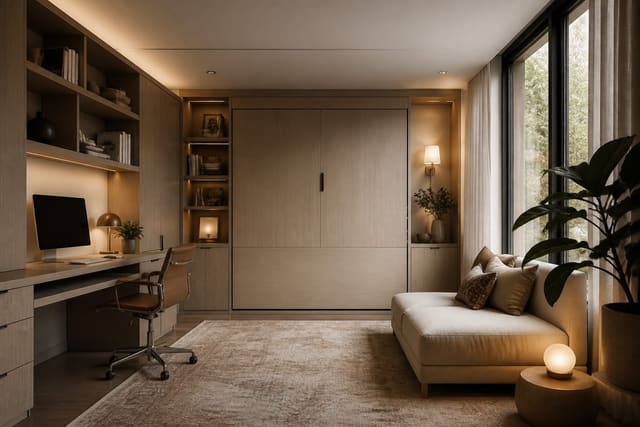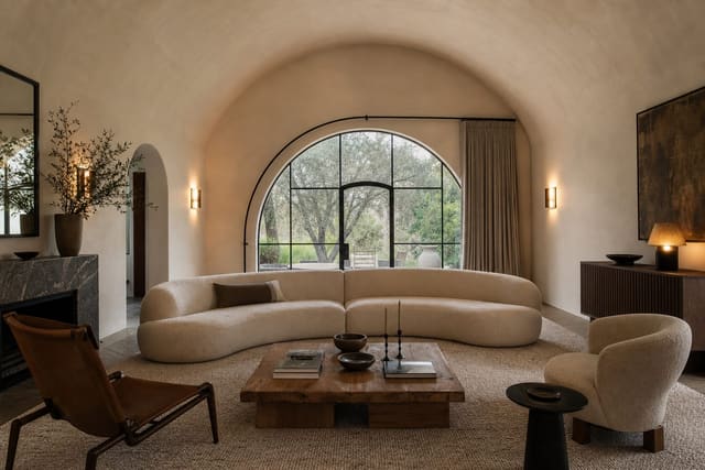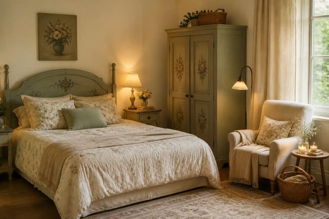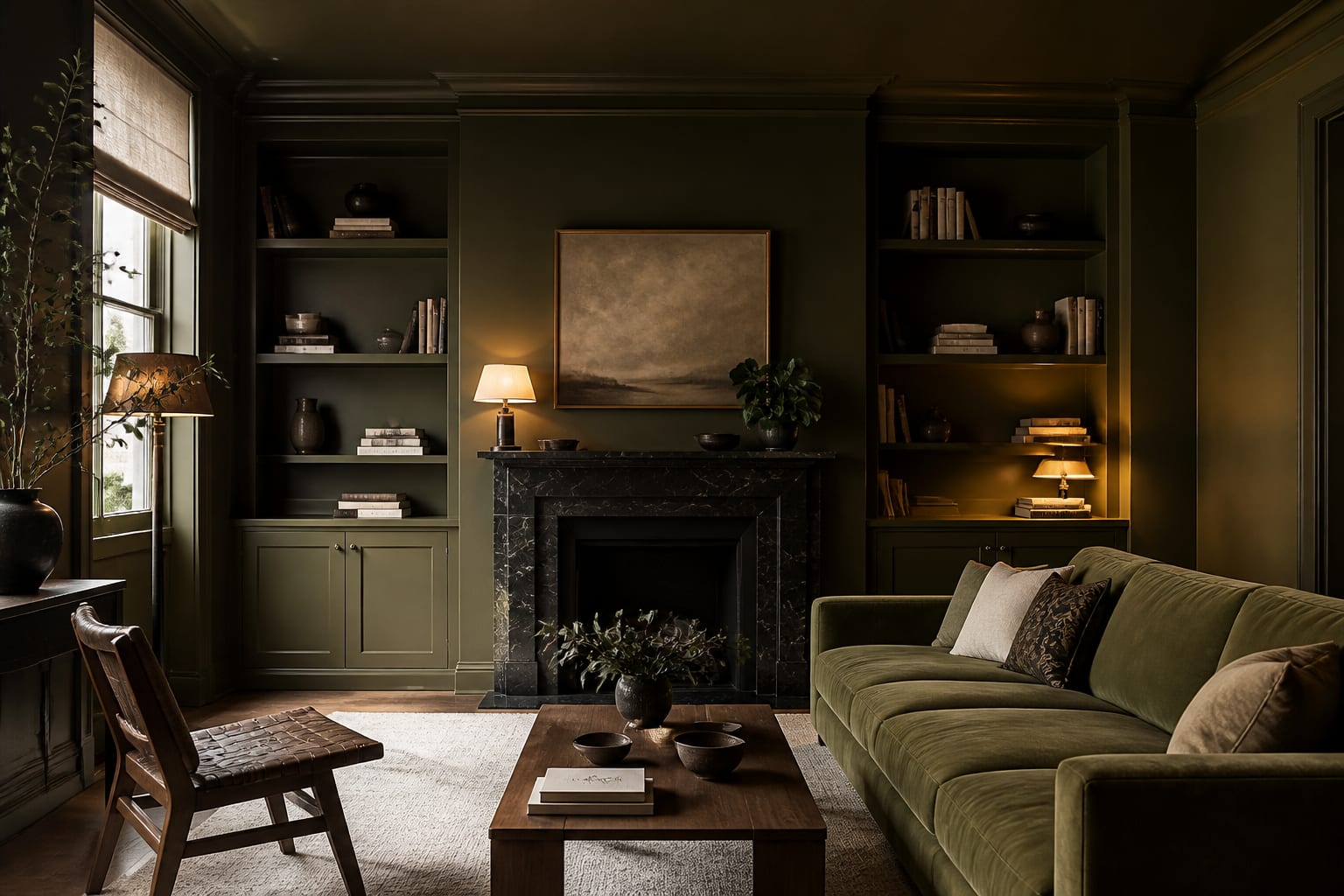
AI can visualize a color-drenched room by applying one color across walls, trim, ceiling, doors, and built-ins in your uploaded photo, so you judge the mood before buying paint. AI color drenching room design turns a bold, hard-to-picture commitment into a preview you can compare against your actual floor, furniture, and light before spending a weekend with painter's tape.
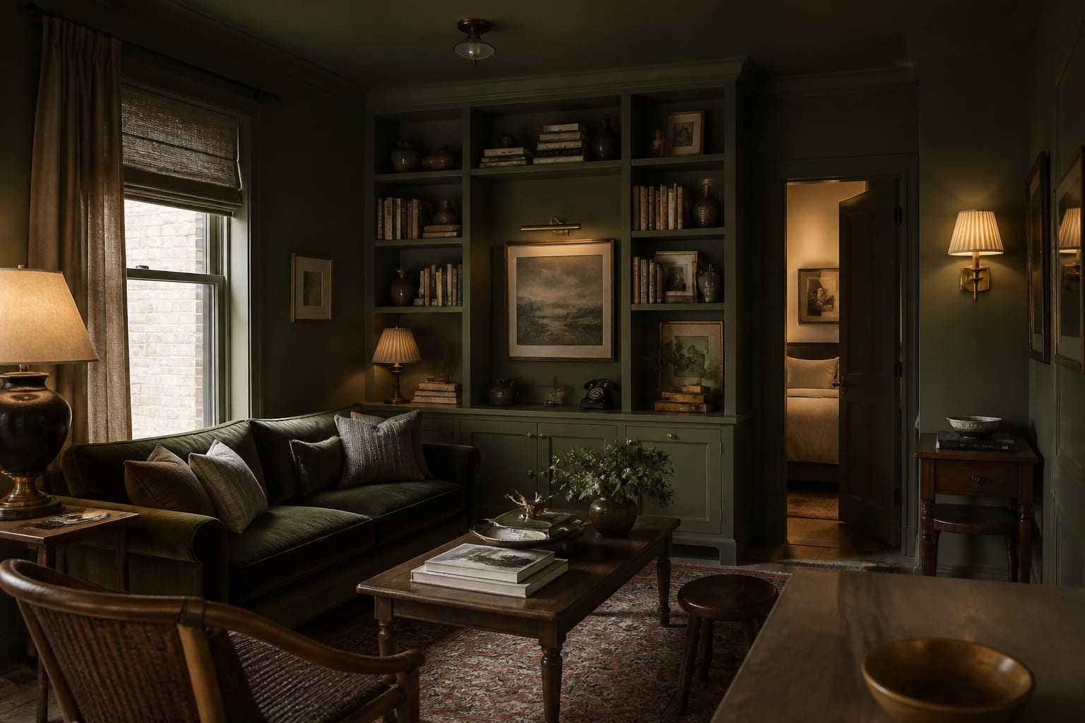
Can AI show a color-drenched room before you paint?
A color drench room AI tool previews the same color across walls, trim, ceiling, doors, cabinetry, shelves, and architectural details from your photo. It's not just recoloring drywall; it shows how the color behaves around window light, door frames, and the awkward corners you normally ignore.
The most useful preview keeps your room's existing structure: your actual ceiling height, windows, and floor color, not a fantasy townhouse. Color drenching has real range, from butter-yellow guest rooms to oxblood dining nooks to chalky blue bedrooms, and each choice changes a room differently. If your space serves multiple jobs, weigh this move against AI dual-purpose room design ideas before wrapping the whole envelope in one mood.
What does the "before" room usually get wrong?
The typical before room isn't ugly, it's visually chopped up: white baseboards cut across the wall color, a bright ceiling presses down, doors read as leftover rectangles, and built-ins look like separate furniture. Drenching fixes this by making the room feel continuous.
- Paint trim into the wall color when casing is thin or builder-grade; contrast makes cheap profiles louder. Use satin or semi-gloss on baseboards and door frames so scuffs wipe clean.
- Carry color onto the ceiling in small or oddly shaped rooms, where a white lid can feel unfinished. In low rooms, go one step softer or flatter than full strength.
- Drench built-ins when shelving looks busy; one color behind books and dividers cuts visual clutter. Keep shelf depth near 10-12 inches so the color doesn't read as a cave.
- Keep floor and upholstery honest. Preserve at least 30 inches through the main path and 16-18 inches between seating and a coffee table.
A good after-image makes the edges quieter, not just a painted box with furniture pushed back in.
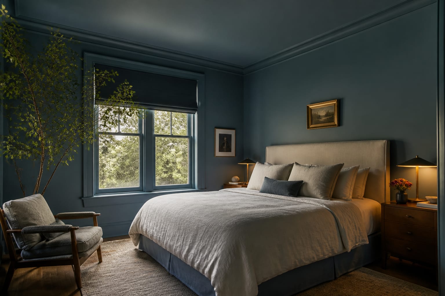
What color decision makes or breaks the wrap?
Undertone is the make-or-break call. North-facing rooms often turn cool colors sharper and warm whites grayer; sunny rooms can make reds, pinks, and yellows louder than the paint chip suggested.
For an AI monochromatic room design preview, request a specific family, not a vague name. "Smoky olive," "muddy plum," "warm mushroom," "inky blue," or "burnt clay" steer toward livable complexity instead of cartoon saturation.
Finish matters almost as much as hue. Walls usually look best matte, flat, or eggshell; trim and doors need more resilience, so satin is the practical middle ground; ceilings should stay flat unless you want deliberate drama, since shine overhead shows every roller mark.
If your ceiling has a vault, slope, tray, or beam line, test the wrap before painting since color drenching can make that architecture spectacular or expose proportions you hadn't noticed. See barrel vault ceiling furniture layouts for pairing tips.
What mistakes ruin a color drench?
The first mistake is stopping at the trim out of nerves. If baseboards, closet doors, and window casing stay white while walls go plum or green, the room can feel less designed than before, more outlined than unified.
The second mistake is using identical sheen everywhere. Use tougher paint on doors and trim, calmer paint on walls, and the lowest practical sheen on the ceiling, so the color stays continuous while surfaces still perform.
The third mistake is forgetting furniture contrast. A navy room with a navy sofa, black table, and dark rug can collapse into a shadowy mass; add warm wood, cream linen, aged brass, or pale stone for relief. If you prefer softer, collected rooms, compare with AI cottagecore room design examples, which lean on pattern and age instead of the envelope.
The fourth mistake is trusting only a bright daytime rendering. Color-drenched rooms shift dramatically at night, so preview with warm lamps and evening shadows before committing.
How do you preview your own room?
Use a photo of the room you actually own, taken from the doorway or main sightline, with floor, ceiling, windows, and trim visible. Include a second angle if a radiator, low sill, or built-in affects the wrap.
A strong prompt: "Create a color-drenched bedroom using the existing oak floor and 8-foot ceiling, with muted blue walls, matching trim and closet doors, a flat painted ceiling, linen bedding, 2700K bedside lamps, warm wood nightstands, and no invented molding." For a living room: "Color drench this room in smoky olive, including walls, baseboards, interior door, and built-in shelves, with satin trim, matte walls, an 8x10 rug, cream sofa, brass lamps, and no change to window size."
Run at least three versions: one medium color, one darker, one with a warmer or muddier undertone. The best preview isn't always the most dramatic, it's the one that still works with your actual sofa, floor, and ceiling height.
Check each version against practical questions: Does the ceiling feel cocooning or compressed? Do doors disappear pleasantly? Does the rug reach at least 6 inches under the front legs of seating? Is there enough contrast for the room to read after dark?
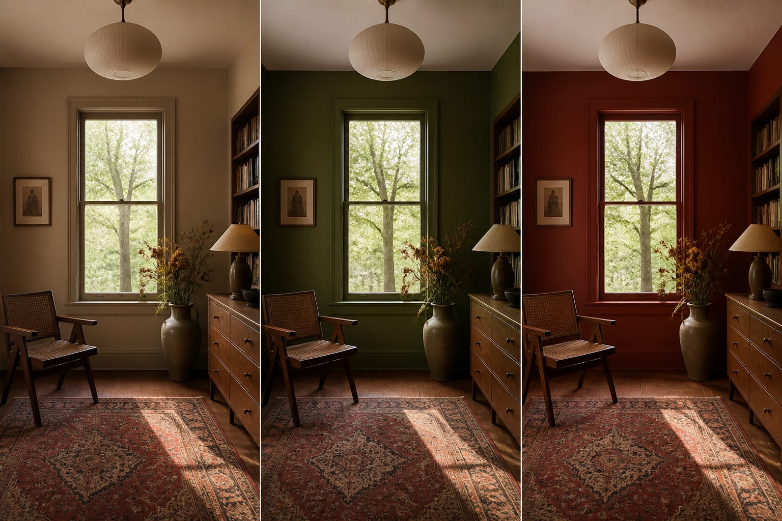
How do you turn the preview into a paint plan?
List every surface: walls, ceiling, crown, baseboards, doors, casing, built-ins, shelves, radiators, vents, cabinetry. Decide which join the drench and which stay separate for a real reason.
Don't skip sampling. Paint at least a 12x12 inch test area on two walls, near the window and in the dimmest corner, and check it in morning light, afternoon light, and lamp light. If your north-facing bedroom turns a beautiful aubergine sample brown-gray by 7 p.m., believe the wall.
A practical plan has three lines, for example: "warm mushroom matte on walls, satin on trim and doors, flat on ceiling." Renters should test a reversible version first, drapery, bedding, or peel-and-stick color on one wall, before requesting permission to paint the whole shell.
The goal isn't bravery for its own sake. If the rendered room looks better because the color simplifies ugly breaks, you have a real direction; if it only works because the tool invented taller windows or new floors, keep the color mood and rebuild the plan around the room you actually have.
Frequently Asked Questions
Does color drenching work in small rooms?
Yes, as long as circulation stays clear (at least 30 inches through main paths), the ceiling color is chosen intentionally, and furniture doesn't visually compete with the wall color. Small rooms often benefit most because drenching removes the choppy breaks that make tight spaces feel busier.
Should the ceiling match the walls in a drenched room?
Often yes in small or low rooms, where a white ceiling can feel unfinished against saturated walls. Use the same color one step softer or in a flatter finish overhead so the room feels intentional rather than heavy.
What sheen should I use for color drenching?
Matte or eggshell on walls, satin on trim and doors for durability, and flat on the ceiling to hide roller marks and drywall imperfections. Keeping the color consistent while varying sheen lets the room stay unified without sacrificing wear resistance.
How many AI preview versions should I generate before choosing?
Generate at least three: one medium-intensity color, one darker, and one with a warmer or muddier undertone. Judge each against your actual floor, furniture, and ceiling height rather than picking the most dramatic option by default.
Why does my color drench look different at night?
Color-drenched rooms shift with light temperature, and a color that reads confidently at noon can look muddy under weak or overly cool bulbs. Preview the room with warm lamps (2700K-3000K) and closed curtains before committing to the paint.
Do I have to paint every surface the same color?
No. The strongest drenches vary finish (matte walls, satin trim) while keeping one color family, and some surfaces, like floors or a feature piece, are intentionally left out for contrast rather than confusion.