The worst dual-purpose rooms are not multipurpose; they are undecided. A guest room that is also an office cannot rely on a random desk beside a bed and hope the tension disappears. My opinion: the room needs one dominant daily use, one respectful secondary use, and a clear visual reset between them. AI multi purpose room design is useful because it lets you test that hierarchy before you buy a sleeper sofa, move a bookcase, or drill into a rental wall.
Can AI help design a room that serves two different purposes?
Yes, AI can help design a room that serves two different purposes by turning one uploaded photo into multiple visual concepts for layout, furniture scale, color, storage, and lighting. The real value is not that the software magically knows your life; it gives you fast comparisons so you can see which version looks calm instead of improvised.
For a dual-use room, ask for two separate concepts from the same photo. One should show the weekday mode, such as office, workout space, craft room, or homework zone. The other should show the occasional mode, such as guest room, nursery overflow, dining, or movie night. If both images still look like the same room with a different chair dragged in, the concept is not flexible enough.
The best prompt names the two jobs, the non-negotiable furniture, and the tolerance for visible storage. A better request is: “Turn this 10-by-12-foot spare room into a home office that can sleep two guests, with a queen sleeper, closed file storage, warm neutrals, and no permanent construction.” That gives AI enough design boundaries to produce a useful dual use room ai concept instead of a fantasy room that ignores the closet door.
What the before version usually gets wrong
The typical “before” room has furniture from both lives shoved into the same rectangle. There is a bed because guests might come, a desk because someone works there every day, a laundry basket because the room became overflow, and one ceiling light doing the work of four fixtures. Nothing is technically wrong, but everything is visually arguing.
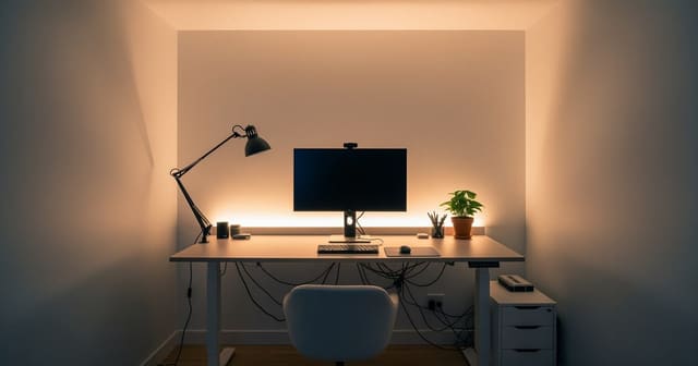
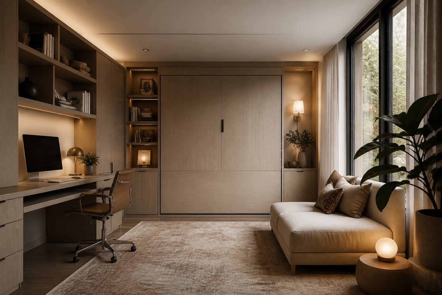
The first fix is to decide which use gets the best wall. If this room functions as an office five days a week and hosts guests six nights a year, the desk deserves the window, not the bed. If the room is primarily a den that occasionally becomes a guest room, a sleeper sofa facing the media wall beats a full mattress that dominates every day. This is where AI home office design choices become useful, because a work zone needs camera background, task light, outlets, and chair clearance before it needs decorative shelves.
Scale is the second before-and-after lever. A 30-inch-deep executive desk can wreck a 10-foot-wide room; a 20- to 24-inch-deep desk with drawers usually gives enough work surface without blocking the guest-bed path. Leave 30 inches for a main walkway when the room is in daily mode, and protect at least 24 inches beside a pullout bed so guests are not climbing over luggage.
Storage is the third lever. Open shelving looks charming in a single-use office, but it can make a guest space feel like someone is sleeping in a supply closet. Closed cabinets, skirted storage benches, or shallow wardrobes keep the secondary function from shouting when it is not in use.
The zoning decision that makes two uses feel intentional
A successful ai flex space design has a visible primary zone, a secondary zone, and a shared buffer. The buffer might be a rug border, a low cabinet, a curtain track, a change in wall color, or a lighting shift. Without that middle layer, the room reads as two incomplete rooms occupying the same address.
Use these zoning moves when you are comparing before-and-after concepts:
- Anchor the daily zone with the best light and the clearest circulation; in a work-and-guest room, place the desk within 12 inches of an outlet and keep the chair from backing into the bed path.
- Give the secondary zone a fast conversion mechanism; a sleeper sofa around 54 to 72 inches wide, a wall bed with roughly 90 inches of open projection, or a nesting dining table prevents setup from becoming a weekly furniture workout.
- Separate the zones with height, not clutter; a 42-inch bookcase, ceiling-mounted curtain, or tall plant near the transition point divides the room while preserving daylight across both uses.
- Repeat one material across both roles; matching walnut tones, black metal legs, or linen shades keep the office side and guest side from looking like two online carts delivered on the same day.
Color can also do the separating. If the room is small, I would rather see one deep, deliberate zone than four timid accent pieces. A wrapped paint moment behind the desk or daybed can make the function feel planned, and one strong color-drenched zone often looks cleaner than scattered contrast on every wall.
Common dual-purpose room mistakes
The most common mistake is buying the convertible furniture first. A wall bed, sleeper sofa, folding table, or storage ottoman only helps if it supports the room’s hierarchy. If the daily use is exercise, a heavy sleeper sofa may steal the exact open floor you need for a mat and weights; choose a narrow daybed or cabinet bed instead.
The second mistake is lighting the whole room from one fixture. Dual-use rooms need at least three layers: a 2700K to 3000K ambient fixture, a focused task lamp at the desk or craft table, and a softer lamp or sconce near the guest or lounge zone. This lets the room change mood without changing furniture.
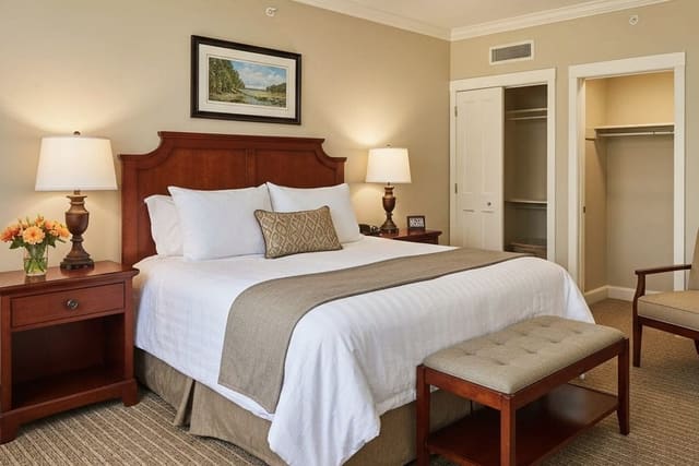
The third mistake is leaving the guest setup exposed all year. A permanent bed in a rarely used guest room makes the daily user feel like a visitor. If overnight guests are occasional, borrow from guest room design that still feels like a room: use a real side table, a readable lamp, hooks for clothing, and closed storage, but keep the mattress solution compact.
The fourth mistake is ignoring door swings and closet access. A 36-inch door swing can erase the perfect desk corner, and a closet that opens into a pullout bed will make every visit awkward. Photograph the room with doors open and closed before asking for AI previews, because those hidden movements decide whether the layout works.
Use AI design to preview both lives of the room
The best AI workflow for a dual-purpose room is not one prompt and one pretty image. Upload the same photo and create a small comparison set: daily mode, guest mode, storage-forward mode, and small-budget mode. Keep the camera angle identical so the differences are about design decisions, not a flattering new perspective.
Start with the room empty in your mind, even if the photo contains current furniture. Tell the tool what stays, what can move, and what must disappear visually. If you rent, say that you need freestanding storage, plug-in sconces, peel-and-stick color, and no built-ins. If you own, you can test wall beds, millwork, pocket doors, and ceiling tracks before calling a contractor.
Then judge the AI previews with practical questions. Can a desk chair pull out 30 inches? Can a guest open a suitcase without blocking the door? Is the exercise mat at least 24 by 68 inches with breathing room at one end? Does the background behind video calls look calm, or does the bed announce itself in every meeting? The image is only successful if the daily friction drops.
The before-and-after you want is not a theatrical reveal. It is a room that stops apologizing for having two jobs. When the zones are legible, the storage is closed, the lighting changes mood, and the furniture converts without a struggle, a multipurpose room can look more intentional than a single-purpose room with too much stuff.