Choosing a room color palette is where confident people suddenly start whispering. My firm opinion: you should not pick paint until you have seen it against the floors, trim, sofa, cabinets, and daylight you already own. A pretty palette on a phone screen can turn muddy beside orange oak or icy under north-facing light. An AI color palette generator room workflow helps because it starts with the actual room, not a fantasy swatch board, and this guide shows how to make the output useful.
Can AI generate a room color palette from a photo?
Yes, AI can generate a room color palette from a photo by reading the visible walls, flooring, furniture, trim, natural light, and fixed finishes, then proposing colors that belong with those elements. The result is strongest when the photo shows the full room instead of one flattering corner.
The tool is not identifying a perfect paint match from a pixel, and it should not replace physical samples. Camera exposure, screen brightness, shadows, and mixed bulbs can all distort color. The useful part is comparison: you can test warm white against mushroom, sage against olive, or charcoal against navy before you buy samples or repaint a wall.
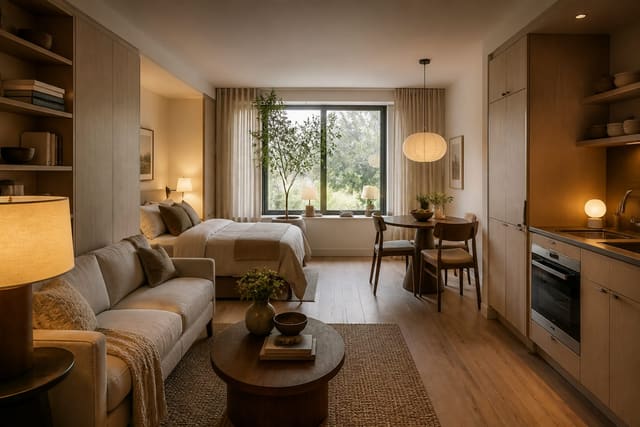
For renters, the palette may need to avoid permanent paint and work through rugs, curtains, art, lamps, peel-and-stick accents, and removable panels. The limits in AI room design for rental apartments matter because a palette that requires spraying kitchen cabinets or staining floors is not helpful when the lease says no.
The palette decision that makes every other choice easier
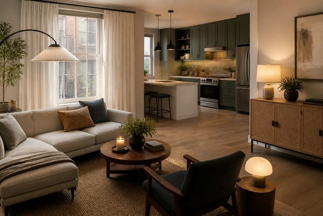
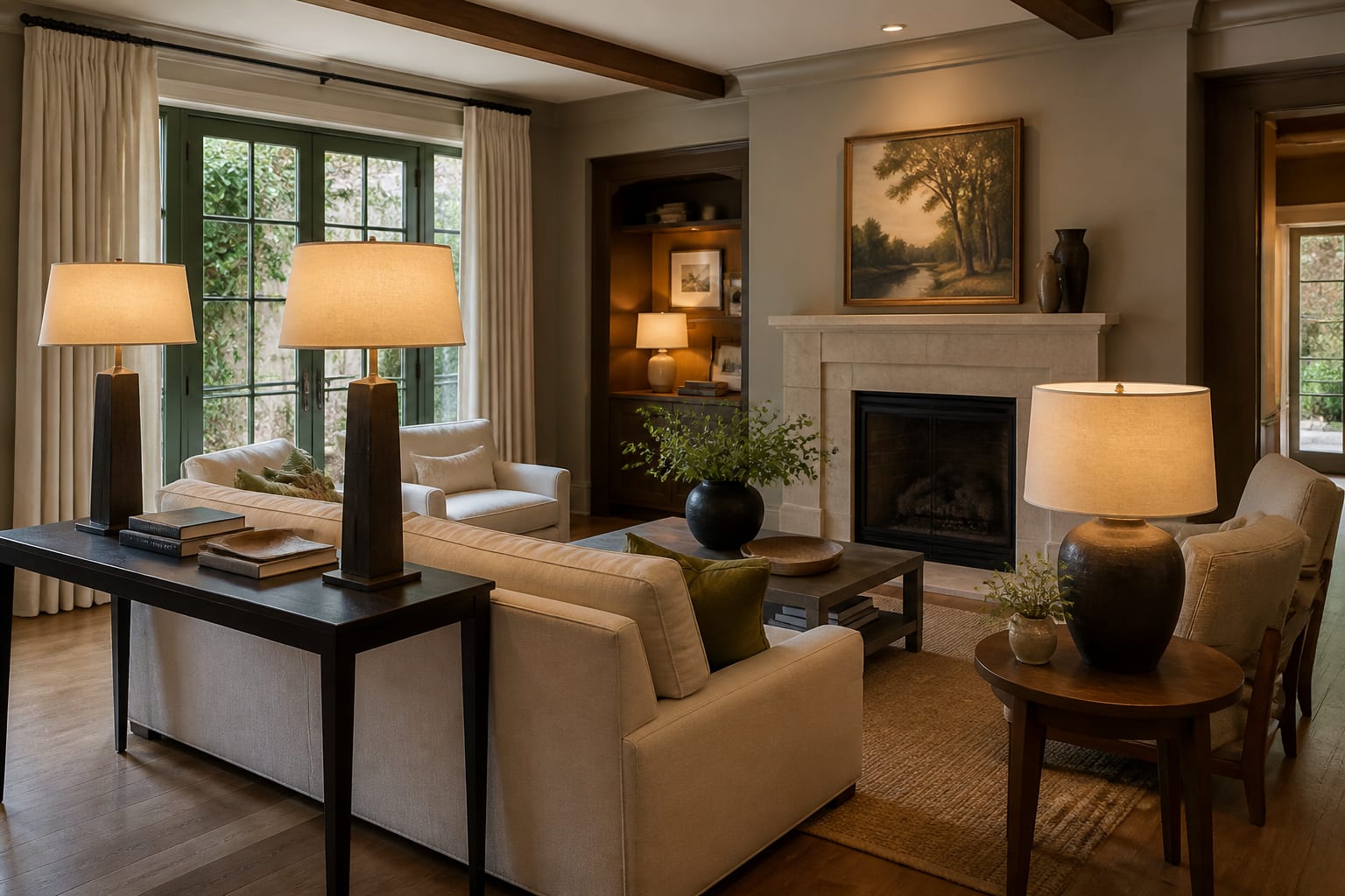
The first color decision is not the wall color; it is the undertone you are agreeing to live with. Every room already has a color temperature before you add paint. Honey oak floors, gray vinyl plank, beige carpet, red brick, black window frames, white appliances, green stone, and cream upholstery all push the palette in a direction.
A room with warm oak and cream trim usually fights cool blue-gray walls. A kitchen with bright white cabinets and black hardware may tolerate clearer contrast. A living room with taupe carpet often looks better with warm off-white, clay, olive, camel, or muted plum than with pure white walls that make the carpet look dingy.
Use the AI preview to identify which existing finish is bossy. If the sofa is temporary, do not build the palette around it. If the flooring, tile, cabinets, or stone are staying for years, those pieces deserve priority. This is especially important in compact homes, where one wrong undertone repeats across every view; the scale rules in AI interior design for small spaces apply to color because small rooms show clashes faster.
A framework for building a room color scheme that survives real life
A good AI room color scheme should feel edited, not timid. Give the tool a tight structure so it does not return a wallpaper of random beige, sage, brass, terracotta, navy, and blush.
- Choose one fixed anchor first, because the palette needs a nonnegotiable starting point. Use the floor, countertop, fireplace stone, major sofa, or cabinet color, then ask the AI paint color picker to preserve that element and build around it rather than recoloring the whole room.
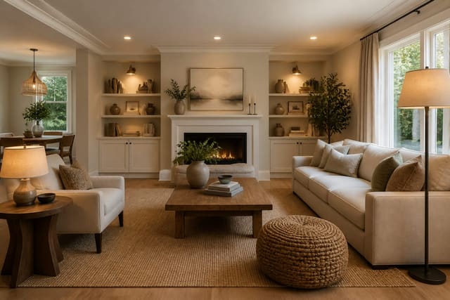
- Limit the visible palette to five main colors, because most real rooms already contain visual noise from books, toys, cords, plants, food, and textiles. A useful split is 60 percent field color, 30 percent secondary color, and 10 percent accent, with wood and metal treated as part of the count.
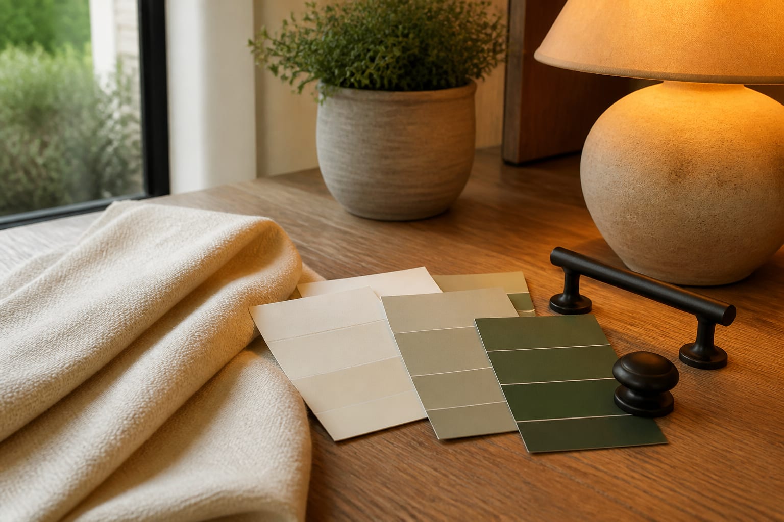
- Test paint with large samples, because a one-inch chip lies in low light. Paint or order samples close to 2 by 2 feet, place them beside trim and flooring, and view them under daylight plus the bulbs you actually use.
- Keep bulb temperature consistent, because color changes when one lamp is 2700K and the next is 4000K. Living rooms and bedrooms often feel better around 2700K, while kitchens, bathrooms, and desks can handle 3000K when task clarity matters.
- Repeat the accent at least three times, because one isolated color looks accidental. If you choose black, let it appear in a lamp, frame, and curtain rod; if you choose rust, repeat it in a pillow, art detail, and small vase.
Common room color palette mistakes
Most color mistakes happen because the palette is chosen away from the room. The image looks tasteful, the paint name sounds safe, and then the actual space exposes the weak logic.
- Picking the wall color before reading the floor fails because floors cover more visual territory than walls in many seated views. If the floor runs orange, pink, gray, or yellow, choose wall colors that respond to that undertone instead of pretending the floor is neutral.
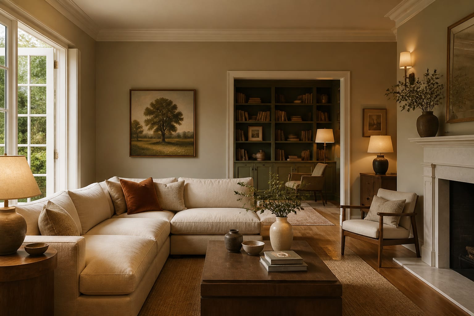
- Using too many near-neutrals fails because beige, greige, mushroom, cream, taupe, and white can clash when their undertones are different. Choose one dominant neutral family and let contrast come from wood, black, brass, greenery, or a real accent color.
- Trusting an AI palette from a dark photo fails because shadows make walls and upholstery look flatter than they are. Take the photo in daylight with lamps off first, then run a second version with lamps on if evening mood is part of the decision.
- Copying a resale palette into a lived-in home fails when the room needs personality, storage, and durability. If you are preparing a property to sell, the cleaner color discipline in AI design home staging makes sense; if you live there, the palette can carry more character.
- Forgetting sheen fails because color is not only hue. Matte walls hide bumps better, satin trim cleans more easily, glossy tile reflects more light, and black hardware can show dust, fingerprints, and hard-water residue.
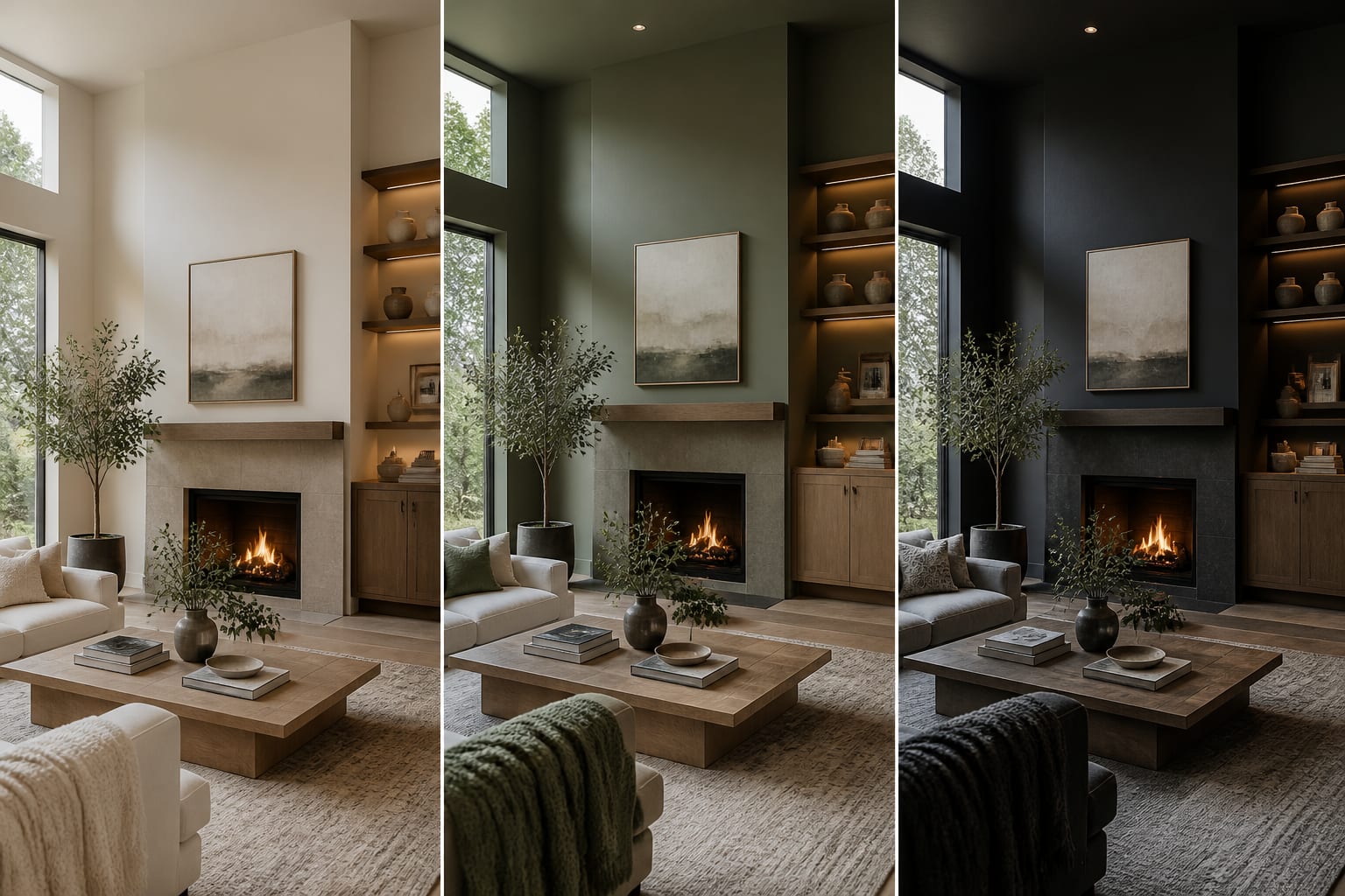
Use AI to preview your palette before you commit
Use AI design after you have named what must stay and what may change. Upload a straight daylight photo from a doorway or corner, with the floor, trim, windows, largest furniture, and main light sources visible. Do not crop out the ugly carpet, dated tile, or sofa you cannot replace; those are the exact constraints the palette has to solve.
A grounded prompt might say: redesign this living room color palette while keeping the oak floor, cream sofa, white trim, black media cabinet, and existing rug size. Show a warm neutral scheme with mushroom walls, olive accents, aged brass, linen curtains hung 6 to 8 inches above the trim, 2700K lamps, and no construction.
Run three versions with different priorities. One should be safest and resale-friendly. One should be richer and more personal. One should keep the cost low by changing only textiles, art, lamps, and removable decor. Compare the versions by asking which fixed finish looks better, which palette makes the room feel calmer, and which one would still work after the first week of dishes, shoes, pets, mail, and laundry.
Which finishing choices make the palette feel intentional?
The final palette succeeds when the room repeats itself without looking matched from a kit. Choose one wall family, one main textile family, one wood tone or painted furniture color, one metal finish, and one accent that can move around the room. That gives you enough structure to shop without buying identical pieces.
Curtains should support the palette, not interrupt it. Hang panels 6 to 8 inches above the window casing when the wall allows, and extend the rod wider than the trim so fabric stacks off the glass. A cream linen panel can soften a green wall; a tan woven shade can connect oak flooring to white walls.
Rugs deserve the same discipline. A room with a strong wall color often needs a quieter rug, while a pale room may need pattern or deeper contrast underfoot. In living rooms, larger rugs such as 8 by 10 feet or 9 by 12 feet often make the palette look calmer because furniture stops floating on separate color islands.
Before buying everything, create a small physical board with the paint sample, fabric, rug corner, metal finish, wood sample, and one accent color. View it near the window and under the evening lamp. The AI preview gives direction; the real materials decide the final yes.