Most disability-accessible rooms are made worse by panic purchases: a hospital-looking grab bar, a bulky recliner, a ramp that fights the entry, or furniture shoved aside after a mobility need becomes urgent. My firm take: accessibility should be designed as architecture and comfort, not disguised as an apology. A wheelchair-friendly home can be warm, tailored, and beautiful when clearances, reach, light, and material choices are planned together. This guide shows how to use a room photo to test the practical moves before the room becomes a collection of expensive compromises.
Can AI help design a disability-accessible home interior?
Yes, AI can help design a disability-accessible home interior by using a real room photo to preview wheelchair clearances, furniture placement, safer lighting, reachable storage, bathroom updates, and universal design details before anything is bought or installed.
It should not replace an occupational therapist, architect, contractor, or code professional when the project involves ramps, structural changes, plumbing, electrical work, or medical needs. Its real value is visual: it lets you see whether the sofa blocks the turning route, whether the vanity has enough knee space, whether a matte floor looks warmer than shiny tile, and whether support hardware can coordinate with the room instead of looking tacked on.
For a useful preview, photograph the room from the main doorway at chest height. Include the floor, threshold, door swing, windows, outlets, radiators, fixed cabinets, and any furniture that must stay. Add measurements in the prompt: doorway width, clear path, bed height, vanity width, shower opening, table diameter, and the turning space available.
What makes universal design feel beautiful instead of medical?
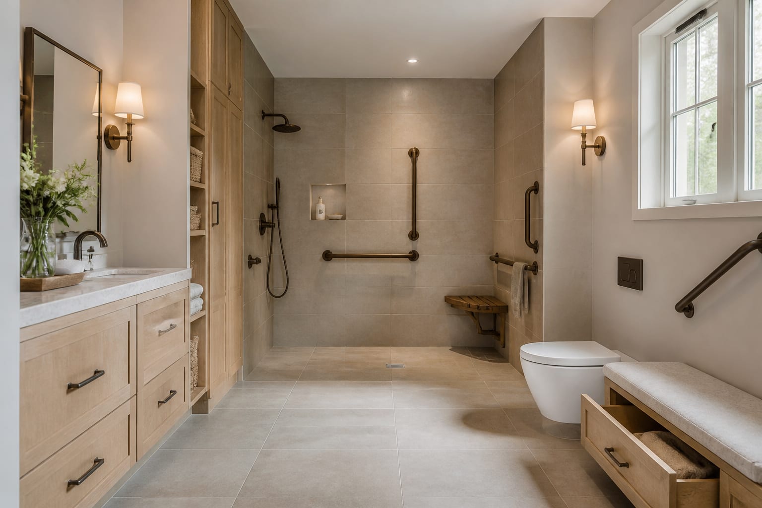
Universal design feels beautiful when the useful parts share the same design language as the rest of the room. A black grab bar can look deliberate when the faucet, mirror frame, and towel hook also use black. A warm brass support rail can feel elegant in a traditional bath when it relates to sconces and cabinet pulls. The problem is not the support; the problem is support that arrives with no visual allies.
Start with movement, then finish. A wheelchair user usually needs a clear route that stays close to 36 inches wide, and many rooms need a 60-inch turning area at the bed, table, vanity, or main seating zone. If the space cannot give that everywhere, protect the route that matters most: entry to bathroom, entry to bed, entry to kitchen work zone, or entry to favorite chair.
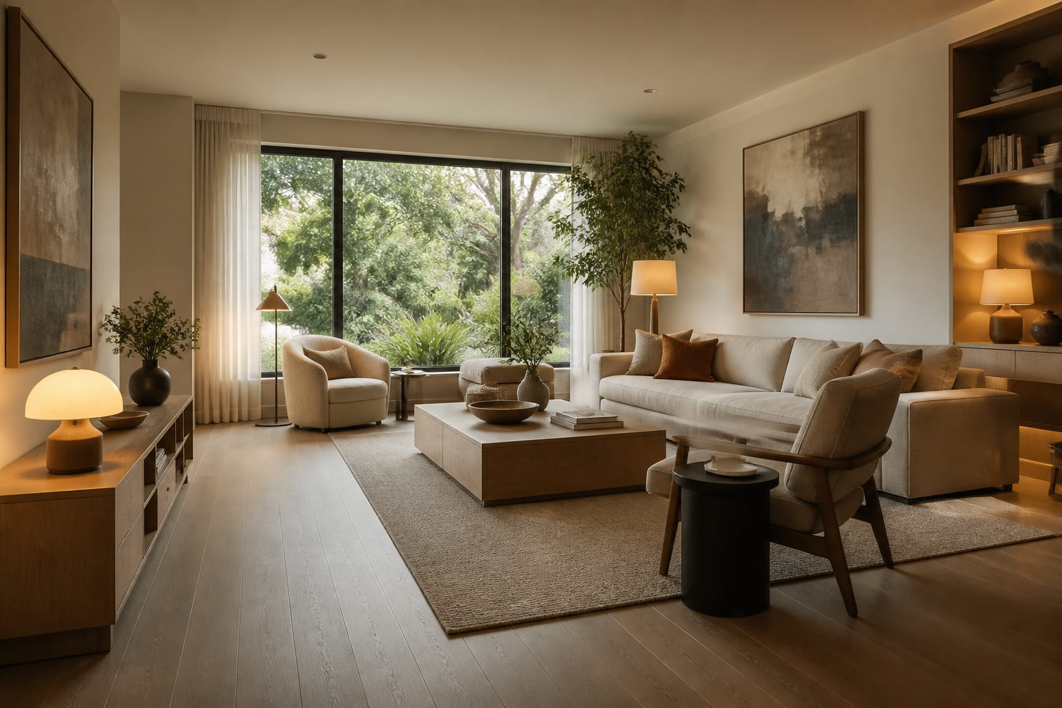
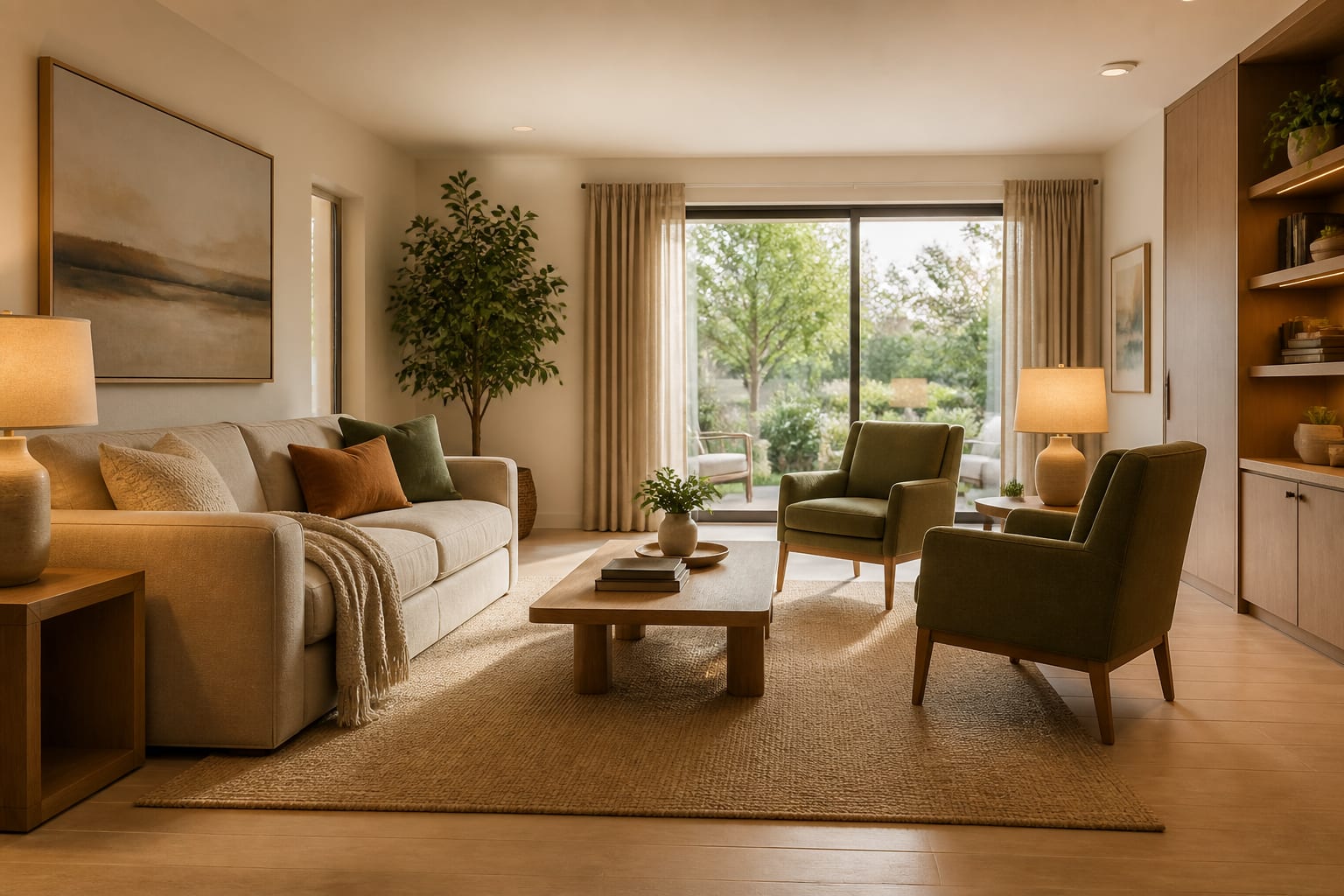
Choose surfaces that reduce glare and slipping without draining personality. Matte porcelain, low-pile rugs with firm pads, honed stone, cork, rubber-backed runners, and textured vinyl can all look residential when the color palette is considered. Glossy floors under cool bulbs can confuse depth perception and make a room feel harsh. Warm 2700K lighting suits living rooms and bedrooms; 3000K can work in kitchens and baths where task visibility matters.
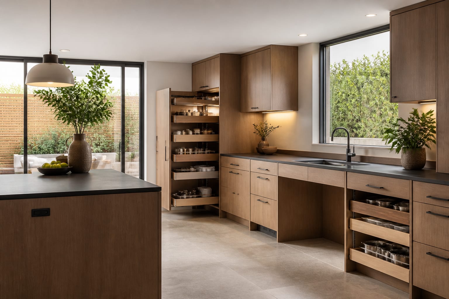
Reach matters as much as width. Daily objects should live between seated knee height and shoulder height whenever possible. A beautiful pantry is not accessible if every useful item is above 60 inches. A nightstand should be reachable from bed, not placed as a symmetrical prop 8 inches too far away.
Which room-by-room changes matter most?
The best universal design plan does not spread money evenly. It spends attention where daily friction happens.
- In an entry, keep the landing clear and readable because the first ten seconds set the tone for the whole home. A 36-inch route, a bench around 18 to 20 inches high, lever hardware, a shallow shoe cabinet, and low-glare lighting can make arrival safer without making the foyer look institutional.
- In a living room, choose fewer pieces with better clearance because wheelchair access and conversation both need open space. Leave about 18 inches between sofa and coffee table only if mobility allows it; if transfers or turning are tight, use a smaller round table, nesting tables, or a side table reachable from the main seat.
- In a bedroom, design the bed wall around transfers instead of symmetry. A 24-inch clear space beside a bed may work for some walkers, but wheelchair transfers often need more room, a stable surface, and a lamp or switch reachable from the sleeping position.
- In a bathroom, plan support where hands actually go. Towel bars are not grab bars, and a beautiful shower still fails if the threshold, slope, seat, handheld shower, and blocking behind the wall were never coordinated.
- In a kitchen, prioritize seated reach and landing zones. Pull-out shelves, D-shaped pulls, knee space at one work surface, and a microwave placed below shoulder height can matter more than another decorative backsplash.
If disability access overlaps with aging-in-place planning, compare the room against senior-friendly home design with AI so mobility, vision, reach, and comfort are considered together rather than as separate upgrades.
Use AI design to preview accessibility before you commit
Use AI design as a visual rehearsal for universal design choices, not as a permit set. Upload the clearest photo of the room, then ask for one accessibility improvement at a time: wider circulation, lower storage, safer bathroom hardware, better lighting, bed transfer space, or a wheelchair-friendly seating layout.
A strong prompt might say: design this 11 by 13 foot bedroom for wheelchair access, keep the existing window and closet, use a queen bed, leave a 36-inch route from door to bed, create transfer space on the right side, add reachable lamps, use low-glare flooring, include closed storage below 54 inches, and avoid construction changes.
Run a second version that is more traditional, a third that is warmer and modern, and a fourth that keeps more existing furniture. Then compare the same facts in each image: door clearance, turning space, bed access, switch location, storage height, rug edge, lamp placement, and whether the room still feels like the person who lives there.
Privacy deserves extra care because accessible rooms may show medications, mobility equipment, medical paperwork, family calendars, or addresses. Crop anything that does not help the design, and review private AI room design options before uploading sensitive images. The tool needs the room geometry and fixed features; it does not need a prescription label on the nightstand.
Common mistakes to avoid in accessible home design
The most common accessible design mistake is treating clearance as empty space instead of comfort. A bare middle of the room can look unfinished if the edges are cluttered, the lighting is weak, and the furniture feels pushed away. Use the clear path as the plan, then furnish the edges with intention.
A second mistake is buying medical-looking pieces before testing integrated ones. A supportive chair with arms, an 18-to-20-inch seat height, firm cushioning, and washable fabric can look like real furniture. A grab bar, rail, or shower seat can coordinate with the faucet finish, tile tone, and wall color.
The third mistake is trusting an AI image that quietly deletes the hard parts. If the preview widens a doorway, removes a radiator, flattens a threshold, hides a toilet location, or turns a tight bath into a spa, keep the mood and reject the logistics. The winning version preserves the awkward facts and still improves the room.
The fourth mistake is confusing resale neutrality with good universal design. Wider routes, better light, reachable storage, safer thresholds, and coordinated support hardware can help many people. If a future sale is part of the plan, the restraint used in an AI redesign for resale can keep accessibility looking like quality rather than emergency adaptation.
The fifth mistake is leaving caregivers out of the geometry. A bathroom may technically fit a wheelchair and still fail if there is no side access for assistance. A bedroom may look calm and still fail if a caregiver cannot reach the far side of the bed without twisting through furniture.
When is the accessible plan ready to build or buy from?
The plan is ready when the beautiful version and the usable version are the same version. Before ordering furniture, tile, hardware, or storage, confirm the real doorway width, turning space, bed height, transfer side, cabinet depth, shower opening, threshold height, rug thickness, outlet locations, switch reach, and every door swing.
Buy in the order that protects daily life: circulation changes first, then bathroom and entry safety, then lighting, then seating and bed setup, then storage, then rugs, textiles, art, and smaller decorative layers. Do not let the prettiest preview talk you into a piece that blocks the route or asks the person using the room to adapt to the furniture.
A disability-accessible home should not look like fear made all the decisions. It should look calm, specific, and personal, with every practical choice quietly earning its place.