A senior-friendly home should not announce itself with beige vinyl, glare, and bathroom hardware that looks borrowed from a clinic. My firm opinion: accessibility is best when it is designed into the room early, not bolted on after someone has already tripped, strained, or stopped using a space they love. The goal is not to make every room look “senior”; the goal is to make daily life easier while the home still feels personal, warm, and adult.
Can AI make senior-friendly design beautiful instead of clinical?
Yes, AI can help design a home that is both accessible and beautiful for seniors by previewing aging-in-place layouts, safer clearances, lighting, furniture, storage, and finishes inside real room photos before anything is installed. It cannot diagnose mobility needs, approve construction, or replace an occupational therapist, but it can show whether a safer plan still looks like a home instead of a care facility.
The most helpful prompt names the real constraints: knee pain, walker clearance, poor night vision, a spouse using the same bathroom, a favorite recliner that must stay, or a hallway that feels too dark. Ask for a warm age-in-place bedroom with a 36 inch route to the bathroom, a bed height that is easy to sit on, two reachable lamps, a non-slip rug plan, and no change to the windows.
This is also where whole-room thinking matters. A safer chair is not enough if the route to it is blocked by a coffee table. A beautiful bathroom tile is not enough if it glares under cool bulbs. The preview should help you judge the relationship between furniture, light, flooring, storage, and handholds.
Which accessible choices should happen before the decorating?
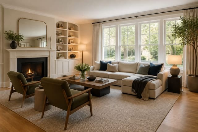
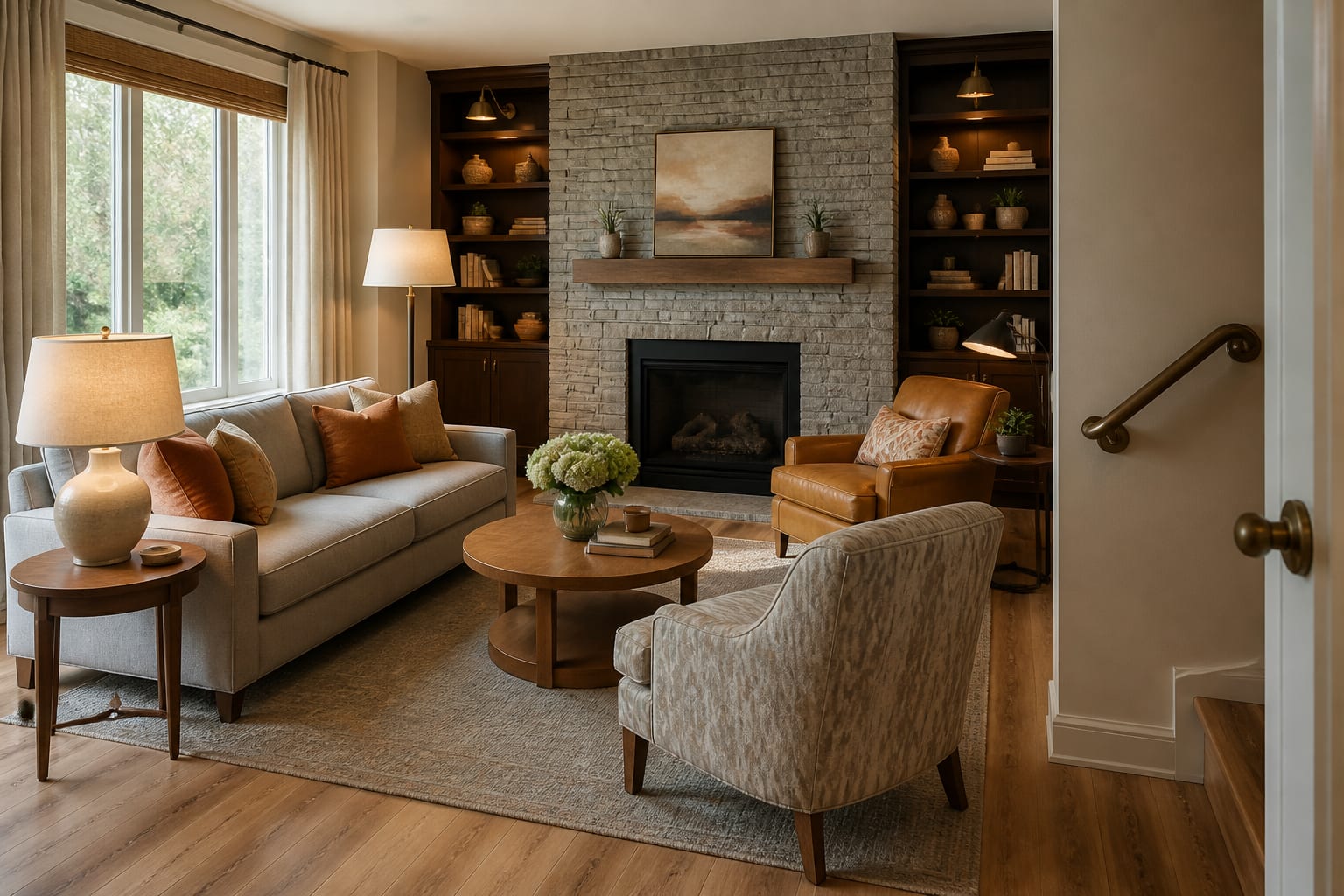
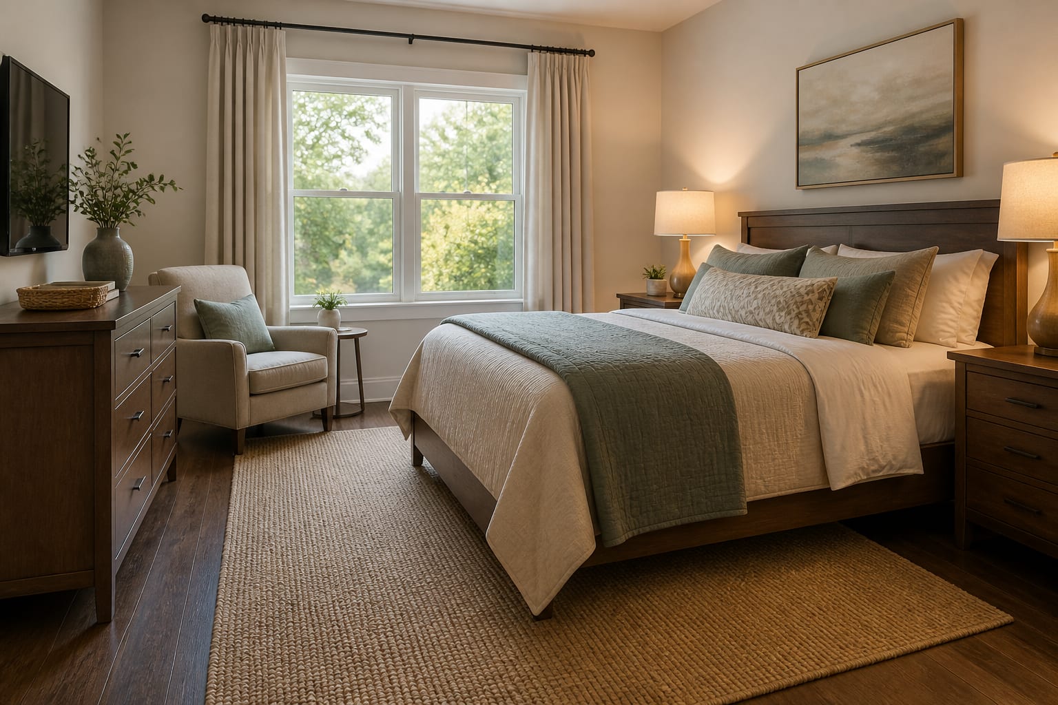
Start with the decisions that change how the body moves through the home. Paint color is easier to adjust than a shower threshold, a slippery floor, or a sofa that is too low to stand from comfortably. In senior-friendly rooms, beauty comes after the plan respects balance, reach, vision, and fatigue.
- Keep main routes calm and wide enough to use without negotiation, because a room that requires sideways walking is not truly accessible. Aim for 36 inches from entry to seating, bed, bathroom, or kitchen work zone when possible; if an older home only allows 30 inches in one pinch point, keep that route free of baskets, plant stands, and sharp table corners.
- Choose seating that supports standing, because overly deep lounge furniture can trap people who have hip, knee, or balance issues. Look for seat heights around 18 to 20 inches, arms sturdy enough to push from, and sofa depths that do not force a person to rock forward before standing.
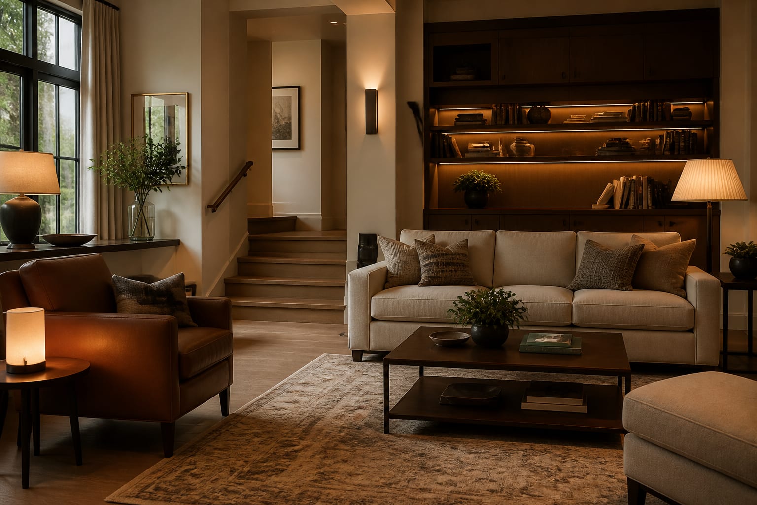
- Put light where the task happens, because aging eyes need contrast without harshness. Add a reading lamp beside the main chair, a lamp reachable from bed, under-cabinet light at a kitchen counter, and soft night lighting on the route to the bathroom; 2700k usually feels warmer in bedrooms and living rooms, while 3000k can work in kitchens and task-heavy baths.
- Treat flooring transitions as design details, because tiny height changes create real trip points. Keep thresholds as flush as the home allows, use low-pile rugs with proper pads, and avoid loose runners on routes between bedroom, bath, kitchen, and entry.
- Make storage reachable, because beautiful cabinetry is not helpful if daily items live above shoulder height or below knee level. Put medications, dishes, towels, chargers, and reading glasses between roughly waist and eye level, then reserve high shelves for light seasonal items.
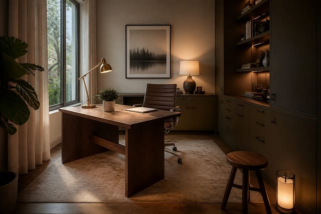
Aging-in-place planning also intersects with work and hobbies. If a senior uses a desk for bills, telehealth, crafts, or part-time work, the same ergonomic thinking in a safer work-from-home setup can help with chair clearance, screen glare, task lighting, and storage within reach.
How do you make safety features look intentional?
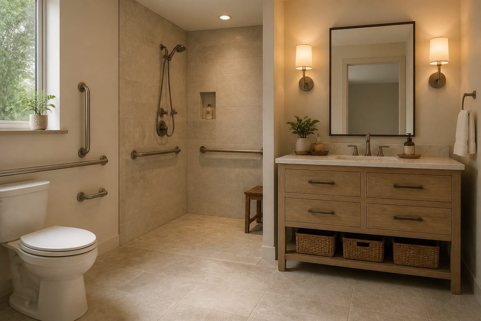
The trick is to stop hiding accessibility and start coordinating it. A matte black grab bar can look sharp in a modern bathroom if the faucet, mirror frame, and towel hooks share the same finish. A warm brass rail can look deliberate in a traditional bath when it relates to sconces and cabinet pulls. White plastic on beige tile looks clinical because it has no design allies.
Bathrooms usually need the most discipline. A curbless shower, if construction allows it, should be planned with slope, drain location, non-slip tile, and a place to sit. If a full remodel is not happening, a handheld shower on a slide bar, a fold-down teak seat, and blocking for future grab bars can still look refined. Place towel bars where towels belong and install actual grab bars where hands need support; towel bars are not safety devices.
In entries, a bench is not just cute styling. It gives a place to sit while changing shoes, dropping a bag, or waiting for a ride. A bench around 18 inches high with arms nearby, a 30 to 36 inch clear path past it, and a shallow shoe cabinet can make the front door feel calmer without announcing anyone’s age.
Kitchens need reach and contrast. A dark counter against dark cabinets can make edges difficult to see, especially under weak lighting. Use under-cabinet light, contrasting cabinet pulls, and a few pull-out shelves where bending is hard. If a microwave is above shoulder height, the room may photograph well and function badly.
Use AI design to preview aging-in-place changes before you commit
Use AI design to compare age-in-place choices in the actual room photo before you buy fixtures, furniture, flooring, or storage. Upload a straight image from the main doorway, then add measurements for doorway width, walkway pinch points, sofa length, bed size, vanity width, shower opening, and any furniture that must stay.
A strong prompt might say: design a senior-friendly living room that keeps the existing 84 inch sofa, adds two supportive armchairs, leaves a 36 inch route from entry to kitchen, uses a low-pile 8 by 10 rug, adds warm layered lamps, hides cords, avoids glass tables, and keeps the room traditional but not formal. Run a second version with a smaller coffee table, then another with a round ottoman. The best image is the one that makes safer movement look natural.
Privacy deserves attention when photos show bedrooms, medication areas, mail, calendars, family portraits, or medical equipment. Crop anything that does not help the design, and review private AI room design workflows before uploading sensitive rooms. The design tool only needs the room geometry, fixed finishes, and furniture constraints; it does not need prescription labels or addresses.
Judge every preview against reality. If the image widens a hallway, deletes a radiator, removes a stair, changes the shower size, or gives an 86-year-old a low armless lounge chair because it looks stylish, reject that part. Keep the useful direction and tighten the prompt.
Common mistakes to avoid in senior-friendly home design
The most common mistake is making safety look temporary. A suction grab bar, loose rug, clip-on light, and random shower stool may solve one afternoon, but they rarely make the room feel dignified. Permanent-looking choices, chosen in the room’s finish language, are usually kinder.
- Choosing low, deep furniture because it looks relaxed can make standing harder every day, so test seat height, arm strength, and depth before upholstery style. A chair that sits around 18 to 20 inches high with firm arms will usually serve an aging body better than a low slipper chair chosen only for scale.
- Ignoring glare makes expensive finishes feel hostile, especially in bathrooms and kitchens. Glossy tile, polished stone, and cool bulbs can create reflections that confuse depth perception; use warmer bulbs, matte surfaces where possible, and layered light instead of one bright ceiling fixture.
- Treating grab bars as bathroom accessories fails because support needs structure behind it. Plan blocking, stud locations, and correct placement with a professional, then choose a finish that relates to the faucet, sconces, mirror, or cabinet hardware.
- Filling rooms with small decorative tables creates obstacle courses. One stable side table beside a chair is better than three tiny stands, and round corners are often friendlier than sharp glass near a walking route.
- Designing only for frailty can make the home feel prematurely limited. A stylish accessible room should still host grandchildren, pets, friends, hobbies, holiday meals, and quiet mornings; the plan should reduce effort without draining personality.
There is also a resale angle, especially for homeowners adapting a long-time house before a future move. Thoughtful lighting, clearer circulation, better storage, and coordinated safety hardware can make a room feel more usable to many buyers, not just older adults. If resale is part of the horizon, use the restraint in an AI redesign for resale plan so accessibility reads as quality rather than a patchwork of urgent fixes.
When is the plan ready to buy or build?
The plan is ready when the safer version and the beautiful version are the same version. Before ordering anything, confirm the main walking routes, seat heights, rug sizes, lamp locations, outlet access, cabinet reach, shower entry, door swings, and whether future supports can be installed properly.
Buy or build in the order that protects daily life: fix hazards first, then lighting, then seating and bed height, then storage, then rugs and window treatments, then art and decorative layers. Do not let a pretty preview talk you into the wrong priority. A room with one good lamp, a stable chair, a clear path, and a coordinated grab bar is more elegant than a styled room that makes someone brace against the wall.
The best senior-friendly home does not look like it was designed around fear. It looks calm, easy, well lit, and personal, with every practical choice quietly doing its job.