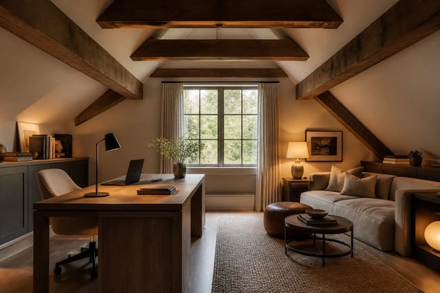
Mobile homes are not “small houses” with standard proportions, and treating them that way is the fastest route to a room that looks good only in a rendering. My firm take: manufactured-home interiors need stricter design rules than many larger houses because every inch of width, ceiling height, doorway placement, and built-in cabinet depth shows. The best plan respects the long sightlines, lower ceilings, panel seams, compact kitchens, and narrow circulation instead of pretending they are flaws to hide. This guide shows how to use AI previews without letting the tool invent a suburban floor plan your home does not have.
Can AI help design the interior of a mobile home?
Yes, AI can help design the interior of a mobile home by using real room photos to preview layouts, colors, storage, lighting, and furniture scale within narrower manufactured-home dimensions. The useful version is not a fantasy makeover with widened rooms and taller ceilings; it is a visual test that keeps the wall lengths, window positions, ceiling height, cabinet runs, vents, and traffic paths intact.
Mobile homes often have rooms that are 12 to 16 feet wide, with long rectangular living areas, compact bedrooms, shallow closets, and kitchens that open directly into the main sitting space. That means a normal “living room design” prompt is too loose. Ask for a 72 to 84 inch sofa instead of a deep sectional, a 5 by 8 or 8 by 10 rug instead of a rug that swallows the aisle, and storage under 18 inches deep where the path is tight.
If the home has a bump-out, angled hall, built-in dining bench, or unusually placed window, treat it like a design feature. The same discipline used for designing unusual floor plans with AI applies here: show the oddity clearly, name it in the prompt, and judge the preview by whether it solves that specific constraint.
What makes a mobile home room feel intentional instead of squeezed?
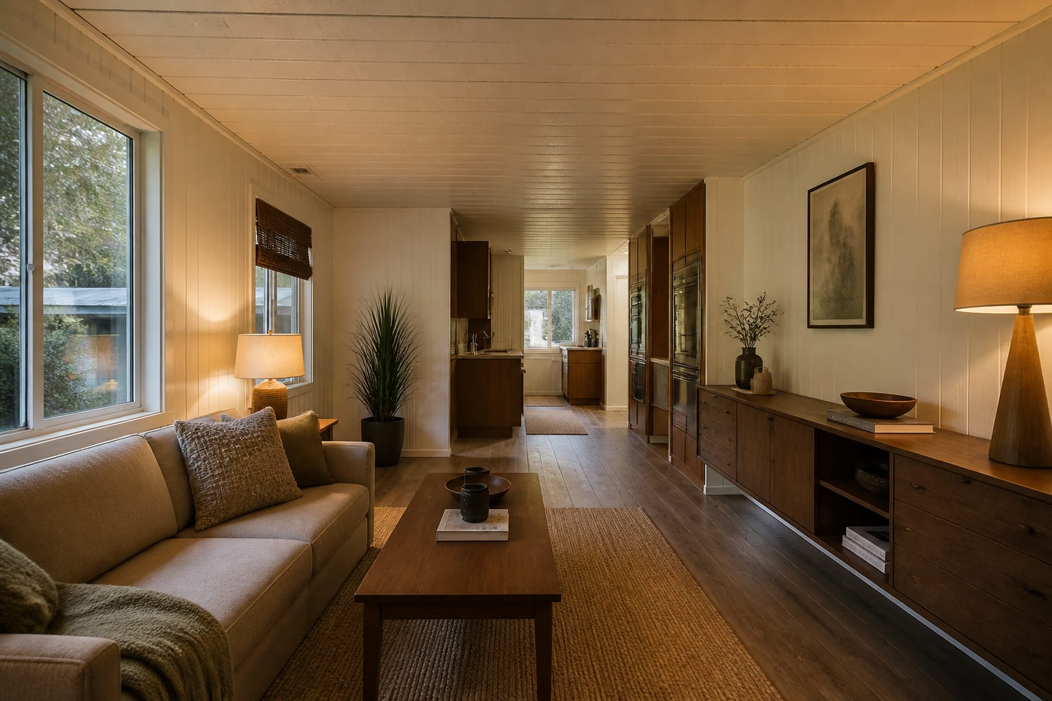
A mobile home room feels intentional when the long axis is controlled. Many manufactured homes have a front door, living room, dining edge, and kitchen in one stretched view, so scattered furniture makes the entire home feel busy before you have taken three steps inside.
Start with one clear visual lane from the entry to the next room. If the living area is narrow, keep the deepest furniture off the main route and let the sofa sit along the longest uninterrupted wall. A coffee table should usually leave about 18 inches from the sofa edge, but in a very tight room a 16 inch gap with rounded corners can be safer than a sharp oversized table.
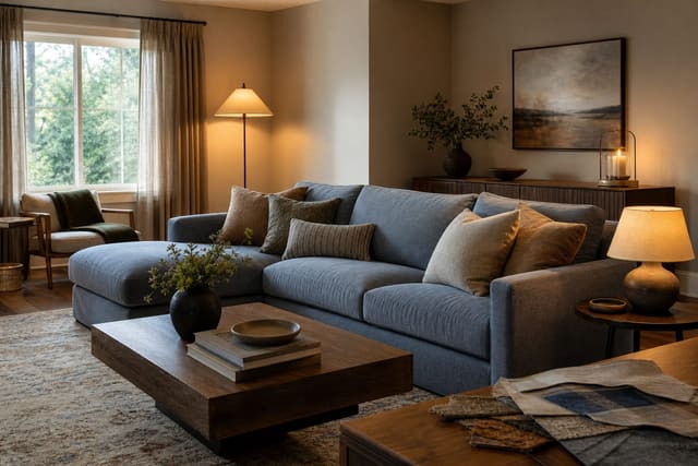
Scale matters more than style labels. A skirted farmhouse sofa, a modern track-arm sofa, or a cottage slipcovered piece can all work if the depth is controlled. A 40 inch deep sofa may make a narrow living room feel stalled, while a 34 to 36 inch deep sofa often gives the same comfort with less visual bulk.
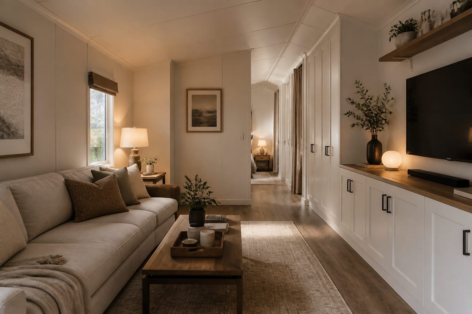
Ceiling height needs a lighter hand. Flush-mount fixtures, short drum shades, wall sconces, and table lamps usually look better than dangling pendants in a room with a low ceiling plane. Use 2700K bulbs in living rooms and bedrooms for warmth, and consider 3000K only where a kitchen counter or laundry task zone needs a cleaner read.
Which layout moves work in single-wide and double-wide homes?
Single-wide homes usually need corridor discipline; double-wide homes often need better zone definition. The mistake is assuming both want the same open-plan furniture arrangement.
Use these layout rules before asking the AI for style:
- Put the sofa where it protects the walking lane, because mobile home living rooms often share circulation with the entry, kitchen, or hall. Aim for 30 inches minimum on the tightest everyday path and 36 inches where people carry laundry baskets, groceries, or pet crates.
- Choose rugs that define a zone without becoming a wall, because a rug running across the main route visually cuts the home in half. In a compact sitting area, a 5 by 8 rug can work with the front sofa legs on it; in a wider double-wide, an 8 by 10 rug may make the seating group look settled.
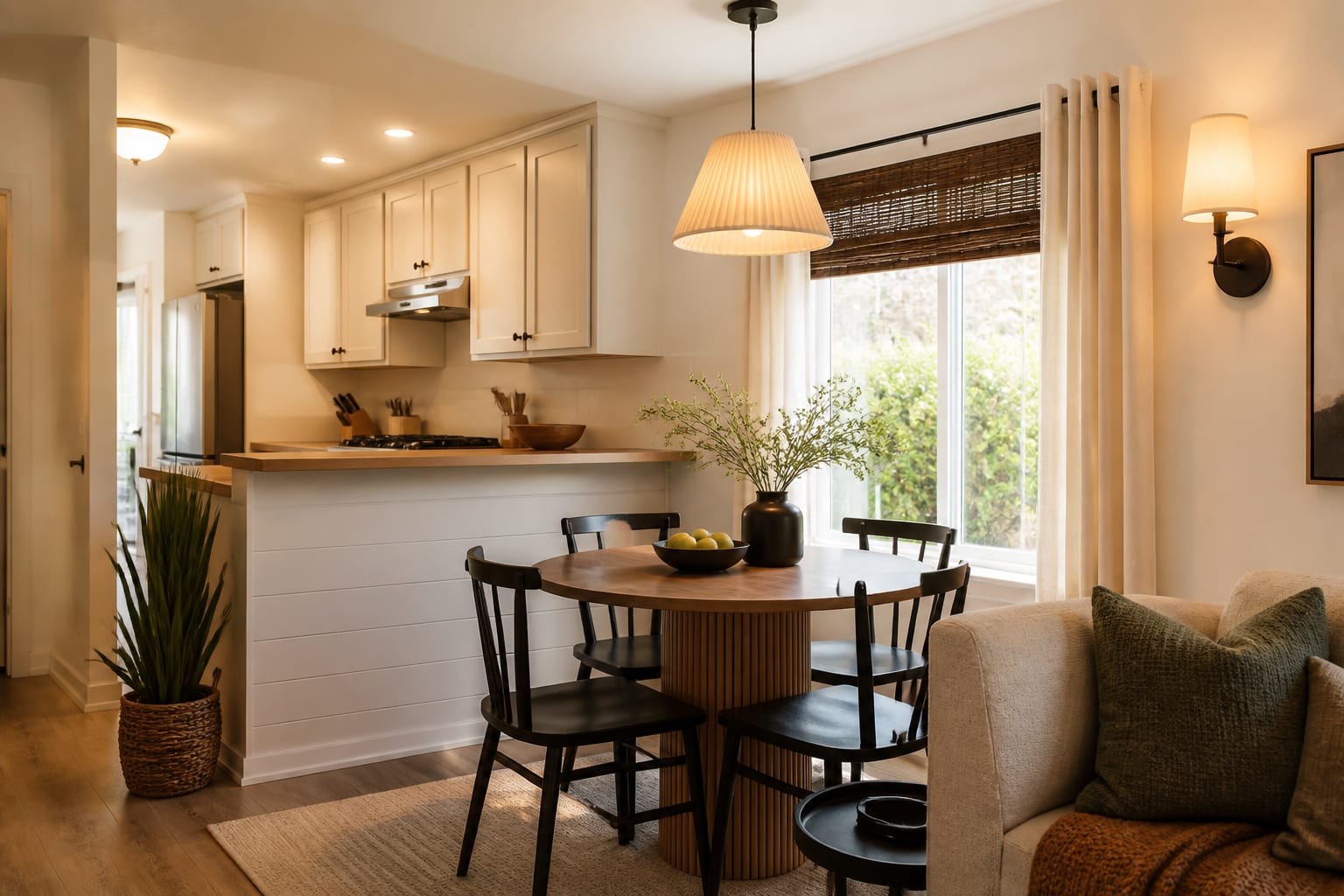
- Keep dining flexible when the kitchen is shallow, because a rectangular table can block cabinets faster than it appears to in a preview. A 36 to 42 inch round table or a wall bench with two chairs often handles meals without stealing the route to the sink.
- Use vertical storage on the least beautiful wall, because closed cabinets calm the view better than open shelves full of daily life. Look for 12 to 16 inch deep units near entries and halls, then reserve deeper storage for bedrooms or laundry rooms.
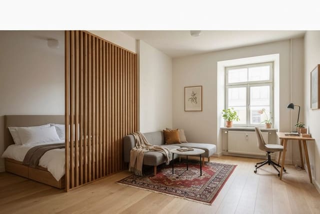
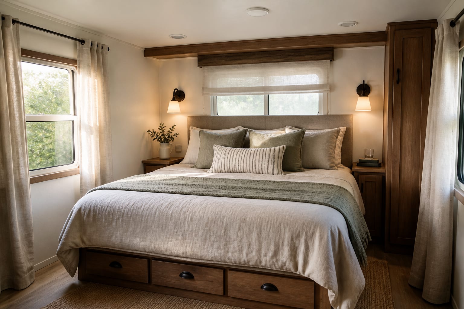
Tiny manufactured-home bedrooms borrow some logic from studio apartment zoning with AI, especially when the bed, dresser, closet, and door swing all compete in one view. A queen bed is 60 inches wide before the frame, so two 24 inch nightstands may be impossible; one proper 20 to 24 inch table plus a wall shelf can look more deliberate than two tiny apology tables.
How should finishes handle paneling, cabinets, and lower ceilings?
Mobile home finishes often include strong fixed surfaces: vinyl floors, wall panels, oak-look cabinets, laminate counters, metal vents, narrow trim, and factory-installed doors. The goal is not to erase every trace of the home; the goal is to make those surfaces look chosen.
If the walls have vertical seams, either lean into the rhythm or quiet it down. Warm white paint can make paneling feel cleaner, but a cool gray beside honey cabinets may turn the whole room sour. When the floor, cabinets, and counters disagree, use the same method as a fixed-finish undertone strategy: pick the bossiest surface, then choose paint, textiles, and metals that support it instead of starting a new color argument.
Low ceilings usually dislike high-contrast horizontal bands. Dark lower cabinets can work, but a dark chair rail, dark ceiling fan, dark sofa, and dark rug may compress the room. If you want drama, put it in one strong area: a deeper cabinet color, a patterned runner, a textured headboard, or art hung in a vertical stack.
Curtains can help more than people expect. If the window trim is plain and the wall material can handle hardware, mount rods 4 to 8 inches above the casing and let panels land within 1/2 inch of the floor. In rentals or homes with delicate wall panels, tension rods, inside-mount shades, or lightweight curtain tracks may be smarter than heavy drapery hardware.
Use AI design to preview a mobile home before you commit
Use AI design as a measured rehearsal for the manufactured home you actually own, not the larger house the tool may want to draw. Upload a straight photo from the main doorway or the farthest corner, with the floor line, ceiling line, windows, vents, built-ins, door swings, and cabinet edges visible.
A strong prompt might say: design a single-wide mobile home living room with the existing wall paneling, a 78 inch sofa, a 5 by 8 rug, 30 inch path to the kitchen, closed storage under 16 inches deep, warm 2700K lamps, light curtains, no wall removal, no new windows, and no change to the ceiling height. That prompt gives the AI the restrictions that make the result believable.
Run versions with different decisions, not just different styles. Test sofa placement first, then storage, then palette, then lighting. If the AI removes the ceiling vent, widens the hallway, changes the cabinet run, deletes a furnace closet, or turns a low window into a picture window, keep the mood and reject the layout.
Common mistakes to avoid in mobile home AI makeovers
The most common mobile home AI mistake is letting the preview solve the wrong house. A pretty image is useless if it depends on extra width, taller ceilings, hidden vents, or a missing built-in.
- Buying furniture at standard suburban scale makes narrow rooms feel blocked, so check depth before you check fabric. A 96 inch sofa may fit on one wall, but a 76 to 84 inch sofa with slimmer arms often leaves a better path and still seats real people.
- Ignoring ceiling fixtures makes the home feel lower, so replace heavy visual bulk with flatter lighting and lamps at different heights. A low-profile flush mount, two table lamps, and one plug-in sconce can make a room feel layered without dropping a pendant into head space.
- Painting every surface bright white can make older cabinets and vinyl floors look harsher, so test warmer whites, mushroom, clay, soft olive, or muted blue against the fixed finishes. The right neutral should flatter the floor and cabinets, not shame them.
- Using open shelving as the main storage turns compact rooms into visual noise, so hide the daily items first. Closed shoe cabinets, lidded benches, skirted laundry carts, and shallow wardrobes do more for a mobile home than another display shelf.
- Trusting an AI image that deletes practical systems creates expensive frustration, so protect registers, access panels, furnace closets, electrical panels, and plumbing walls in the prompt. Those unglamorous details decide whether the design can exist.
A mobile home plan is ready when the same preview survives the tape measure. Confirm sofa length and depth, rug size, walkway width, bed clearance, cabinet depth, window treatment height, outlet locations, vent clearance, and every door swing before ordering. Buy in the order that protects daily life: layout-defining furniture first, storage second, lighting third, rugs and curtains fourth, then art and smaller objects. The win is not making a manufactured home impersonate something else; the win is making its real proportions feel calm, useful, and deliberately designed.