A multi-generational home does not fail because grandparents like carved wood and teenagers like clean-lined black furniture. It fails when nobody decides which rooms are shared, which rooms are private, and where each generation is allowed to have a strong opinion. My firm take: the public rooms need a diplomatic design language, but private rooms should not be forced into family-wide neutrality.
Can AI help design a home where multiple generations live together?
Yes, AI can help design a home where multiple generations live together by previewing shared rooms, private zones, furniture scale, color palettes, storage, and style blends before anyone buys the wrong sofa or paints over a finish someone loves. The value is not that AI magically settles family taste; the value is that it makes the conflict visible while the fix is still cheap.
Start with photos of the real rooms, not inspiration images. A living room with a bay window, a recliner that must stay, a toy basket, and a piano has different rules than a blank online mood board. Add measurements in the prompt: sofa wall length, ceiling height, doorway width, rug size, and any furniture that is non-negotiable.
For families planning more than one room, think beyond a single pretty angle. A whole home AI design plan is useful because the entry, living room, kitchen, guest suite, and hall bath are experienced as one sequence. If the entry says farmhouse, the living room says hotel modern, and the dining room says inherited mahogany, the house may have meaningful pieces but no shared grammar.
Which rooms need one shared style, and which can split?
The biggest mistake in a multi-gen house is asking every room to carry every preference. Shared rooms need enough consistency that the home feels calm, but they also need enough personality that nobody feels erased. Private rooms can be more specific because they are not carrying the whole family’s visual identity.
Use this room-by-room split before choosing paint or furniture:
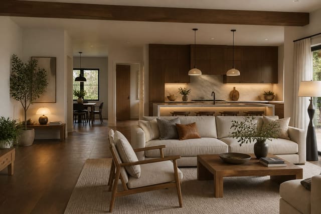
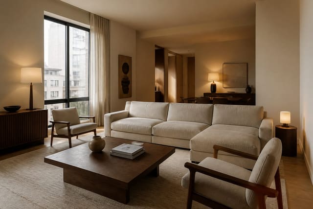
- Treat the living room as the style bridge because it hosts the widest emotional range. Pair one warmer traditional anchor, such as a wood coffee table or framed landscape, with one cleaner modern anchor, such as an 84 to 96 inch sofa in a plain performance fabric; the mix works because each side gets a visible vote.
- Give the kitchen fewer competing finishes because food, cleanup, homework, and hosting already create visual noise. If cabinets are fixed, repeat one cabinet tone in counter stools, runner, or hardware, and keep pendant shades roughly 30 to 36 inches above the island so the room feels practical rather than theatrical.
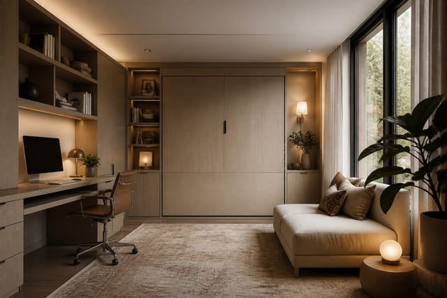
- Let bedrooms become more personal because they are recovery spaces, not family committees. A grandparent’s room may want a 24 to 30 inch nightstand, a chair with arms, and lamps reachable from bed, while a teen room may need wall-mounted storage above 60 inches and a desk that can survive schoolwork.
- Make bathrooms and hallways the quiet connectors because they are too small for style debates. Warm white walls, simple mirrors 2 to 4 inches narrower than the vanity, washable runners, and good hardware can connect different rooms without pretending everyone has identical taste.
This is where dual-use planning becomes important. A guest room that doubles as a grandparent’s sitting room, a homework zone that becomes an office, or a den that handles overnight visitors needs a clear priority. If the household is constantly converting rooms, compare your plan against AI dual-purpose room design so the furniture does not solve one generation’s need by blocking another’s.

How do two styles become one house instead of a compromise?
Two styles become one house when they share color temperature, scale, and material repetition. They do not need to match. Matching is often the enemy in a family home because it makes inherited pieces look accidental and new pieces look timid.
Pick one dominant mood for the shared areas. Warm traditional plus modern clean lines can work beautifully if the palette stays connected: cream walls, walnut or oak, blackened bronze, olive, clay, linen, and one deep accent. Coastal modern plus grandmother’s antiques can work if the antiques are edited, the upholstery is lighter, and the wood tones are repeated instead of scattered.
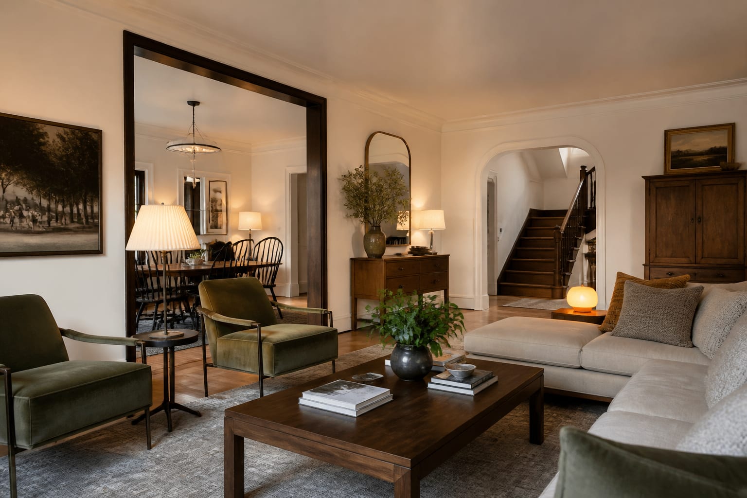
Scale is the referee. A heavy carved sideboard can sit near a modern dining table if the table has enough visual weight, usually a 1 1/2 inch or thicker top, substantial legs, or a textured rug beneath it. A delicate antique chair beside a huge sectional often looks abandoned, so give it a companion: a small table, floor lamp, and art stack that make it read as a purposeful reading corner.
Lighting also calms mixed styles. Use 2700K bulbs in living rooms, bedrooms, and dens, then reserve 3000K only for kitchens or task-heavy baths where the finishes can handle a slightly crisper light. Matching lamps are not required, but lampshade color matters; three cream linen shades can make different bases feel related.
What privacy choices keep everyone comfortable?
Privacy in a multi-generational home is usually lost through sightlines before it is lost through square footage. If someone’s bed, medicine cabinet, work monitor, or laundry pile is visible from a main route, the house will feel more crowded than it is. A door helps, but a better plan layers visual privacy, sound control, and storage access.
Bedrooms used by older adults should avoid obstacle-course design. Keep at least 30 inches on the easier side of the bed when possible, choose rugs with low pile and a rug pad, and place switches or lamps where they can be reached without crossing a dark room. If mobility is a factor, a chair with arms and a seat around dining-chair height is often more useful than a low accent chair chosen for looks.
Younger residents need privacy that does not turn into isolation. A teen room can have stronger color, posters, gaming storage, or a black desk, but the shared hallway should still feel intentional. Use a consistent door color, runner, or sconce style to connect private expressions to the rest of the house.
For remote work, caregiving, guests, or adult children returning home, privacy becomes a planning requirement. Frosted film, lined drapery, bookcases used as partial screens, acoustic panels disguised as art, and closed storage can change daily life without major construction. If photos include sensitive rooms or family documents, review AI room design privacy options before uploading images, and crop out addresses, medication labels, school papers, and personal calendars.
Use AI design to preview the family style agreement
AI design is most helpful when the prompt describes the household tension plainly. Do not ask for “a beautiful family living room.” Ask for the actual negotiation: a multi-generational living room that keeps a traditional wood cabinet, adds a modern washable sofa, includes two supportive chairs, uses a 9 by 12 rug, leaves 36 inch circulation to the kitchen, and blends warm neutral walls with muted blue or olive accents.
Run separate previews for the main disagreement. One version can lean warmer and more traditional, one can lean cleaner and more modern, and one can deliberately split the difference. Judge the images by what survives: the sofa shape, rug size, wall color, lighting temperature, storage wall, and whether the inherited piece looks honored or merely tolerated.
Do not let AI invent impossible architecture. If a preview removes a column, widens a doorway, hides a radiator, or turns a small den into a hotel suite, treat it as a style sketch only. The useful version respects the photo: same window, same ceiling, same awkward corner, same door swing. The best multi-generational preview is not the prettiest one; it is the one that reduces family friction while keeping the room buildable.
Common mistakes to avoid in multi-generational home design
The first mistake is designing the shared rooms for the loudest opinion. A house can look decisive and still be unfair. If one person’s taste dominates every wall, the other generations will start expressing themselves through clutter, avoided rooms, or furniture that never quite gets approved.
The second mistake is using beige as a peace treaty. Beige can be lovely, but blandness is not the same as agreement. A better shared palette might use warm white walls, oak, charcoal, olive, rust, and brass, then let private rooms take stronger turns. Neutral rooms still need contrast, texture, and a few pieces with memory.
The third mistake is ignoring comfort differences. A low lounge chair may suit one adult and trap another. A glass coffee table may look light but create sharp corners for toddlers. A deep sofa can be cozy for movie night and terrible for someone who needs firm back support. Test seat depth, arm height, table edges, and walking routes before treating style as the only problem.
The fourth mistake is keeping every inherited piece in the most public room. Sentimental furniture deserves respect, not automatic placement. If a cabinet is too tall for the living room or a dining set blocks circulation, preview it in a bedroom, hall, office, or guest suite before deciding it has to define the main floor.
The fifth mistake is buying large pieces before the family agrees on the role of each room. A sleeper sofa, sectional, dining table, wardrobe, or pair of recliners can set the entire plan. Confirm the purpose, the clearances, the lighting, and the style bridge first, then shop. In a shared house, the wrong large purchase does not just waste money; it becomes a daily argument with upholstery.
A multi-generational home is ready for purchases when the public rooms have a shared palette, the private rooms have permission to differ, and the largest furniture has survived a measured preview. That is the design agreement worth making before the delivery truck arrives.