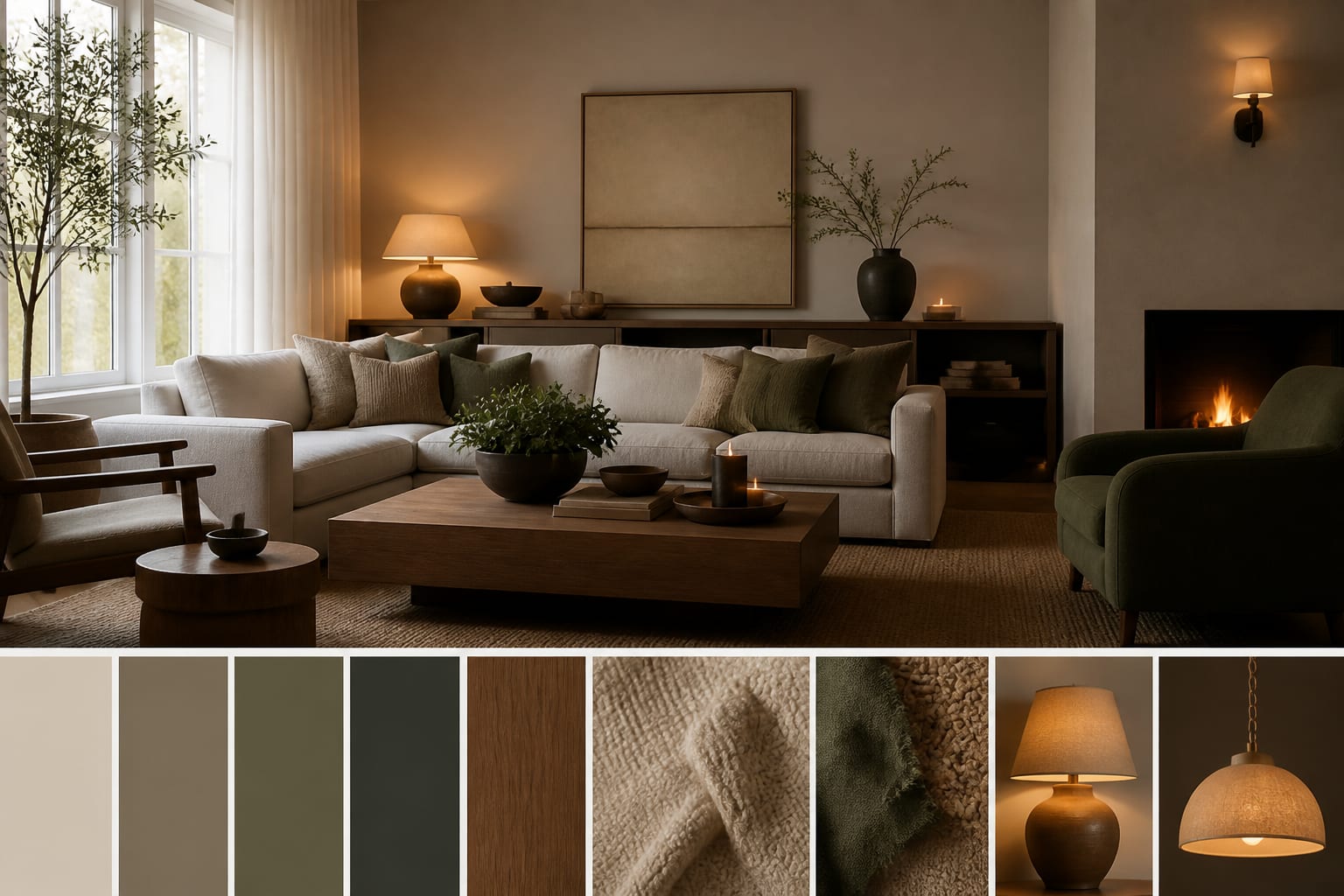
A mood board made from a real room photo is better than one built from random inspiration images. My firm opinion: start with the room you already have, because your floor color, window light, trim, ceiling height, and bulky sofa are not optional background details. A board made from fantasy interiors can be pretty and still betray the space the minute you shop from it. The smart workflow is to use AI to read the existing room, extract a direction, then test whether that direction survives your actual constraints.
Can AI generate a useful mood board from your room photo?
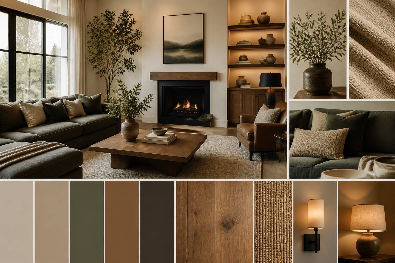
Yes, AI can generate a mood board from a photo of your room by using the image as the starting point for color, material, furniture, lighting, and style direction. The best result is not a collage of beautiful objects floating in space; it is an ai room concept board photo that respects what is already fixed.
That distinction matters. If the room has orange oak floors, cool gray tile, glossy white cabinets, a north-facing window, or an 8-foot ceiling, the mood board should respond to those facts instead of pretending you live inside a showroom. AI can suggest wall colors, wood finishes, rug textures, lamp shapes, art scale, and furniture silhouettes, but you still need to check measurements and samples before buying.
When people search for ai generate moodboard tools, they often expect a finished answer. I would treat the first board as a sharp draft. It should narrow the room to a palette, a material family, and a furniture attitude: warm traditional with aged brass, quiet modern with walnut and linen, rental-friendly soft minimal, or a more layered collected look.
Key Takeaways
What should the photo and prompt include before you generate?
The photo is the raw material, so do not upload a crooked, cluttered corner and expect the AI to understand the room. Shoot from standing height, roughly 48–60 inches off the floor, and keep at least two walls visible when possible. A 4:3 crop often gives the tool enough architecture without the stretched edges that make small rooms look fake.
If the room feels dim, mention the light problem in the prompt instead of letting the AI invent sunshine. The same logic behind making fake natural light feel believable applies here: pale finishes, warmer lamps, reflection, and contrast have to work together.
- Keep fixed surfaces visible, because the board has to harmonize with the floor, tile, brick, cabinet stain, countertop, trim, and major upholstery already in the room. A sage palette that flatters white oak can look muddy beside pink-beige tile, so crop for context rather than drama.
- Name what must stay, because AI loves replacing the exact piece your budget depends on. Write that the gray sectional, 84-inch media console, black ceiling fan, queen bed, rental carpet, or cherry cabinets remain, then ask for a direction around them.
- Add scale anchors, because mood boards become expensive when they ignore proportion. Include the room size, ceiling height, sofa length, rug size, window width, or a key limit such as 30–36 inches of walking space through the main path.
- Give one style lane and one material lane, because too many adjectives make the board vague. Warm modern with walnut, cream linen, matte black, and muted clay will usually beat cozy organic contemporary vintage.
How do you turn one photo into a real concept board?
Start by asking AI for a board that preserves the room before it beautifies the room. A strong prompt might read: create a mood board from this 11 by 13 foot bedroom photo, keep the oak floor, white trim, queen bed, and 8-foot ceiling, then suggest a calm warm modern palette with linen texture, walnut nightstands, plug-in sconces, mushroom walls, and no built-ins.
Generate two or three boards around different directions, not twenty unrelated fantasies. One board can test warm neutrals, another can test muted color, and a third can test a darker, moodier version. If you generate too many options, the eye gets tired and the room starts to feel less clear.
Look for repetition across the best boards. If walnut, shaded lamps, a larger rug, warmer walls, and lower contrast art appear again and again, the room is probably asking for warmth and softness. If every good board removes open shelving, glossy finishes, or tiny rugs, the room is telling you what to stop doing.
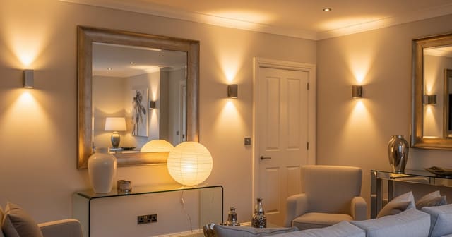
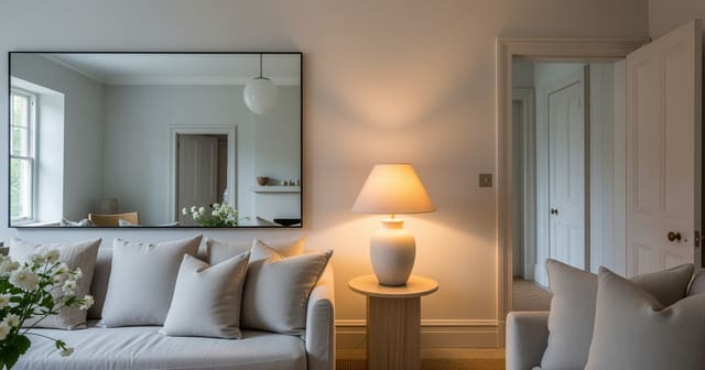
Be especially strict with mirrors. A mirror belongs on the board only when it reflects a window, lamp, pale wall, or long sightline; the placement principles in using mirrors to amplify light are more useful than another decorative rectangle over a console.
Common mistakes to avoid
The most common mistake is treating the mood board as proof that every item belongs in your room. A board is a direction; your room still needs clearance, samples, and permission checks.
- Building from inspiration images fails when the real room has a stubborn undertone. If your floor is orange oak or your tile is cool gray, force the AI to keep that surface visible and ask for materials that calm it rather than fight it.
- Asking for a complete makeover fails when you need a design language first. Instead of requesting a finished room, ask for palette, material, lighting, and furniture shape recommendations that work with the existing photo.
- Ignoring scale fails because mood boards flatten big decisions into cute squares. A 96-inch sofa, 42-inch coffee table, or 24-inch-deep cabinet may look harmless on a board, but those numbers can block a doorway or swallow a small room.
- Choosing from screen color alone fails because walls, fabrics, and wood finishes shift under real light. Order 2–4 paint sheets, fabric swatches, or wood samples, then view them beside the floor and trim in morning and evening light.
- Letting the AI replace rental limits fails when the board depends on hardwired sconces, new flooring, or painted trim you cannot touch. Tell it no drilling, no permanent lighting, no cabinet painting, or removable changes only before the first generation.
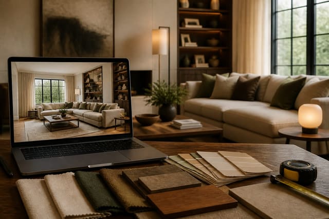
Use AI design to preview the mood board before you commit
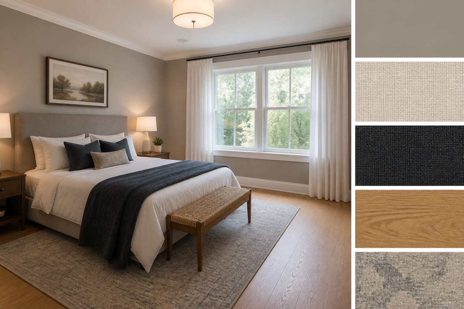
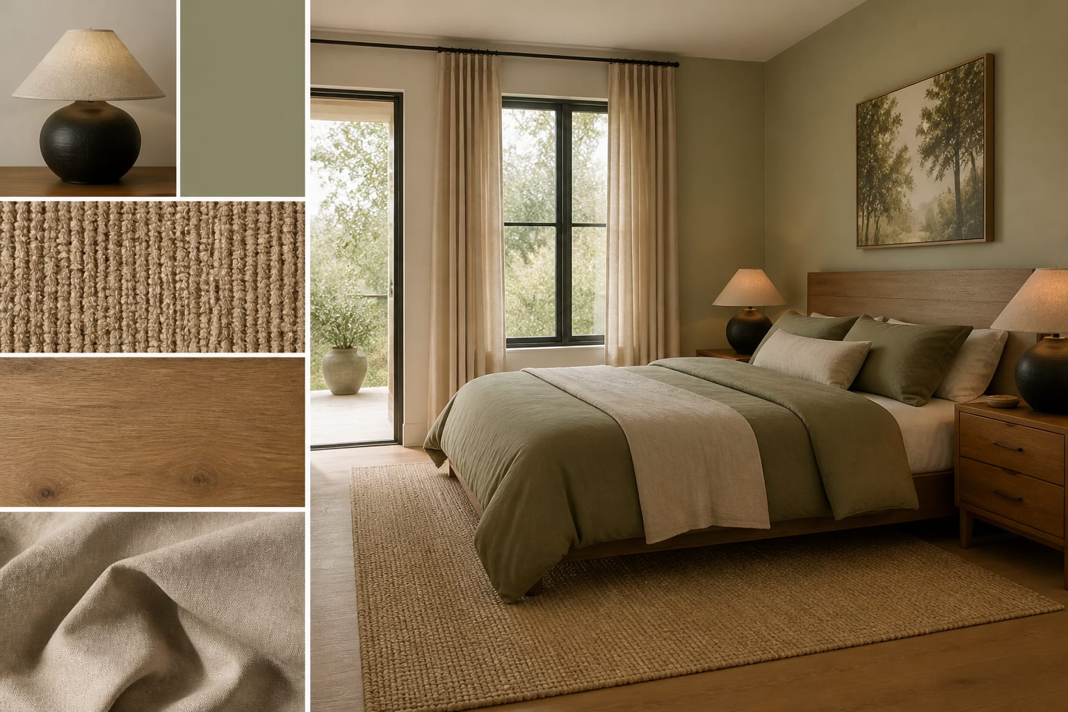
A mood board becomes much more useful when you preview it on the same room photo. Upload the room, generate the board, then ask for a room preview that applies the chosen palette, materials, lighting, and furniture shapes while keeping the architecture unchanged.
This is where iterating an AI room design matters. If the first preview uses the right colors but removes the window, correct the window before changing the style. If the furniture mood feels right but the rug looks too small, keep the mood and test an 8 by 10 versus a 9 by 12 rug. If the board depends on soft lighting, ask for two table lamps, one floor lamp, and warm 2700K bulbs instead of a vague glow.
The upload-and-preview loop also exposes weak boards quickly. A board of cream boucle, pale oak, and white walls may look serene as a collage, then feel washed out against beige carpet. A darker board may look sophisticated until the preview shows it swallowing a small north-facing room. The point is not to make AI decide for you; the point is to make the room argue back before your credit card does.
How do you turn the board into a room you can buy for?
Translate the board into a plain shopping brief before opening a single product tab. If the board says warm modern bedroom, rewrite it as warm white walls, low upholstered headboard, two 24-inch walnut nightstands, linen curtains mounted 6 inches above the casing, two plug-in shaded sconces, 2700K bulbs, muted wool-look rug, and black metal picture frames.
That sentence is useful because it contains objects, sizes, finishes, and limits. It can be priced, sampled, measured, and challenged. A vague board cannot tell you whether the nightstand fits beside the closet door or whether the curtain panel can reach the floor from the proposed rod height.
Before buying the largest pieces, test the board physically. Tape the rug footprint. Hold paint sheets near the trim. Put fabric swatches on the sofa. Measure the path from the doorway to the seat. Check whether drawers, closet doors, and windows still open. If the room has kids, pets, a landlord, or a strict budget, those realities belong in the final board just as much as the color palette.
The best AI mood board does not make the room feel imaginary. It makes the next step obvious: sample this paint, test this rug size, swap this lamp temperature, keep that sofa, and stop shopping for pieces that belong to a different house.
- Pull palette, texture, and shape cues.
- Choose three reference objects first.
- Use the moodboard to set direction.
- Pull palette, texture, and shape cues.
- Choose three reference objects first.
- Use the moodboard to set direction.
- Pull palette, texture, and shape cues.
- Choose three reference objects first.
- Use the moodboard to set direction.
- Pull palette, texture, and shape cues.
- Choose three reference objects first.
- Use the moodboard to set direction.