Paint paralysis is real because the tiny chip never tells the truth about your room. My firm opinion: you should not choose wall color from a fan deck alone, especially if the space has beige carpet, orange oak, gray tile, or weak daylight. AI will not replace real paint samples, but it can kill the worst options before you spend a weekend rolling the wrong beige onto four walls. The right workflow is photo first, preview second, sample third.
Can AI help you choose a paint color for a room?
Yes, AI can help you choose a paint color for a room by previewing wall colors on a photo of your actual space before you buy samples or gallons. The useful part is not that AI knows one magical color; it shows how a color behaves next to your floor, trim, sofa, cabinets, and daylight.
Think of AI paint color suggestions as a fast rejection tool. If five greens make your cherry floor look redder, you learn that before buying quarts. If a warm white looks dingy beside cool gray tile, you can test a cleaner white or a muted greige instead. The preview should narrow the field to 2–4 real samples, not crown a winner from the screen.
If the room feels dim before paint enters the conversation, solve light and color together. A wall color that looks elegant in a sunny room may die in a north-facing den, so pair the preview with practical ideas for making fake natural light feel believable before you blame the paint.
What must the room photo reveal before color is believable?
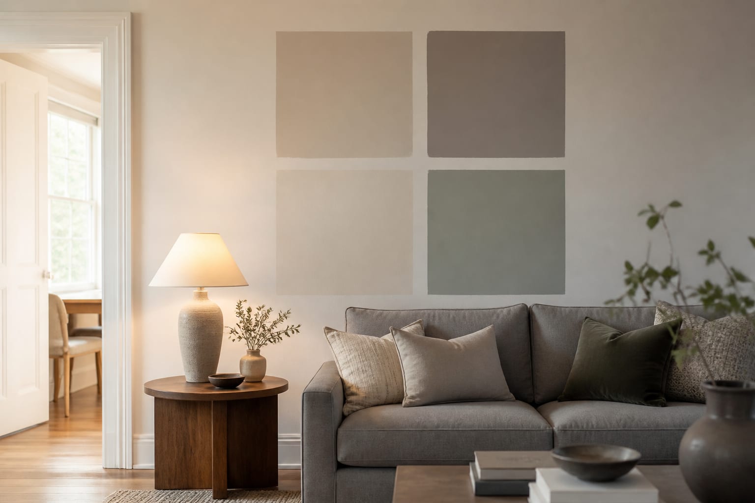
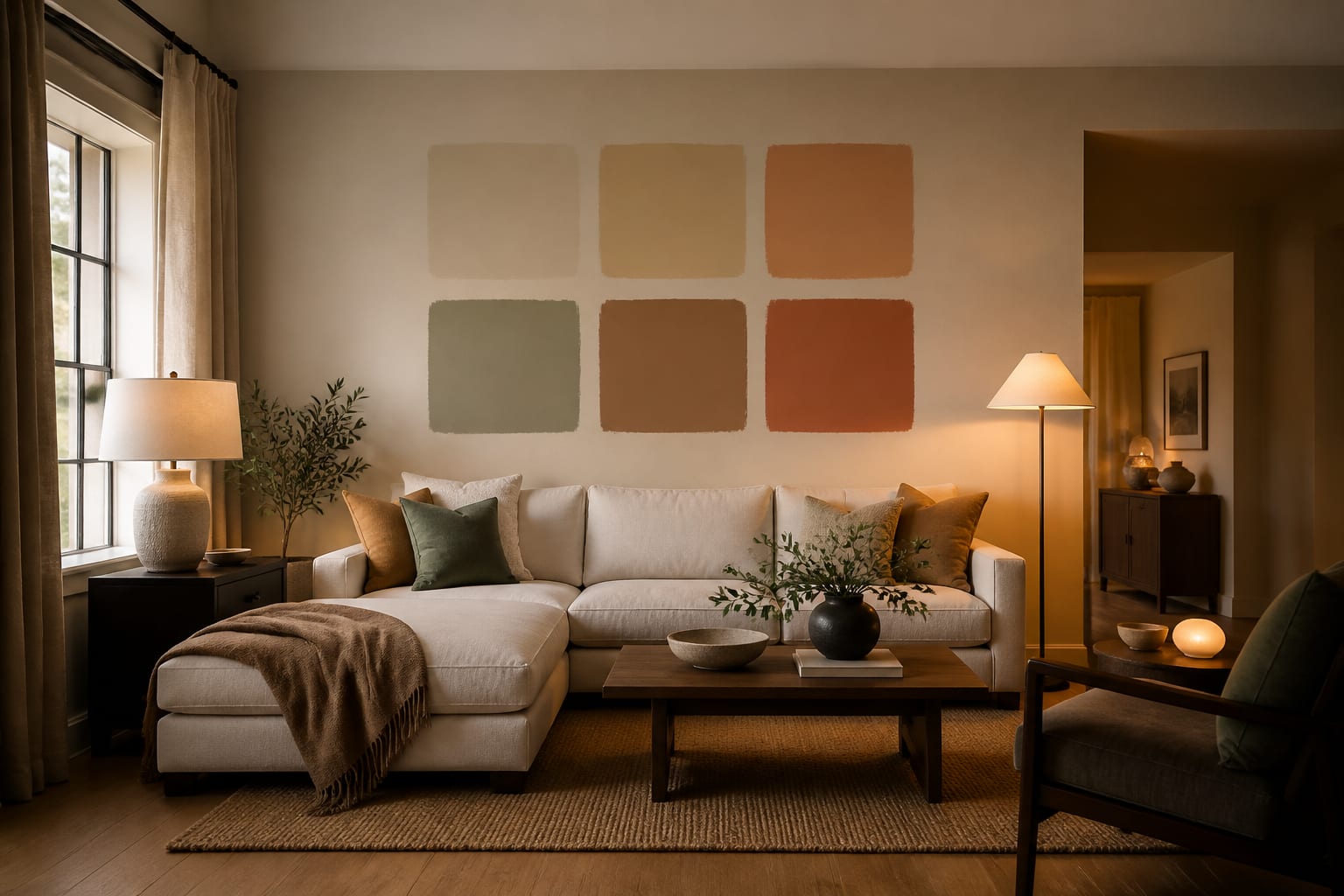
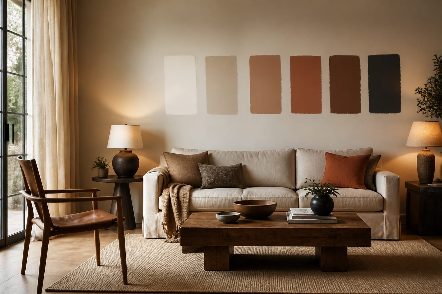
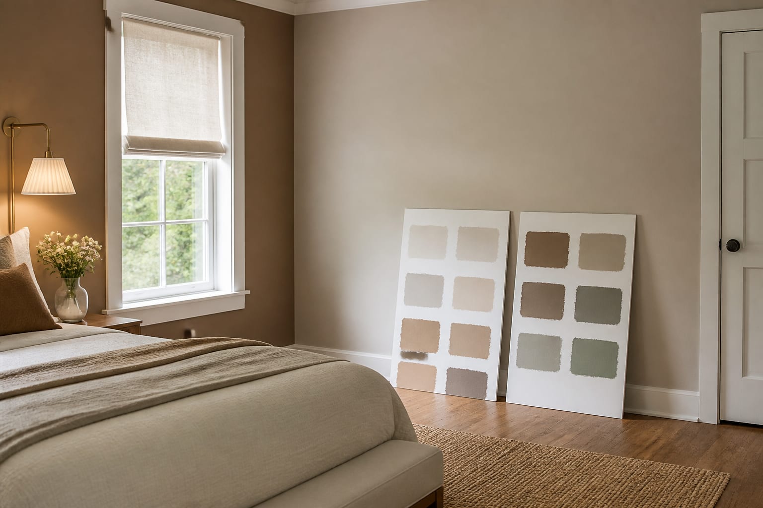
A paint preview is only as honest as the photo feeding it. If the image hides the floor, blows out the window, or crops off the trim, the AI has to guess the very surfaces that decide undertone.
Shoot the room from standing height, roughly 48–60 inches off the floor, with the phone level enough that door frames do not lean. A 4:3 crop usually works better than a dramatic wide angle because it preserves corners without bending walls. Show at least two walls when possible, plus the floor, ceiling line, window direction, and anything expensive that will stay.
Use these photo rules before asking AI to choose paint:
- Keep fixed finishes visible because paint has to answer them first. Show flooring, tile, stone, brick, cabinetry, countertops, large rugs, and trim; a cream that flatters white oak can turn sour beside pink-beige tile.
- Photograph in clean daylight because mixed color temperatures distort undertones. Open shades, turn off colored LEDs, and if lamps are necessary, keep bulbs in the 2700K–3000K warm-white range so the preview does not invent a false wall color.
- Leave scale anchors in the frame because paint changes with wall size. A 10 by 12 foot bedroom wall covered in muted clay feels different from a powder room accent wall, and the AI needs furniture, doors, and windows to read that proportion.
- Remove small clutter because visual noise becomes fake design information. Mail, laundry, toys, and loose cords can push the preview toward busy styling when the actual decision is whether the walls should be mushroom, warm white, olive, or blue-gray.
The paint-color framework that beats guessing
Start with the surfaces you are not changing. Paint should make the fixed elements look intentional, not expose them as leftovers. If the floor is orange oak, avoid wall colors with too much yellow unless you want the whole room to read honey. If the tile is cool gray, test cleaner whites, muted blue-grays, or soft taupes before reaching for creamy beige.
Then decide whether the room needs the paint to brighten, soften, deepen, or connect. Brightening usually means warm whites, pale greiges, or colors with a higher LRV. Softening often means dusty, low-chroma colors: mushroom, clay, sage, putty, or blue-gray. Deepening can work beautifully in bedrooms and dining rooms, but dark colors with an LRV below 10 need enough lamps, contrast, and confidence.
Use AI to choose wall color with a prompt that gives the tool boundaries instead of vibes. A strong version sounds like: “Preview three wall colors for this 11 by 13 foot north-facing bedroom with white trim, oak floors, an 8-foot ceiling, a beige upholstered bed, and warm 2700K lamps. Keep the ceiling and trim white. Show warm white, muted mushroom, and soft sage options.”
If you are testing mirrors with a new paint direction, ask the AI to place them where they reflect a window, lamp, or pale wall. The same rule behind using mirrors to amplify light applies to paint previews: reflection only helps when it bounces something worth seeing.
Common paint color mistakes to avoid
The most common paint mistake is choosing the color you like in isolation. Paint is relational; it changes when the floor, trim, furniture, and daylight push against it.
- Choosing white because the room is dark fails when the light is weak or cold. A bright white can look gray in a shaded room, so test warmer whites, pale greige, or a soft putty beside your trim before assuming white equals bright.
- Ignoring trim color fails because trim is the paint’s closest neighbor. If the trim is a cool factory white, a creamy wall may look dirty; if the trim is warm ivory, a crisp blue-white wall can make it look yellow.
- Trusting the screen fails because AI previews and monitors smooth out undertones. Buy sample sheets or paint at least 24 by 36 inches on two different walls, then check them morning, afternoon, and after dark with your normal lamps on.
- Painting every wall dark fails when the room has no lighting plan. Deep green, navy, oxblood, or charcoal needs contrast from pale art, warm lamps, lighter textiles, or natural wood so the room feels designed instead of swallowed.
- Forgetting doorways fails in rooms where wall color moves from one area into another. If a living room opens into a hall, kitchen, and stair, test the color from each threshold; a guide to a room with too many doorways can help you protect sightlines before you paint the chopped-up walls.
Use AI to preview your wall color before you commit
AI design is strongest when it lets you compare the same room with different wall colors while the fixed pieces stay put. Upload one clear photo, write one tight prompt, and ask for 3–5 color directions that solve the actual issue: too cold, too yellow, too dark, too bland, or disconnected from furniture.
Do not ask for “a beautiful color.” Ask for decisions. Try “make the oak floor look less orange,” “keep the gray sofa from looking flat,” “warm up this north-facing office,” or “test renter-friendly paint alternatives with no trim change.” The more physical the prompt, the more useful the preview.
After the first set, revise around what the AI gets wrong. If it changes your flooring, repeat “keep the existing floor.” If it paints the trim, say “walls only, trim remains white.” If it adds unrealistic sunlight, ask for the same room in evening light with two shaded lamps. This is how AI paint color suggestions become a working shortlist instead of a pile of pretty walls.
The final step still happens in the room. Order the best 2–4 samples, place them near the trim and floor, and view them beside the largest furniture piece that will stay. If the AI preview and the real sample disagree, believe the wall.