Color is where most art deco rooms either soar or stumble. The era loved saturation and contrast, but the palette only works when one dominant hue leads and the rest play supporting roles. Get the balance wrong and a deco room tips from glamorous into garish. The classic schemes pair deep, jewel-like colors with crisp neutrals and a shimmer of metal, so each surface feels intentional. Whether you favor stark black and white or velvety emerald, the logic stays the same. This guide covers the signature colors and how to combine them so the result reads as luxury.
The Signature Deco Colors
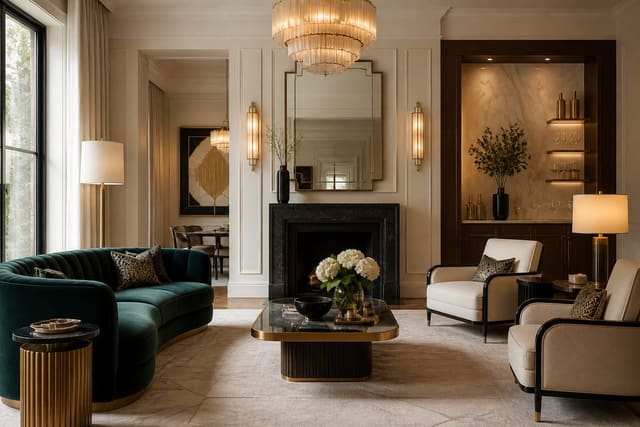
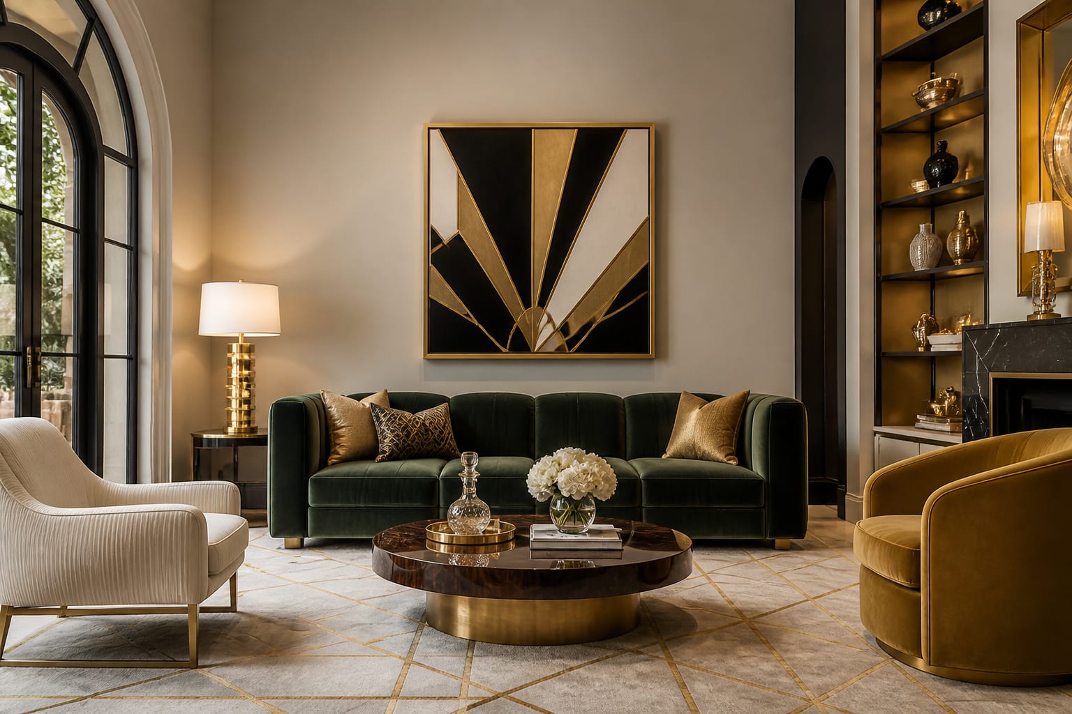
Certain hues recur so often in period interiors that they have become shorthand for the style. At the saturated end sit the jewel tones: emerald green, sapphire and peacock blue, oxblood and ruby red, and deep amethyst purple. These colors carry the velvety richness the era adored and look spectacular under warm light. Anchoring them is the black-and-white axis, a high-contrast pairing that gives deco its graphic backbone and never feels dated. Metallics form the third pillar, with gold, brass, and silver adding shimmer that pulls the whole scheme together. Softer period shades round out the family, including blush pink, dusty rose, seafoam green, and pale champagne, which offer a gentler residential take. A common rule of thumb is to cover roughly 60% of a room in your dominant color and reserve the remaining 40% for neutrals and metallic accents. That ratio keeps even a bold scheme from overwhelming the space. The colors were almost never used at full strength across every surface; instead they appeared in concentrated, deliberate doses against calmer backdrops. Knowing the core family gives you a reliable starting point for any deco room.
See also our guide to What Is Art Deco Design for more on art deco color palette.
Balancing Bold Hues With Neutrals
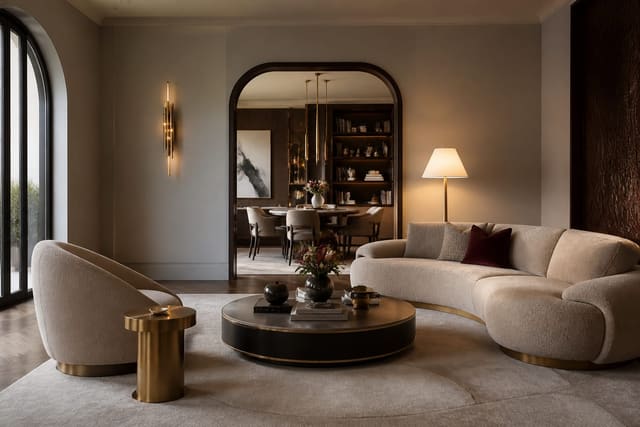
The secret to a successful deco palette is restraint within boldness. Pick one hero color and commit to it fully, then let neutrals carry the rest of the room so the eye has somewhere calm to land. An emerald lacquered wall feels luxurious when the surrounding trim, ceiling, and larger furniture stay in soft cream or warm white. If you want two strong colors, keep them in the same tonal family, pairing sapphire with teal rather than fighting it against red. The classic 60-30-10 formula works well here: 60% dominant color, 30% secondary or neutral, and 10% metallic accent. Crisp white at around 30% of the visible surface keeps jewel tones from closing in on a small room. Texture also helps balance saturation, since a matte velvet emerald reads softer than the same green in high gloss. Distribute your dominant color in at least three spots so it feels woven through the room rather than stuck in one corner. When you respect these proportions, even the most saturated deco colors feel immersive instead of suffocating, and the room gains the layered, considered glamour the style is known for.
For a related angle on art deco color palette, read Modern Art Deco Style.
Adding Metallics Without Overdoing It
Metallic finishes are essential to deco glamour, but they reward a light hand. Treat gold, brass, silver, and chrome as accents rather than fields of color, aiming for roughly 10% of a room's visible surfaces. A gilded mirror frame, a brass coffee-table base, and a set of metallic sconces give plenty of shimmer without turning the space into a trophy case. Mixing two metals deliberately, such as warm brass with cool chrome, adds depth and keeps the look from feeling like a single-finish showroom. Metallic wallpaper offers a way to introduce shine across a larger plane, but reserve it for a single accent wall rather than all four. The metal you choose should harmonize with your dominant color: brass and gold flatter warm jewel tones like emerald and oxblood, while silver and chrome suit cooler sapphire and black-and-white schemes. Keep the bulbs warm, ideally around 2700K, so the metals glow rather than glare. A useful budget guideline is to spend more on a few visible metal pieces, perhaps $300 on a statement light fixture, than to scatter cheap accents that read as plated. Used with discipline, metallics tie every other color in the room together.
Color Mistakes That Cheapen the Look
Several color missteps can drag a deco room from elegant toward gaudy. The most common is using too many saturated hues at once; a wall of emerald, a sapphire sofa, and an oxblood rug all competing at full strength creates noise rather than glamour. Another error is treating metallics as a primary color, covering more than about 15% of surfaces in shine until the room feels like a jewelry box. Cool, harsh lighting is a quiet culprit too, since bulbs around 5000K flatten jewel tones and make warm metals look gray; a 2700K glow keeps the palette rich. Many people also forget neutrals entirely, leaving no calm surface to balance the boldness, which exhausts the eye. Using muddy or grayed-down versions of the signature colors is another trap, as deco favored clear, confident saturation over murky tones. Finally, ignoring undertones causes clashes, like pairing a warm gold with a cool blue-based pink that fights rather than complements it. Avoiding these pitfalls is mostly about discipline: choose fewer colors, light them warmly, and give them room to breathe. With that restraint, even a daring palette reads as deliberate, polished, and unmistakably luxurious.
Here are the common mistakes to avoid: - Combining too many saturated jewel tones at full strength - Treating metallics as a primary rather than accent color - Lighting jewel tones with cool harsh bulbs - Forgetting neutrals that give the eye rest - Choosing muddy versions of clear signature colors - Ignoring undertones so warm and cool hues clash
Bring the look home with Re-Design
Choosing deco colors from tiny swatches is a gamble; seeing them at full scale is not. Upload a photo of your room to Re-Design and preview an art deco color palette painted onto your real walls and furniture. Compare an emerald hero wall against a black-and-white scheme, layer in brass or chrome accents, and judge the balance instantly. Testing saturated hues on your actual space before buying paint saves you from the costly mistake of a color that looked great only on paper.
Frequently Asked Questions
What are the signature colors of an art deco palette?
The classic scheme contrasts deep black with crisp ivory, then adds saturated jewel tones for drama. Emerald green, sapphire blue, ruby red, and amethyst purple all appear in upholstery and accent walls. Gold, silver, and chrome metallics tie the room together with reflective sparkle. This pairing of strong neutrals and gem-like brights creates the bold, luxurious mood the era is known for.
How do I combine art deco colors without overwhelming a room?
Anchor the space with one dominant neutral, usually black, white, or charcoal, covering most surfaces. Choose a single jewel tone as the hero accent and repeat it in two or three spots for balance. Let metallics serve as the connecting thread through frames, hardware, and lighting. Limiting bright hues keeps the geometry legible and prevents the scheme from feeling chaotic.
Are pastels part of the art deco color story?
Yes, a softer pastel range thrived alongside the bold version, especially in 1930s residential and bathroom design. Powder pink, mint green, pale yellow, and dusty blue paired beautifully with black trim and chrome. These muted tones bring the same geometric glamour with a calmer, more feminine feel. They suit bedrooms and powder rooms where deep jewel shades might feel too heavy.
What metallic accents work in an art deco color scheme?
Gold and brass deliver the warmest glow and pair naturally with emerald, navy, and black. Chrome and polished nickel read cooler and modern, complementing grey, white, and pastel palettes. Rose gold offers a softer middle option for blush-toned rooms. Use metallics on light fixtures, mirror frames, cabinet hardware, and inlaid table edges to catch light and reinforce the period's signature shimmer.