Brass is firmly in style, and it has been climbing for years across kitchen and bath remodels. The fear that gold hardware looks dated comes from one specific memory: the shiny, mirror-bright polished brass of late-80s builder homes. My position is simple: the metal was never the problem, the finish and the overuse were. Modern brass leans satin, brushed, or unlacquered, and it lands warm instead of flashy.
Pick the right finish and use it with genuine restraint, and brass reads as a current, considered choice rather than a throwback to a decade everyone is trying to forget.
Why brass reads dated and how to fix it
The dated look traces almost entirely to one variable: sheen. Bright, lacquered polished brass throws a mirror reflection that instantly recalls the era it peaked in. Swap that single quality for brushed or satin brass, and the very same warm tone suddenly reads tailored and intentional.
There are three brass finishes worth knowing before you order anything. Brushed brass carries a fine directional grain that hides fingerprints during daily use. Satin brass is smoother, with a soft low-luster glow that flatters almost every cabinet color. Unlacquered brass starts bright but ages into a living patina over several months. Each one sidesteps the showroom-shine problem in its own distinct way.
- Brushed brass: directional grain, the most fingerprint-friendly daily-use choice.
- Satin brass: low-luster, warm, the most versatile across styles.
- Unlacquered brass: untreated, develops a darkened patina with handling.
- Avoid: bright polished lacquered brass on every fixture in a single room.
The short version is that finish does more work than the metal itself, so the finish is where your decision should start. It helps to see real brass in person before ordering, because screen photos exaggerate the yellow and flatten the grain. Two brass pieces from different brands can also vary in undertone, one leaning rosy and one leaning green, so buy a single coordinated line where you can.
Style context matters too. Brushed brass suits a modern or transitional kitchen, satin brass flexes from traditional to contemporary, and unlacquered brass belongs in spaces that welcome age and character. Match the finish to the room's overall temperature and the gold stops feeling like a trend and starts feeling like a decision.
Where to use brass and how much
Restraint is the line that separates current from costume. Use brass as the warm thread that ties a room together, never as a wall-to-wall metal scheme. A reliable ratio is roughly one brass element for every three metal touchpoints in a space, which lets the gold punctuate rather than dominate the room.
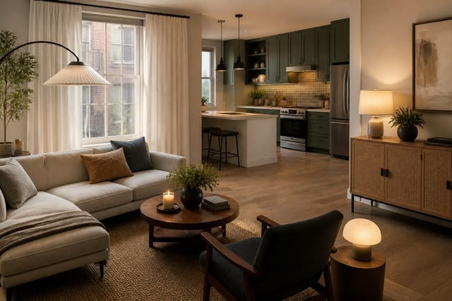
Strong placements include cabinet pulls, a single faucet, a set of cabinet knobs, and one statement light fixture overhead. In a bathroom, a brushed brass faucet paired with a matching towel bar is usually plenty of warmth on its own. Build the room around a clear hierarchy: one hero brass piece, a couple of supporting touches, and everything else in a quieter metal. Renters who cannot swap a faucet can still preview the look first, the way an AI room design for a rental apartment workflow tests visible changes without touching the plumbing.
Sizing, mixing, and concrete specs
Hardware sizing is where good intentions quietly go wrong. For standard cabinet doors, a 1.25 inch knob suits drawers and small doors, while a 5 to 6 inch pull fits most full-height doors comfortably. On wide drawers over 30 inches, jump to an 8 to 12 inch pull so the proportion holds and the drawer does not look under-handled. Budget roughly $8 to $25 per brushed-brass pull from mid-range lines, with designer pieces running well past that.
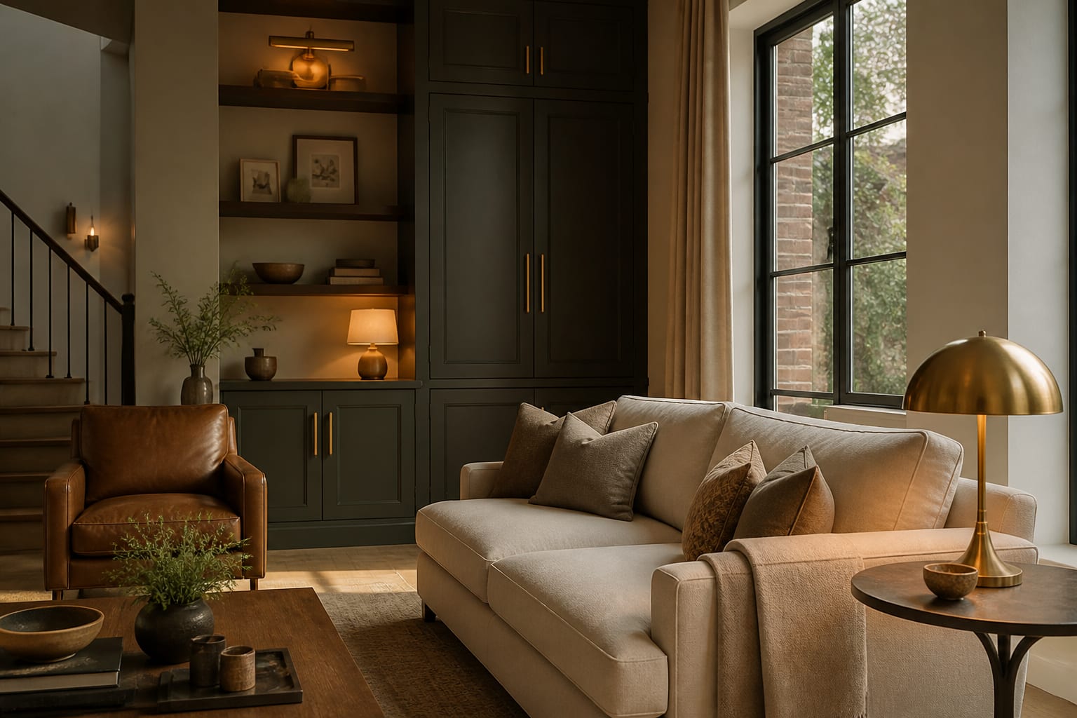
Mixing metals works beautifully, but only when one of them clearly leads. Pair matte black on lighting with brass on cabinetry, holding a deliberate 70/30 split so the combination reads designed rather than accidental. Keep the warm and cool metals on different planes when you can, so brass pulls and a black faucet are not fighting on the same cabinet face. In a compact kitchen, that disciplined mix reads richer than a single finish, which is exactly the logic behind good AI interior design for small spaces.
Placement geometry is the last detail people skip. Mount pulls vertically on cabinet doors and horizontally on drawer fronts, centered on the rail, so the hardware lines stay consistent across the run. On shaker doors, set the pull on the stile about 2.5 to 3 inches from the corner; on slab doors, center it on the visual third. Small as it sounds, that alignment is the difference between a kitchen that looks builder-grade and one that looks designed.
Common mistakes to avoid
The first mistake is buying high-shine polished brass because it photographs bright and rich in the showroom, then living with constant glare under your own kitchen lights. The second is going all-brass on the faucet, pulls, lights, and frames at once, which tips the look from a warm accent straight into a heavy theme.
A third common mistake is mismatched brass tones, since a cool greenish brass pull sitting beside a warm yellow brass faucet looks like an error rather than an intentional mix. The fourth is buying a matte unlacquered piece and a glossy lacquered piece for the same run, so they age at different rates. The fifth is forgetting that buyers notice finishes; a coherent metal story is part of why AI home staging design leans on consistent, restrained hardware. A sixth, quieter error is letting the brass clash with warm-metal lighting from a different tone, so a yellow chandelier hums against rosy cabinet pulls. Decide on one master brass tone early and check every fixture against it before anything ships.
Use AI design to preview brass hardware before you commit
Hardware is expensive to get wrong, because a full kitchen of brass pulls plus a faucet can run several hundred dollars before you ever discover the tone fights your counter. Re-Design lets you upload a photo of your kitchen or bath and preview brushed, satin, or polished brass directly on your actual cabinets and fixtures.
Seeing the warm gold tone against your real countertop, backsplash, and wall color tells you whether brass reads tailored or busy in your particular light. Compare two or three finishes side by side in minutes, adjust how much coverage feels right, then order only the hardware that genuinely earned its place in the room.
The preview is especially handy for testing a metal mix before you spend on two finishes. Render brass pulls with a black faucet, then flip to all-brass, and the heavier option usually announces itself instantly. You can also gauge whether a brass tone fights or flatters a specific countertop, which is the exact clash that sends so many shoppers back to the store with a box of returns.