A builder-grade kitchen upgrades without demo when the four most-seen surfaces change — cabinet doors get painted or refaced, cabinet hardware swaps for solid brass or matte black, the backsplash replaces flat 4in trim with full-height tile, and the lighting layers add 3000K under-cabinet plus pendants — for a fraction of the cost of full cabinetry replacement. Builder-grade kitchens rarely fail because the cabinets are plain; they fail because every fixture announces the lowest acceptable bid. My opinion is blunt: replace the things your hands and eyes meet first, not the entire kitchen. A flimsy faucet, shiny little knobs, weak ceiling light, beige outlet plates, and a builder basic sink can make decent cabinets look worse than they are. The right swaps give the room sharper edges, better function, and a more intentional finish without pretending you did a full remodel.
What are the best builder grade kitchen upgrades to make first?
The best builder grade kitchen upgrades are fixture swaps that change daily touch points: cabinet hardware, faucet, sink area, lighting, and visible electrical details. Those five moves work because they sit on top of the existing kitchen rather than requiring demolition, yet they are visible from the doorway and used every day.
Start with cabinet hardware if the kitchen has tiny chrome knobs, hollow-feeling pulls, or no hardware at all. Measure the existing screw spacing before you shop; common pull sizes include 3 inches, 96mm, and 128mm center to center. On wide drawers, a pull around one third of the drawer width often looks more substantial than a small knob stranded in the center. If drilling new holes makes you nervous, use a paper template and painter’s tape, then test one door before committing to the whole wall.
The faucet is the next high-impact swap because it sits at eye level over the sink. Choose a faucet with a finish that relates to at least one other element in the room, such as cabinet pulls, appliance trim, or the light fixture. A pull-down sprayer is usually more useful than a decorative bridge faucet in a tight builder kitchen. Check deck holes before ordering, and use a simple escutcheon plate only when it hides old holes cleanly.
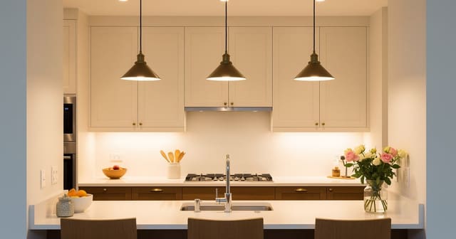
Lighting deserves priority because cheap fixtures make even good materials look tired. Replace a boob light, tiny pendant, or blue-white bulb before judging cabinet color. For a deeper lighting reset, read the guide to task lighting placement for kitchens; the placement matters as much as the fixture finish.
Which fixture finishes make a cheap kitchen look intentional?
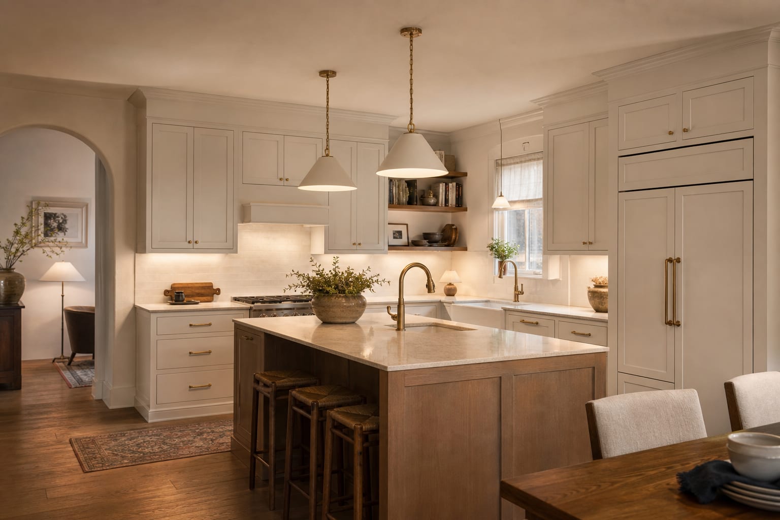
A builder kitchen looks more intentional when the finishes are limited, repeated, and tied to the appliances or cabinet color. Do not let every small upgrade introduce a new metal. Two finishes are enough for most kitchens: stainless plus black, stainless plus aged brass, or black plus warm brass if the appliances are paneled or less visually dominant.
Aged brass is forgiving on warm white, navy, olive, mushroom, and wood cabinets, but bright yellow brass can look harsh against cool gray cabinets. Matte black adds a clean line, especially on white or light oak cabinets, but use it in slimmer shapes so the kitchen does not become a grid of black dots. Polished chrome can still work if the kitchen has stainless appliances and a crisp modern faucet; the problem is usually cheap shape, not chrome itself.
Scale is where many fixture upgrades go wrong. A 1-inch knob can look fine on a narrow upper cabinet, but it often feels flimsy on a tall pantry door. A 4-inch to 6-inch pull is usually better on standard drawers, while large pot drawers may want 8-inch to 12-inch pulls. If your kitchen is small, the editing rules in micro kitchen design for small spaces apply here too: choose fewer, calmer lines instead of making every door a decorative event.
Do not ignore outlet covers and switch plates. Builder beige plastic plates can make a fresh faucet and new pulls feel unfinished. Use screwless plates in white, black, stainless, or a paintable finish that blends into the wall. If outlets sit in a backsplash, match the plate to the tile or choose a low-contrast finish; a row of mismatched rectangles can cheapen an otherwise careful update.
Test this on your own room photo with ReDesign before you choose the final direction; keep the doorway, walls, windows, main furniture, lighting, and awkward fixed features visible so the preview solves the room you actually have.
Common builder-grade kitchen fixture mistakes
Replacing everything in the same trendy finish is the fastest way to create a second builder package. A kitchen with brass pulls, brass faucet, brass pendants, brass hinges, and brass bar stools can feel as generic as the original chrome. Choose one finish to lead and one finish to support it, then repeat each at least twice within the same view.
Buying hardware before checking the cabinet door style creates awkward scale. Thin shaker rails, slab fronts, raised panels, and arched doors all handle hardware differently. Tape the sample pull to the cabinet and open the door several times. If your fingers hit the rail or the pull overpowers a narrow stile, the size is wrong even if the finish is right.
Swapping a pendant without checking light position wastes money. Island pendants usually look best around 30 to 36 inches above the counter, with spacing that gives each shade breathing room instead of a crowded row. If the junction box is off center, use a canopy, swag solution, or different fixture type instead of pretending the crooked light is charming.
Choosing cool bulbs because the kitchen feels yellow often backfires. Many builder kitchens look flat because the light is weak, not because every bulb needs to be icy. Try bulbs around 2700K to 3000K with 90 CRI or higher, especially near food prep and cabinet color. If the whole room is dark, the practical moves in making a dark kitchen feel brighter can help you decide whether lighting, paint, or surface contrast is the real issue.
Forgetting the sink area leaves the most used zone looking old. A new faucet beside a stained sink flange, rusty disposal ring, warped soap pump, and chipped caulk will not read as a clean upgrade. Replace the drain trim, refresh silicone in a neat bead, and keep the counter accessories to one tray or one soap set rather than a lineup of plastic bottles.
Use AI design to preview your kitchen before you order
AI design is useful for builder-grade kitchen fixtures because small metal and lighting choices change dramatically beside your actual cabinets, counters, appliances, and floor. Product photos rarely show your beige tile, orange floor, black refrigerator, or north-facing window. Uploading a straight photo lets you compare fixture plans before you drill holes or order twenty-five pulls.
Take the photo from the kitchen entrance or a back corner so the preview includes the sink, cabinet runs, ceiling light, floor, and at least one appliance. Turn on the lights you normally use at night, then take a second image in daylight if the kitchen has a window. Clear the counter enough that the tool can read the fixtures, but do not strip the room into a fantasy version you never live in.
Run focused previews. Test one version with black pulls, a stainless faucet, and warmer lighting. Test another with aged brass hardware, a simple white shade, and screwless plates. Test a third that leaves the hardware alone but changes the faucet, pendant, and under-cabinet lighting. Keep the cabinet color and countertops consistent unless you are actually planning to change them.
The useful result is not the most dramatic image. It is the version where your existing kitchen suddenly looks less temporary. If the best preview only works after replacing the cabinets, counters, backsplash, flooring, and appliances, it is not answering the fixture problem. Use the image to narrow the first order: one sample pull, one faucet finish, one light direction, and one outlet plate choice.
What should you replace this weekend if the budget is tight?
If the budget is tight, replace the fixture that looks cheapest from the doorway and the fixture that annoys you every day. In many kitchens, that means hardware plus bulbs, or faucet plus outlet plates. A weekend update should feel finished in one clear zone rather than half-finished across the whole room.
For a low-spend refresh, change bulbs first, then add hardware samples. Use painter’s tape to mark pull length on several doors before buying a full set. If the kitchen has no pulls, install one cabinet section first so you can confirm height and hand feel. Knobs on doors and pulls on drawers are a safe classic split, while pulls everywhere create a cleaner modern line.
If you can spend more, make the sink wall the focus. A better faucet, fresh drain trim, simple soap dispenser, new towel hook, and cleaner under-cabinet light can make the whole kitchen feel more cared for. Keep the faucet height proportional; a very tall commercial-style faucet can overwhelm a shallow apartment sink or low upper cabinet.
Lighting is the upgrade to choose when the kitchen feels dingy even after cleaning. Under-cabinet LED strips should sit toward the front of the cabinet underside, not buried against the back wall, so the light reaches the counter. Choose a diffused strip or channel to avoid dotted reflections on glossy stone. On a rental budget, plug-in or rechargeable lights can prove the effect before you ask for anything hardwired.
Finish by editing what competes with the new fixtures. Remove yellowed counter appliances you rarely use, swap a stained dish towel for two consistent towels, and keep one small lamp or tray if the counter allows it. Builder-grade does not disappear because you bought expensive pieces; it disappears when the visible details finally agree with each other.
Frequently Asked Questions
What is the highest-impact builder-grade kitchen upgrade?
Painting the cabinets in a saturated mid-tone (sage, navy, or warm white) and swapping every cabinet pull reads as a full remodel from 6ft away for 400 to 1,200 dollars total. Use the room photo to compare the visible layout and fixed constraints before committing, because door swings, windows, outlets, storage reach, circulation, and existing furniture decide whether the idea survives daily use.
Should I replace builder-grade cabinets or just paint?
Paint solid-wood door cabinets (oak, maple, cherry); replace particleboard or thermofoil cabinets that flake or chip — paint cannot save a substrate that is already failing. Keep the preview honest by leaving the problem area visible in the frame, then compare one conservative version against one bolder version before you buy lighting, paint, furniture, or storage.
What backsplash works over builder-grade counters?
A 2x6in handmade-look ceramic in white or zellige, or a slab marble or porcelain backsplash, lifts a granite or laminate counter without replacing it — full-height tile reads more custom than partial. Check the result against ordinary movement first: drawer clearance, chair pullout, walkway width, glare, switch access, and sightlines matter more than a perfect catalog angle.
How do I update a builder-grade hood vent?
Replace the under-cabinet hood with a wall-mounted chimney hood or a custom drywall hood surround; the hood is the biggest visual element on the cook wall and reads dated faster than cabinets. Use the image to narrow priorities and measurements before ordering anything custom; final purchases still need real dimensions, outlet locations, installation limits, and product clearances.
Is it worth replacing builder-grade countertops?
Yes if the counter is laminate or stained — a quartz upgrade runs 3,000 to 6,000 for a typical kitchen and dramatically lifts the room; granite or quartz counters can stay if the color reads neutral. If the preview invents architecture or hides the awkward feature you need solved, rerun it with stricter instructions so the result remains tied to your actual room.
Three transformations to try
- Painted cabinets with brass pulls and tile backsplash
- Custom drywall hood surround over range
- Under-cabinet LED strip and pendant lights