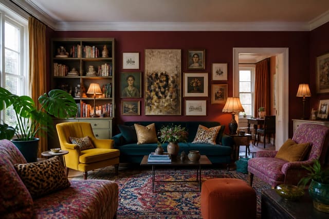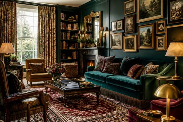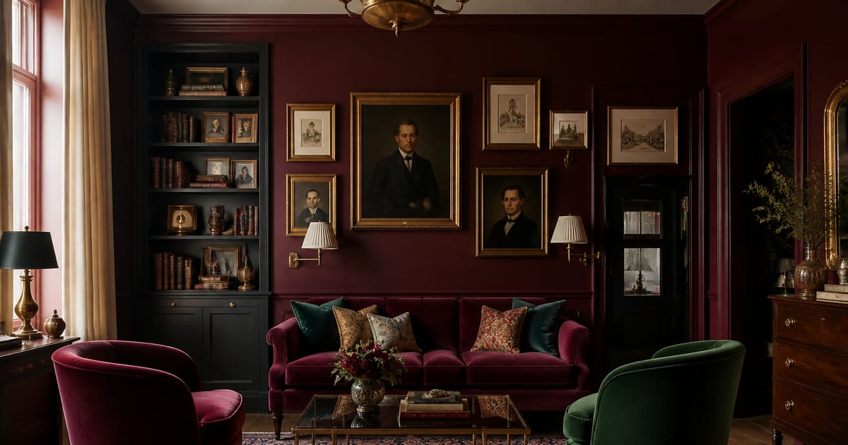
Decorate with burgundy and wine by treating them as rich, architectural tones rather than small accents: use them on walls, velvet upholstery, curtains, or built-ins, then balance the depth with emerald, navy, aged brass, black, or warm off-white. Burgundy works best in dining rooms, libraries, home offices, and small jewel-box spaces lit with warm 2700K bulbs.
Why Does Burgundy Work So Well in Maximalist Rooms?
Burgundy, wine, and oxblood sit in the deep red-purple family, carrying the drama of red, the shadow of purple, and undertones of brown or black. That complexity makes these tones feel romantic, glamorous, and slightly mysterious at once. In a dining room burgundy feels candlelit before candles are lit; in an office it feels focused; in a small library or powder room it feels designed rather than merely decorated.
Burgundy belongs to the broader jewel tone palette that anchors maximalism, alongside emerald, sapphire, and deep amethyst. These colors have visual depth and shift with changing light throughout the day. For the underlying philosophy, see What Is Maximalism?, which explains why layered color, pattern, and texture matter more than matching everything exactly. Burgundy has held strong through the 2023–2026 trend cycle in moody, collected, vintage-leaning rooms, but it needs structure and contrast to avoid looking flat.
How Do I Choose the Right Burgundy Paint?
A white room with a burgundy sofa reads as neutral with a statement piece; a burgundy room reads as an experience. Most burgundy paints sit around 5–15 LRV (Light Reflectance Value), meaning they absorb significant light. They work best with strong natural light, a deliberate artificial lighting plan, or an intentional cocooning effect. Always check the exact LRV on the manufacturer's current site, since names and formulas change.
Options to consider:
- Farrow & Ball Brinjal No. 222 — deep aubergine-burgundy.
- Little Greene Warm Pewter Red — heritage-toned red.
- Benjamin Moore Moroccan Red 2083-20 — saturated wine red.
- Sherwin-Williams Antique Red SW 0002 — historic dark red.
Test large swatches on two walls across morning light, afternoon shadow, and evening lamp light — burgundy can look plum at noon, brown-red at dusk, and nearly black under a cool bulb. Warm light around 2700K is most flattering, which is why burgundy dining rooms and libraries tend to glow best at night.
What Colors Pair Best With Burgundy Decor?
Burgundy handles other saturated colors well, but the room still needs an anchor: black, warm off-white, aged brass, or dark wood.
| Pairing | Effect | Where to use it |
|---|---|---|
| Burgundy + emerald | Classic maximalist contrast | Velvet chairs, marble lamps, patterned curtains |
| Burgundy + brass/gold | Opulent and warm | Hardware, picture lights, mirror frames |
| Burgundy + navy | Dark, moody elegance | Offices, bedrooms, formal living rooms |
| Burgundy + black | Graphic and sophisticated | Lampshades, frames, lacquered furniture |
| Burgundy + off-white | Softer entry point | Ceilings, linen curtains, pale rugs |
The jewel tone rule: anchor saturated colors with one grounding element. If burgundy, emerald, sapphire, and amethyst all appear at full strength with no metallic or neutral pause, the eye tires quickly. For layered room inspiration, see Maximalist Living Room Ideas.
What Is Colour-Drenching in Burgundy?
Colour-drenching paints walls, ceiling, trim, and often doors in the same or a closely related tone, removing visual breaks and making small rooms feel jewel-box immersive. It works especially well in:
- Dining rooms with low evening light
- Powder rooms that can handle drama
- Home offices needing a focused, cocooned feel
- Libraries with dark shelving
- Small bedrooms where trim would chop up the space
Because burgundy is dark, drenched rooms need layered lighting: ceiling fixtures, wall sconces, table lamps, and picture lights. A single overhead bulb leaves corners dull. See Colour Drenching Interior Design for finish guidance — matte walls feel soft and velvety, while satin or eggshell trim in the same color adds subtle light movement.
Bring the Look Home With Re-Design
Unsure whether burgundy walls, emerald velvet, brass lighting, or a full jewel-tone palette will work in your space? Upload a photo to Re-Design and generate burgundy and wine-inspired transformations before buying paint, ordering fabric, or committing to colour-drenching.
How Do I Use Burgundy Velvet, Pattern, and Texture?
Burgundy velvet adds color, sheen, and tactile depth simultaneously — theatrical on a sofa, intimate on dining chairs, hotel-like on a headboard. For furniture-grade velvet, look for a minimum of around 30,000 Martindale rubs and verify the exact rating for your specific fabric, since ratings vary by weave and supplier. Durability matters as much as color if the piece sees heavy daily use, kids, or pets.
Mix velvet with:
- Aged brass or antique gold
- Dark wood, walnut, or mahogany
- High-gloss lacquer in black, oxblood, or navy
- Patterned rugs with red, blue, cream, or green notes
- Linen curtains to soften the richness
- Marble or stone surfaces
Pattern keeps burgundy feeling collected, not staged — a Persian-style rug, botanical wallpaper, striped lampshades, or art with deep red undertones all speak the same visual language without needing to match exactly.
Which Rooms Work Best for Burgundy Decor?
Burgundy is strongest where atmosphere matters most. In dining rooms it creates intimacy, flattering candlelight, brass, glassware, and dark wood — one of the safest places to try it. In libraries it feels classic alongside built-in shelves, leather seating, shaded lamps, and gilded frames.
In home offices, wine tones ground the room; pair with navy, black, or walnut for discipline, plus a brass desk lamp and patterned rug to avoid severity. In bedrooms, use burgundy more softly unless full drama is the goal — a velvet headboard, curtains, or one colour-drenched alcove paired with off-white bedding and brass lighting reads rich without overwhelming.
Frequently Asked Questions
How do I decorate with burgundy and wine colors?
Use burgundy as a major mood element on walls, upholstery, curtains, or built-ins, then balance it with an anchor such as black, off-white, aged brass, navy, or dark wood. Pair with emerald, sapphire, or amethyst for a maximalist look, but keep one grounding neutral so the palette doesn't feel visually tiring.
Is burgundy too dark for walls?
Not if lighting is planned well. Burgundy paints are often around 5–15 LRV, absorbing significant light, so they work best with good natural light, layered warm artificial lighting, or a deliberate moody concept. Always test samples and confirm the exact LRV with the manufacturer.
What colors go best with burgundy decor?
Emerald green is the classic maximalist pairing, brass and gold add warmth, and navy brings dark elegance. Black, walnut, and warm off-white work as anchors when a room combines multiple saturated jewel tones.
Is burgundy velvet practical for furniture?
It can be, with the right fabric. For upholstery, look for furniture-grade velvet around 30,000+ Martindale rubs and confirm the exact spec before ordering, since ratings vary by product and not every velvet suits daily use.
Should I colour-drench a small room in burgundy?
Yes — small rooms handle deep color beautifully because the goal is atmosphere, not expansion. Paint walls, ceiling, and trim the same burgundy tone, then add layered warm lighting and a few reflective details like brass or glass to keep corners from feeling flat.