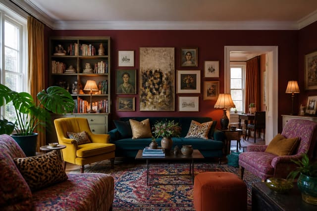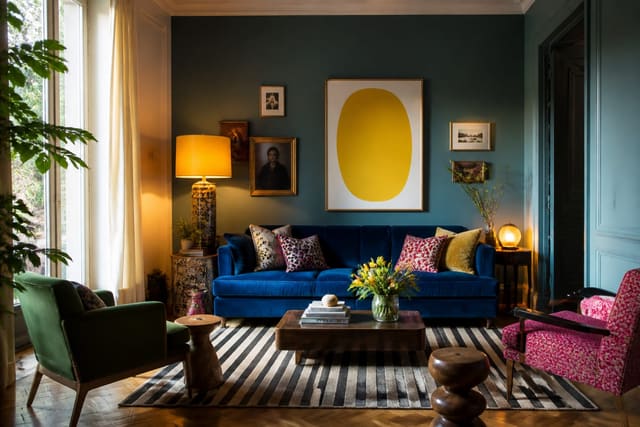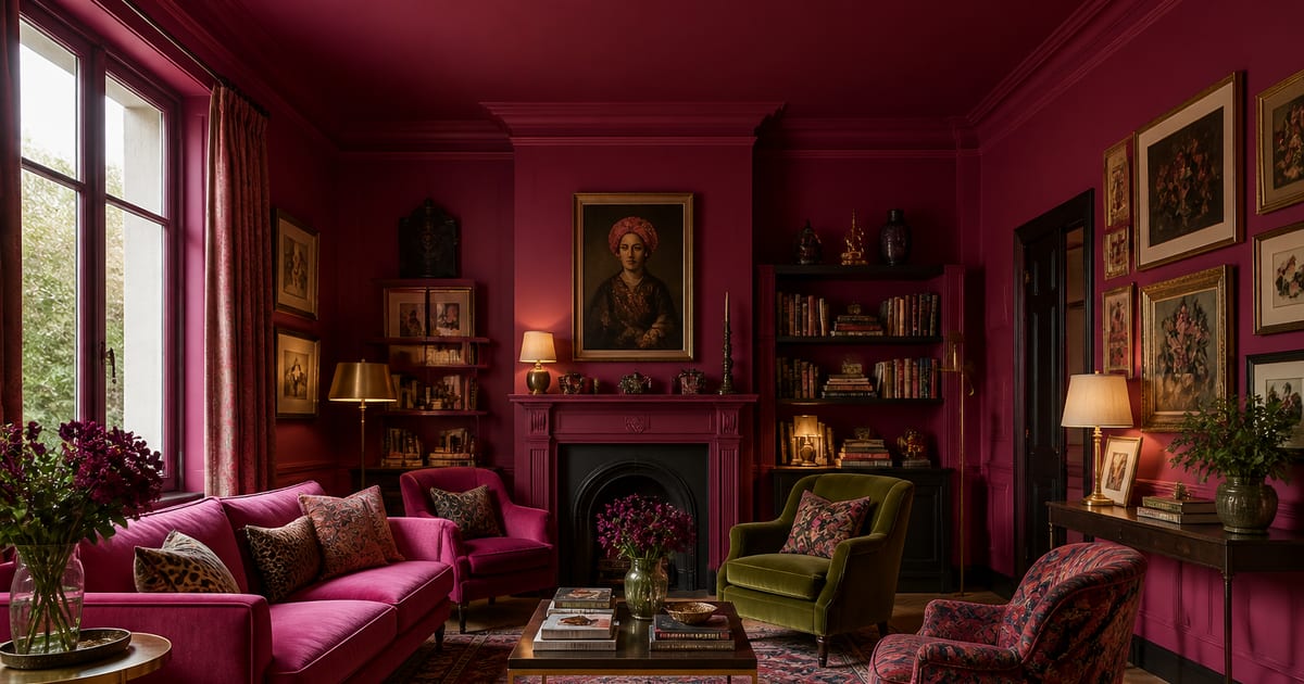
Colour drenching means painting walls, ceiling, skirting boards, door frames, doors and often built-ins in one continuous colour so the room reads as a single wrapped form instead of separate surfaces. Done in a pale shade it can make a small room feel larger; done in a dark shade it turns a room cosy and dramatic. It's one of the fastest ways to add colour confidence without pattern or clutter.
How does colour drenching change a room?
Traditional decorating treats a room as separate planes: white ceiling, coloured walls, contrasting skirting, a painted door with a visible frame. Colour drenching removes those breaks so the eye reads the room as one continuous form. Stopping wall colour at a bright white ceiling creates a hard line; carrying the same colour overhead softens it.
Light reflectance value (LRV) is the best guide to mood. These ranges are a starting point, not a rule; room proportions, flooring and natural light all shift the final effect.
| LRV range | Effect |
|---|---|
| 70+ | Reflects the most light; soft, airy drench |
| 50–70 | Mid-tone; extends visual space without feeling stark |
| 10–30 | Deeper, more enclosed feeling, especially in evening rooms |
If you like high-impact interiors, colour drenching sits naturally beside ideas in Maximalist Living Room Ideas, though it can look just as calm in a muted sage or warm clay.
Which surfaces and finishes should you specify?
Plan every paintable surface before opening a tin: walls, ceiling, skirting boards, door frames and doors are the core. Depending on the room, add picture rails, cornicing, radiator covers, shelves or built-in cabinetry.
Farrow & Ball helped popularise the modern technique through its Dead Flat finish, a multi-surface paint made for walls, woodwork and metal in one colour. A single formula keeps colour and sheen consistent across surfaces; a matt option like Dulux Matt can also anchor a simple specification.
The alternative is matching the same colour across different finishes: matt or estate emulsion for walls, ceiling paint overhead, and eggshell or satin for skirting boards and doors, since woodwork needs to be more wipeable than walls. Expect slight variation even with an identical colour name, because light hits each surface differently and sheen changes perception. That's fine: as long as every surface shares one colour family, the room still reads as drenched.
Specification checklist:
- Choose one main colour before selecting finishes.
- Confirm which surfaces each paint formula is suitable for.
- Use flat or matt on walls for a soft, wrapped effect.
- Use eggshell or satin on trim, doors and skirting boards for cleanability.
- Paint a large sample on two walls and near the ceiling line.
- Check the colour in morning, afternoon and evening light.
Where does colour drenching work best?
Colour drenching works in any room but is most effective where you can paint every visible boundary.
- Hallways: many doors, frames and skirting lines turn into one calm passage.
- Dining rooms: one colour creates atmosphere without extra decorative layers.
- Home offices: a single tone sharpens focus.
- Powder rooms: small, enclosed spaces are ideal for testing bolder shades.
Dark blue, burgundy and forest green remain classic dramatic choices, but 2025's trend leans toward muddy pastels and earthy neutrals: sage green, dusty rose, clay, mushroom, ochre and soft brown. If you're nervous, start with a mid-tone like sage or clay for presence without the commitment of a dark LRV. For bolder palettes, borrow the confidence behind Dopamine Decor Ideas and channel it into one dominant shade instead of many accents.
Furniture matters too. Pale upholstery against a dark drench feels crisp and theatrical; tonal furniture in a similar shade feels quieter and more enveloping. Natural wood, brass, stone and linen add warmth to any drenched palette.
Bring the look home with Re-Design
Before committing to paint across walls, ceiling, skirting boards and doors, use Re-Design to test colour drenching from a room photo. Upload your space, try a pale, mid-tone or dark drench, and compare how the room feels once the visual boundaries disappear. It's the fastest way to see whether sage, dusty rose, clay or a deeper dramatic colour suits your light, furniture and proportions.
Frequently Asked Questions
What is colour drenching in interior design?
Colour drenching is painting a room's walls, ceiling, skirting boards, door frames and doors in the same colour. It creates an immersive one-tone effect by removing the usual contrast between surfaces.
Does colour drenching make a room look bigger or smaller?
It can do either. Pale colours (LRV 70+) reflect more light and can open a room up. Mid-tones (LRV 50–70) extend the sense of space, while dark colours (LRV 10–30) usually make a room feel more intimate. The result depends on size, windows and furnishings.
Should the ceiling be the same colour as the walls?
Yes, for the full drenched effect. Extending the wall colour onto the ceiling removes the hard boundary at the top of the room and makes the choice feel intentional rather than accidental.
What paint finish is best for colour drenching?
A single multi-surface finish is simplest if it suits your walls, woodwork and ceiling. Otherwise use matt or flat paint on walls, ceiling paint overhead, and eggshell or satin on skirting boards, doors and frames, all in the same colour.
Will the same colour look identical on every surface?
Not always. Light angle, texture and sheen can make an identical colour look slightly different from wall to ceiling to door. A multi-surface paint gives the closest match; otherwise treat subtle tonal variation as part of the look.