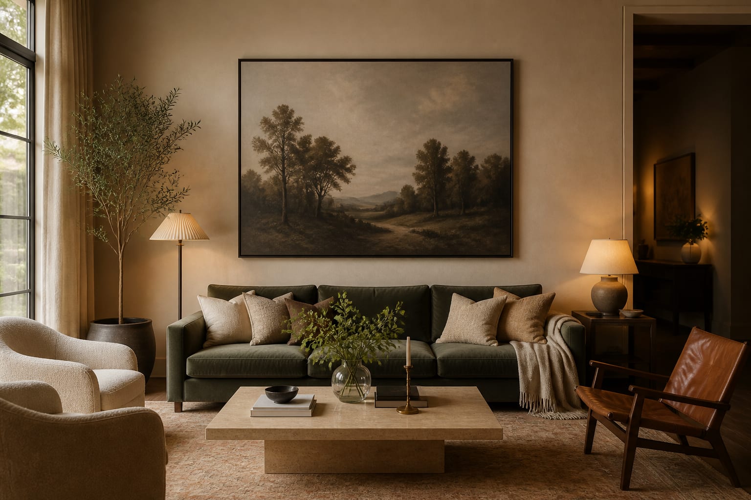
How do you choose the right size art for a wall? Fill about two-thirds to three-quarters of the available wall width with your piece or arrangement, and hang it so the center sits 57 to 60 inches off the floor. The honest answer is that almost everyone goes too small and hangs too high, which leaves art floating like a postage stamp in the middle of a wide blank field.
I think of art sizing as a proportion problem, not a taste problem. Once the scale relates correctly to the wall and to the furniture below it, even an inexpensive print looks deliberate, while a genuinely beautiful piece at the wrong size always looks lost and apologetic. The rules below cover width, height, and gallery spacing, with the specific numbers that keep a piece from disappearing.
The two-thirds rule and why it works
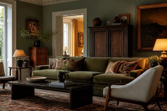
The core sizing rule is proportional rather than absolute. Measure the wall or the furniture the art will hang above, then aim for the piece, or the combined arrangement, to span about two-thirds to three-quarters of that width. Over a 72-inch sofa, that works out to roughly 48 to 54 inches of art, whether that arrives as one large canvas or a tight cluster of smaller frames. Anything narrower than half the sofa width starts to look undersized and tentative.
The rule holds because your eye reads the relationship between objects, not their measured size in isolation. A 30-inch print can feel generous on a narrow wall and tiny over a long sectional; the wall and the furniture set the scale, every time. This is also why low, dim walls swallow art so easily, and the same instinct behind helping a dark room feel fuller and more finished applies directly to art: larger, lighter pieces hold a shadowy wall that smaller ones simply vanish into.
There is a confidence reason to favor the upper end of the range, too. A piece at three-quarters of the wall width commits to the space and makes the room feel furnished and resolved, while a piece that hugs the two-thirds floor leaves a little more breathing room and a quieter mood. Neither is wrong; I just decide which feeling I want before I shop, because that single choice changes the budget and the frame size more than the artwork itself does.
Height and spacing: the numbers
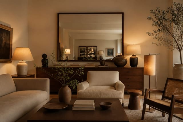
Height is the second half of the problem and the half most people get wrong. Center the artwork at 57 to 60 inches off the floor, measured to the vertical midpoint of the piece rather than its top edge. That eye line is precisely why gallery hangs feel comfortable and home hangs so often feel a foot too high. When art hangs over furniture, also respect the gap: 6 to 10 inches between the top of a sofa or console and the bottom of the frame keeps the two connected as a single group.
Gallery walls follow their own quiet math. Keep a consistent gap of 2 to 3 inches between frames so the cluster reads as one solid block, then let that block obey the same two-thirds-width and 57-to-60-inch-center rules a single piece would. Mixed frame styles can absolutely work when the spacing stays disciplined, the same way bringing more than one aesthetic into a single room holds together as long as one element stays consistent throughout. Watch for these sizing signals as you lay frames out on the floor first:
- The arrangement covers at least two-thirds of the furniture or wall width.
- The visual center of the whole group lands near 58 inches off the floor.
- The gaps between frames stay even, within roughly half an inch of each other.
- The outer edges of the cluster form a clean rectangle or oval, not a ragged outline.
Sizing for tricky and double-duty walls
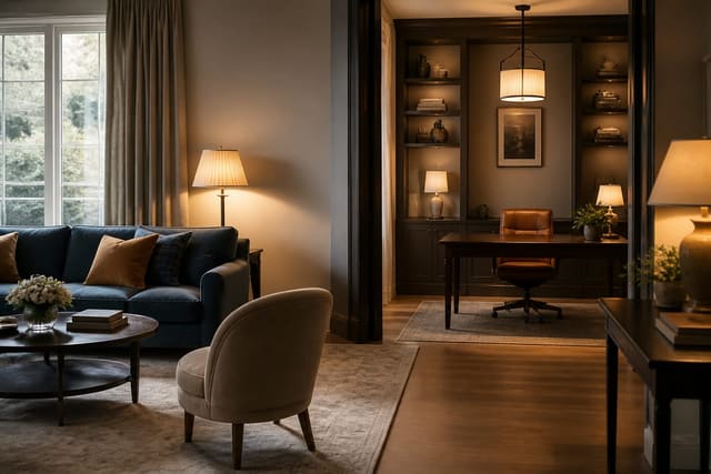
Not every wall is a simple rectangle floating above a sofa. Tall, narrow walls call for vertical pieces or a stacked pair that echoes the proportion of the space. Wide, low walls behind a credenza want horizontal art or a measured row of frames. In rooms that do two jobs at once, art also has to survive the occasional furniture rearrange, so I size to the largest likely layout from the start. Many flexible single-room layouts built around two functions work better with one large, repositionable piece than with a fixed gallery wall that only flatters a single configuration of the furniture.
Staircase walls and narrow hallways deserve their own rule. On a stair, follow the slope of the handrail and keep the centers of each frame a consistent distance above each tread, usually around 60 inches measured from the stair directly below. In a hallway under 4 feet wide, you cannot stand far enough back to take in a huge piece, so a vertical run of medium frames at a tight 2-inch gap reads better than one oversized canvas you can only ever see at an angle.
Common mistakes to avoid
The most common mistakes to avoid are hanging too high and buying too small, and they almost always travel together. If the bottom of your frame sits more than about 10 inches above the sofa back, the art has floated off into no-man's-land; bring the center down to that 57-to-60-inch line. Undersizing follows close behind: a 16-by-20-inch print over a full sofa covers maybe a quarter of the width and reads as a genuine accident.
People also forget weight when they finally size up. A 40-by-60-inch framed piece with glass can run 30 to 50 pounds, so plan for a stud or a rated anchor, never a single thin picture hook. Another frequent error is uneven gallery spacing; gaps that drift from 2 inches to 5 inches make a wall look careless no matter how lovely the individual frames are. Finally, avoid centering art to the wall when it hangs over off-center furniture; center it to the furniture instead, or the entire grouping looks subtly wrong by exactly those few inches. A related slip is treating a tall ceiling as license to climb the art upward; an 11-foot wall does not change the human eye line, so the center still belongs near 58 inches with the empty space left up top, not below.
Matting and frame width quietly change the apparent size, too. A 3-inch mat can add 6 inches of presence to a modest print and push it from undersized into the right range, so when a piece you love measures a little small, a wider mat and a substantial frame often solve the scale problem for far less than a bigger artwork would cost.
Use AI design to preview artwork size before you commit
Art is expensive to get wrong, and you usually cannot tell whether a piece is too small until it is already on the wall with holes drilled behind it. Re-Design fixes that order of operations: upload a photo of the actual wall and the furniture beneath it, and the AI design tool can show a large single canvas, a balanced gallery cluster, or an oversized statement piece scaled to your real dimensions.
I use it to settle the size debate before measuring twice and drilling once. Upload your wall, generate a 36-inch option and a 54-inch option in the very same spot, and you can see immediately which one actually fills the space and which one looks lost. That preview turns a risky, regret-prone purchase into a confident one, because you are judging scale against your own room and light instead of a gallery photo that flatters everything.