If each room in your house looks good in isolation but the whole place feels like a stack of unrelated showrooms, the problem is rarely any single room. The honest answer is that cohesion comes from repetition, not matching, and most homes fail because nothing repeats across doorways.
To make your home's design feel cohesive, choose a small palette of three to five colors and two or three recurring materials, then carry them through every room so the eye recognizes the same family wherever it lands. Rooms can have their own personality, but they should share a visual DNA.
Start with a whole-home palette
Cohesion begins with color discipline. Pick three to five colors that will appear throughout the house and assign rough proportions: one dominant neutral covering roughly 60% of surfaces, a secondary tone near 30%, and an accent for the last 10%. The trick is that each color shows up in more than one room, even if the role shifts. A blue that is the accent cushion in the living room can become the cabinet color in a powder bath. That repetition is what your eye registers as a single home rather than a corridor of unrelated rooms.
A quick way to build the palette is to start from one element you already own and love, a rug, a piece of art, a stone countertop, and pull your colors from it. That object becomes the source of truth, and every later decision either agrees with it or gets cut. Keeping a small set of physical swatches in your bag while you shop stops you from buying a piece that looked right in the store and clashes the moment it comes home.
White walls do not automatically create flow, because there are dozens of whites and they fight each other under different light. Picking one consistent wall white, or a tight family of two, removes a surprising amount of visual noise. If your home has rooms that feel gloomy and break the palette, the fixes in AI design dark room solutions help you brighten them without abandoning the shared scheme. Undertone is the detail that trips people up; a white with a green undertone and a white with a pink undertone will quietly clash even though both read as white on the chip. Test your candidates on the actual walls and look at them at morning and evening, since the undertone you missed in the store becomes obvious once the light changes through the day.
A workable palette usually holds to three colors in a 60/30/10 ratio, and carrying one trim white across all 1,500 square feet of a home reads as deliberate rather than accidental.
Repeat materials and finishes
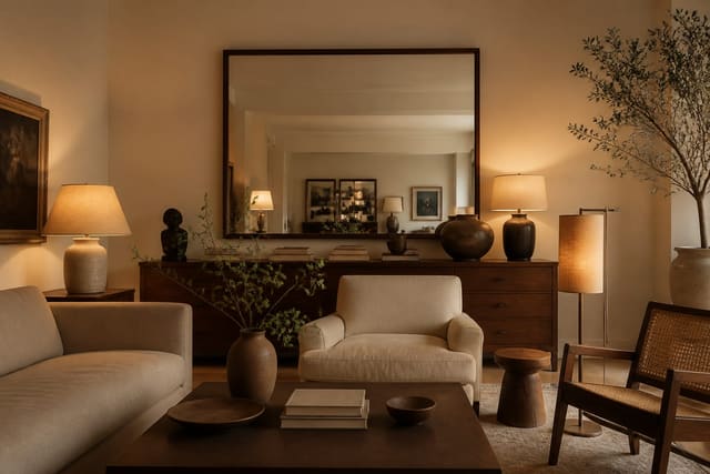
Color sets the mood; materials make it feel intentional. Choose two or three materials that recur as a thread through the home. Maybe it is white oak, unlacquered brass, and a nubby linen. When those same notes appear in the kitchen, the hallway, and the primary bedroom, the brain reads continuity even though the rooms differ. Materials carry more weight than people expect, because a wood tone or a metal finish shows up on furniture, lighting, frames, and hardware all at once, so getting it consistent solves several rooms in one decision.
When you walk the house, look for these repeatable anchors and make each one consistent:
- Flooring, ideally one species or a tight pair across the main level.
- Trim and door color, which should stay the same on every floor.
- Metal finish for hardware and lighting, all in one warm or cool family.
- Wood tone for furniture, kept within two adjacent shades.
- One recurring textile, like a weave or pattern, that reappears room to room.
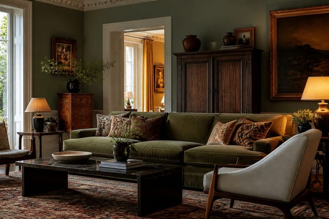
Cohesion does not mean every room is the same style, though. You can blend traditional and modern as long as the palette and materials hold steady. My guide on how to mix design styles shows how to keep contrast intentional rather than chaotic, which is exactly what stops an eclectic home from looking accidental. A reliable test is to ask whether a single object from one room could move to another and still look at home; if a brass lamp from the office would read fine on the living room console, your material thread is doing its job. When pieces feel interchangeable across rooms in that way, the whole house starts to feel designed by one hand.
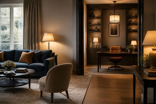
Plan sightlines and transitions
The most overlooked cohesion tool is the sightline. Stand in each doorway and notice what you can see of the next room. In open layouts you might see three spaces at once, so they have to agree. If a 36-inch doorway frames a bright coral wall against an otherwise muted home, that frame becomes a jarring picture you see every day. Walk your whole house this way once, pausing at every threshold, and you will spot the clashes that photos and memory both miss.
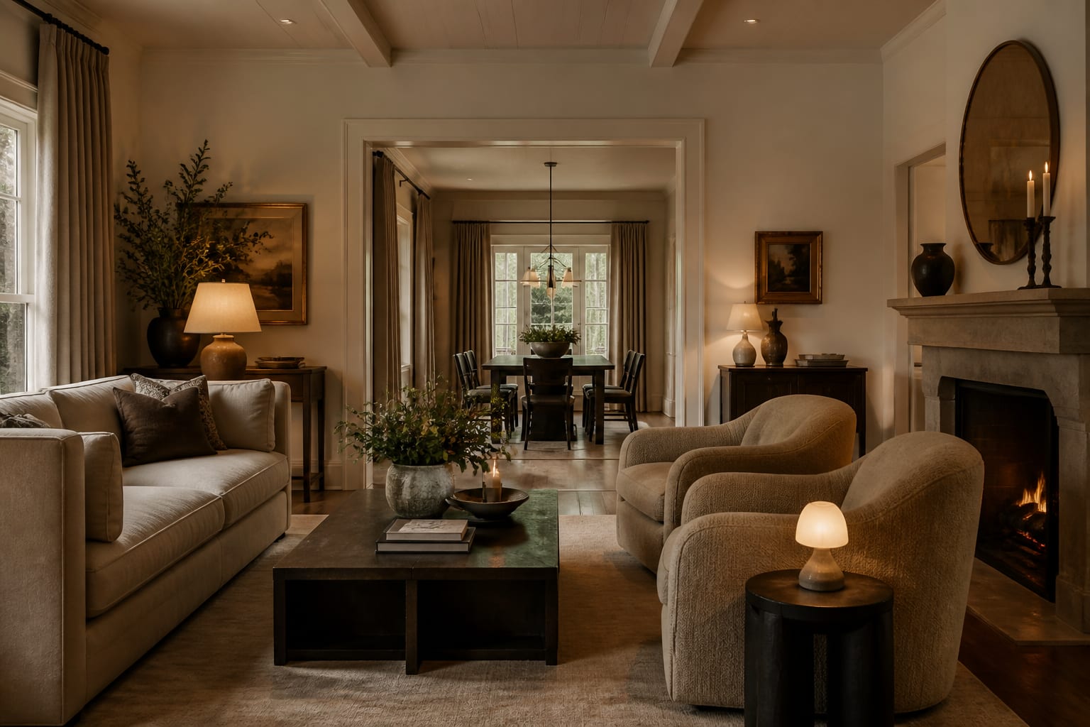
Transitions matter underfoot too. Where flooring changes, use a clean threshold and keep the tones related so the switch feels deliberate. Carrying one element continuously, like the same trim white or a continuous floor on the main level, acts as connective tissue. Rooms that pull double duty need extra care here, and dual-purpose room ideas covers how to keep a multi-use space reading as part of the whole rather than a separate zone.
Hallways deserve more attention than they get, because they are the literal connectors between rooms and the place flow either continues or breaks. A consistent runner, a repeated frame style on the walls, and the same wall color as the adjoining rooms turn a hallway from a gap into a bridge. The same goes for stairwells, where carrying the trim color and a single wood tone up and down keeps the upper floor feeling like part of the same home rather than a separate apartment.
Common mistakes to avoid
The most common mistake is decorating room by room with no master plan, buying whatever looks good in the store that week. Each purchase is fine alone, and the sum is a muddle. Decide the palette and materials first, then shop against that list.
A second common mistake is over-matching, where every element is so identical the home feels like a hotel with no soul. Cohesion needs about 70% consistency and 30% variation; the variation is what makes each room worth entering. A fourth trap is changing flooring at every doorway, which chops the home into disconnected boxes and visually shrinks the whole place. The third mistake to avoid is ignoring the ceilings, trim, and transitions, the connective surfaces that quietly carry flow. Repaint trim a consistent color before you touch furniture, and you will see the house pull together faster than any single new piece could manage.
Use AI design to preview cohesive changes before you commit
It is hard to picture how a palette will read across multiple rooms when you are standing in just one. With Re-Design you can upload a photo of each room and re-render them with the same colors, woods, and metals applied, so you can check that your shared scheme actually holds up from space to space.
That side-by-side view is where cohesion becomes obvious instead of theoretical. Upload the living room and the adjoining kitchen, apply the same oak-and-brass direction to both, and you will see the doorway between them stop fighting. Testing the whole-home look on your real walls before you buy paint or flooring saves you from committing to a scheme that only worked in your head.