Color drenching looks effortless and is the easiest paint trick to botch. Painting the walls, trim, ceiling, and sometimes the doors all one color can wrap a room in a calm cocoon, or it can flatten the space into a featureless box. The difference is not the color you pick, it is how you handle sheen, undertone, and the few surfaces you choose to leave alone. Done with intent, a drenched room hides awkward architecture and reads far more sophisticated than the same color confined to the walls. Done carelessly, it just looks like you ran out of trim paint.
What is color drenching and why does it work?
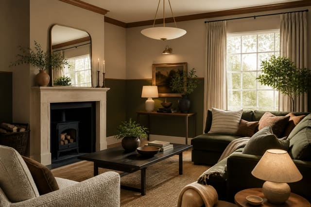
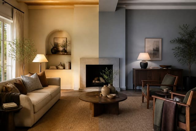
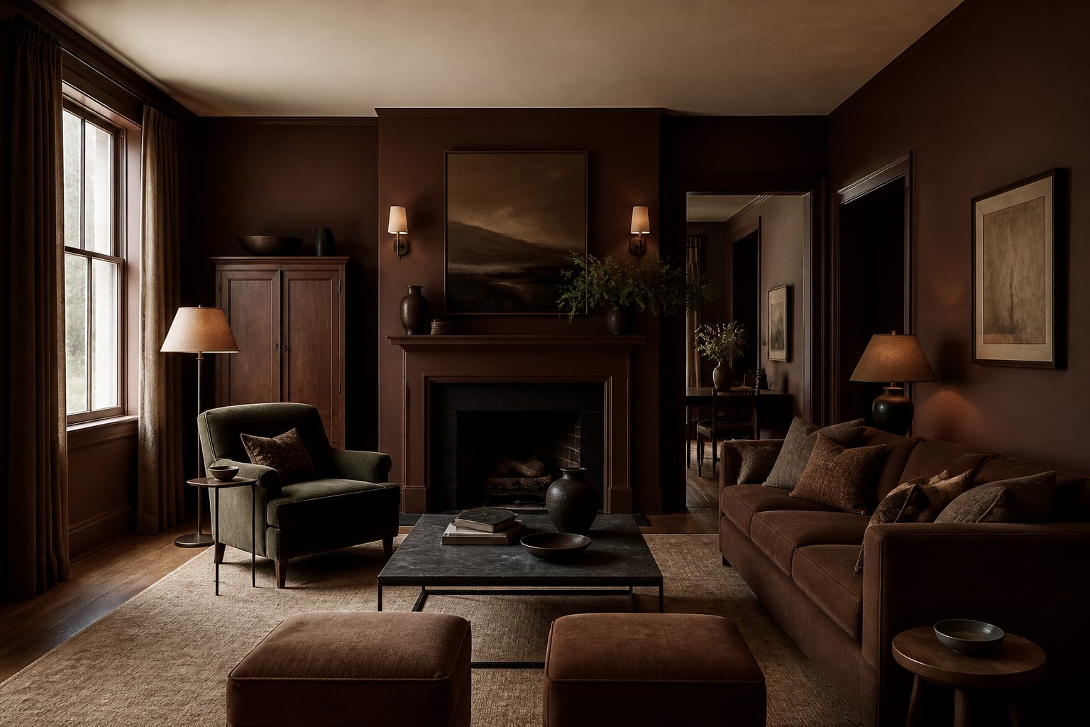
Color drenching means taking a single color and carrying it across the walls, the trim, the ceiling, and often the doors and built-ins, so the whole room is bathed in one continuous shade. The effect works because it erases the visual breaks that normally chop a room into parts. When the trim, ceiling, and walls all match, the eye stops registering edges and corners, and the room reads as one soft, enveloping volume rather than a box with a lid and a frame. That seamlessness is what makes a drenched room feel calm and intentional.
It also solves practical problems. Awkward architecture, like a low soffit, a boxed-in pipe, or mismatched trim profiles, disappears when everything wears the same color, because there is no contrast to draw attention to the flaw. Small rooms benefit most, since the lack of a contrasting trim line makes the walls feel like they recede further than they do. This is a close cousin of two-tone paint, and choosing between the two comes down to whether you want the room to feel divided and grounded or unified and enveloping. Drenching commits fully to the second.
How do you choose the right color to drench?
The color choice matters more here than in any other paint job, because the shade is everywhere with no relief. Lean toward mid-tones, muddy neutrals, and muted, complex colors rather than pure, saturated brights. A soft sage, a warm clay, a deep teal, or a smoky blue wraps a room beautifully, while a pure primary red or a vivid yellow becomes exhausting when it covers the ceiling and trim too. The more surface a color occupies, the more its intensity multiplies, so dial the saturation down from what you would choose for a single accent wall.
Undertone is the detail that separates a great drench from a regretted one. A green-gray that looks neutral on a chip can turn distinctly green across an entire room, and a beige can swing pink or yellow once it surrounds you. Buy three sample pints, paint swatches at least 24 inches wide on two walls that get different light, and watch them from morning to night before committing. North-facing rooms cool a color and want a warmer, brown-based shade, while south-facing rooms warm it up and can carry a cooler tone. If you are weighing temperature, our notes on warm versus cool paint colors walk through how light direction shifts an undertone, which is doubly important when that undertone covers every surface in the room.
How do you stop a drenched room from feeling flat?
The secret weapon is sheen, not color. Painting every surface in the same flat finish is what produces the dreaded featureless box, because nothing catches light differently. Instead, hold the color constant but vary the finish: a flat or 5% matte on the walls and ceiling so they recede softly, and a satin or eggshell at roughly 35% sheen on the trim, doors, and built-ins. That difference in finish lets the trim catch a quiet highlight and the architecture reveal itself even though the color never changes, which gives the room subtle depth.
Texture and contrast do the rest. A drenched room needs a few materials the paint cannot touch: natural wood, woven baskets, a leather chair, linen drapes, or metal hardware all give the eye something to land on besides the painted plane. Aim for at least 3 distinct textures and keep one undrenched element covering roughly 15% of the visible surface so the cocoon never tips into monotony. Leaving one major element undrenched is the simplest move of all, whether that is a wood floor, a stone fireplace, or a single piece of furniture in a contrasting tone. That one point of relief keeps the cocoon from becoming claustrophobic. Layered warm lighting at 2700K matters too, since pools of light and shadow across the matte walls add the dimension a single overhead would flatten.
Common color-drenching mistakes to avoid
A drenched room goes wrong in a handful of predictable ways. Avoid these and the result reads sophisticated rather than amateur: - Using the same flat sheen on every surface, which kills all definition and turns the room into a featureless box. - Choosing a pure, saturated bright color, which becomes overwhelming once it covers the ceiling and trim as well as the walls. - Skipping swatch tests, so an undertone you did not notice on the chip surrounds you in green or pink across the whole room. - Drenching everything with zero contrast, leaving no wood, stone, or undrenched element for the eye to rest on. - Forgetting the tinted primer, which leaves a deep color patchy and uneven instead of solid in raking light. - Ignoring light direction, so a cool color in a north-facing room reads cold and dreary instead of calm.
See your room drenched in Re-Design
Committing to one color across every surface is a big leap from a paint chip, which tells you almost nothing about how the shade will behave wrapped around your actual room. Upload a photo of the space into Re-Design and preview it fully drenched in a sage, a clay, and a smoky blue to see how each undertone reads against your floor, your light, and your furniture. You can compare a drenched scheme to a walls-only version, test a matte ceiling against trim in a crisper finish, and judge whether the room feels enveloping or boxed in, all in seconds. That preview takes the gamble out of a high-commitment paint job, so you walk into the store knowing the exact color your room can carry.
Frequently Asked Questions
What does color drenching mean?
Color drenching means painting the walls, trim, ceiling, and often the doors and built-ins all in one continuous color, so the whole room is bathed in a single shade. Erasing the contrast between trim and walls removes the visual breaks that chop a room into parts, so it reads as one soft, enveloping volume. The effect feels calm and intentional and hides awkward architecture along the way.
What sheen should I use when color drenching?
Keep the color identical but vary the sheen. Use a flat or 2 to 5 percent matte on walls and ceiling so they recede softly, and a satin or eggshell around 25 to 40 percent on trim, doors, and built-ins. That difference in finish lets the trim catch a subtle highlight and gives the room depth, which is what stops a drenched space from flattening into a featureless box.
What colors work best for color drenching?
Mid-tones, muddy neutrals, and muted complex colors work best, like sage, clay, deep teal, or smoky blue. Avoid pure, saturated brights, since their intensity multiplies once the color covers the ceiling and trim as well as the walls. Always test 24-inch swatches on two walls with different light across a full day, because the undertone can shift dramatically when it surrounds you.
Does color drenching make a room look smaller?
Usually the opposite. Removing the contrasting trim line blurs the edges where walls meet the ceiling and floor, so the boundaries are harder to read and the room can feel larger and more enveloping. To keep it from feeling closed in, leave one element undrenched and add natural texture, so the cocoon has a point of contrast for the eye to rest on.