A color of the year is a marketing event first and a design tool second, and treating it as gospel is how people end up regretting a bold wall. My position is simpler: borrow the mood, commit only as much as you can reverse, and let the shade earn its place through accents before it touches a whole room. Used with restraint, a color of the year is a useful prompt; used literally, it dates a room within two cycles. The guidance below works for any year's pick, named or illustrative.
How to read a color of the year
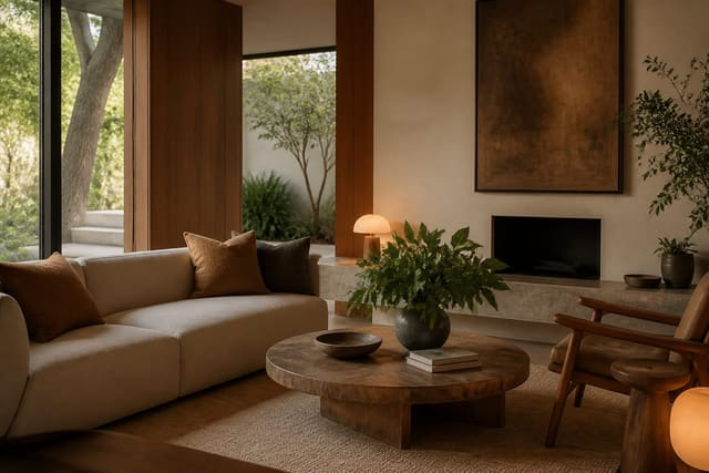
A color of the year, whether from Pantone or a major paint brand, is chosen to capture a cultural mood, not to dictate your living room. The smart use is to take the feeling behind the pick, calm, energy, warmth, groundedness, and translate it into your space at a dose you control. If a given year leans toward a warm earthy red or a soft botanical green, the question is not whether to obey it but how much of that mood your room can carry.
The honest reality is that these colors look stunning in a styled press photo and harder to live with on four walls. Light, furnishings, and the size of your room change a shade dramatically. A color that reads sophisticated in a 200-square-foot studio shot can feel oppressive in a low-light bedroom. This is exactly why commitment should scale with reversibility: a $25 throw pillow is a free experiment, while a $400 painting job and new sofa are not.
Think in terms of a spectrum of commitment. At the low end sit accessories you can swap in minutes; in the middle, an accent wall or a single piece of furniture; at the high end, full walls, cabinetry, or upholstery. Most people are happiest staying in the low-to-middle range with any trend color, reserving permanent commitments for shades they have lived with and loved for years.
There is also a resale angle worth weighing. If you expect to sell within a few years, keep permanent surfaces neutral and express the trend through items you take with you, since buyers price a bold custom kitchen as a renovation cost rather than a feature. If you plan to stay a decade, commit more freely, because you will get years of daily enjoyment that easily justifies a $400 paint job. Matching the size of the commitment to your timeline in the home is as important as matching it to the room.
How much of the color to commit
The practical question is dosage, and a few simple ratios keep you out of trouble. Here is how to scale the color of the year from a cheap test to a full commitment.
- Start with accents under $100: two pillows, a throw, a vase, or a stack of books in the shade.
- If you still love it after a month, add a mid-level move like a $200 to $400 accent chair or an accent wall.
- Reserve full-room paint, roughly $300 to $600 for a standard 12-by-12-foot room, for colors you are certain about.
- Apply a 60-30-10 ratio: 60 percent dominant neutral, 30 percent secondary, 10 percent trend color.
- Keep large investments like a sofa, which can run $1,200 to $2,500, in timeless neutrals and bring the trend through cushions.
That sequence protects your budget and your sanity. The 60-30-10 guideline in particular keeps a bold shade feeling like a confident accent rather than a takeover, and it is the single most useful rule for applying any trend color. Designers reach for it because it scales from a small powder room to a great room without changing the underlying logic. A calm, wellness-minded approach tends to favor the lower end of this scale, as our look at wellness design trends explains. If you lean the other way and love a bold, layered room, the heavier end of the ratio reads very differently, which our take on the maximalism trend for 2026 unpacks.
Common mistakes to avoid
The most common error is painting all four walls of a primary room in the trend color on first impulse. Beyond the cost of repainting, a saturated color on every wall shrinks a space and fights with furnishings you already own. A single accent wall delivers most of the impact at a quarter of the commitment, and an accent wall costs roughly $75 to $150 in paint and supplies versus $300 to $600 for a full room.
The second mistake is ignoring finish. A trend color in the wrong sheen looks cheap regardless of how good the hue is. Use eggshell or satin on walls for a subtle depth that hides imperfections, semi-gloss on trim and doors for durability, and a flat or matte finish on ceilings. Skipping a sample is the third trap: paint dries differently than the swatch, and a 2-by-2-foot test board viewed across morning, afternoon, and evening light for 48 hours saves you from a gallon you regret. Pay for the slightly more expensive sample pot rather than judging from a tiny printed chip, since the chip is too small to read how the color behaves at scale.
Finally, people forget that a color of the year still has to coexist with the rest of the home. Pulling a trend shade into a space that clashes with adjoining rooms creates a jarring transition. Smart-home lighting can help here, since tunable bulbs shift how a color reads through the day, a point our guide to smart home design trends develops further.
Preview the color of the year in Re-Design
Frequently Asked Questions
Should I paint a whole room in the color of the year? Usually not on first impulse. Start with accents under $100 and, if you still love the shade after a month, consider an accent wall before committing to all four. Full-room paint is best reserved for colors you are confident about, since repainting a 12-by-12-foot room costs $300 to $600.
What is the 60-30-10 rule? It is a ratio for distributing color: 60 percent a dominant neutral, 30 percent a secondary color, and 10 percent an accent. Putting the trend color in that 10 percent slot keeps it feeling intentional rather than overwhelming. It scales from a small bathroom to a large living room.
How do I test a color before buying a gallon? Paint a 2-by-2-foot sample directly on the wall, or on a board you can move, and live with it for at least 48 hours. Check it in morning, afternoon, and evening light, since color shifts dramatically across the day. This small step prevents the most expensive paint mistakes.