Most people misread the dark academia color palette as simply paint everything dark and call it scholarly. The aesthetic actually relies on warmth, contrast, and disciplined proportion far more than on raw darkness. A genuine dark academia color palette layers forest greens against espresso browns, then breaks the gloom with oxblood, aged gold, and parchment so the eye always has somewhere to rest. Get the ratios and the bulb temperature wrong and the room turns cavernous. Get them right and it reads like a candlelit library you never want to leave.
The Core Hues That Define the Palette
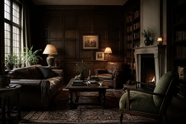
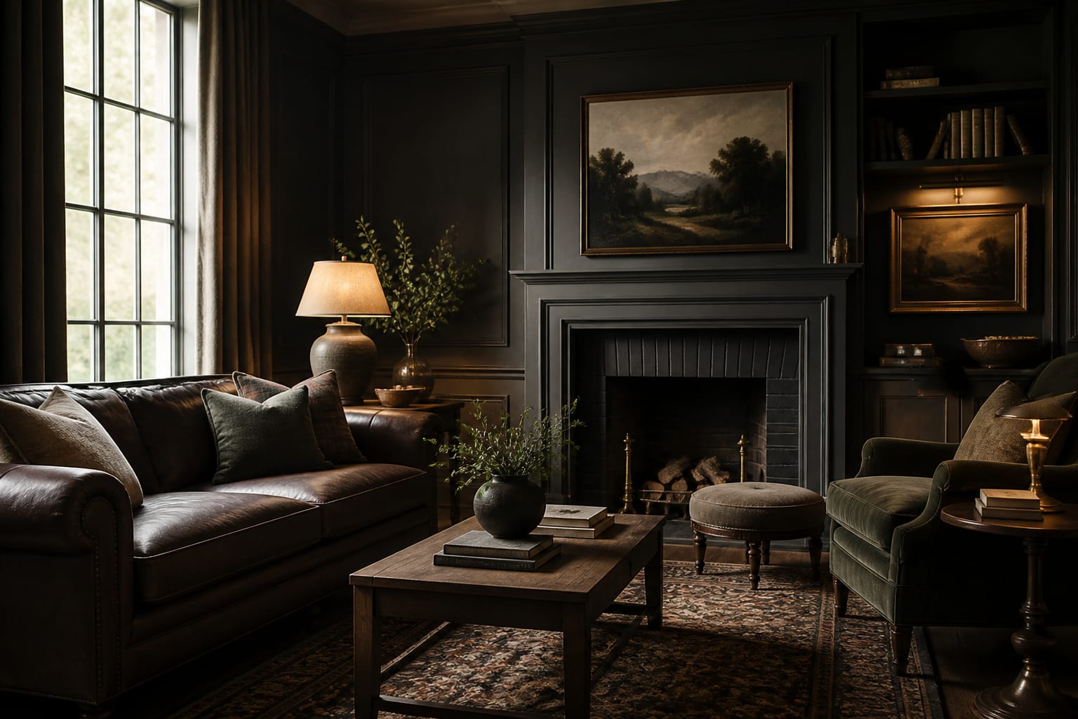
Every dark academia scheme starts from a small family of saturated, earthy colors that feel pulled from an old university. Forest and hunter green sit at the center, often paired with espresso and chocolate browns that echo old wood and worn leather bindings. Charcoal and near-black ground the darkest corners, while oxblood, burgundy, and deep mustard supply the flashes of richness that keep the room from ever reading flat or monotone.
Think of these colors the way an old library accumulated them slowly over many decades of use. The greens come from painted plaster and reading lamps, the browns from shelving and leather bindings, the reds from cracked club chairs, and the gold from tarnished brass fittings on the cabinets. None of it was chosen all at once from a single chart, which is precisely why authentic versions feel collected over time rather than rigidly coordinated from a showroom display.
When you build your own version, resist the urge to match everything to one swatch on the wall. Let the greens vary slightly between walls and textiles, allow the browns to range from cool walnut to warm cognac, and treat your accent reds as occasional punctuation rather than a repeated motif. A palette with this much internal variety photographs with real depth and rewards a second look, since the eye keeps discovering new tones tucked into the shadows of the room long after the first impression has faded. That subtle complexity is the whole point of the style.
See also our guide to What Is Dark Academia for more on dark academia color palette.
Balancing Tones With the 60/30/10 Ratio
Proportion is what separates a sophisticated dark room from a depressing one, and the classic 60/30/10 ratio is the most reliable tool for getting it right. Devote roughly sixty parts of the room to a dominant color, thirty to a secondary, and ten to a single sharp accent. In a dark academia space, that might mean espresso brown walls and large furniture carrying the sixty, forest green textiles and shelving holding the thirty, and oxblood or brass details claiming the final ten of the scheme.
The ratio matters even more when the colors themselves are dark, because without a clear hierarchy the whole room dissolves into one shadowy, shapeless mass. Giving the dominant tone the most surface area lets the secondary and accent colors register as deliberate, considered choices rather than random spots of contrast scattered without reason across the space.
Don't forget to count light and reflective surfaces as part of the math when you plan. A 9-foot wall of dark paneling reads very differently from a 7-foot wall in the same color, and a large area rug can single-handedly shift which tone dominates the room. Measure your biggest surfaces first, assign them the sixty share, then carefully distribute the remaining thirty and ten across textiles, smaller furniture, and the metal or glass accents that catch the eye and break up the darkness. This simple accounting keeps even a heavily saturated room feeling balanced and intentional rather than overwhelming to anyone inside it.
For a related angle on dark academia color palette, read What Is Industrial Design.
Lighting Temperature and How Color Reads
Paint colors are meaningless until you know the light falling on them, and bulb temperature can make or break a dark palette entirely. Cool white light around 4000K or higher drains warmth from greens and browns, turning a cozy study into something that feels clinical, flat, and gray. The fix is committing to warm bulbs throughout the room from the very start of your planning.
Aim for bulbs in the 2700K range, which casts the soft amber glow of old incandescent lamps and candlelight. At 2700K, espresso browns deepen pleasantly, forest greens gain a velvety quality, and brass accents seem to catch fire and glow from within. If you want flexibility through the day, dimmable warm bulbs let you drop even lower in the evening for a softer, more candlelit mood without rewiring anything in the room.
Placement matters just as much as temperature, and the two work together. A single overhead source flattens a dark room badly, so distribute several warm fixtures at different heights instead. Keep each pool of light within a few feet of the next so no corner falls into pure unrelieved black. A desk lamp at 2700K, a floor lamp standing by the reading chair, and a pair of sconces together build the layered, shadowed glow that makes a dark academia palette feel deliberate and inviting rather than simply underlit and uncomfortable to spend time in. Light is the final ingredient that brings the colors to life.
Adding Relief So the Room Breathes
A palette built entirely from dark saturated colors quickly becomes oppressive, so every successful scheme includes lighter relief somewhere. These are the parchment creams, aged ivories, antique golds, and worn leather tans that let the eye rest between the deep greens and the heavy browns. They function as visual breathing room, much like the pale cream pages tucked between a book's dark cloth covers.
Introduce relief through the materials you already love rather than forcing it. Old book pages, a linen lampshade, an ivory ceramic bust, polished brass instruments, and the natural tan of a leather chair all lighten the scheme without betraying its overall mood. Even a small amount goes a surprisingly long way, since a single pale element placed in a dark room draws the eye immediately and creates welcome contrast against the surrounding shadow.
Texture provides another kind of relief that color alone simply cannot deliver. A nubby wool throw, a tufted velvet cushion, rough-hewn wood, and aged paper each catch light differently, adding quiet dimension that keeps a dark room from feeling like a single flat painted surface. When you combine these lighter tones and varied textures with disciplined proportion and warm 2700K lighting, the dark academia palette stops feeling heavy or claustrophobic and starts feeling like a room you can genuinely live and work inside for hours. The relief is what ultimately makes the darkness comfortable rather than suffocating to be around.
Here are the common mistakes to avoid: - Painting every surface near-black until the room loses depth and feels like a cave - Using cool white bulbs that drain warmth and turn rich browns muddy and gray - Ignoring the 60/30/10 ratio so dark tones blur into one shapeless mass - Skipping lighter parchment and brass relief that lets the heavy palette breathe - Matching every green and brown to a single swatch instead of layering varied tones
Bring the look home with Re-Design
Picking dark paint from tiny chips is notoriously unreliable, since a swatch never shows how a color behaves across a whole wall. Re-Design solves that by letting you upload a photo of your actual room and preview a full dark academia color palette on your real surfaces and lighting. You can compare espresso against forest green, judge how each reads under your windows, and settle on proportions before buying a single can of paint.
Frequently Asked Questions
What three colors define a dark academia palette?
Forest green, espresso brown, and a deep accent like oxblood form the backbone. Charcoal grounds the shadows while brass and parchment add warmth and relief. Together they create the moody, scholarly richness associated with old libraries and university studies.
What bulb temperature works best for these dark colors?
Warm bulbs around 2700K are ideal because they make greens and browns glow rather than turn gray. Cooler temperatures near 4000K or higher feel clinical and drain the warmth that gives a dark academia room its cozy, candlelit atmosphere.
How do I keep a dark palette from feeling depressing?
Use the 60/30/10 ratio for a clear hierarchy, layer several warm light sources at different heights, and add parchment, brass, and leather relief. These lighter tones and varied textures give the eye places to rest so the room breathes.