Dark moody rooms lighten without losing drama by keeping the wall color, swapping in higher-contrast trim, adding a brighter rug, and pulling one mid-tone fabric into the upholstery — surgical lifts that hold the mood while opening the room. A dark room should feel enveloping, not like the walls moved two feet closer overnight. My firm opinion: most heavy moody rooms are not too dark; they are too flat. The paint, sofa, rug, curtains, and lighting all sit in the same visual register, so the eye has no place to recover. The fix is not automatically a white ceiling or a beige rug, but a sharper balance of depth, relief, and glow.
What keeps a dark room moody instead of heavy?
You keep a dark room from feeling too heavy by pairing the dark color with visible contrast, layered warm lighting, matte texture, and a few pale surfaces that give the eye somewhere to rest. The room can stay dramatic; it just needs intervals of brightness and shape so the darkness reads as atmosphere rather than pressure.
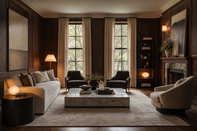
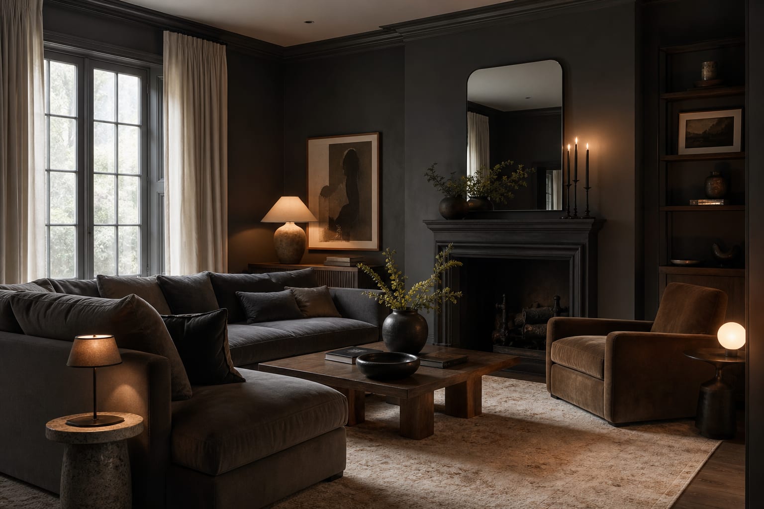
Start with the largest dark plane. If the walls are navy, forest green, oxblood, or charcoal, do not let the rug, curtains, sofa, and lampshades all land at the same depth. Choose one large relief surface: a cream rug, linen drapery, an oatmeal sofa, pale bedding, a bleached wood table, or art with wide mats. In a living room, that relief often needs to be at least rug-sized, not pillow-sized. An 8 by 10 foot rug can change the balance of a small seating area more than six pale accessories scattered around the room.
Keep the ceiling honest. A dark ceiling can be gorgeous in a snug library or powder room, but in a low room with weak windows it often turns mood into compression. If the ceiling is under 8 feet, test a softened white, pale plaster, or the wall color cut much lighter before committing to a fully dark lid. If the room has 9 foot ceilings or taller, a dark ceiling can work when the trim, art, or curtains create vertical brightness.
Lighting has to be planned as part of the color scheme. Use at least three sources: overhead or architectural light, a table or floor lamp, and one accent source such as a picture light, sconce, or cabinet lamp. Bulbs around 2700K to 3000K usually flatter dark colors, and 90 CRI or higher helps deep greens, blues, and browns keep their nuance. If the room has almost no daylight, the strategies in creating fake natural light in any room matter before you blame the paint.
Which surfaces need relief first?
Fix the surfaces that touch the darkness at the largest scale before buying decorative pieces. In a dark room, a tiny brass object or pale vase cannot compete with a black rug, brown sectional, and heavy curtains. Scale is the difference between moody and murky.
Look at the floor first. Dark walls with a dark floor can work, but only when furniture legs, rug pattern, or upholstery interrupt the mass. If the floor is espresso wood or dark tile, bring in a rug with a light ground, visible weave, or medium-scale pattern. Leave 12 to 18 inches of floor visible around the rug in smaller rooms so it looks intentional rather than like wall-to-wall carpet pretending to be temporary.
Then check the window wall. Heavy drapery in the exact wall color can look elegant in a room with tall windows, but it can smother a standard apartment bedroom. Hang curtain rods 6 to 10 inches above the casing and extend them 8 to 12 inches past the trim so the fabric clears more glass when open. Let panels stop about 1/2 inch above the floor. A flax, mushroom, tobacco stripe, or warm white linen can soften the room without breaking the moody palette.
Furniture needs contrast in silhouette as much as color. A dark velvet sofa against a dark wall looks better when the legs are visible, the coffee table is lighter, or the side tables have slimmer profiles. If every piece is blocky, skirted, and low, the room feels sunk. Try one lifted shape: a chair on exposed wood legs, a glass or stone-topped table, a narrow black metal lamp, or a cane cabinet that introduces air through the weave.
Mirrors can help, but only when they double the right thing. A mirror reflecting a black bookcase makes the room heavier twice. A mirror catching a pale curtain, shaded lamp, window, or light artwork gives the darkness relief. The same logic behind using mirrors to amplify light applies especially in saturated rooms: the reflection must be brighter or calmer than the wall it replaces.
Test this on your own room photo with ReDesign before you choose the final direction; keep the doorway, walls, windows, main furniture, lighting, and awkward fixed features visible so the preview solves the room you actually have.
Common mistakes that make a dark room feel oppressive
Painting every surface dark before testing the lighting is the fastest route to a room that photographs well once and feels difficult every evening. If the room only has one ceiling fixture, add lamps before adding more paint. A dark room needs pockets of glow at seated height, not one harsh bulb in the middle of the ceiling.
Using only shiny finishes is another problem. Glossy dark paint, polished stone, reflective black furniture, and glass frames can create glare without creating brightness. Choose matte or eggshell walls, linen shades, wool or jute texture, honed stone, plaster, unglazed ceramic, or raw wood so the room absorbs light softly instead of flashing it back in hard spots.
Avoid the all-dark furniture pileup. A charcoal wall, brown leather sofa, black media console, dark rug, and walnut shelves can each be handsome, but together they become one visual slab. Keep one or two dark anchors and lighten the pieces that sit directly beside them. A pale lampshade next to a dark sofa often works harder than a new throw pillow.
Do not assume white is the only escape. Bright white can look chalky beside deep paint, especially in a room with warm bulbs or old wood floors. Softer relief colors are usually more convincing: ivory, bone, oatmeal, parchment, mushroom, putty, pale oak, aged brass, or muted stone. These tones give contrast without making the dark walls look theatrical in the wrong way.
Ignoring doorways can also ruin the balance. A dark dining room seen from a bright white hall may feel dramatic; the same room seen through three busy openings can feel visually crowded. If several adjacent spaces are visible, borrow layout discipline from rooms with too many doorways: keep the neighboring sightlines quieter, and let the moody room hold the strongest color.
How AI design helps you see the balance before repainting
AI design is useful for a heavy dark room because the issue is relational: the wall color changes when the rug, bulbs, curtains, art, and adjacent rooms change. Upload a straight photo of the actual room and test versions where the dark wall or main dark furniture stays in place. That keeps the preview focused on balance instead of inventing a fantasy renovation.
Take the photo from a doorway or back corner so the preview includes the floor, ceiling line, windows, main furniture, and at least two walls. Open curtains during the day, then take a second version with the lamps on if the room is mostly used at night. Do not use a dramatic filter; it will hide the exact heaviness you are trying to diagnose.
Run focused variations. One version should add a pale rug and lighter curtains. One should keep the dark palette but improve lamps, sconces, and picture lights. One should introduce warmer texture through linen, oak, cane, wool, or leather. One should test a lighter ceiling while leaving the walls dark. When the best preview works because of two or three realistic changes, you have a plan. When it only works after replacing every major piece, reject it.
The most valuable preview is often the least dramatic one. If a cream shade, 9 by 12 foot rug, larger art mat, and two warm lamps make the room feel breathable, that is a better answer than repainting three walls and still living with the same dim corner.
What should you change first this weekend?
Begin with light because it changes every other decision. Replace cool or weak bulbs with warm bulbs around 2700K to 3000K, then add one lamp where the room currently falls into a dead corner. A 14 to 18 inch fabric shade on a table lamp gives softer spread than a tiny dark shade, and a floor lamp with the shade bottom near seated eye level reduces glare.
Next, edit the darkest clutter. Dark books, black frames, brown baskets, shadowy art, and small objects on dark shelves may be making the palette look heavier than the walls do. Clear 25% of the visible shelf or tabletop space, then bring back objects that create contrast: a pale ceramic bowl, a linen box, a warm metal frame, a stack of lighter books, or a small lamp.
After that, choose one large relief move. In a bedroom, make the bedding lighter before replacing nightstands. In a living room, test a lighter rug or curtain panel before buying another accent chair. In a dining room, try lighter art, a pale runner, or upholstered chair seats before repainting the table. The largest adjacent surface decides whether the dark color feels rich or relentless.
Finish by checking the room at the hour you actually use it. A moody room that works at noon but collapses at 8 p.m. is not finished. Stand at the entrance, turn on the lamps you normally use, and squint. You should see dark depth, mid-tone texture, and at least one clear pale area. If you only see one dark mass, add contrast at a larger scale, not more accessories.
A successful dark room still has shadow. It just gives the shadow edges, warmth, and breathing room.
Frequently Asked Questions
Should I repaint a dark moody room to make it feel lighter?
Usually no — the wall color is doing the work; instead change the trim from matching dark to crisp white, swap the rug to a cream or graphic pattern, and brighten one piece of upholstery. Use the room photo to compare the visible layout and fixed constraints before committing, because door swings, windows, outlets, storage reach, circulation, and existing furniture decide whether the idea survives daily use.
What rug works in a dark moody room?
Cream or oat-toned wool rugs (or graphic black-and-white patterns) lift a dark room from the floor up; matching-dark rugs double down on the heaviness. Keep the preview honest by leaving the problem area visible in the frame, then compare one conservative version against one bolder version before you buy lighting, paint, furniture, or storage.
How does trim color change a dark room?
Crisp white trim (Chantilly Lace, Decorators White) against deep walls creates a high-contrast frame that makes the room read intentional and architectural rather than dim. Check the result against ordinary movement first: drawer clearance, chair pullout, walkway width, glare, switch access, and sightlines matter more than a perfect catalog angle.
Should I add metallic accents to a dark moody room?
Yes — brass, brushed nickel, or polished chrome in lamps, hardware, and frames bounces light and reads as jewelry against the dark walls; matte-black hardware doubles down on the heaviness. Use the image to narrow priorities and measurements before ordering anything custom; final purchases still need real dimensions, outlet locations, installation limits, and product clearances.
Does AI preview lifts before I buy?
Yes — upload the dark room photo and preview trim swap, rug change, and accent additions before any purchase or paint job. If the preview invents architecture or hides the awkward feature you need solved, rerun it with stricter instructions so the result remains tied to your actual room.
Three transformations to try
- Dark walls with crisp white trim swap
- Cream rug under dark moody seating
- Brass accents in dark library room