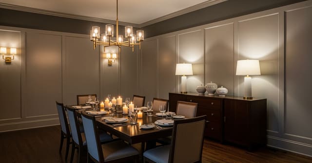
A dining room that doubles as a hallway works when the table sits parallel to the traffic flow (not perpendicular), the walking path is at least 36in clear on both sides of the chairs, the rug runs lengthwise to reinforce the path, and the lighting holds the room as a destination — a chandelier and sconces — instead of pass-through hallway flush mount. A dining room that doubles as a hallway is not a decorating problem first; it is a traffic problem with plates on top. My firm opinion: the walking route gets priority over the fantasy of a centered dining table. If the room is the path from kitchen to living room, entry to patio, or stairs to bedrooms, the layout has to respect moving bodies before it can feel gracious. The goal is a table that feels invited into the route, not dumped in the way of it.
What makes a dining room hallway combo work instead of annoy?
You design a dining room that is also a hallway by reserving a continuous walking lane, choosing a table that does not require chairs in the lane, and using lighting, rug placement, and storage to tell guests where dining stops and circulation begins. The room can still feel like a dining room, but it cannot behave like a closed formal room with doors on either end.
Start by naming the traffic line. In many homes, it runs straight from the kitchen to the living room, from the entry to the back door, or from the stairs to the bathroom. Keep that main route at least 36 inches wide when people carry dishes, grocery bags, backpacks, or a toddler. A secondary path can compress to about 30 inches, but if every trip through the house requires a sideways shuffle behind a chair, the dining setup is wrong.
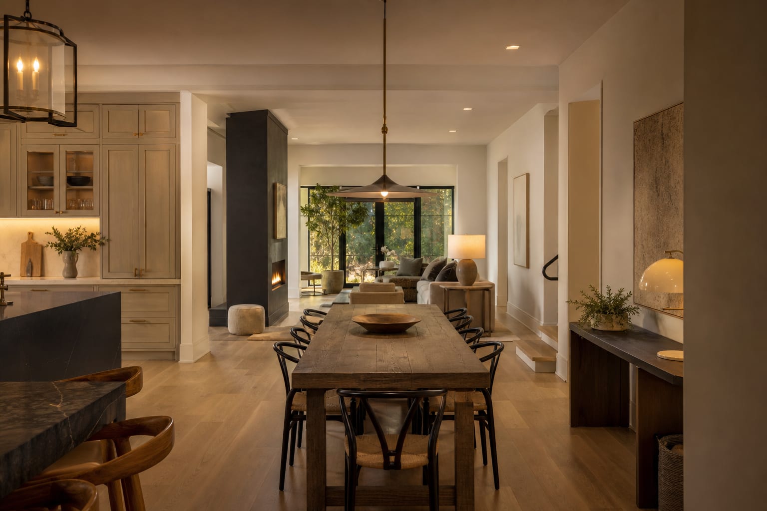
The table should sit parallel to the path more often than perpendicular to it. A table placed across the traffic line asks every person to walk around chair backs, table corners, and someone’s knees. A table aligned with the route lets the hallway function continue while the dining area reads as a long, deliberate zone.
If the room is also narrow, borrow planning discipline from a narrow dining room galley layout: long sightlines, shallow storage, and fewer pieces doing more work. The same logic applies here, even when the room is technically wide enough for a bigger table.
The table decision that controls the through dining room design
The controlling choice in a through dining room design is table shape, because the wrong shape turns every chair into a roadblock. Rectangular, oval, round, and banquette layouts all work in different versions of a dining room hallway combo, but they do not solve the same problem.
Use a narrow rectangular table when the room has one obvious long path. A 30 to 34 inch wide table is often enough for everyday meals, especially if serving dishes can stay on a sideboard or kitchen counter. Standard dining tables around 36 inches wide feel generous, but in a pass-through room those extra inches may be stolen directly from the aisle.
Choose an oval table when people clip corners. An oval gives you the length of a rectangle but softens the most dangerous points near doorways, sliders, and kitchen thresholds. It is especially useful when the table floats between two openings and guests approach from more than one side.
A round table works only when the room widens into a pocket. A 42 inch round can seat four in a calm corner, but it can also push chairs into every direction at once. If the dining room is truly a corridor, a round table may create more conflict than a slim rectangle tucked along the least important wall.
Banquettes are powerful when one side of the table can become fixed. A built-in or freestanding bench against a wall removes chair pullout from that side, which can save 18 to 24 inches where the room needs it most. Keep the seat around 18 inches high and the table close enough that diners are not sliding forward like they are eating in a booth designed by someone who hates knees.
Chairs matter as much as the tabletop. Armless chairs between 18 and 20 inches wide tuck more cleanly into tight rooms than broad upholstered host chairs. If people need to walk behind a seated diner, plan roughly 36 inches from the table edge to the wall, cabinet, or opposite furniture. If nobody walks behind that chair, 24 inches can work for sitting and sliding in.
Test this on your own room photo with ReDesign before you choose the final direction; keep the doorway, walls, windows, main furniture, lighting, and awkward fixed features visible so the preview solves the room you actually have.
How do you protect dining room traffic flow without making dinner feel temporary?
Protect dining room traffic flow by giving the path its own space while giving the table its own signal. A pass-through dining room feels temporary when the table is simply parked in leftover floor area with no light, no wall relationship, and no storage nearby.
Lighting is the strongest signal. Hang a pendant or linear fixture centered over the table, not centered in the room, and place it about 30 to 36 inches above the tabletop. That move tells the eye that the dining zone is intentional even if the room also carries traffic on one side. If hardwiring is not possible, a plug-in swag pendant, wall sconce, or shaded floor lamp near the table can still create a pool of dining light.
Rugs need caution in a hallway dining room. A rug under the table should extend at least 24 inches beyond the table edge on the sides where chairs pull out, or chair legs will catch the border every night. If the room cannot support that size, skip the rug and use lighting, art, and a wall color shift instead. A too-small rug in a traffic lane looks fussy and becomes a trip hazard.
Storage should be shallow and specific. A sideboard 12 to 15 inches deep can hold napkins, candles, placemats, chargers, and school papers without narrowing the route. A standard 20 inch deep buffet may be beautiful, but in a dining room hallway combo it can make the whole room feel like furniture is leaning into the walkway.
Think about the room as a series of zones, not a table floating in a hallway. The principles behind zoning an open plan room without walls are useful here: repeat one finish, use furniture backs as boundaries, and let lighting separate functions without pretending there is a wall.
Common dining room hallway combo mistakes to avoid
The first mistake is centering the table on the room instead of centering it on the usable dining zone. A symmetrical plan can look right from a doorway and still fail every time someone carries dinner from the kitchen. Shift the table off center if that protects the main 36 inch path; function will look more graceful than forced symmetry.
The second mistake is buying chairs for the photograph rather than the pullout. Wingback host chairs, deep slipcovered seats, and thick woven arms are charming until they live in the only route to the back door. Use slimmer daily chairs, then keep one or two extra chairs elsewhere for holidays instead of punishing the room all year.
The third mistake is putting the sideboard on the busiest wall because it fits there on paper. Storage near the kitchen end can be useful, but not if open drawers collide with chair backs or traffic. Place storage where someone can stand in front of it without blocking the main path, even if that means a smaller cabinet or wall-mounted shelf.
The fourth mistake is ignoring door swings and thresholds. A patio slider, basement door, powder room door, or pantry door may decide the layout more than the chandelier does. Tape the door arcs on the floor before committing to a table length, then pull out every chair that will be used on an ordinary weeknight.
The fifth mistake is letting the dining room become dim because it is also transitional. A hallway fixture may light the route but leave faces, food, and the table surface flat. If the room feels gloomy at dinner, use the same practical thinking behind fixing dim dining room lighting: warm bulbs around 2700K to 3000K, more than one light source, and fixtures aimed at the table instead of the floor.
Use AI to preview your dining room hallway combo before you commit
AI design is especially helpful for a dining room hallway combo because the problem is visual and bodily at the same time. You are not just choosing a prettier table; you are testing whether the room still works when chairs move, lights hang lower, storage gains depth, and the walking lane becomes visible.
Upload one photo from the kitchen looking through the dining room, one from the opposite end looking back, and one wider angle that shows doorways, windows, radiators, and any living room furniture nearby. Leave the existing table and chairs in at least one photo if you have them, because their awkwardness gives the preview useful evidence.
Ask for specific layout versions. Try one preview with a 32 inch wide rectangular table aligned with the traffic path, four armless chairs, a shallow 14 inch sideboard, warm pendant lighting, and a clear 36 inch walking lane along the window side. Run another with an oval table, bench seating against the wall, no rug, wall sconces, and a narrow art ledge. A third version with a round table in a widened pocket can quickly reveal whether the room has enough width or whether the circle makes every path worse.
Look at the unglamorous details in the preview. Does a chair back block the kitchen route? Does the pendant make the table feel anchored or does it hang in the walking lane? Does the sideboard make the dining area feel finished, or does it turn the room into a bottleneck? Does a rug clarify the zone or make the through route feel cluttered?
AI will not confirm the exact chair dimensions, fixture junction box, building clearances, or whether a vintage table has a knee-banging apron. Use the image to choose a direction, then tape the tabletop, chair pullout, sideboard depth, and pendant centerline in the actual room. Walk from kitchen to living room with two plates in your hands, then ask someone to sit at the table while you pass behind them.
A through dining room succeeds when the path is obvious and the meal still feels worth sitting down for. Let the route breathe, make the table slim enough for real chairs, and use light to give the dining zone authority. The room does not have to stop being a hallway; it has to stop letting the hallway ruin dinner.
Frequently Asked Questions
How do I make a passage-style dining room feel like a real dining room?
Anchor it with a chandelier overhead, a rug under the table, and one substantial piece of furniture (sideboard, console, or bench); without those three anchors the room reads hallway no matter the table. Use the room photo to compare the visible layout and fixed constraints before committing, because door swings, windows, outlets, storage reach, circulation, and existing furniture decide whether the idea survives daily use.
What table shape works in a hallway dining room?
Rectangular or oval tables sit parallel to the traffic path so chairs pull back into the same axis as walking; round tables block the passage in narrow plans and force diagonal traffic. Keep the preview honest by leaving the problem area visible in the frame, then compare one conservative version against one bolder version before you buy lighting, paint, furniture, or storage.
How wide does the walking path need to be?
36in minimum on both sides of the pulled-back chair so two people can pass without touching; below 30in the passage feels like a squeeze and family traffic detours through other rooms. Check the result against ordinary movement first: drawer clearance, chair pullout, walkway width, glare, switch access, and sightlines matter more than a perfect catalog angle.
Should the dining table be smaller than usual in a passage room?
Yes — pick a table that seats two or four normally and extends to six for occasions; oversized tables in passage rooms break the traffic flow and become permanent obstacles. Use the image to narrow priorities and measurements before ordering anything custom; final purchases still need real dimensions, outlet locations, installation limits, and product clearances.
What rug works in a passage dining room?
A rug sized to extend 24in past the chair pull-back on the long sides and 12in past the short ends; running the rug long lengthwise reinforces the traffic path and makes the room read intentional. If the preview invents architecture or hides the awkward feature you need solved, rerun it with stricter instructions so the result remains tied to your actual room.
Three transformations to try
- Passage dining with parallel rectangular table and chandelier
- Narrow dining with sideboard against one wall
- Extendable table with traffic clearance both sides