Flat-front everything started to feel cold a few years ago, and fluted surfaces are the correction. I think reeded and fluted detailing is the rare texture trend with real staying power, because it predates us by centuries and reads as architecture, not novelty.
What is fluted design in interior design? Fluting is a series of soft vertical concave grooves carved into a surface, while reeding is the inverse, a run of rounded convex ribs that stand proud. Both throw gentle shadow lines that catch light and give a plain panel rhythm and depth. You see them on cabinet doors, island bases, vanity fronts, wall panels, and ribbed glass and tile, and the appeal is purely tactile: a surface you want to run your hand across.
The vocabulary trips people up, so it is worth settling early. In everyday design talk the two words get used almost interchangeably, and you will see a ribbed cabinet front called fluted by one showroom and reeded by another. Strictly, fluting cuts in and reeding stands out, but the visual effect of vertical rhythm and grazed-light shadow is the same in both, and either term will get you close enough when you brief a millworker. What matters more than the label is committing to clean, consistent groove spacing, because uneven ribs read as a mistake while regular ones read as craft.
Where fluted and reeded surfaces shine
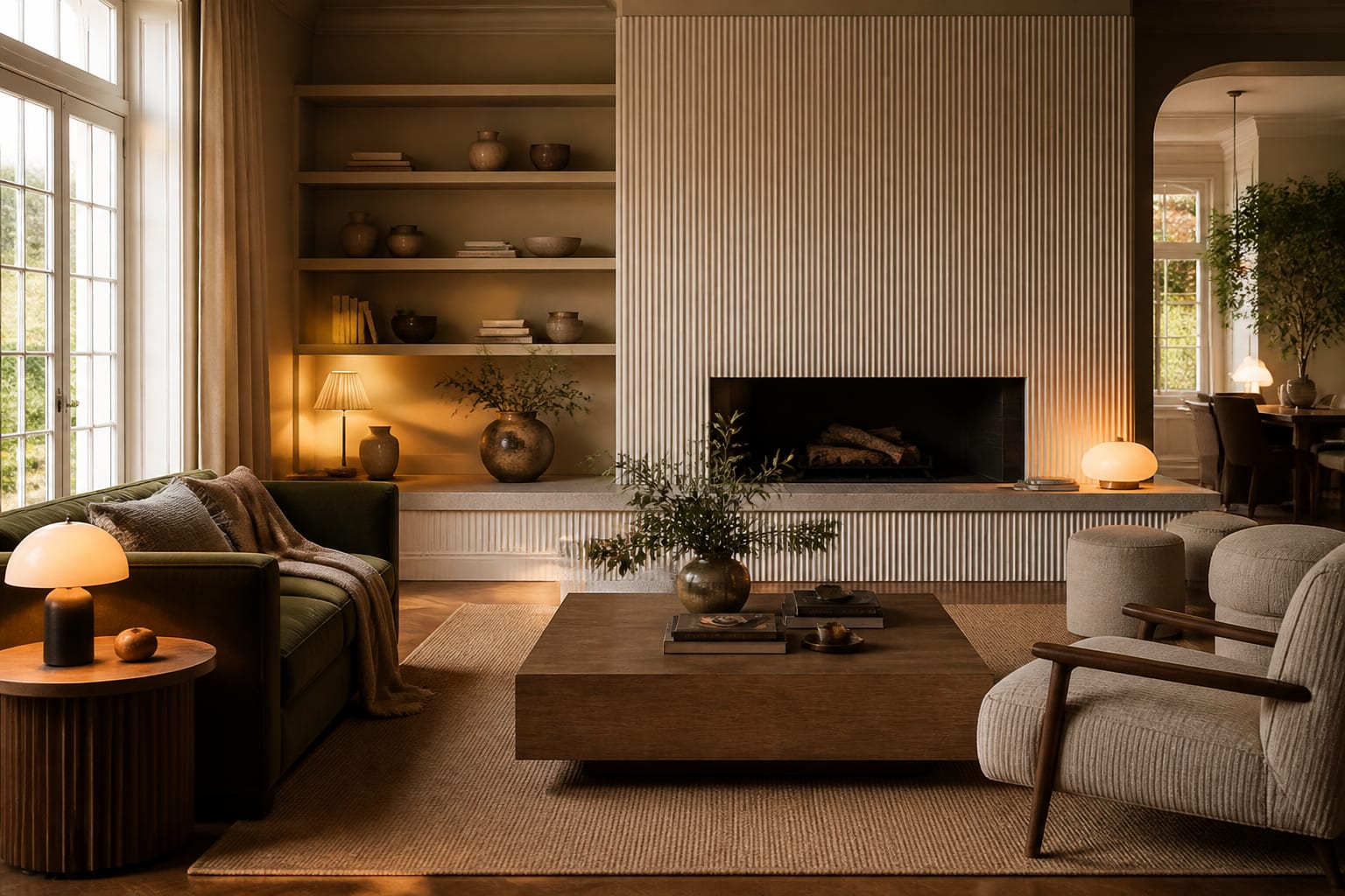
The detail does its best work as a single, confident focal point. A fluted kitchen island base turns a plain box into the centerpiece of the room, a reeded vanity front gives a small bathroom unexpected craft, and a run of ribbed wall paneling behind a bed becomes a headboard without buying one. The grooves read as quiet luxury because they imply hand-work and material thickness, even on factory-made fronts, and that perceived richness is most of the reason the detail spread so quickly.
Part of why the detail feels current is that it bridges old and new. Fluted columns and reeded furniture legs go back to classical architecture and Art Deco cabinetry, so the eye registers them as familiar and grounded rather than gimmicky. Pair that heritage with a clean modern cabinet shape and you get something that feels fresh without being trendy, which is a rare combination and the main reason I expect fluting to outlast the usual two-year trend cycle.
It also photographs beautifully, which matters more than people admit. The shadow lines give a flat phone photo something to grab onto, so a fluted island or vanity reads as designed even in a quick listing shot. That visual payoff, combined with the low material premium when the grooves are machined rather than hand-carved, is why the detail keeps showing up across very different budgets.
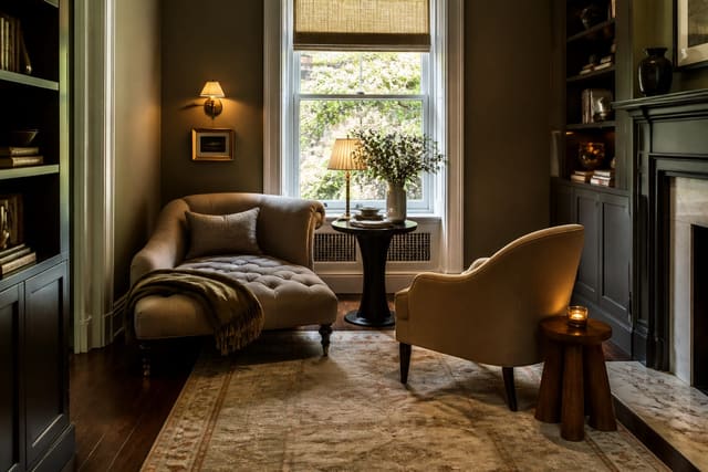
Lighting is half the effect. Fluting only shows its shadow lines when light rakes across it, so place these surfaces where a window or a wall lamp can graze them at an angle. A reeded surface in flat overhead light loses most of its depth. That interplay of texture and light is the same instinct behind a cozy reading nook, where the goal is depth and shadow rather than flat brightness.
Scale of the grooves changes the personality completely. Wide, shallow flutes feel soft and classical, the kind you see on a column or a vintage dresser, while narrow, tight reeding feels crisp and contemporary, almost graphic. A fine-ribbed glass cabinet front reads delicate, whereas a chunky channeled oak island reads bold and architectural. Picking the groove spacing is as much a design decision as picking the material, and it is worth seeing the two extremes side by side before you commit. As a rough rule, larger surfaces can carry wider flutes without looking heavy, while small accents like a vanity or a cabinet door usually look best with finer, more numerous ribs.
A run of fluted and reeded ideas to try
Here are specific applications worth considering, room by room:
- Wrap a kitchen island base in vertical fluted oak so it anchors an open-plan space.
- Face a bathroom vanity in painted reeded fronts for craft in a tight footprint.
- Panel a bedroom accent wall in tall reeded battens to imply a built-in headboard.
- Use ribbed reeded glass in upper cabinet doors to hide clutter while passing light.
- Set a fluted plaster or tile surround around a fireplace for a sculptural focal wall.
- Add a fluted timber base to a bathroom or entry vanity for a furniture-grade feel.
- Run reeded tile vertically in a shower niche to draw the eye upward.
Each of these works because it concentrates the texture in one place rather than scattering it. The detail rewards restraint, and a single fluted surface in a calm room outperforms three competing ones. If you find yourself wanting fluting on the island, the vanity, and the wall all at once, pick the one that gets the most light and the most attention, and let the others stay smooth.
Maintenance is the quiet downside nobody mentions in the magazine spreads. Grooves collect dust along their length, so a reeded surface in a kitchen near cooking grease will need wiping down the ribs now and then, and a painted finish has to be sprayed or carefully brushed so paint does not pool and fill the channels. None of that is a reason to skip the detail; it just argues for choosing washable finishes in working rooms and saving the most delicate fine-ribbed treatments for low-traffic spots.
Pairing texture with the rest of the room
Fluted and reeded surfaces want quiet neighbors. Set a ribbed island against smooth slab counters and plain walls, and the contrast makes the texture sing. Surround it with equally busy finishes and the whole room turns restless. The same logic governs ceilings: if you commit to a statement ceiling, keep the vertical fluting below it understated so the two features take turns rather than shout over each other.
Material choice shifts the mood. Natural oak fluting feels warm and Scandinavian, painted reeded fronts in a deep green or off-white feel classical and soft, and fluted plaster or stone reads sculptural and serene. Metal and terrazzo versions exist too, pushing the same vertical rhythm toward something more polished and modern. The point is that fluting is a shape, not a style, so it bends to whatever direction the rest of the room is heading.
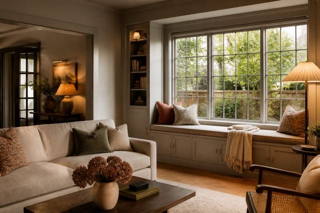
A reeded surface near a window seat is a lovely touch, since the grazing daylight from a window seat reveals every groove through the day and changes the look from morning to evening. Match the texture to the light you actually have, and pick one hero surface to carry it rather than spreading the detail thin.
Use AI design to preview fluted surfaces before you commit
Fluting is a texture you feel as much as see, which makes it genuinely hard to picture from a product photo of a single door front. With Re-Design you upload a photo of your kitchen, bathroom, or bedroom and re-render a surface with fluted or reeded detailing, so you can judge how the grooves catch your room's light and whether the texture suits the space before any cabinetry is ordered.
The real value is testing placement. Upload the room, try the fluting on the island base, then move it to the wall or the vanity to see where the shadow lines look intentional instead of busy. Comparing reeded oak against painted fronts as AI design renders lets you settle the look quickly, without committing to a custom millwork bid on a hunch.