Most French country rooms fail on color before they fail on furniture. The palette looks simple, but its restraint is deceptive: every shade must feel softened, as if filtered through Provençal sun. Warm creams carry the walls, muted herbs and dusty blues supply accents, and wood tones quietly fill in the rest. Get the undertones wrong and the room turns either cold or cartoonish. This guide walks through how the palette is built, why finish matters as much as hue, and the specific mistakes that drain the warmth out of an otherwise well-planned space.
Build the Base From Warm Neutrals
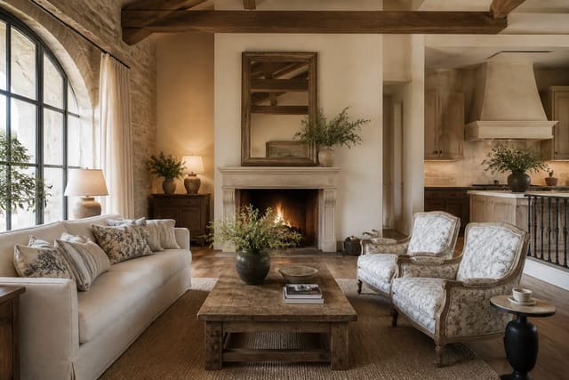
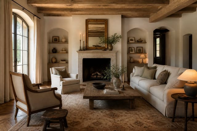
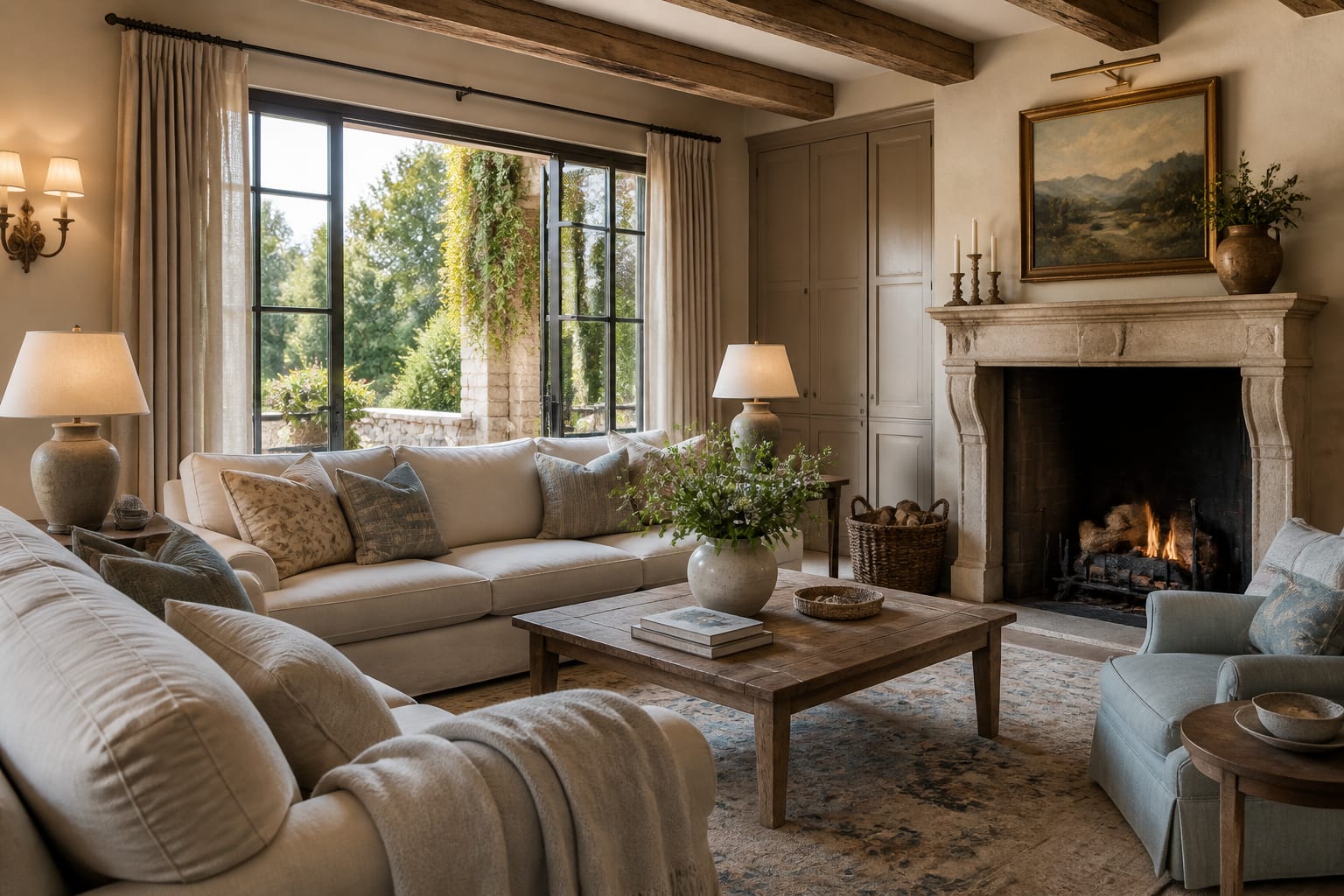
Every French country color palette starts with a generous foundation of warm neutrals. Creamy off-whites, soft putty, and pale oatmeal should occupy around 60% of a room, covering walls, large upholstery, and trim. The key word is warm: choose whites with a yellow, pink, or grey undertone rather than crisp blue-based whites that read modern and clinical. Test paint in the actual room across a full day, since north-facing light can pull a warm cream toward grey and ruin the effect. A limewash or chalky matte finish suits this style far better than a satin or eggshell sheen, because the soft, cloudy texture mimics aged plaster. Aim for a finish with no more than a 2% to 5% sheen on main walls. These neutrals are not meant to be exciting on their own; their job is to create a quiet, sun-washed backdrop that lets muted accents and natural wood do the talking. When the base is right, the whole room feels bathed in gentle light even on overcast days, which is the atmospheric foundation everything else depends on.
See also our guide to French Country VS Farmhouse Style for more on french country color palette.
Choose Muted Accents That Feel Sun-Faded
Accent colors give the palette its character, but they must always feel faded rather than vivid. Pull your accents from the Provençal landscape: sage and olive greens, dusty lavender, faded denim blue, ochre, and a weathered terracotta red. The decisive move is desaturation, so take any candidate color and imagine it left in strong sun for years until its intensity drops by roughly 30% to 40%. A pure kelly green or a bright royal blue will fight the warm base, while their dusty cousins settle in comfortably. Use these accents on perhaps one upholstered piece, a painted cabinet, or a set of cushions rather than across whole walls, keeping any single accent to under 20% of the room. Layering two or three muted shades together works beautifully, since they share that sun-washed quality and blend without clashing. Avoid high-contrast pairings; the palette relies on gentle transitions, not bold statements. When an accent feels like it could have come from a dried herb bundle or a fading shutter, it belongs. When it looks like it came from a paint chip in a children's playroom, dial it back until it does. Keep painted walls to roughly 70% of the visible surface in soft neutrals, then warm the room with 2700K bulbs so ochre and faded lavender read gentle instead of stark.
For a related angle on french country color palette, read Modern French Country Style.
Let Materials and Finishes Carry Color
Half the palette in a French country room comes from materials rather than paint, and forgetting this flattens the result. Honey oak, dark walnut, fruitwood, and the warm grey of weathered timber all act as colors and must be counted in the scheme. Stone, terracotta tile, aged brass, pewter, and wrought iron each contribute their own quiet tones. Before adding painted accents, take stock of these existing material colors so the room does not become muddy or overloaded. Finish matters as much as hue here: a matte clay plaster reads completely differently from the same color in glossy enamel, and the style nearly always wants the matte version. Metals should be aged rather than bright, since polished chrome or shiny gold reads contemporary and disrupts the period feel. Even textiles contribute, as the natural slubs of undyed linen carry their own soft, warm color. Budget a little extra for these finishes; a quality limewash or a genuine stone counter at around $2,500 often does more for the palette than any amount of accent paint. When materials and paint colors share warm undertones, the room reads cohesive and deeply layered rather than thinly decorated.
Balance and Pull the Whole Palette Together
A successful French country palette is about proportion as much as the colors themselves. A reliable structure keeps roughly 60% warm neutral, 30% supporting tones from wood and stone, and 10% muted accent, which prevents any one element from dominating. Distribute accent colors around the room rather than clustering them in one corner, so the eye travels and the scheme feels intentional. Repeat each accent at least twice, perhaps a sage cushion echoed by a sage-painted side table, to tie the space together. Keep overall contrast low; the magic of this look lies in soft, almost imperceptible shifts between tones rather than dramatic pairings. Bring in living color through fresh flowers, fruit, and dried herbs, which add seasonal variation without permanent commitment. Step back often during the process and squint at the room, since blurring your vision reveals whether the values blend or jar. If one spot jumps out sharply, soften or relocate it. The finished palette should feel collected and harmonious, as though it accumulated naturally over decades of country living rather than being assembled from a single shopping trip with a strict color formula in hand.
Here are the common mistakes to avoid: - Using crisp blue-based whites instead of warm creams - Choosing accents too saturated to read sun-faded - Ignoring wood and stone as part of the palette - Picking glossy finishes that flatten the aged plaster look - Clustering all accent color in one corner - Pairing high-contrast colors that break the soft transitions
Bring the look home with Re-Design
Not sure which French country color palette suits your light? Upload a photo of your room to Re-Design and preview warm creams, faded sage, and dusty blue on your actual walls before committing to paint. You can compare a limewash neutral against a putty tone, test where a muted accent belongs, and judge how the colors read in your specific daylight in seconds.
Frequently Asked Questions
What are the core colors of a French Country palette?
The foundation rests on warm whites, creams, and soft greige that mimic aged plaster. Layer dusty blue, sage and olive green, and faded lavender drawn from the Provence landscape. Earthy terracotta, ochre, and mustard add grounding warmth. Accents of gilded gold and weathered black iron provide contrast. Every hue reads slightly muted, as though softened by years of bright Mediterranean sunlight.
Which paint colors work best on the walls?
Soft buttery yellow brings sunny warmth to north-facing rooms, while pale dove grey suits brighter spaces. Creamy off-white with a hint of beige flatters wood beams and stone. For a bolder room, a chalky sage green or muted slate blue feels grounded. Choose matte or eggshell finishes over gloss. Test swatches at different times of day, since this palette shifts beautifully with changing light.
How do I combine these colors without clashing?
Anchor about seventy percent of the room in warm neutrals, then introduce one muted color, like dusty blue, across roughly twenty percent through textiles and cabinetry. Reserve the final ten percent for accents in ochre or gilded brass. Repeat each hue at least twice so it feels intentional. Because every tone is already softened, combinations rarely fight, giving you generous freedom to mix florals and stripes.
What accent colors add interest to the scheme?
A washed lavender brings unmistakable Provencal charm to bedrooms and bathrooms. Deep mustard or burnt sienna injects energy through a single armchair or a stack of cushions. Aged brass and gold leaf catch candlelight on mirror frames and sconces. Wrought-iron black grounds lighter rooms and sharpens softer pastels. Use these sparingly, letting them punctuate the neutral base rather than compete for attention.