Lay the whole gallery wall out on the floor before a single nail goes in, and you remove almost all the guesswork that makes people hate the result. The error I watch people make is hanging one frame, then another, then a third, eyeballing each one until the wall looks scattered and crooked. My read is that a gallery wall is a layout problem you solve on the floor, not a hanging problem you solve on the wall. Spend the time flat, and the wall practically hangs itself.
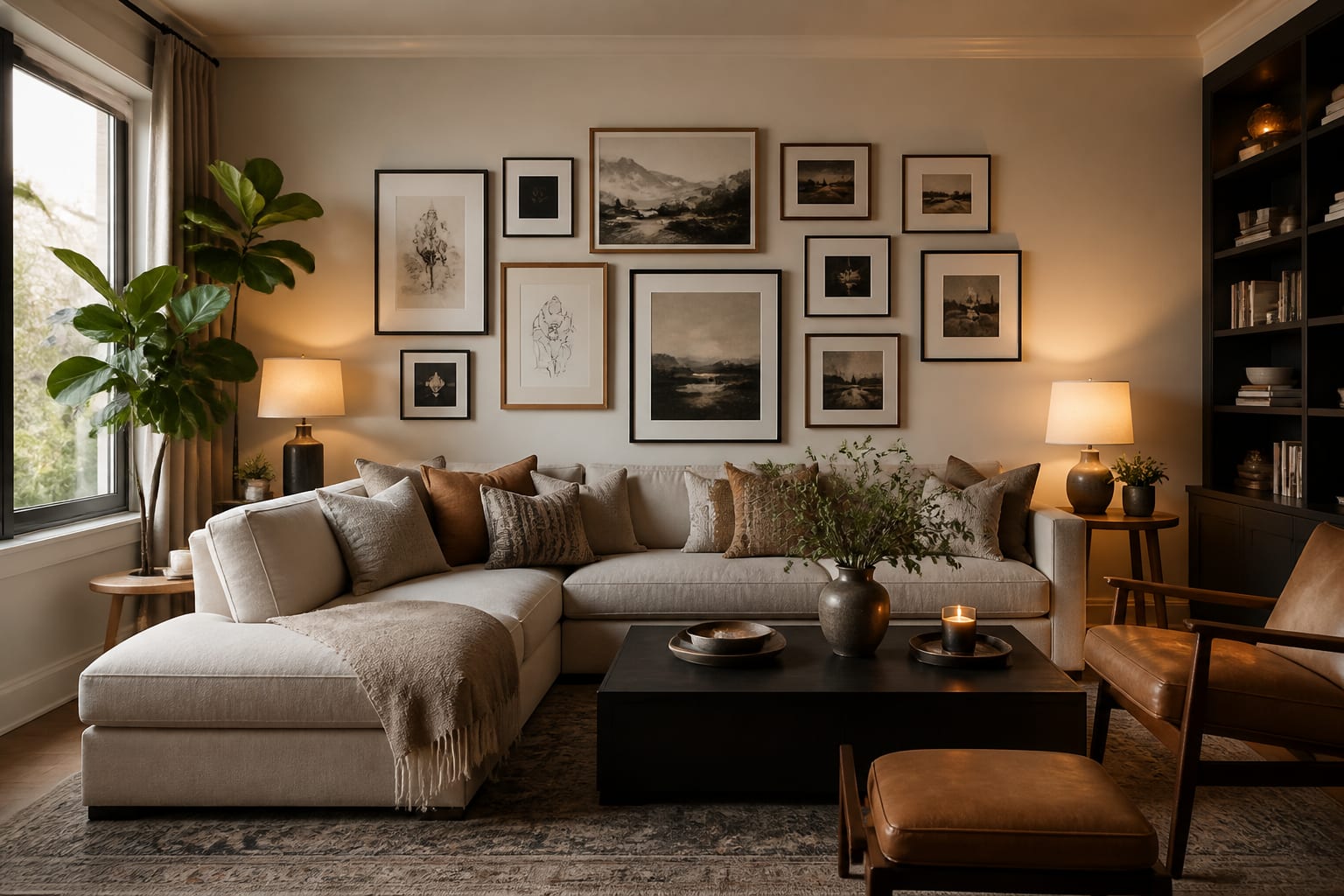
A gallery wall reads as intentional when the spacing is consistent and the cluster is centered at the right height. Those two rules carry the whole look. I will give you the formulas I use for grid, salon, and row layouts, plus the numbers that keep the spacing tight and even.
Plan the layout on the floor first
The floor is your test bench. Lay all your frames out on the floor below the wall they are headed for and push them around until the arrangement clicks, keeping a steady 2 to 3 inches between each frame. Working flat lets you swap pieces, rotate orientations, and fix the spacing without a single hole in the drywall. When it looks right, trace each frame onto kraft paper or newspaper, mark the hanging hook position on each tracing, and tape those templates to the wall to preview the real thing at full size.
This paper step is the one I never skip, because it shows you the exact footprint before you commit. Stand at the doorway and check the overall shape; if the cluster drifts too far one way, shift the templates as a group. A gallery wall also leans on good wall light to land, so if the wall sits in a dim corner, the fixes in my dark room solutions guide will keep the art from disappearing into shadow.
Treat the whole group as one big rectangle or shape. The individual frames can vary wildly, but the outer edge of the cluster should hold a clean silhouette, because that outer boundary is what your eye actually reads from across the room.
Pick a layout formula
Three formulas cover almost every gallery wall, and each one suits a different look.
- Grid: identical frames in even rows and columns with a fixed 2-inch gap. Crisp, calm, and best for a set of matching prints.
- Salon: mixed sizes packed around a strong center piece, with consistent gaps and a tidy outer edge. Collected and layered.
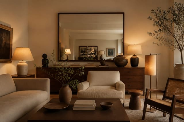
- Row: a single horizontal line of frames sharing a common center line, ideal above a sofa or down a hallway.
For a salon wall, start with the largest piece slightly off-center, then build outward, keeping the 2 to 3 inch spacing constant even as the frame sizes change. The trick that sells a mixed wall is repetition: use at least 2 frames of each size so the eye finds rhythm instead of chaos. The same balance-through-repetition idea runs through how I mix design styles, where one repeated element ties an eclectic group together.
Whatever formula you choose, lock the spacing first and let frame size vary second. Consistent gaps are what make a wall look professionally hung.
Orientation is the lever most people forget. A wall of all-vertical frames feels stiff, and a wall of all-horizontal frames feels squat, so mix in a few of each to give the cluster movement. Color helps too: matching frame finishes, all black or all natural wood, ties a wildly mixed set of art together and lets the images themselves carry the variety. If your art ranges across styles, photos, abstracts, and prints, the unifying frame is what keeps the wall from reading as a jumble. One more rule I hold: leave the same gap between the cluster's outer edge and any nearby door casing or corner as you keep between the frames, so the whole arrangement breathes against the architecture instead of crowding it.
Get the height and scale right
Height is where many gallery walls go wrong, hung too high so the cluster floats near the ceiling. Center the entire arrangement on 57 inches from the floor, the museum standard for average eye level. That means the vertical midpoint of the whole group, not any single frame, lands at 57 inches.
Scale the cluster to whatever sits below it. Above a sofa or console, the gallery should span roughly 60 to 75% of the furniture width, leaving breathing room on each side rather than running wall to wall. The bottom of the lowest frame should sit about 8 to 10 inches above the sofa back, close enough to feel connected but high enough to clear heads. Keep that bottom edge consistent so the cluster relates to the furniture instead of hovering above it.
Common mistakes to avoid
The most common mistake is hanging frames one at a time and hoping they add up, which almost always produces uneven gaps and a lopsided shape. Lay it out on the floor and trace templates first.
The second mistake is hanging the whole cluster too high; aim for a 57-inch center, not a ceiling-hugging band. A third is inconsistent spacing, where some frames sit 2 inches apart and others 5, which instantly looks accidental. Lock one gap and hold it. A fourth is scaling the cluster to the wrong width, either stretching it past the furniture or shrinking it to a timid little patch; target 60 to 75% of the furniture below. The last common mistake is using every frame size exactly once, so nothing repeats and the eye finds no rhythm; double up on at least a couple of sizes.
Use AI design to test a gallery wall before you nail anything
The maddening part of a gallery wall is that you only truly see it once the nails are in, and a wall full of holes is the price of a bad guess. Re-Design lets you skip the guessing. Upload a photo of your real wall and the furniture beneath it, and the AI design renders gallery arrangements in grid, salon, and row formats so you can judge spacing, height, and scale before you reach for a hammer.
Because you upload your actual room, the preview keeps your true wall width, ceiling height, and the sofa or console below in frame, so you can see whether a cluster centered at 57 inches sits right or needs to drop. Test a tight grid against a layered salon, scale the group up or down against the furniture, and settle the layout while it is still pixels instead of holes in the drywall.