Greige is the neutral most people actually want when they say they want grey. It is a grey-beige hybrid that stays warm enough to feel livable while dodging the cold, hospital tint that pure grey drifts toward in flat light. My take: greige is the safest whole-home neutral on the market, but only if you respect its undertone, because the wrong one quietly turns a room muddy or faintly purple.
Greige in interior design means a balanced blend of grey and beige, roughly a 50/50 base nudged warm or cool by a hint of pigment. That hint is the whole game, and it is what separates a calm, expensive-looking wall from a flat, dingy one.
What greige is and how to read its undertone
Every greige carries a secret undertone that surfaces under your specific light. The simplest test is to hold a true grey chip and a true beige chip beside the candidate; the direction it leans tells you the base pigment doing the work. The common traps are a green undertone that reads sickly under warm bulbs and a pink-violet undertone that turns faintly lilac at dusk.
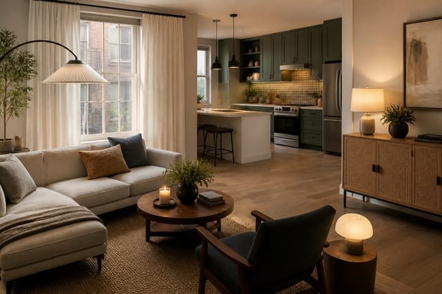
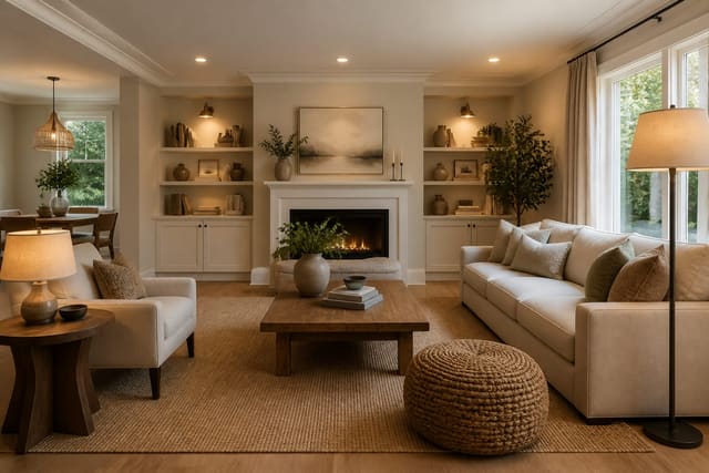
Popular real-world picks span the warm-to-cool range, and knowing where each lands saves you a wasted gallon. Sherwin-Williams Agreeable Gray sits in the middle and is the default for good reason. Benjamin Moore Revere Pewter leans green-gray, while Edgecomb Gray runs warmer and lighter. For a deeper anchor on a feature wall, a richer greige adds noticeable warmth without going full brown.
- Agreeable Gray (SW 7029): balanced, light reflectance value around 60, forgiving in most light.
- Revere Pewter (BM HC-172): green-gray, best in rooms with strong daylight.
- Edgecomb Gray (BM HC-173): warmer and lighter, good for north-facing rooms.
- Accessible Beige (SW 7036): the beige-leaning end of the greige family.
The takeaway is that there is no single best greige, only the right greige for your light and your fixed finishes. It also helps to know the light reflectance value, or LRV, printed on most fan decks. An LRV near 60 keeps a room bright and open, while a value down near 40 reads cozy and enclosed; pick the number to match the mood you want, not just the color name.
It is also worth distinguishing greige from its cousins. A true greige holds grey and beige in near balance, whereas a "mushroom" leans browner and a "putty" leans softer and paler. Knowing which family your candidate belongs to predicts how it will behave long before the roller touches the wall.
Choosing greige by room and light
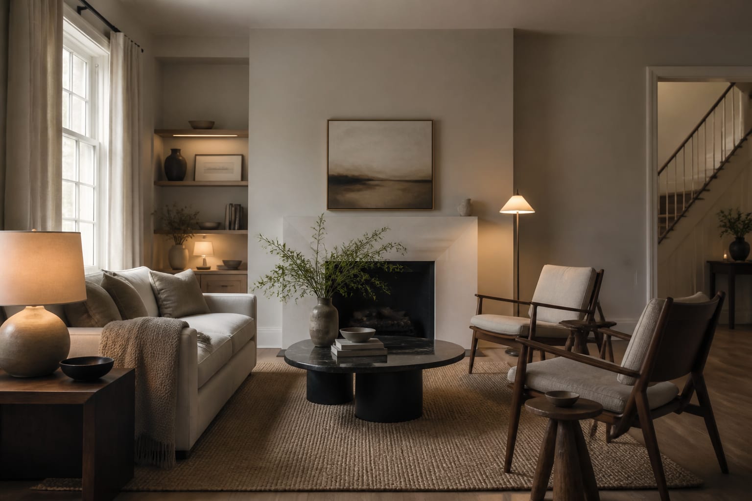
A paint color's behavior is roughly 80 percent light and 20 percent pigment, which is why the same can looks different in two rooms. North-facing rooms get cool, indirect light all day, so a cool greige there goes flat and grey; pick a warmer base like Edgecomb Gray to compensate. South-facing rooms flood with warm light that can push greige toward yellow, so a more neutral or slightly cooler pick balances out.
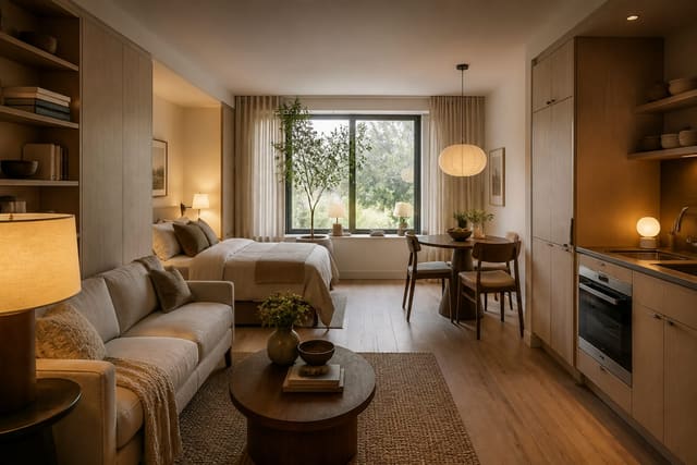
East and west rooms change character through the day, reading warm at one end and cool at the other, so test those at both morning and evening. Small rooms benefit from a lighter greige with a light reflectance value above 55, which keeps walls from closing in and bounces what daylight you have. The same logic that guides color in AI interior design for small spaces applies directly to greige: lighter and warmer makes tight square footage feel generous. Renters who cannot repaint freely can still preview options the way an AI room design for a rental apartment workflow does before committing a deposit's worth of paint and labor.
Sheen, coats, and finishing specs
Sheen changes the perceived color as much as the pigment does, so it is part of the color decision, not an afterthought. Flat and matte hide wall flaws and deepen the color but scuff easily, which suits ceilings and low-traffic walls. Eggshell is the living-room default, with just enough wipeability. Satin and semi-gloss go on trim, doors, and bathrooms where you regularly wipe surfaces down.
Plan on 2 coats over a tinted primer for even coverage, since greige over a bold old color almost never covers in one. Budget roughly $45 to $75 per gallon for premium interior paint, with one gallon covering about 350 square feet, so a standard 12 by 14 foot room needs about two gallons for walls. Paint your samples in 12 by 12 inch squares on two different walls and check them at 9 a.m., noon, and 9 p.m. before you commit to a final pick.
A coordinated palette extends the color past the walls. Pair your greige with a trim white a few notches brighter and a ceiling in a flat finish to keep the eye moving up. For a whole-home flow, hold one greige across open sightlines and shift only the accent colors room to room, which reads far calmer than switching neutrals at every doorway and keeps the square footage feeling continuous.
Common mistakes to avoid
The biggest mistake is judging greige from a paint chip held under the store's fluorescent light, which strips out the very undertone you most need to see. The second is using the exact same greige on walls and trim, which flattens the architecture; keep trim a few shades lighter or move to a crisp white for contrast.
A third common mistake is ignoring fixed elements already in the room. Greige with a pink undertone fights a green-gray quartz counter, and a green-based greige clashes against warm honey oak floors. The fourth is skipping primer over a previously bold color, which lets the old hue bleed through and quietly shift your warm grey toward cool. The fifth is buying the gallon off a one-inch chip rather than a painted sample, which is how most greige regret starts.
Use AI design to preview greige before you commit
Greige is the single hardest neutral to judge from a sample, because its undertone only reveals itself at full wall scale in your own light. Re-Design lets you upload a photo of the room and preview Agreeable Gray, Revere Pewter, or Edgecomb Gray on your actual walls next to your existing floor, trim, and furniture in seconds.
That side-by-side removes the guesswork that staging pros rely on instinctively, the same judgment behind AI-assisted home staging. You can see whether a given pick reads warm and inviting or muddy and grey against your sofa before you buy three gallons and give up a weekend to rolling walls.
The preview is most useful for comparing several greiges at once in the exact same lighting, which is nearly impossible to do fairly with paint samples that dry at different speeds. Line up Agreeable Gray against Edgecomb Gray and Accessible Beige in your living room render, and the undertone differences that hide on a fan deck become obvious. It is the fastest way to narrow a dozen contenders down to the two worth sampling for real.